Hi, Team!
I would like to request functionality that enables me to implement a feature allowing the users to drag and drop multiple rows simultaneously inside the Kendo UI for Angular Grid.
Hi, Team!
Currently, the built-in row reordering feature is not compatible with the grouping feature of the Grid component. Therefore, I would like to request a feature where the drag and drop of records inside a single group or across multiple groups is possible.
A possible workaround that requires additional logic for the full implementation of the logic:
https://stackblitz.com/edit/angular-y4arlg-ze1bhb
When I type on a filter, the event filterChange is fired and it correctly contains the data of the column filter that has been modified, with its value.
The problem is that when a filter is cleared (either via clear button or by emptying the filter), the fired filterChange event does not contain any information. No name of the filter field is provided. This doesn't allow me to know which filter has been cleared.
Typing a decimal number in a grid filter menu input for number type removes dot sometimes.
Can be reproduced in this Grid:
https://www.telerik.com/kendo-angular-ui/components/grid/filtering/filter-menu/
Hi, Team!
I would like to request an enhancement to the built-in drag selection functionality such that the Grid component is automatically scrolled thus allowing the user to reach rows and columns that are rendered on the page but are not currently visible.
When using virtual scrolling and grouping features (currently achieved with kendoGridGroupBinding directive), the ability to control the expanded state of the groups is disabled due to limitation.
The available methods are helpfull when you want to control the state of the groups at runtime, but are not compatible with virtual scrolling since the records are loaded on demand.
It would be nice if we had the ability to collapse and expand all groups of the Grid programatically when using virtual scrolling.
We need to overwrite kendo-grid-column-chooser component reset button logic. We need reset button to select all columns that were selected during the initial load of grid.instead of current reset logic. Is there a way to overwrite reset button logic?
I tried <kendo-grid-column-chooser (reset)="resetColumnMenu($event)"></kendo-grid-column-chooser> but it didn't work.
We need copy-pasting data from Excel to Kendo UI for Angular Grid, and it is available in old telerik component for silverlite application
hello
i`m always using kendo grid in my project
but i can`t import excel to kendo grid
please make it possible to import excel file and select specific sheet to kendo grid
The feature request affects built-in filter cell components for primitive types such as StringFilterCellComponent, NumericFilterCellComponent, etc.
The built-in filter cell components currently allow to hide operators, but doesn't allow to hide clear button, which is being shown when a user provides some input to these filters. The workarounds are in the current moment possible, but seems to be not very maintainable, as the most obvious workaround is to control with the CSS the internal stylings of the components, which can change with any patch. I would hope for some toggle, which can control hide/display of the clear button.
The use-case in which someone might want to achieve this, is when the filtering is being cleared only globally for the whole grid. and local clearing is not necessarily desired.
The behavior can be tested on an example or provided example in official docs.
It would be helpful to have a filter option inside the ColumnChooserComponent.
In some use cases we have around 30-50 items inside the list, it's hard to scroll through the small window to find your entries.
A simple textbox to search through the entries would be enough.
Hi,
There is no event to cater mouse-over events for rows in k-grid. This is important if we need to perform something row specific.
Also, this is not achievable through javascript events. So it should be a feature in Kendo.
Thanks!
Richa
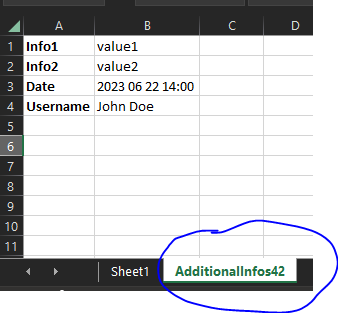
input to grid:
@Input()
public additionalExcelExportInfos: { additionalWorksheetTitle: string,
parameters: { key: string, parameterValue: any }[]
};
output in excel file:
Hi,
Allow an option to filter when the user presses the enter key for the row filtering. The option can be a part of the StringFilterCellComponent(applicable to the other built-in filter components) and can also be considered for the TreeList component.
We need to be able to overrride "compare" method in kendo-data-query sort-array.operator.  We are using your processData for client side sorting but need to change the "compare" method since we have decimal values already formatted in our objects.  Since they are formatted they are technically strings and sorted as such.  Currently we had to rip out your processData and call our custom version with a compare method like so:

const compare = (a, b) => {
    if (isBlank(a)) {
        return a === b ? 0 : -1;
    }

    if (isBlank(b)) {
        return 1;
    }

    let a1 = a;
    if (isNumber(a)) {
        a1 = toNumber(a);
    } else if (isDate(a)) {
        a1 = ensureDate(a);
    }

    let b1 = b;
    if (isNumber(b)) {
        b1 = toNumber(b);
    } else if (isDate(b)) {
        b1 = ensureDate(b);
    }

    if (a1.localeCompare) {
        return a1.localeCompare(b1);
    }

    return a1 > b1 ? 1 : (a1 < b1 ? -1 : 0);
};
Hi,
It will be nice to have a feature to allow the Grid to be exported to Word(DOCX) format.
Hi, Team!
I would like to request functionality that would allow the developer to determine whether single or multiple items are expanded at the same time inside the Grid's Column Menu.