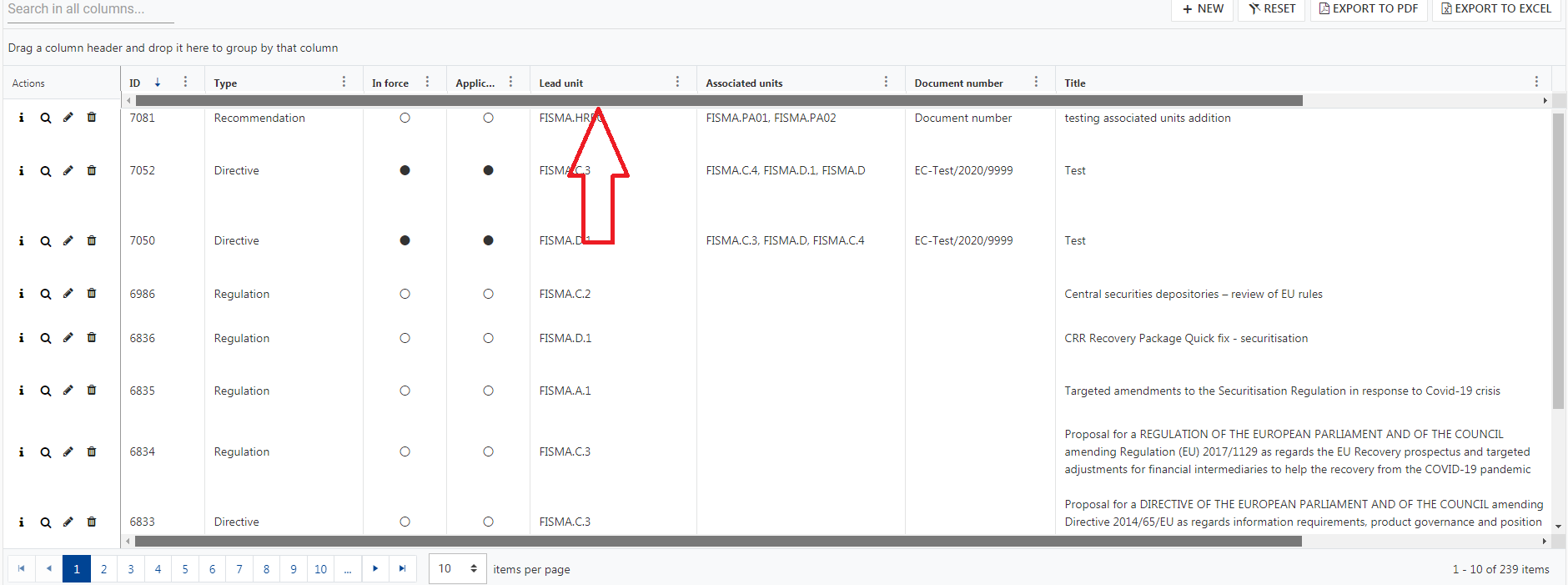
When resizing grid columns so the last column does not reach the right border of the grid (sum of columns width < current grid width), loading stored state (or changing column width property in any way) does not restore the columns width proportionaly to use the full width of the grid.
Note: in this case, the default columns width sum and stored state columns width sum are always inferior to the grid width in order to use proportionality and adapt to every screen size.
In our implementation, we made a "Reset columns view" (working exactly as the loading store data), but if the user play arround with the columns as described above), the reset is broken.
Reproduce steps:
Using the persisting state exemple available in the doc: https://stackblitz.com/edit/angular-3jdmzy?file=app%2Fapp.component.ts
- Click "Save current state"
- Resize grid columns so the last column does not reach the right border of the grid

- Click "Load saved state", the columns are resized proportionaly of the saved state but on the base of previous columns width sum instead of the full grid width.

When a Grid cell is focused, and after this, the data is filtered so that the data contains fewer items than the index of the row the last focused cell was in, the Grid table area does not receive focus when tabbed into.
Please check the example:
https://stackblitz.com/edit/angular-xqswy5-zqeqkb?file=app/app.component.ts
Hi
we have a lot of clients requesting two features for the KendoGrids:
1st) A second horizontal scrollbar on top of the grid, scrolling smoothly in parallel with the bottom one.
2nd) Sticky / fixed headers to be able to always see the header row. Somethine like this: https://www.telerik.com/kendo-angular-ui/components/grid/columns/sticky/ but for the top labels row.
Could we have a turnkey solution which allows to disable a row selection which takes care of disabling only the relevant selection checkboxes and handle properly the "Select all" checkbox state (in header).
With CheckboxColumnComponent field which allows providing dataItem field name or predicate function.
<kendo-grid-checkbox-column showSelectAll="true" disableSelection="isDisabled">
</kendo-grid-checkbox-column><kendo-grid-checkbox-column showSelectAll="true" [disableSelection]="isDisabledPredicateFunction">
</kendo-grid-checkbox-column>OR
If you don't want to add more selection concerns into CheckboxColumnComponent this field could be specified in your SelectableSettings as well:
public selectableSettngs: SelectableSettings = {
    enabled: true,
    checkboxOnly: false,
    mode: 'multiple',
    cell: false,
    drag: false,
    rowEnabled: mySelectableRowPredicateFunction
}
rowEnabled field could something like this:
export declare type RowEnabledSelectionFn = (context: RowArgs) => boolean | boolean;

export interface SelectableSettings {
    //...
    /**
     * Determines if row selection is allowed.
     *
     * @default true
     */
    rowEnabled?: RowEnabledSelectionFn;
}
Thank you
Current behavior
The developer must measure the Grid row height in the browser and set it to the `rowHeight` in order for virtual scrolling to work correctly. Setting an incorrect value can lead to subtle errors - glitches during scrolling or inability to scroll down to the last row.
The row height may change as a result of a styling adjustments and is not guaranteed to be identical across browsers and devices. This makes the current workflow tedious and error-prone.
One of the following approaches can be used to solve this issue:
- The Grid should take accurate measurements of the row height at run-time. The developer should still be aware that row height is constant . This is the preferred approach as it does not change current behavior, instead the set `rowHeight` value is ignored.
- The set `rowHeight` should be applied as inline styles. This is a more risky approach as it will change the appearance of the Grid.
Hi,
Please provide an option that allows disabling the Clear button located in the Grid filter menu. Currently, it is always enabled, but I expect that it should be enabled only when there is a filter applied for the specific column that can be cleared. The required behavior is similar to the way the Filter button in the filter menu is functioning.
thanks
Hi,
Please provide a way to control the grouping operation whether it is performed case sensitive or case insensitive. One option would be to add an ignoreCase property to the GroupDesciptor similar to the FilterDescriptor.
Hi Team,
I'd like to request the Grid to have resize sensors to be able to determine when the Grid height changes.
Thank you!
When the column filter is set to date, it shows a built-in filter menu with the DatePicker and the operators dropdown. Can we have a similar feature where the filter Menu shows the DateTimePicker with the operators and logic dropdown?
I have a groupable kendo grid. I'm utilizing the kendoGridGroupHeaderColumnTemplate directive.
I see that <kendo-grid-column> takes headerClass and headerStyle, but neither applies styles to the grouped header.
Please provide a groupedHeaderClass and groupHeaderStyle properties so that I can style the cell rendered by kendoGridGroupHeaderColumnTemplate.
Thanks,
-Adam
Implementing this functionality would greatly benefit applications that heavily rely on grid usage. Currently, each usage of the grid component requires a custom implementation to override default behavior.
Currently, we can specify which columns to be included in the exported PDF file or Excel file:
It would be also convenient to have a property such as excludeFromPDF (or similar) for scenarios when only a single column should be removed from the PDF file.
Right now this is possible but defining the rest of the columns between <kendo-grid-pdf> tags which in scenarios with more columns drastically increases the HTML template.
Hi, Team!
I would like to request functionality that would allow the developer to determine whether single or multiple items are expanded at the same time inside the Grid's Column Menu.
It would be helpful to have a filter option inside the ColumnChooserComponent.
In some use cases we have around 30-50 items inside the list, it's hard to scroll through the small window to find your entries.
A simple textbox to search through the entries would be enough.
There is already checkbox column and check/select all on header level, but it will be great to see checkbox on group level header too, so we can select/deselect all items in the group.