Could we have a turnkey solution which allows to disable a row selection which takes care of disabling only the relevant selection checkboxes and handle properly the "Select all" checkbox state (in header).
With CheckboxColumnComponent field which allows providing dataItem field name or predicate function.
<kendo-grid-checkbox-column showSelectAll="true" disableSelection="isDisabled">
</kendo-grid-checkbox-column><kendo-grid-checkbox-column showSelectAll="true" [disableSelection]="isDisabledPredicateFunction">
</kendo-grid-checkbox-column>OR
If you don't want to add more selection concerns into CheckboxColumnComponent this field could be specified in your SelectableSettings as well:
public selectableSettngs: SelectableSettings = {
    enabled: true,
    checkboxOnly: false,
    mode: 'multiple',
    cell: false,
    drag: false,
    rowEnabled: mySelectableRowPredicateFunction
}
rowEnabled field could something like this:
export declare type RowEnabledSelectionFn = (context: RowArgs) => boolean | boolean;

export interface SelectableSettings {
    //...
    /**
     * Determines if row selection is allowed.
     *
     * @default true
     */
    rowEnabled?: RowEnabledSelectionFn;
}
Thank you
Hi
we have a lot of clients requesting two features for the KendoGrids:
1st) A second horizontal scrollbar on top of the grid, scrolling smoothly in parallel with the bottom one.
2nd) Sticky / fixed headers to be able to always see the header row. Somethine like this: https://www.telerik.com/kendo-angular-ui/components/grid/columns/sticky/ but for the top labels row.
Hi Kendo Angular team,
It will be a nice improvement if there is an option to set a specific type for the Grid data item and the templates. This will allow checking the types inside the templates when fullTemplateTypeCheck is on.
There is a bug with the kendoGridGroupBinding directive when changing the input data and using virtual scrolling. If you have many rows and scroll down to a lower virtual page and then change the input data to a small subset the grid will think there is no data. And if you then change back to the full data set you have to start scrolling down before the grid repaints with data.
Reproduction available here https://tyb2ys--run.stackblitz.io
Steps:
1. scroll down halfway in the grid
2. click the "Show subset" button. Note the grid shows the no records message but should show three rows
3. click the "Show all" button. Now the grid shows the scrollbar and the no records message is gone but it is not showing data. You have to scroll down past where you previously were with all data before it repaints the rows
One workaround is to have an ngIf on the grid to destroy and recreate the grid when the input data changes, something like this:
Thank you for providing information about customization using <kendo-grid-message>
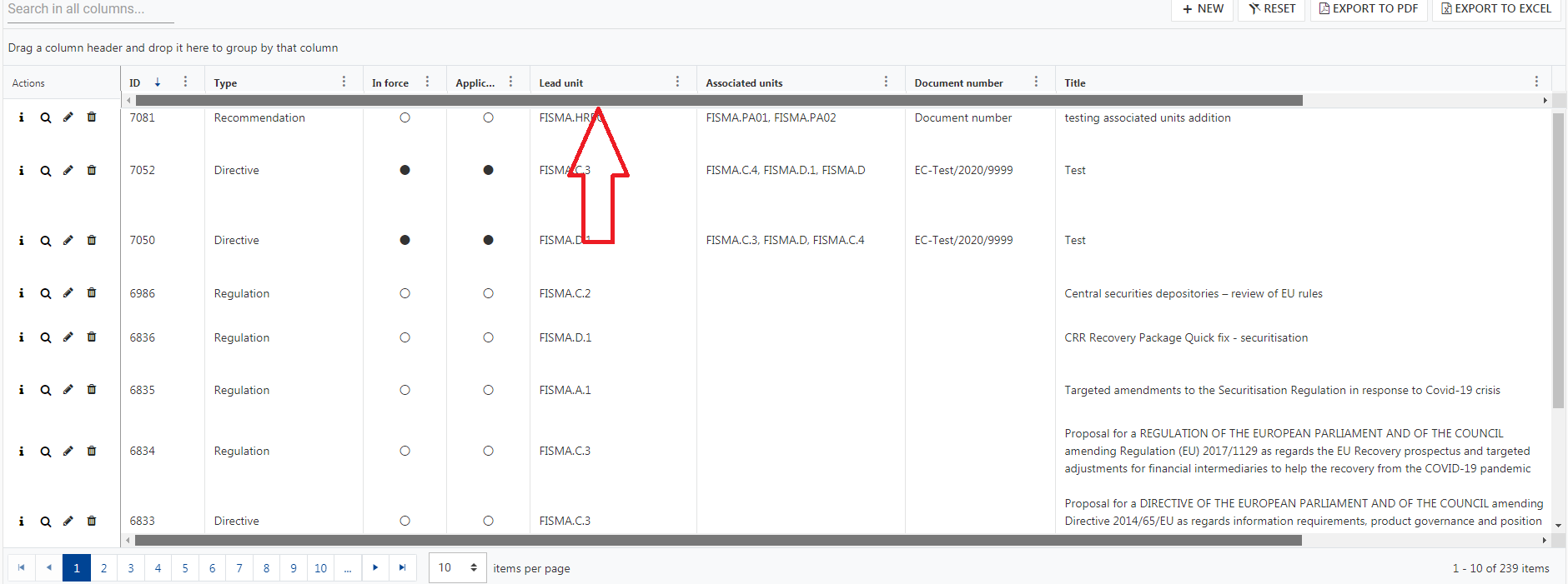
We can customize text inside drag a column here.... using <kendo-grid-message>
but in that line I am willing to add column chooser and one icon
i.e in tag <kendo-grid-group-panel> I want to add column chooser and one icon
please find below screen shot, in highlighted areas I want to add mentioned things
I want to replace highlighted areas in tag <kendo-grid-group-panel> as
Please help me for this issue
When a Grid cell is focused, and after this, the data is filtered so that the data contains fewer items than the index of the row the last focused cell was in, the Grid table area does not receive focus when tabbed into.
Please check the example:
https://stackblitz.com/edit/angular-xqswy5-zqeqkb?file=app/app.component.ts
When resizing grid columns so the last column does not reach the right border of the grid (sum of columns width < current grid width), loading stored state (or changing column width property in any way) does not restore the columns width proportionaly to use the full width of the grid.
Note: in this case, the default columns width sum and stored state columns width sum are always inferior to the grid width in order to use proportionality and adapt to every screen size.
In our implementation, we made a "Reset columns view" (working exactly as the loading store data), but if the user play arround with the columns as described above), the reset is broken.
Reproduce steps:
Using the persisting state exemple available in the doc: https://stackblitz.com/edit/angular-3jdmzy?file=app%2Fapp.component.ts
- Click "Save current state"
- Resize grid columns so the last column does not reach the right border of the grid

- Click "Load saved state", the columns are resized proportionaly of the saved state but on the base of previous columns width sum instead of the full grid width.

Essentially the most basic GridComponent when ngIf'd in and out will not be collected -- apparently because of orientation change / resize change listeners not being appropriately removed.
Steps to Reproduce
Click the TOGGLE TABLE button to hide the table
Click the TOGGLE TABLE button to show the table
repeat several times
Take a memory snapshot
There will be HTMLTableRowElement items that grow each iteration of toggling the table.
The HTMLTableRowElements retention shows that they eventually lead to a resize listener, or an orientation change listener.
I had already made an entry in the Foum about it.
https://www.telerik.com/forums/is-there-a-way-for-percentage-column-widths
Link to the demo with the css workaround:
https://stackblitz.com/edit/angular-y8y55s
The main intention is that I want to be able to specify the column width in percentage values rather than fixed pixel values.
There are some edge cases that must be considered:
- If columns are rearranged, the column width is taken to the new position.
- If the table is grouped, the columns in the group remain aligned below the column headers.
- If a column is manually resized, the behavior changes, the table is allowed to grow beyond 100% and gets a scrollbar.
Proposal
CellCloseEvent<T> should provide dataItem: T
Why
Currently the CellCloseEvent dataItem is typed as any. This could be the default, but adding a generic type here would allow strong typing in the event handler.
I have a Grid with a command column for edit/remove buttons.
I also have a custom button that has to be hidden while the row is being edited, but there is no variable that exposes that state.
Please provide isEdited field in the kendoGridCellTemplate context.
Please add support for bulk selection (as well as bulk deselection) using Shift+Click when in checkboxOnly mode.
Alternatively, it would be useful to have access to a setting to allow Shift+Click bulk selection/deselection when in checkboxOnly mode.
Hi Team,
We need to add caption on grid table as explained here: https://accessibility.psu.edu/tableshtml/#caption
JAWS should read this caption on pressing T while selecting the table.
Can you guide us how can we add this caption!
Thanks,
Saini
Currently when I click the horizontal scrollbar button which is present at the left side or right side of the scroll bar then the columns are scrolled as a regular table.
It will be nice to move from one column to another column instead.
Hello,
The list view component provides a loader template. This is easier to work with than the mechanisms provided for the grid component. For the sake of consistency of approach, I would like to request that a grid loader template directive be provided for the grid component, similar to the one available for the list view that is seen here: https://www.telerik.com/kendo-angular-ui/components/listview/api/LoaderTemplateDirective/
Thank you,
David
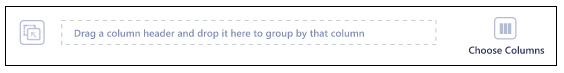
A built-in option for enabling a second scrollbar on the top of the Grid like the following screenshot would be nice feature to have:

Please provide a built - in rows reordering functionality that isn't based on the public HTML drag and drop api. Also please allow to customize the content of the drag hint. Something similar to the drag and drop feature of the TreeView.
thank you