Hi,
At present, the DropDown components do not activate their popups when focused and the spacebar is pressed. Instead, the popup opening is achieved by pressing "alt + arrowDown." However, to align with the behavior of HTML5 select elements, it would be expected that the Kendo DropDown components open their popups when the spacebar is pressed as well.
I'm using the Kendo Angular DropDownList component and I'm facing a couple of accessibility issues.
I got two issues, the same as those I get in my own application using the DropDownList component.
I've attached the output for both issues below.
First issue and an explanation of the issue and its solutions can be seen in the first attachment.
Second issue and an explanation of the issue and its solutions can be seen in the sercond attachment.
The current design of the DropDownList is not in line with Bootstrap. The dark background is very "aggressive" and distracts the user in a large form.

The styling should match the bootstrap design (of course in the Bootstrap Theme) or there should be an option to switch between your current and the "official" bootstrap design.
There's currently no way to change the style of a dropdown button to match the other "looks" of a regular buttons like "bare", "outline", and "flat". It is important for a row of buttons to have the same look and feel. Please add "look" property to dropdown buttons.
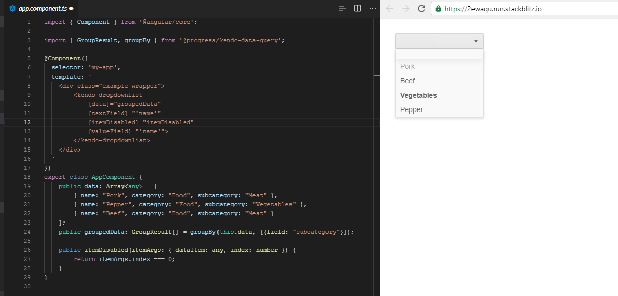
1.) Use grouping functionality for the drop list's data.
2.) Have at least one item disabled. (Easiest to replicate if the first item is disabled)
3.) Click on dropdown to open the popup.
4.) If first item is disabled notice the group it belongs to is not displayed in the popup. If the first item isn't disabled scroll until disabled item is at the top of the list and the group information will be cleared.
Easily replicated if you modify the stackblitz from this page https://www.telerik.com/kendo-angular-ui/components/dropdowns/dropdownlist/grouping/ to disable the first item in the list
"Meat" should be displayed in that empty row at the top. Lines 12 and 26-28 are the only modifications made to the code found at the url above.
Can we have the MultiColumnComboBox (already available in Kendo UI JQuery) in Angular 2+ please..
It takes lot of time for rending thousands of records from client side, some times browse gets crashed, causes performance issue. Virtualization support will help us to overcome this issue, as the same provided in Angular 1.x and Kendo MVC controls. Can you please provide virtualization support for Autocomplete & Multi Select controls.
Please add the colour picker component as per current jQuery widget.
The dropdowns should provide an easy way to have certain items in the list as inactive. The easiest way could be an attribute. In addition to [textField] and [valueField] an [inactiveField] could be added.

If the assigned data field is a boolean the item in the list can be either enabled or disabled.

Reason for this request is, that those value lists often are dynamic, meaning that an item in the list could be superseded by a new one. But the existing records in the database still could reference the older item, but new records should be prevented from selecting the new item.
It would be nice to be able to organize the content of dropdown list in categories, link car models organized by brand or cities organized by state or country.
The floating label for drop down in angular as in material.io.
The normal DropDown with its feautures would allow do multiselect its items or if the standard Multiselect would allow to avoid the linebreaks. A possible solution would be to add only one label with the text of the selected Items and an ellipsis when there get selected too many items to show all text, then you show the text hole text in the tooltip.

https://github.com/telerik/kendo-angular2/issues/160
I don't see the promised datepicker control in the January 18 release. Am I missing something?

