find below appcomponent.html code: <kendo-dropdownlist [defaultItem]="defaultYear"
 [data]="budgetYears"
[valueField]="budgetYears.value">
</kendo-dropdownlist>

and in appcomponent.ts file:
public budgetYears: Array<{ value: number }> = [
        { value: 2019 },
        { value: 2020 },
        { value: 2021 },
        { value: 2022 },
        { value: 2023 },
        { value: 2024 },
    ];

as mentioned above I have provided the mentioned codes but I am not getting the binded values. Instead of that I am getting [object Object]. Why it is so and where I am doing mistake. Please provide me a solution for this. Thanks
I don't see the promised datepicker control in the January 18 release. Am I missing something?
I was using angular-ui-select based on select2 in the past. Select2 has a nice feature that allow you to highlight search term in the combo items. could you add this?
The floating label for drop down in angular as in material.io.
The current design of the DropDownList is not in line with Bootstrap. The dark background is very "aggressive" and distracts the user in a large form.

The styling should match the bootstrap design (of course in the Bootstrap Theme) or there should be an option to switch between your current and the "official" bootstrap design.
Is there any way to set error focus on the selected items in multi select component.
And after that, user can take immediate action to update the value, say auto Open the drop down dialog and go to the selected item.
Placeholder for dropdownlist could be a great thing, because defaultItem not have the same use. I just want to show text when nothing is select, but I do not want that the dropdownlist have nothing selected (or the defaultItem) when we have already selected an item. The defaultItem can be selected again and it is not the same use of placeholder.
Thanks for reading.
Hello,
we want to show filtered data in the options list of the dropdown component and request a feature, to provide a filter callback function or the possiblity to pass different data sources to the component.
The use case is, that the dropdown should show existing values but when opening the dropdown list, the user should only be able to select a subset of the data source. Yes there is the possibility to disable items, but we want to complete hide them as a choice.
Currently we apply the workaround to filter the data on the open event and reset the data on the close event but we think, that this can be a common feature for the dropdown list.
Thank you!
I'm using the Kendo Angular DropDownList component and I'm facing a couple of accessibility issues.
I got two issues, the same as those I get in my own application using the DropDownList component.
I've attached the output for both issues below.
First issue and an explanation of the issue and its solutions can be seen in the first attachment.
Second issue and an explanation of the issue and its solutions can be seen in the sercond attachment.
Greetings
Related to this issue, when you use multiple groups, then the header of the first subgroup doesn't get rendered. This cascades down all sublevels.
Example: https://codesandbox.io/s/strange-benji-3m9d19?file=/src/app/app.component.ts
As I was typing this up I also noticed that we don't have access to the field we're grouping on in the kendoDropDownListGroupTemplate (not exclusive to the DropDownList, all dropdown types have this problem).
It'd be great and a very minor change to enable this.
It's currently like this (line 103 inside common/list.component.ts in the source code):
[templateContext]="{
    templateRef: groupTemplate.templateRef,
    $implicit: dataItem.value
}"[templateContext]="{
templateRef: groupTemplate.templateRef,
$implicit: dataItem.value,
field: dataItem.field
}"Regards
Greetings,
My team and I are wondering about the possibility for the DropDownLists to be configurable to allow screenreader users to focus disabled items in the dropdown list.
Currently in the DropDownList, it is not possible (or we can't discover) to reach disabled items in a DropDownList (not talking about the input itself being disabled, but rather items inside)
https://www.telerik.com/kendo-angular-ui/components/dropdowns/dropdownlist/disabled-items/
Regardless of if this functionality does or does not violate any accessibility standards, we believe it would be a useful feature for screen reader users. We are also aware that the default HTML select does skip disabled options:
There is precedent for this behavior in drop down lists from other vendors:
https://ng-bootstrap.github.io/#/components/dropdown/examples#disabled
https://github.com/JedWatson/react-select/issues/3354
Other relevant discussions:
https://github.com/nvaccess/nvda/issues/14190
Perhaps adding a simple [disabledItemsFocusable]="false" boolean (false by default for backwards compatibility) to the inputs could be a solution here.
Hi,
At present, the DropDowns have the capability to accommodate just a single level of grouping. Enhancing this feature to support multiple levels of grouping would be highly beneficial.
When a DropDownList is configured with both sticky headers and grouping, the first group header is rendered twice when opening the component - once as the sticky header and once as part of the list.
Currently, there is no built-in way to suppress this duplicate. Achieving the desired appearance requires custom CSS styles, and in cases where virtual scrolling is enabled, custom DOM manipulation of internal elements is needed, which causes side effects and edge cases.
Enhancing the DropDownList with a built-in option for achieving this would allow developers to control this behavior without relying on unsupported workarounds.
In the example below "X-Small" is initially the selected item in the dropdown. Once you click the "Sort" button and sort the array, "2X-Large" becomes the highlighted item in the dropdown but "X-Small" is displayed. I would expect that "X-Small" would be highlighted. After opening and closing the dropdown "2x-Large" becomes the selected item even if you don't select it. The same behavior does not happen with a simple select dropdown.
import { Component, OnInit } from '@angular/core';

@Component({
  selector: 'my-app',
  template: `
  <form>
    <div>
      <p>T-shirt size:</p>
      <kendo-dropdownlist [data]="listItems" [(ngModel)]="selectedShirt" name="shirtsize">
      </kendo-dropdownlist>
    </div>
    <br/>
    <div>
    <select [(ngModel)]="selectedShirt" name="shirtsize2">
      <option *ngFor="let d of listItems">{{d}}</option>
    </select>
    </div>
    <br/>
    <button (click)="sortArray()">Sort</button>
  </form>
  `
})
export class AppComponent implements OnInit {
    public listItems: Array<string> = ["X-Small", "Small", "Medium", "Large", "X-Large", "2X-Large"];
    public selectedShirt: string;
    ngOnInit(){
      this.selectedShirt = this.listItems[0];
    }

    sortArray(){
      this.listItems.sort((a, b) => a.localeCompare(b));
    }
}
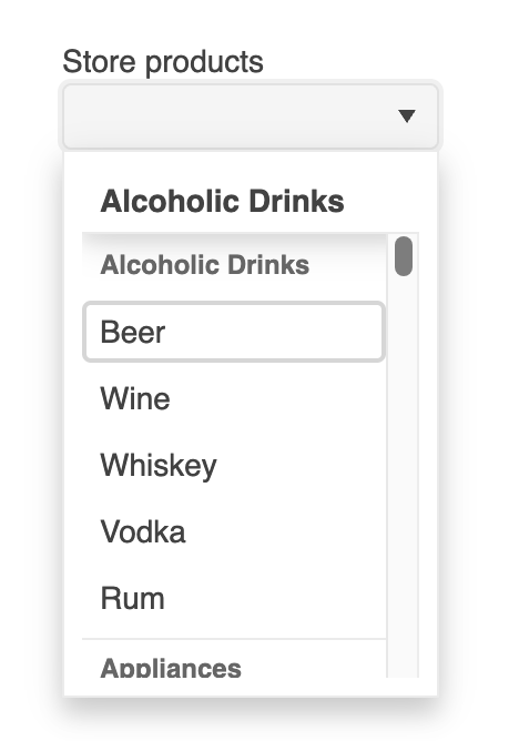
1.) Use grouping functionality for the drop list's data.
2.) Have at least one item disabled. (Easiest to replicate if the first item is disabled)
3.) Click on dropdown to open the popup.
4.) If first item is disabled notice the group it belongs to is not displayed in the popup. If the first item isn't disabled scroll until disabled item is at the top of the list and the group information will be cleared.
Easily replicated if you modify the stackblitz from this page https://www.telerik.com/kendo-angular-ui/components/dropdowns/dropdownlist/grouping/ to disable the first item in the list
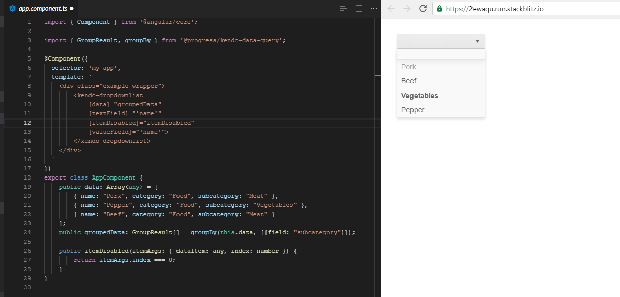
"Meat" should be displayed in that empty row at the top. Lines 12 and 26-28 are the only modifications made to the code found at the url above.
Currently, there’s no way to add a placeholder for the filter input in a DropDownList when filtering is enabled. It would be a great enhancement to create a component that provides a placeholder for the filter input.