Currently, when setting the value property of the TimePickerComponent programmatically (without using two-way binding in the template), the control does not update its displayed value until it gains focus. This behavior is inconsistent, especially when compared to other controls that properly reflect programmatic value changes.
Example - https://stackblitz.com/edit/angular-nhg2x1b9-d7f5bhh9?file=src%2Fapp%2Fapp.component.ts
Currently, when the min and max options of the TimePicker are defined, the user is still able to enter a value that is outside the specified range, which triggers an error and the control enters an invalid state.
Provide an option that would entirely restrict the user from entering values outside the specified range and would automatically correct the value to the corresponding min or max value.
One way to achieve such functionality is to handle the blur event of the TimePicker and correct the value if necessary:
Currently angular will fail builds due to type check if kendo-timepicker value is null/undefined.
It requires it to always be a date - making it impossible to have initially empty values or to even reset the selection/value and show a placeholder.
Even the documentation for placeholder says:
Specifies the hint the TimePicker displays when its value is `null`.
private _value: Date = null;
@Input() public set value(value: Date)
But the input does not allow this. Even the property is defined in a way that would fail type checks in any newer angular project (strict mode is the default).
The only workaround currently is to disable type check with $any()
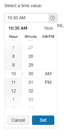
Provide a classic type view as the jQuery TimePicker:
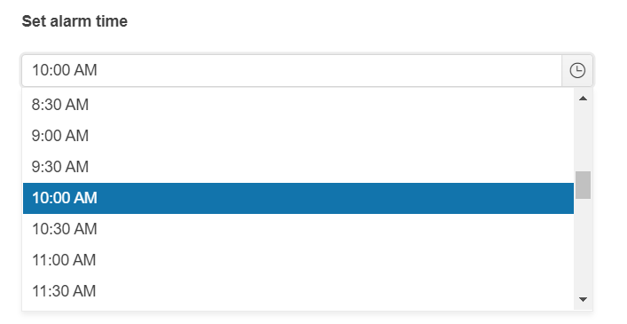
Currently, the Angular TimePicker supports only a single view (modern as per jQuery documentation):
Since we are using ionic, all scrollable kendo items (such as dropdownlist and timepicker) are being closed by ionic in an interraction issue.
We patched the dropdownlist by using the popupSettings appendTo to put the content of the dropdownlist outside of the zone of influence of ionic to manually stop the propagation of the scrolling event back to ionic.
In short, we would like to get the appendTo settings for the timepicker component. (And any other scrolling component!)
Thanks.
Please provide an option that would allow to disable multiple time ranges for the TimePicker component, so that a time isn't possible to be selected from these disabled time ranges.
thanks
Hello dear Telerik-Team,
I have a problem with the timepicker: We have same nightshifts and there are time-intervals that go over midnight. The available dates in the timepicker should lay between the min and max borders.
https://stackblitz.com/edit/angular-ktai17?file=app/app.component.ts
Provide support for overnight time range.
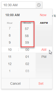
In the TimePicker (and other Date Input controls) you can in the input field use the arrow keys or mousewheel to go endless through the options. E.g. for minutes you can go directly from 00 to 59 using the down arrow. Especially with large ranges like minutes this is handy.
But in the popup you can't do that. It would be nice that the user can scroll directly from 00 to 59, 58 and so on. See composed image below.
(This should not be done when there are less options than the size of the popup, else you whould get duplicate options visible. That would be confusing for the user.)
Would be a usefull feature, especially when using this control on touch devices.
hi,
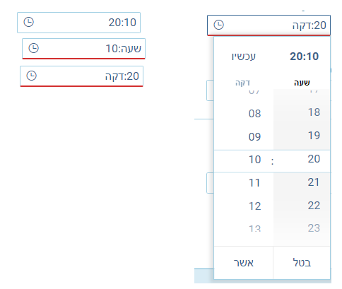
We would really appreciate RTL support for our Hebrew customers for KendoDateinputs.
The current behavior is VERY confusing for users and causes them to input the wrong data for both date and time components, causing them to lose critical information.
Thank you!
Thanks,
Shahar
Hi,
Many of my users complain that when clicking the the time component in the "empty" space, the focus is automatically set to the minutes area.
See image for example (clicking where the arrow is pointing).
This is very confusing for them and causes them to make a lot of mistakes.
Is it possible to disable this behavior?
Thanks,
Shahar


