It might be a formatting issue on my end
The adaptive popup on mobile (adaptiveMode = auto) popups when the control is touched, not only when the button in the control is touched.
I want the user to be able to focus the control and use the numeric keyboard (via inputAttributes inputMode) to enter the date or time.
Perhaps an extra adaptiveMode option?
Or any other option to prevent opening on focus (perhaps something on the AdaptiveService)?
So I want the flow like on desktop, but with the large adaptive popup.
Hi, Team!
I would like to request both prefix and suffix templates that would allow users to display various elements as adornments in the Date Inputs components.
We face some issue with the with keyboard inputs. The current behavior is that the kendo tries to help us the dates right. For example if you have entered the 28th of February and you start to type another new date which should be the 31.12.2019 for example, after typing the first "3" the is immediately jumping to the month after hitting the first number because there is no date in February which has two digits on a day and starts with a "3". So it tries to get the dates right but the user maybe wants to replace the whole date and just want to continue writing the date.
We need a functionality that the not validate the date the way he does it right now, overtake the validation, like turn it off or anything like that?
Hi Team,
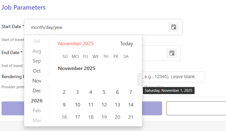
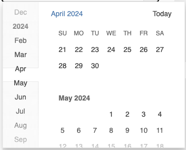
Currently, the month of January is not displayed in the navigation section of the DatePicker component and is instead represented by the respective year:
I would like to request functionality that allows me to display January separately and not beneath the year.
Hi team.
We would like to provide a possibility to use our specific masks for Date Picker component, like this:
- d.m.y = Current date
- 1.m.y = 1st day of current month
- 31.m.y = Last day of current month
- etc.
Can you recommend a good solution for this?
Hello,
In case when datepicker used inside treelist with kendoTreeListEditTemplate, it is logging the PreventableEvent of datepicker inside the ExpandEvent of treelist.
Thanks
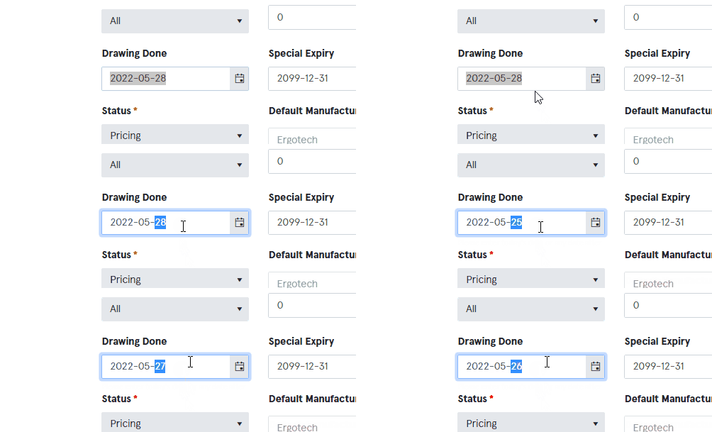
If the cursor is over the input after changing a date scrolling with the mouse wheel makes the value change.
We need a property just like this one:
https://www.telerik.com/kendo-angular-ui-develop/components/inputs/api/NumericTextBoxComponent/?&_ga=2.113010244.1182956334.1653485754-1241247116.1645472843#toc-changevalueonscroll
Hi,
It will be a good addition to the component if there is a way to set the animation duration of the opening and closing of the popup as currently there isn't such a control for the component. Similar to the standalone Popup component:
https://www.telerik.com/kendo-angular-ui/components/popup/api/PopupAnimation/
Thank you for your consideration.
If a DatePicker input is set to not required and a user enters an incomplete date like 05/day/2018, the component does not recognize the value and the input is null. This behaviour is ok, the problem is, that no validation is triggered.
In such a case, a validation error should be thrown such as "incomplete date" or "invalid", but nothing happens. To allow the form validation of an incomplete date, such a validation is needed.
Hi,
Currently when setting a date range with the min and max input properties and typing an out-of-range value won't fire an error. According to the documentation, this is the desired behavior and to prevent this, I should put the date component in a read-only state:
https://www.telerik.com/kendo-angular-ui/components/dateinputs/datepicker/date-ranges/
I'd really love it if by typing an out of range value, the DatePicler fires an error instead of preventing the user of typing values by making him go through the calendar.
Thank you
How can we allow custom inputs and custom parse these inputs?
You can reproduce the bug even in your documentation: Overview - DatePicker - Kendo UI for Angular (telerik.com)
- Select the Bootstrap Theme
- Try to select for example the 14th March 2000 the calendar goes to December 2000 (and doesn't select the date).
- If you click slightly outside of the number, the selection works.
The problem seems to be the infinite navigation that's overlaying with that dates' columns.
We would like to use the Angular DatePicker with Fast Navigation Bar style and would like to change the height and width of the monthly view to expand to the size of the device and show multiple months.
https://www.telerik.com/kendo-angular-ui/components/dateinputs/datepicker/sidebar/
After communicating with support we learned this was not currently possible so we are requesting it be added as a feature.
This is going into a mobile application and we would like to use all of the screen to display a calendar control. If it helps to understand conceptually, it would be similar to the Apple Calendar, on Apple Devices, with a few differences but having the months span the entire screen.
We are looking for a calendar control to work in a mobile app written with Angular and using Cordova to deploy as a native application. Since it's a mobile app, it will need to work on a variety of different devices and we want the user experience to be the same for all.
We are implementing something similar to the Apple Calendar. It will have a weekly view at the time, implemented with an in-house control, and clicking on the Month's Name in the top left will open the monthly view which is where we were hoping to use the Telerik control.
We would like the calendar view to fit to the viewport so you do not see any of the app behind the calendar. If in Portrait view, it should be responsive in width but not display any additional data. It's height should expand to see additional weeks, or months if there's enough room.
We don't know exactly what we'll do for Landscape view yet. One thought is that it should be responsive in height but not display more than one month vertically. It should expand in width displaying additional months if the entire month can fit in the viewport. The latter scenario is open to design changes. It could also be implemented similarly to Landscape view.
When i select a date in Kendo-datepicker it gives me a date which is with the local timezone.
Now if the same thing is opened in different timezone the date differs.
So i would need how do i show the same date irrespective of timezone.
If we format kendo-datepicker to (MMMM/dd/yyyy) and if we enter number of month in input then it is not reflecting and shows month in input field.
As you can see in screenshot, I called (valueChange) event to see the changed value, I have enter 10 in month input field so it shows two value in console, first one is when 1 is press and second is when 0 is pressed after 1 so it gives null and in input field it shows month instead of October.
It is working if we enter first letter of month but it should work if we enter month in number.
Please fix this issue asap.
Thanks.
Hi team,
It will be a nice addition to Kendo UI for Angular[DatePicker, DateTimePicker, DateRange] components to have the ability to replace the Calendar with a custom component like in the following counterparts in Kendo UI for React:
1. DatePicker- https://www.telerik.com/kendo-react-ui/components/dateinputs/datepicker/custom-rendering/#toc-customizing-the-calendar
2. DateTimePicker - https://www.telerik.com/kendo-react-ui/components/dateinputs/datetimepicker/custom-rendering/#toc-customizing-the-calendar
3. DateRange - https://www.telerik.com/kendo-react-ui/components/dateinputs/daterangepicker/custom-rendering/#toc-customizing-the-calendar
Thanks.


