Description
When you move the cursor to a new series item, the tooltip position does not move until you leave the chart area and re-enter. It changes the content based on where the cursor is pointing, but does not change the position.
Steps To Reproduce
- Create a new Angular application
- Add the Kendo UI Chart and paste the following code in the app.component.ts file:
import { Component } from '@angular/core';
import {KENDO_CHARTS} from "@progress/kendo-angular-charts";
@Component({
selector: 'app-root',
imports: [KENDO_CHARTS],
template: `
<kendo-chart>
<kendo-chart-legend position="bottom"></kendo-chart-legend>
<kendo-chart-series>
<kendo-chart-series-item
type="donut"
[data]="data"
field="value"
categoryField="category"
colorField="color"
[holeSize]="60"
[tooltip]="{
visible: true,
format: '{0:C0}'
}"
[highlight]="{ visible: true }"
>
</kendo-chart-series-item>
</kendo-chart-series>
</kendo-chart>
`,
})
export class App {
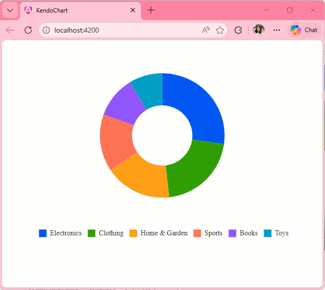
public data = [
{ category: "Electronics", value: 245000, color: "#0058e9" },
{ category: "Clothing", value: 189000, color: "#37b400" },
{ category: "Home & Garden", value: 156000, color: "#f59c1a" },
{ category: "Sports", value: 134000, color: "#ff6358" },
{ category: "Books", value: 98000, color: "#8c43ff" },
{ category: "Toys", value: 78000, color: "#00acc1" },
];
}
- Run the application
Screenshots or video

Actual Behavior
The Tooltip position only changes when you leave and reenter the Chart area. It does not change when you move the cursor from one series item to other, it updates the content displayed in the Tooltip though.
Expected Behavior
The Tooltip position should move with the cursor as seen in the screen recording below:
https://stackblitz.com/edit/angular-sdmdrbjt-5yunmeo2
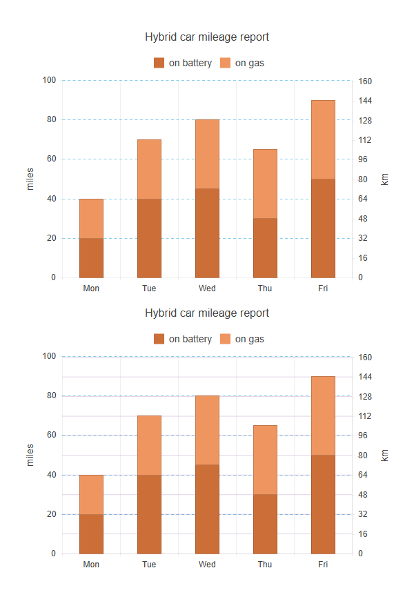
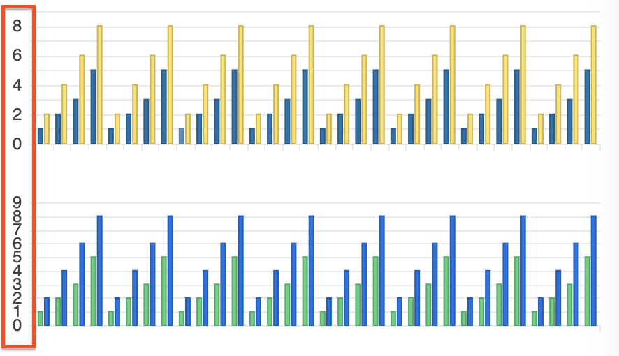
Currently, in Kendo UI for Angular Charts, when using multiple axes of the same orientation (e.g., two Y axes), only the major grid lines of the first axis are displayed. The grid lines of the second axis (Y2) are ignored, even if enabled in the configuration. This limits the readability of multi-axis charts, as it is not possible to visually distinguish the graduations of each axis.
Add an option (for example, showGridLinesOnAllAxes: true) that would allow displaying major grid lines on all axes, not just the primary one.
The Kendo team suggests using plot bands to simulate the grid lines of the second axis, but this solution is less convenient and requires manual configuration.
Below is a screenshot of what it might look like; the first graph shows what is currently possible, and the second shows what would be possible if this feature were added.
When setting the color using a function, a TypeScript error will occur because the property expects a value of type string.
Type '(e: SeriesLabelsContentArgs) => string' is not assignable to type 'string'.The color properties of the Chart components should support a callback to prevent such errors, as this is a valid feature to implement. The current workaround is to skip type checking.
          <kendo-chart-series-item-labels
            [color]="$any(labelColor)"
          >
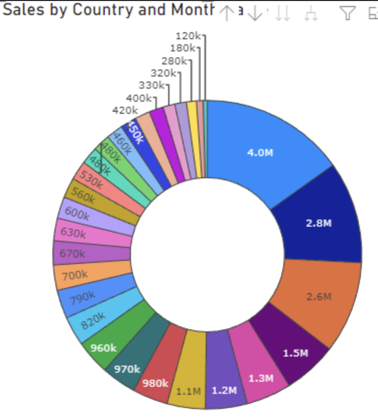
Provide support for dynamic label positions for the Donut chart.
Some labels to be displayed inside the Donut, and other (which couldn't fit) to be outside, similar to:
Implementing a Lollipop Chart type would improve data representation. This chart type enhances readability by combining a dot and a line to emphasize data points, making comparisons clearer.
https://datavizproject.com/data-type/lollipop-chart/
The introduction of an Alluvial Diagram chart type would be beneficial. This type of chart helps visualize changes in categorical data over different stages, supporting insights into process flows and transitions.
https://datavizproject.com/data-type/waterfall-plot/
The introduction of an Alluvial Diagram chart type would be beneficial. This type of chart helps visualize changes in categorical data over different stages, supporting insights into process flows and transitions.
https://datavizproject.com/data-type/alluvial-diagram/
Adding a Parallel Sets chart type would enhance data visualization capabilities. This type of chart effectively displays categorical data flows and relationships, making it useful for comparative analysis.
https://datavizcatalogue.com/methods/parallel_sets.html
I would like to modify the crosshair tooltip to display the interpolated y value for the given x position of the crosshair (see data below the chart)
Hi Team
I was using Kendo UI for Angular to render a Sankey chart.
I checked with the technical support and currently there is no way to adjust the width of link lines in Sankey Chart API for Angular.
In many cases because of data , the link lines appear too big for the whole canvas and does not look good, leading me to use another chart types or alternate libraries.
Request you to please look into this and provide a way as soon as possible.
Thanks
Mohit
It will be a good addition to the Title element if the underlined text option is added.
Currently, it can be added to the font property, but it will break the background property:
https://stackblitz.com/edit/angular-j1wzef?file=src%2Fapp%2Fapp.component.ts
Currently, the label renders to the right:
However, it would be good to have an option to manage the alignment to the left, similar to the RTL mode:
Hi,
I have prepared a forked stackblitz example for a navigator selection with a shared tooltip:
https://stackblitz.com/edit/angular-h1j1hq-kmmqfg?file=src%2Fapp%2Fapp.component.ts
(I also included a screenshot)
There seems to be now way to have a shared tooltip in this scenario that makes sense, clearly no one needs the duplicated items in the tooltip that origins from the navigator selection pane.
So I would propose a flag for a pane to configure if a pane is included in the shared tooltip.
Or alternatively on the series item level a flag that allows for enable / disable or visible / invisible regarding the shared tool tip.
I think there are other cases where this might come handy to have a shared tooltip for several serieses only over one pane, or exclude specific panes and or serieses.
I tried to make the tooltip invisible, on the series level of the navigator pane but something like:
[tooltip]="{ visible: false }"
inside the navigator series seems to be only applicable to the current series tooltips but not the shared ones.
In a line chart where markers are set to be not visible.
There is no way to increase the hit box of a marker (or line) to be hit if I want to trigger the tooltip of the marker.
The mouse hover obviously works better from it's inherent logic (a click not beeing involved), but triggering the tool tip with a touch gesture seems quite fumbly. One has to hit the line very exactly. Up to a point where one has to try several times to make it happen, which makes it very impractical for new users who might not even know that there are tooltips to be displayed.
For further infos here is my forum thread with more details:
As described there, increasing the marker size does only work when markers are visible.
Making the line thicker might help a little but comes with unwanted optical changes which are impractical for most usecases.
Best Regards,
Leo Härdle
This feature request is already logged in the Kendo UI for jQuery portal and upon implementation would be nice to bring the feature also to Kendo UI for Angular Charts.
https://feedback.telerik.com/kendo-jquery-ui/1358671-support-quarters-in-date-series-just-like-weeks
We have noticed that the labels on the y-axis are rendered too close together, almost touching each other. This can be configured by setting the step option.
However, it could be ideal in such cases for the step to be determined automatically by the Chart based on the available space (similar to the rotation option which rotates the label, but in this case to control the step).
Please provide an option to automatically render the labels based on the available space.
We've already implemented several Kendo Chart performance optimization techniques, including:
- Canvas Rendering.
- Inline Series Binding.
- Disabling Animated Transitions.
- Disabling Gradients.
- Hiding Minor Grid Lines.
- Date Grouping using Category Axis in Date Mode.
However we are still experiencing issues when using large amounts of data.