

Hi Team,
Currently, the Kendo UI for Angular library relies on SVG icons as default icons. This means that developers would have to use a service to change the default icons inside components. This approach, however, does change all icons inside the project and is not suitable for cases where only a particular icon in a single component should be changed.
Therefore, I would like to request a designated property or a specific approach that would allow developers to change particular icons inside particular components.

Hi,
This works with Angular 20, must be a change related to that.
If I assign data to the TreeView synchronously, it works, but e.g. in a setTimeout, it doesn't any more. (I assign the full array, change detection is set to eager.)
Reproduction can be found here: https://codesandbox.io/p/devbox/mutable-glade-39twhs?workspaceId=ws_P4gPDf6RC2r5W8xExWQehV
Best regards,
Michael
For the Kendo DatePicker, if you try to set the size on a kendo-datepicker with plain text, it will not render and give a console error of "ERROR TypeError: Cannot read properties of undefined (reading 'nativeElement')".
Errors:
// HTML
<kendo-datepicker size="small" ... />
---
But on the other hand, it does work if you create a field of type "DateInputSize" and pass that variable to the size.
Works:// TS
protected size: DateInputSize = 'small';
// HTML
<kendo-datepicker [size]="size" ... />
Hi,
When the first day of the week is changed dynamically through a custom IntlService, the Calendar weekday headers are updated, but the date cells are not repositioned. (The first day is changed as described in your guide: https://www.telerik.com/kendo-angular-ui/components/knowledge-base/calendar-first-day )
Reproduction (forked from your example): https://stackblitz.com/edit/angular-tqvypgwg
Click on "Set first day to Monday ": the weekday headers are updated to start with Monday, but the date cells remain in their previous positions.
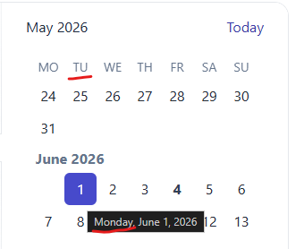
Best regards,
Michael
When the user wants to select a date, the filter closes up and the user is not able to select any date from the calendar.
The issue is happening on tablet device in portrait mode and we found out that it's happening on your documentation too. To reproduce the issue, please go to the "Angular Grid Filter Menu" in your documentation:
https://www.telerik.com/kendo-angular-ui/components/grid/filtering/filter-menu/
Please open the dev tools and set the browser on any tablet portrait size or use Galaxy Tab S4.
In your first example (Angular Grid Filter Menu), please click on the "Date" filter in the grid. When the popup opens up, please click on the calendar icon
of the date input field.
When the calendar shows up, try to select any date. You'll see that the filter closes up and the user is not able to select any date. Demo video attached for reference.
Please fix this bug as we support Samsung Galaxy tablet devices and we're using this feature in our project.
The DrawerAnimation interface isn't exposed in the index file.
DrawerItem, DrawerMode, and DrawerPosition are all exported but DrawerAnimation is missing.
Hi ,
I want the kendoGridFocussable to apply the FocusableDirective on an anchor tag. This should allow the user to reach the anchor element using only the arrow keys without pressing Enter. (Example : Please, check out the following StackBlitz demo: https://stackblitz.com/edit/angular-rqqzam)
Regards,
Uzma
The directive `kendoGridColumnChooserTool` does not work correctly when having columns which are grouped. See this example: https://stackblitz.com/edit/angular-r9duqpcn?file=src%2Fapp%2Fapp.component.ts
- It shows that 0 items are selected ("0 Selected items") - This is incorrect because all columns are selected by default. In the example above, I would expect it shows that 4 items are selected.
- When unselecting an item in the list (popup), it does not actually hide any column.
- When using directive `kendoGridToolbarTemplate` with `kendo-grid-column-chooser` component, it works as expected. I would expect that `kendoGridColumnChooserTool` directive would work (behave) exactly the same way.
import { Component } from '@angular/core';
import { FormsModule } from '@angular/forms';
import {
  KENDO_GRID,
  KENDO_GRID_EXCEL_EXPORT,
  KENDO_GRID_PDF_EXPORT,
} from '@progress/kendo-angular-grid';
import { KENDO_TOOLBAR } from '@progress/kendo-angular-toolbar';
import { KENDO_LABELS } from '@progress/kendo-angular-label';
import { KENDO_INPUTS } from '@progress/kendo-angular-inputs';
import { KENDO_BUTTONS } from '@progress/kendo-angular-buttons';
import { Product } from './model';
import { products } from './products';

@Component({
  selector: 'my-app',
  standalone: true,
  imports: [
    FormsModule,
    KENDO_GRID_EXCEL_EXPORT,
    KENDO_GRID_PDF_EXPORT,
    KENDO_GRID,
    KENDO_BUTTONS,
    KENDO_TOOLBAR,
    KENDO_LABELS,
    KENDO_INPUTS,
  ],
  template: `
    <kendo-grid
      [kendoGridBinding]="products"
      [pageSize]="5"
      [pageable]="true"
      [sortable]="{ mode: 'multiple' }"
      [style.width.%]="gridWidth"
    >
      <ng-template kendoGridToolbarTemplate position="bottom">
        <kendo-grid-column-chooser></kendo-grid-column-chooser>
      </ng-template>

      <kendo-toolbar overflow="scroll">
        <kendo-toolbar-button kendoGridColumnChooserTool></kendo-toolbar-button>
      </kendo-toolbar>

      <kendo-grid-column-group title="TestA">
      <kendo-grid-column
        field="ProductName"
        title="Product Name"
      ></kendo-grid-column>
      </kendo-grid-column-group>

      <kendo-grid-column-group title="TestB">
      <kendo-grid-column
        field="UnitPrice"
        filter="numeric"
        title="Price"
      ></kendo-grid-column>
      <kendo-grid-column
        field="Discontinued"
        filter="boolean"
        title="Discontinued"
      ></kendo-grid-column>
      <kendo-grid-column
        field="UnitsInStock"
        filter="numeric"
        title="Units In Stock"
      ></kendo-grid-column>
      </kendo-grid-column-group>
    </kendo-grid>
  `,
  styles: [
    `
      .example-info {
        background: rgba(83, 146, 228, 0.1);
        border-radius: 2px;
        margin: 10px auto 10px auto;
        padding: 15px;
        border-left: 4px solid #5392e4;
        font-size: 14px;
      }
    `,
  ],
})
export class AppComponent {
  public gridWidth: number = 100;
  public products: Product[] = products;
}

Add functionality to the Java Spring Boot sample application to support server-side data operations, such as sorting, filtering, and pagination. Currently, the demo uses the process method to do the operations on the client.
https://github.com/telerik/kendo-angular/tree/master/examples-standalone/kendoangular-java-integration
Based on the feature set of the current jQuery widget - http://demos.telerik.com/kendo-ui/diagram/index
Hi team,
I am working on a simple UI where kendo combo-box is a "column" of a kendo tree-list. The problem is, the opening and closing of kendo combo-box also expands and collapses the kendo tree-list's row.
I think the event of kendo-combo-box is bubbled to treelist. Is this a bug or am I missing something?
Here's my Stackblitz example for reproducing the issue (Link: https://stackblitz.com/edit/angular-18guak?file=src/app/app.component.ts)
I upgraded today from 4.3.7 to v11 and the dates are 1 day off in the scheduler month view, meaning the date variable from let-date (I think).
<kendo-scheduler
    <ng-template kendoSchedulerMonthDaySlotTemplate let-date="date">
                ...
               <div>{{ date | kendoDate : 'dd' }}</div>
<kendo-scheduler
<ng-template kendoSchedulerMonthDaySlotTemplate let-date="date">
... <div>{{ date | kendoDate : 'dd' }}</div>
The date is just flat out wrong. What's weird is the mouseover shows the correct date.
Again, if I use the old version everything works as expected but the v11 update I'm off by one.
When virtual is true for a multiselect and checkboxes are set to true, there is a bug which results in multiple items being selected.
To reproduce, one needs to scroll down a long list of items. The amount to scroll seems random but might have something to do with the itemHeight setting. When clicking directly inside the checkbox, two items are selected at once - the item selected, and one other seemingly random item. This does not happen if the click selection event happens inside the item, but not the checkbox.
I have reproduced this inside this code sandbox: https://codesandbox.io/p/sandbox/mystifying-shirley-2qxn32
Hi,
It will be a good addition to your standalone examples if a Java backend implementation is also added to the list:
https://github.com/telerik/kendo-angular/tree/master/examples-standalone
https://stackblitz.com/edit/angular-niog8n-eldomz?file=app%2Fapp.component.ts
Recurrency "End On" date in datepicker is different with RecurrencyRule's one.
Steps to reproduce:
open series from the example, set Recurrency's End selector to date option, set date to Sep 9th.
Actual result: recurrency rule contains UNTIL=20200910T000000Z.
Save and open series again: recurrency's End date is now Sep 10th.
Changing it to Sep 9th and saving brings no changes.
*** Feature Request created by Telerik by Progress staff ***
This feature request will allow developers to set inputmode to components like NumericTextBox, DatePicker, and etc. Making mobile users experience better as it will require the Virtual Numeric keyboard to be opened instead of the default that includes letters.
https://developer.mozilla.org/en-US/docs/Web/HTML/Global_attributes/inputmode
As at this current time the developers are required to select the element using querySelector and setAttribute as demonstrated in the following demo with DatePicker:
https://stackblitz.com/edit/angular-qlnyzv?file=app/app.component.ts
This functionality is requested in the following threads:
https://github.com/telerik/kendo-angular/issues/3076
Ticket reference - 1486073, 1493791, and 1541636.
https://stackblitz.com/edit/angular-mqywpa?file=src%2Fapp%2Fupload.component.ts
When using kendoTooltip directive on the upload component - tooltips are positioned in invalid position somewhere on the app.
cancel, delete, retry tooltips.