Due to recent changes to kendoButton directive behaving like a component, this directive is no longer compatible.
This was important for buttons used in grid editing to extend the themes and styles of the kendoButton.
Now this however leads to
ERROR Error: NG0300: Multiple components match node with tagname button: ButtonComponent and AddCommandDirective. Find more at https://angular.io/errors/NG0300
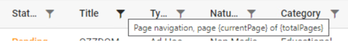
Issue description: While navigating through page number buttons Screen reader does not identify which page number is selected. Issue is observed with “Narrator” and “NVDA” as well
Test Environment:
Narrator (Windows 11), NVDA (Version: 2022.1)
Repro steps:
- Hit on the link Overview - Grid - Kendo UI for Angular (telerik.com)
- Tab navigate to table under “Angular Data Grid Overview”
- Run Screen reader
- Tab Navigate to page navigation buttons
- Observe that Screen reader does not identify which page number is selected
Actual results: While navigating through page number buttons Screen reader does not identify which page number is selected. Issue is observed with “Narrator” and “NVDA” as well
Expected results: While navigating through page number buttons screen reader should identify which page number is selected
Attachments: Attachments
This happens if the TimePicker is visible on the page and you change your system timezone (like from +2 to +12) and try to open the timepicker.
When the user enters each character into the combobox, the system should validate that the resulting value is valid. If not, the system should not display the character
Step to produce:
Give focus to combobox
Type res
System should select Residential
Type z
System should not accept z character (both values in list that start with res do not have a z as the next character)
Type t
System should select Restaurant
Type y
Tap Tab
Expected Result: Restaurant should be selected
<kendo-combobox class="kendo-combobox" [ngClass]="{'inactive-color' : custColor}"
         #comboboxComponent [openOnKendoFocus]="comboboxComponent"
          formControlName="CustType" [data]="custTypes" textField="Description" valueField="CustTypeID"
          [suggest]="true" [valuePrimitive]="true" [allowCustom]="false" (selectionChange)="onCusttypechange($event)">
          <ng-template kendoComboBoxItemTemplate let-dataItem>
            <span class="template_lbl" [ngClass]="{'inactive-color' : dataItem.QInactive}">
              {{ dataItem.Description }}</span>
          </ng-template>
        </kendo-combobox>
We are using placeholder like <span id="P_Name" name="P_Name">{P_Name}</span> . this would replace with the patient name on loading the editor.
we used the ContentEditable = false is not working for the span. Some important content such as patient information should be read-only.
attached the sample editor content , the below content are loading dynamically , so we should restrict user should not edit the conent.
Hi there,
we'd like to raise a change request in relation to column widths on grids:
https://www.telerik.com/kendo-angular-ui/components/grid/columns/width/
Currently, we can either set a fixed width on a column, or not set a width at all and leave it dynamic. Our problem is, that we have some columns that would benefit from additional space if it is available (e.g. on a larger screen), yet really suffer if they do not receive enough space.
When we give such a column a fixed size, we have to choose an amount that will still leave other columns enough space on smaller screens, and since it is fixed, is does not increase in size with larger screens.
If we don't set a fixed width, (or give all columns a fixed width), the available space will be distributed evenly/proportionally among the columns. So here, the columns do benefit from extra space, but the problem is that on smaller screens, they also can become too small to display the content.
We would like to be able to set a minimum width on columns. We imagine the behavior to be as follows:
If there are some columns with a fixed width and some with a min. width, and
- the available space is less than the sum of the fixed and min. widths -> a horizontal scrollbar is added
- the available space is more than the sum of the fixed and min. widths -> the additional space is distributed among the columns with a min. width (evenly or proportionately, either option is fine)
Hi there,
It would be extremely useful to have some sort of global configuration for component settings / inputs.
For example: I want to remove animation from all of my dropdown lists.
This should be easier. The default workflow is to configure each and every instance of DropDownList using the component's input properties.
Less than ideal workarounds
- Create an angular directive that auto configures a given Kendo component and apply that directive to each instance of your component.
- Wrap a given Kendo component in a custom component, and configure it there. This will break the Kendo component's form integration, and you must implement the wrapper component to account for this.
Thank you.
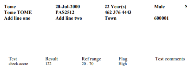
Please find the below screenshot for your reference and help us
Thanks,
Rajkumar S
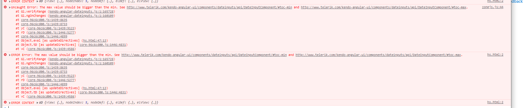
I have installed kendo-angular-layout package and after running the command npm start Im receiving the errors represented in the pictures.
Im not sure how to fix this?
Im not sure how to check my Kendo package version as well /
Hi,
Currently, it seems impossible to have a global search field that look up into a given number of columns.
The idea would be to: either have a bindable property (like "searchString"), either having just an option to activate a "global search"(and you would add the search component).
It would also be required to be able to provide a list of "fields" to search in.
Obviously, when the search string change, it should reset the paging.
It's something we have to implement again every time we use your Grid(and it's quite hard to make a wrapping component because there is a lot of things to customize. You can check how the global filter is implemented: PrimeNG (primefaces.org)
Hi
On click of a label, I want my kendo numeric textbox to have focus, but it is not working. Following is my code.
<label for="kid">Currency</label>

<kendo-numerictextbox
  [attr.id]="'kid'"
  [format]="formatOptions"
  [min]="min"
  [max]="max"
  [step]="step"
  [autoCorrect]="true"
  [spinners]="false"
  [formControl]="control"
  [changeValueOnScroll]="false"
>
</kendo-numerictextbox>
Issue is because, at the run time kendo generates a random ID, and appends that ID to the input box(.k-input) , instead of appending the id given by the user as above. This is causing the issue and focus is not set on input box when clicking in label. Could you please check it and suggest a solution.
"@progress/kendo-angular-inputs": "^9.0.0",
I know to associate any Kendo UI component with the Label, template reference variable is the way to go.
<label [for]="numerictextbox">NumericTextBox: </label>
<kendo-numerictextbox #numerictextbox>
</kendo-numerictextbox>
But what if my label and input box are coming from different components, then this template ref variable approach would not work. So i would suggest kendo to use traditional ID approach to set the focus on input element.
Kendo can use HostBinding property from Angular , to remove ID from kendo-numerictextbox level, and adding the user supplied ID directly to inner input element.
@HostBinding('attr.id') _id = null;

  @Input() id?: string;
Thank You
Select all checkbox provided in tree list module is not working as expected. Below are the detailed step to reproduce
To Reproduce
Scenario 1 :
- Checked on select all checkbox
- Unchecked any of the row, the select all checkbox still checked.
Scenario 2 with pagination:
- Checked on select all checkbox
- Move to next page
- Select all checkbox is checked, but the rows is not selected
Scenario 3:
- Checked on select all checkbox
- Expand the parent node, the child node is not checked
Expected behavior
Scenario 1:
The select all checkbox should be unchecked. Same as what provided in Grid module
Scenario 2:
The select all checkbox should be unchecked
Scenario 3:
The child node need to be checked
The kendo scheduler when opened in the mobile view the events tittle inside the month view texts are broken and hide in responsive design.
The user did not see the full event tittle texts in month view in responsive Design.
please refer below attachments here.
The Scheduler recurrence editor numeric inputs automatically change leading 0 inputs via keydown or pasting to 1's or empty values.
Extend the ability to disable the mandatory autocorrection for all recurrence editor inputs so any numeric value can be entered.
When I create a widget and design widget with image field.
Step 1: I use this widget in CMS=> click edit content => select data for the image field.
Step 2: Click advanced to see the id of image
Step 3: I select simple to view image agian => the image has clear item.
I don't know how it happen.
Please help me about this issue
There seems to be a styling bug in the Kendo theme for Bootstrap.
Default Bootstrap buttons has this strange shadow or border issue