minimized the last column to smallest and it's difficult to expand this column. Could you please help how to expand this column . Thanks.
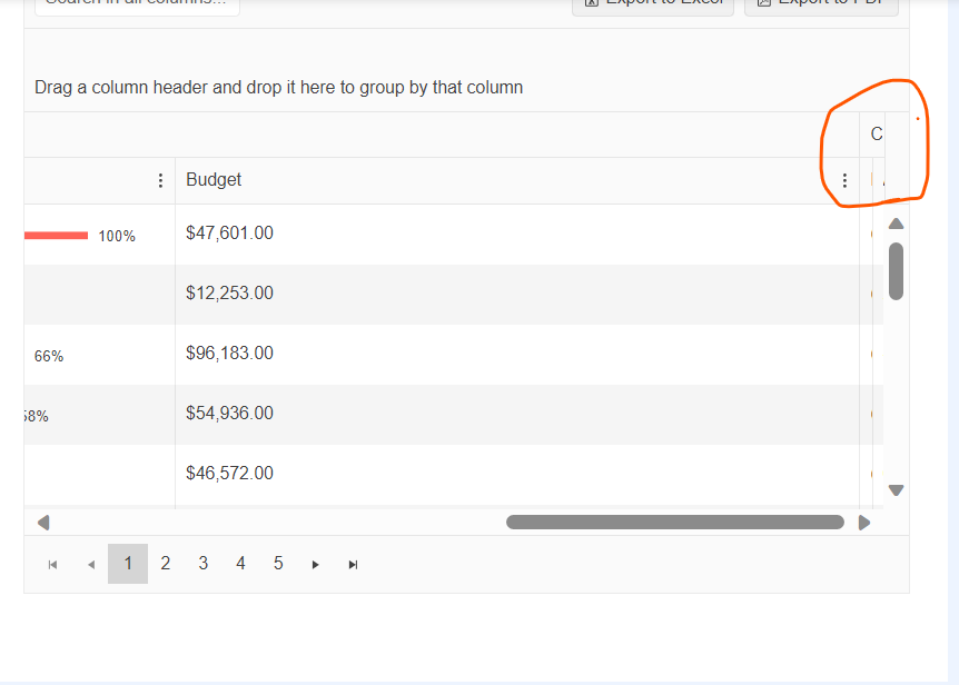
first double click on this column line .
scroll move to first column
Could you please help to solve this?
https://stackblitz.com/edit/angular-mqywpa?file=src%2Fapp%2Fupload.component.ts
When using kendoTooltip directive on the upload component - tooltips are positioned in invalid position somewhere on the app.
cancel, delete, retry tooltips.
https://stackblitz.com/edit/angular-5elhtu?file=src%2Fapp%2Fapp.component.ts
When a detail row is used, the moment you expand one row and scroll, it automatically loads the last items from the dataset.
Ex expand row 1 - start scrolling, and it suddenly loads 5xx th row+;
When grouping is also enabled - expanding the detail row under one group, expands it under all groups.
The stackbliz is from the kendo demo page for virtualscroll (with the added detail row).
If you have a kendo grid table with some data over multiple pages and you go e.g. to the last page and then reload the data, resulting with less pages - the table is empty and you have to manually click on the first page to see the data. Here is a working example:
https://codesandbox.io/s/upbeat-lamarr-d67m8k?file=/src/app/app.component.ts
Step 1. Go to the last page
Step 2. Click on the button "'Reset data" <- you see no data
Step 3. Click on the first page <- You see the data
Hi, Team!
I would like to have a designated component in the Kendo UI for Angular suite that would provide built-in syntax highlighting and code editing experience for popular programming languages.
Similar to the WPF SyntaxEditor: https://www.telerik.com/products/wpf/syntaxeditor.aspx
We are exporting an Excel from a treelist -> there are merged cells, and the table has lots of rows (~20k).
It's taking forever (it's unusable) and the reason is that there is an O(N^2) bug in the toXML function: each row adds a merged cell range, and the mergedCells array is scanned linearly for every new row.
I was able to fix this by adding a mergedCells hash (I would be happy to create a pull request).
Also, as a related issue, it would be nice to be able to change the compression level on the generated zip file, because the default again takes forever for large enough files.
Would like the API expanded to include support for adding your own tool(s) that would allow you to tag the selected text with custom html tags.
For example, would like to be able to highlight some text, hit the custom button and then "text goes here" is replaced with "<custom>text goes here</custom>". From some documentation research, it looks like you don't support custom tools that would be able to accomplish this, is that correct?
From this previous post, it states that such a thing is not supported?
https://www.telerik.com/forums/add-custom-tool
Test Environment:
Windows 11 Enterprise 22H2 22621.1848.
Narrator
Microsoft Edge Version 114.0.1823.79
Repro steps:
- Open link https://www.telerik.com/kendo-angular-ui/components/grid/examples/filter-all-columns/?theme=default-main&themeVersion=6.4.0
- Run Narrator
- Tab to the table present.
- Tab to the column header "Contact Name" and move to the column menu present and press enter
- check if the screen reader is announcing the column menu is expanded.
Actual Result:
When pressing enter on the column menu present beside the "Contact name" column header of the table, Screen reader is no announcing the state of the the column as it is expanded or collapsed because of the role set as link.
Expected Result:
When pressing enter on the column menu present beside the "Contact name" column header of the table, screen reader should be announcing the state of the column menu as it is expanded or collapsed, role should be set as button with expand collapse functionality.
When the user wants to select a date, the filter closes up and the user is not able to select any date from the calendar.
The issue is happening on tablet device in portrait mode and we found out that it's happening on your documentation too. To reproduce the issue, please go to the "Angular Grid Filter Menu" in your documentation:
https://www.telerik.com/kendo-angular-ui/components/grid/filtering/filter-menu/
Please open the dev tools and set the browser on any tablet portrait size or use Galaxy Tab S4.
In your first example (Angular Grid Filter Menu), please click on the "Date" filter in the grid. When the popup opens up, please click on the calendar icon
of the date input field.
When the calendar shows up, try to select any date. You'll see that the filter closes up and the user is not able to select any date. Demo video attached for reference.
Please fix this bug as we support Samsung Galaxy tablet devices and we're using this feature in our project.
When printing directly from Angular PDF Viewer results in a blurry printed PDF document. Downloading to PDF and printing does not affect the document
Basically, we have just a limitation that we could not use host directives if the directive is not standalone:
see for example :
https://angular.io/guide/directive-composition-api#adding-directives-to-a-component
and about cdk (they are not ready as well):
https://github.com/angular/components/issues/26036#issuecomment-1588683306
Thanks
Diego
Test Environment:
Browser: Edge browser Version 114.0.1823.51 (Official build) (64-bit)
OS: Windows 22H2
Steps to Reproduce:
- Open the URL - https://angular-kendo-dropdown-list.stackblitz.io/ in edge browser.
- Press Tab key and navigate to “Select gender” dropdown.
- Run fastpass in Accessibility insights for web extension.
Actual Result: Fastpass run shows "Ensures every ARIA input field has an accessible name" error for “Select gender” dropdown.
Expected Result: Every ARIA input field has an accessible name
Fix ONE of the following:
aria-label attribute does not exist or is empty
aria-labelledby attribute does not exist, references elements that do not exist or references elements that are empty
Element has no title attribute
When setting the [zoom] value in TypeScript the drop down value does not reflect this and remains at the default of 125% even though the PDF is zoomed in/out.
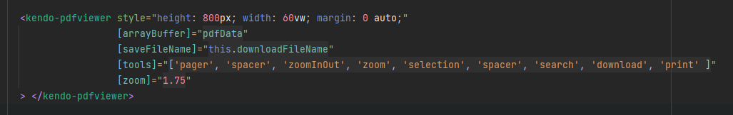
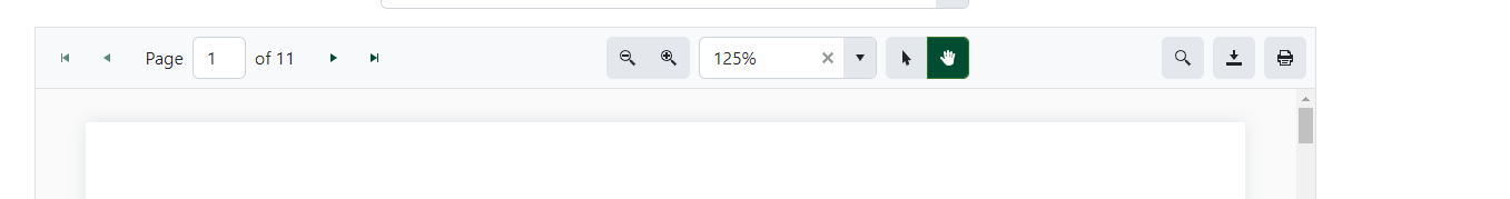
Adjusting the zoom level using the buttons then "corrects" the issue and it displays the right value.
Hi,
The condition is that we need a homepage with multiple dynamic tabs. Only one component is active at any given time in this feature. However, if we want to view the data from two or more tabs simultaneously, we can drag and position them next to each other, similar to how we see tabs in Chrome and other browsers. This functionality is controlled by docking managers.
Thank you in advance for your consideration.
- Open link https://angular-kendo-dropdown-list.stackblitz.io/
- Tab to the “Select gender:” dropdown.
- Run fastpass in Accessibility insights for web extension
Ensures all ARIA attributes have valid values
Fix ONE of the following:
Required ARIA children role not present: group, option
Element has no aria-busy="true" attribute
User Impact:
When an assistive technology encounters an element with an invalid ARIA attribute value, it might ignore the attribute or respond to it in an unexpected way. As a result, people who use assistive technologies might find the element difficult or impossible to use.