

`ZonedDate.fromLocalDate(new Date('2025-10-26T00:00:00.000Z'), TIME_ZONE_ID_EUROPE_BERLIN)`returns hour **1**, although the correct local hour is **2** (CEST, UTC+2). Berlin switches back at **2025-10-26T01:00:00Z**, not at midnight UTC. The two consecutive UTC instants `00:00Z` and `01:00Z` must both display `02:00`, with different offsets.
I tested the behavior with time zones 'Europe/Berlin' and 'Australia/Hobart'.
I tried to attach a Markdown file here, but upload failed for whatever reason. You wiil find the detailed description in the Markdown below:

I'm experiencing an issue with the Kendo Grid when using virtual scrolling.
If I lock any column, scroll down, and then navigate to another page, the locked column disappears. It only reappears after I scroll the grid again.
I've attached the relevant code and a video demonstrating the issue.
A ticket regarding this specific issue has already been opened on GitHub (https://github.com/telerik/kendo-angular/issues/4962) , but I wanted to bring it to your attention here as well. We would appreciate your support in resolving this matter as soon as possible.
Hi,
We've noticed a discrepancy between the Theme Builder and the Angular Grid component regarding size options.Current Behavior:
In the Theme Builder, the Large size property can be selected for Grid components. However, in the Angular package, only the sm and md sizes are currently supported.
Proposed Enhancement:
We would like to request support for the Large size option in the Angular Grid components to ensure design consistency with the Theme Builder.
We are developing an enterprise-scale software application and actively utilizing your products, including the Theme Builder, as efficiently and effectively as possible. Because of this, ensuring consistency across our design and implementation systems is critical for us.
Has anyone else faced this, or is there an existing workaround or planned update for this?
Thanks, and looking forward to your feedback!
The typing for Telerik events in Angular that I have seen so far is generally quite mixed in quality. There is heavy use of EventEmitter<any> for some commonly used components, which is a code smell in TypeScript.
It makes it considerably more difficult/risky to develop using these events, as you don't quite know what to expect until you try running it a few times and/or playing around with it on the website sandbox. Furthermore, the sandbox has its own issues too, such as not always making it clear if a value is null/undefined vs an empty string (which does make a difference for how you handle it), so I typically have to make a dummy component and debug it myself just to find out.
See for instance:
Others have a mix of typed and un-typed
A component that does this well by contrast is the Map one, where the events are all strongly typed, making them much easier and safer to use.
In certain cases (e.g. Comboboxes), where a value change emits the selected object/string, or "undefined" (at least as far as I can tell), could it not use generic typing to infer the type based on the type of the provided data, and default to "any" otherwise?
For focus/blur events, at least the switch component provides typing that lets me know it refers to the original DOM event (though it still has "any" on the valueChange - which seems unusual as I'd intuitively expect it to be a boolean).
Even if it is truly impossible to get typing for certain events, there should at least be clearer documentation on the API reference of what you should typically expect to get/where the event comes from.
Component libraries should not require you to guess or figure out what to expect for exported events. Please can you make this a priority in new releases.
Hi,
This works with Angular 20, must be a change related to that.
If I assign data to the TreeView synchronously, it works, but e.g. in a setTimeout, it doesn't any more. (I assign the full array, change detection is set to eager.)
Reproduction can be found here: https://codesandbox.io/p/devbox/mutable-glade-39twhs?workspaceId=ws_P4gPDf6RC2r5W8xExWQehV
Best regards,
Michael
`@progress/kendo-intl` incorrectly formats timezone offsets whose minute component is non-zero.
For example, a JavaScript `Date` with the historical Warsaw offset `UTC+01:24` is formatted as `+01:04` instead of `+01:24`.
This affects all tested `Z`, `X`, and `x` timezone format variants.
Environment
- `@progress/kendo-angular-intl`: `24.2.0`
- `@progress/kendo-intl`: `3.2.1`
- Browser/Node timezone: `Europe/Warsaw`
- Operating system: Windows
- Format: `yyyy-MM-ddTHH:mm:ssZZZZZ`
The same formatting implementation appears in `@progress/kendo-intl` versions `3.1.2` and `3.2.1`.
Reproduction
const { formatDate } = require('@progress/kendo-intl');

process.env.TZ = 'Europe/Warsaw';

const date = new Date(1900, 0, 1, 16, 0, 0);

console.log(date.toString());
console.log(date.getTimezoneOffset());
console.log(formatDate(date, 'yyyy-MM-ddTHH:mm:ssZZZZZ'));
Actual Result
Mon Jan 01 1900 16:00:00 GMT+0124
-84
1900-01-01T16:00:00+01:04
Expected Result
1900-01-01T16:00:00+01:24Date#getTimezoneOffset() returns -84, meaning the local timezone is 84 minutes ahead of UTC:
84 minutes = 1 hour 24 minutesOther Examples
The issue is not limited to positive offsets:
getTimezoneOffset() | Expected | Actual |
|---|---|---|
-84 | +01:24 | +01:04 |
210 | -03:30 | -03:05 |
UTC is also formatted differently depending on the token, but that behavior may be intentional:
| Offset | Expected ISO representation | ZZZZZ result |
|---|---|---|
0 | +00:00 or Z | Z |
Tested Format Specifiers
All applicable format variants use the same incorrect minute calculation:
Z      -> +0104
ZZ     -> +0104
ZZZ    -> +0104
ZZZZ   -> GMT+01:04
ZZZZZ  -> +01:04

X      -> +0104
XX     -> +0104
XXX    -> +01:04
XXXX   -> +0104
XXXXX  -> +01:04

x      -> +0104
xxx    -> +01:04
xxxxx  -> +01:04
Changing from ZZZZZ to XXXXX or XXX therefore does not resolve the problem.
Suspected Root Cause
The current formatter appears to perform approximately this calculation:
const offset = date.getTimezoneOffset() / 60;
const hoursMinutes = Math.abs(offset).toString().split('.');
const minutes = hoursMinutes[1] || 0;
For an 84-minute offset:
84 / 60 = 1.4The decimal portion "4" is then treated as four minutes and padded to "04".
However, the fractional part represents a fraction of an hour:
0.4 hours * 60 = 24 minutesLikewise, for 210 minutes:
210 / 60 = 3.5The formatter produces 03:05, although 0.5 hours is 30 minutes.
Suggested Fix
Timezone offsets should remain integer minute values throughout formatting:
function formatTimeZone(date, info, options) {
    const totalMinutes = date.getTimezoneOffset();
    const absoluteMinutes = Math.abs(totalMinutes);
    const hours = Math.floor(absoluteMinutes / 60);
    const minutes = absoluteMinutes % 60;
    const sign = totalMinutes <= 0 ? '+' : '-';

    // Continue applying shortHours, separator, optionalMinutes,
    // localizedName and zZeroOffset options using hours and minutes.
}
The important calculations are:
const hours = Math.floor(Math.abs(offsetMinutes) / 60);
const minutes = Math.abs(offsetMinutes) % 60;
Converting the offset to a decimal hour and splitting its string representation is not reliable.
Suggested Regression Tests
it('formats a positive timezone offset with minutes', () => {
    const date = new Date(2024, 5, 25, 12, 7, 5);
    vi.spyOn(date, 'getTimezoneOffset').mockReturnValue(-84);

    expect(formatDate(date, 'yyyy-MM-ddTHH:mm:ssZZZZZ'))
        .toBe('2024-06-25T12:07:05+01:24');
});

it('formats a negative timezone offset with minutes', () => {
    const date = new Date(2024, 5, 25, 12, 7, 5);
    vi.spyOn(date, 'getTimezoneOffset').mockReturnValue(210);

    expect(formatDate(date, 'yyyy-MM-ddTHH:mm:ssZZZZZ'))
        .toBe('2024-06-25T12:07:05-03:30');
});
Other useful cases include:
-345 -> +05:45
-330 -> +05:30
210 -> -03:30
0 -> Z or +00:00, depending on the selected token
Impact
This can corrupt serialized date-time values when they are passed to systems that honor the emitted offset, including .NET DateTimeOffset.
Example:
Intended: 1900-01-01T16:00:00+01:24
Emitted:  1900-01-01T16:00:00+01:04
These values represent instants 20 minutes apart.
The issue affects:
- Historical dates from regions that previously used local mean time.
- Current timezones with half-hour or quarter-hour offsets.
- Any test or custom
Dateimplementation returning a non-whole-hour offset.
Examples of modern fractional offsets include UTC+05:30, UTC+05:45, UTC+09:30, and UTC-03:30.
Additional Context
We initially encountered this with Europe/Warsaw and 1900-01-01. The JavaScript runtime correctly reports Warsaw's historical offset as UTC+01:24. The incorrect UTC+01:04 value is introduced only during Kendo formatting.
We have implemented a temporary application-level workaround that formats the date portion with Kendo and calculates the timezone offset directly from integer minutes.
When dateinput format is "d/M/y" and "allowCaretMode" is enabled, users are unable to enter valid dates. Tested with dateinput and datepicker components.
Steps to reproduce
- Setup a kendo-dateinput component with "allowCaretMode" set to "true" and the "format" set to "d/M/y" (see stackblitz below).
- Enter a valid single-digit day and valid single-digit month into the input.
- Try typing a year.
- Observe that only one character of the year can be entered and the input locks up, preventing the user from completing a valid date.
- Try typing a double digit month.
- Observe that only one character of the month can be entered and the input locks up.
- Try typing a double digit day.
- Observe that only one character of the day can be entered and the input locks up.
Stackblitz example - angular v22 + kendo v24
https://stackblitz.com/edit/angular-kendo-dateinput-bug-rdocwtvr
Expected Behaviour:
The user should be able to enter a full year, month, and day after typing a valid single-digit day and month.
Observed Behaviour:
After entering a single-digit day and month, the input locks up, preventing the user from typing more than one character for the year or month. This prevents users from entering valid dates, making the input unusable in this scenario.
Thanks

For example, a way to set in the data for the event "Morning" to display first instead of "Laboratory Equipment". It cannot depend on the time range.
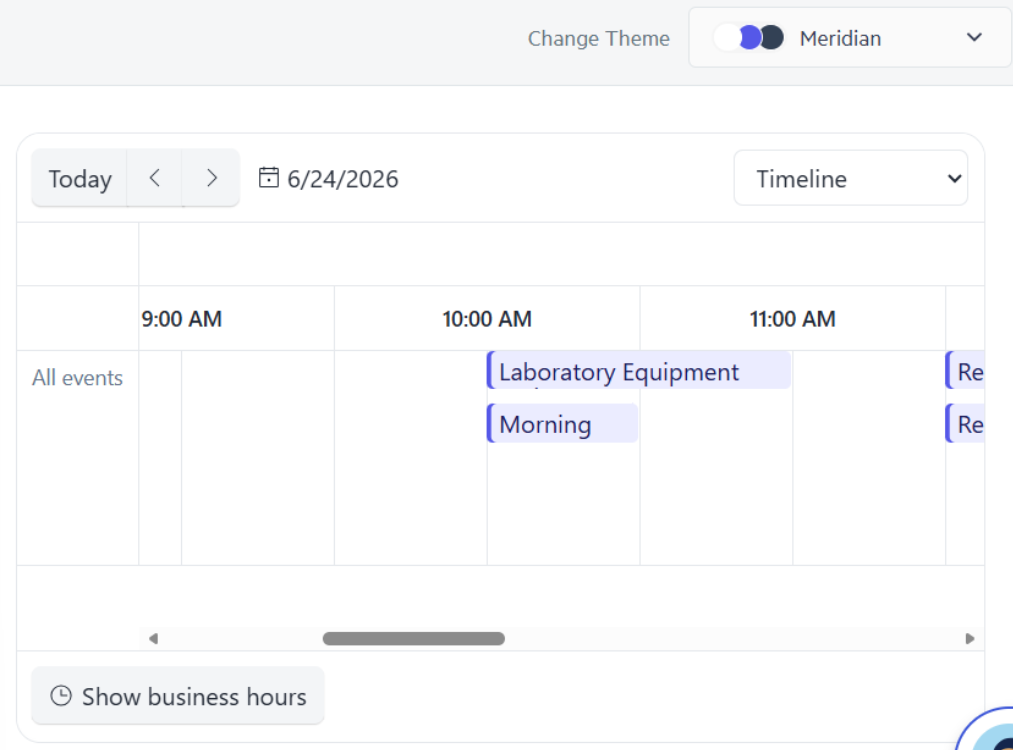
Thank you!
The built-in kendoDropDownFilter directive normalizes text using String.prototype.toLowerCase() when caseSensitive: false. This is locale-insensitive and produces incorrect results for languages with non-standard case-folding rules, most notably Turkish.
The correct fix is to use String.prototype.toLocaleLowerCase(locale), which respects locale-specific case rules. The DropDownFilterSettings interface should expose a locale option for this:
filterSettings = {
  caseSensitive: false,
  operator: 'startsWith',
  locale: 'tr-TR'   // ← proposed new option
};
Affected components: kendoDropDownFilter directive (used with AutoCompleteComponent, ComboBoxComponent, MultiColumnComboBoxComponent, DropDownListComponent, MultiSelectComponent).

Signal Forms are now stable with Angular@22.
It would be nice to have an ability to use all kendo widgets with new form API.
For the Kendo DatePicker, if you try to set the size on a kendo-datepicker with plain text, it will not render and give a console error of "ERROR TypeError: Cannot read properties of undefined (reading 'nativeElement')".
Errors:
// HTML
<kendo-datepicker size="small" ... />
---
But on the other hand, it does work if you create a field of type "DateInputSize" and pass that variable to the size.
Works:// TS
protected size: DateInputSize = 'small';
// HTML
<kendo-datepicker [size]="size" ... />
Hi,
When the first day of the week is changed dynamically through a custom IntlService, the Calendar weekday headers are updated, but the date cells are not repositioned. (The first day is changed as described in your guide: https://www.telerik.com/kendo-angular-ui/components/knowledge-base/calendar-first-day )
Reproduction (forked from your example): https://stackblitz.com/edit/angular-tqvypgwg
Click on "Set first day to Monday ": the weekday headers are updated to start with Monday, but the date cells remain in their previous positions.
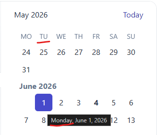
Best regards,
Michael
You're docs say
Open the example in a new window to evaluate it with Axe Core or other accessibility tools. for the Kendo angular grid
When i do that i see the attached error, which is the same issue i get in our product when running playwright axe
That suggests to me that it is not WCAG 2.2 compliant
Ensure elements with an ARIA role that require child roles contain them
more informationElement Location:
.demo-frame.loaded.demo-module--wrap--718a6 > .demo-module--demoWrap--d1437 > .demo-module--explorerWrap--4bf1f.flex-grow-1 > .demo-module--demoBody--97eee > iframe #k-fbe44131-4768-4755-93c3-e321b714780e<div role="grid" kendodragtargetcontainer="" kendodroptargetcontainer="" mode="manual" class="k-grid-aria-root" id="k-fbe44131-4768-4755-93c3-e321b714780e" aria-label="Data table" aria-rowcount="62" aria-colcount="5">To solve this problem, you need to fix the following:
Element has children which are not allowed: div[tabindex]
Related Node
I have tested kendo grid accessibility with AXE Dev tool. Found following errors that seems difficult to fix.
1)Certain ARIA roles must contain particular children
2)Scrollable region must have keyboard access
Any suggestion to fix these above-mentioned issues could be very helpful. Noticed these issues even exist in kendo grid demos published in kendo documentation. Check the link below
stack blitz link : https://stackblitz.com/edit/angular-uhjyd3x9?file=src%2Findex.html
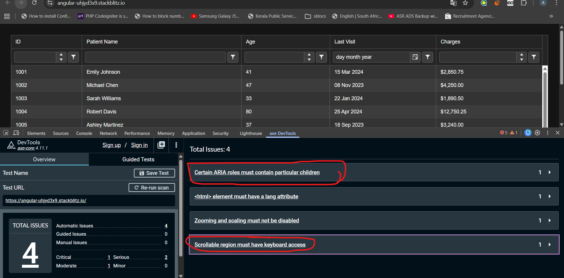
When a tooltip of a dialog is shown and the dialog is closed, the tooltip is still present and is moved into the top left corner.
We use e.g. `kendo-dialog-titlebar` and the close button has a tooltip.
Hi,
if I use both the features locked columns and sticky rows, the sticky rows do not stick in the locked columns.
For me it would be logical if they would stick there too (now the UI looks inconsistent):
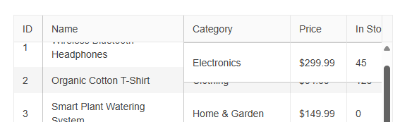
Reproduction (forked from your example): https://stackblitz.com/edit/angular-wak7v99i
Can you please take a look at it?
Best regards,
Michael
Hi,
if I change the [placeholder] input on a kendo-editor, the changes are not reflected.
Reproduction (forked from your example): https://stackblitz.com/edit/angular-uqbchubd
Can you please take a look at it?
Best regards,
Michael
The DrawerAnimation interface isn't exposed in the index file.
DrawerItem, DrawerMode, and DrawerPosition are all exported but DrawerAnimation is missing.
In firefox, open the Kendo Radio Button documentation and slowly resize the window (https://www.telerik.com/kendo-angular-ui/components/inputs/radiobutton)
The radio button will kind of jiggle around and occasionally the white dot in the radio button will become off-center.

This also seems to happen in response to some material bouncy (cubic-bezier) animation transitions.