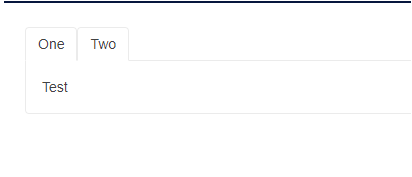
At the moment, when tabs hide their components are removed, so when you go back to a tab, it initializes again - for example, the OnInitializedAsync event fires where you fetch data, so you have to fetch the data again.
This behavior should be controlled through a property so one can keep the original behavior where the components are cleared from the DOM and memory.
Perhaps an option can be added where tabs are initialized not on initial load, but upon first activation only. Maybe the feature can become something like an enum - LoadMode="InitialRender|FirstRender|EveryRender" (working title off the top of my head).
At the moment, a solution you can use is to send the data to the tab from its contents through an event, and to pass it to them as a Parameter so you can check for it before fetching data.
One can generally loop through a collection of items to create several TabStrip instances as shown in the Tabs Collection article.
However, when I am dynamically adding or removing tabs I am hitting a variety of problems targeting:
- The active tab is not correctly set;
- The focus is not always set on the active tab;
- Upon adding/removing a tab, all tabs are re-created and thus their content cannot be persisted;
Please add support for dynamic tabs.
At the moment, if I have many tabs, their titles go off the screen (or the container of the tab strip). I want that they don't stretch my layout, or they don't become invisible.
---
ADMIN EDIT
For the time being, there are two workarounds you can consider:
- adding a scrollbar to the tabs list:
<style> /* sample settings for the parent of the tab strip to showcase how the rules below work */ .tab-container { border: 1px solid red; width: 30%; } /* tab titles will now produce a scrollbar when too wide */ .tab-container .k-tabstrip .k-tabstrip-items { flex-flow: inherit; max-width: 100%; overflow-x: auto; overflow-y: hidden; } /* just to showcase what happens when the content is wide - a separate scrollbar */ .wide-content { background: yellow; width: 1200px; } </style> <div class="tab-container"> <TelerikTabStrip> @foreach (var item in Enumerable.Range(1, 10)) { <TabStripTab Title="@( $"Item {item}" )"><div class="wide-content">Content for item @item</div></TabStripTab> } </TelerikTabStrip> </div> - making the tabs drop into multiple rows:
<style>
    /* sample settings for the parent of the tab strip to showcase how the rules below work */
    .tab-container {
        border: 1px solid red;
        width: 30%;
    }

        /* tabs will wrap on more than one row if there are too many to fit */
        .tab-container .k-tabstrip .k-tabstrip-items {
            flex-wrap:wrap;
        }
</style>

<div class="tab-container">
    <TelerikTabStrip>
        @foreach (var item in Enumerable.Range(1, 10))
        {
            <TabStripTab Title="@( $"Item {item}" )"><div class="wide-content">Content for item @item</div></TabStripTab>
        }
    </TelerikTabStrip>
</div>
---
I want to style my tab headers with something similar to this, but it does not compile:
 <h2>Telerik Tab Strip</h2>
    <TelerikTabStrip TabPosition="Telerik.Blazor.TabPosition.Top">
        <TabStripTab Class="WeirdTab" Title="First">
            First tab content.
        </TabStripTab>
        <TabStripTab Title="Second">
            Second tab content.
        </TabStripTab>
        <TabStripTab Title="Third">
            Third tab content.
        </TabStripTab>
    </TelerikTabStrip>
    <style>
        .WeirdTab {
            color: red;
        }
    </style>
While I can style the content of the tabs in the tabs themlselves (see below) I'd like to be able to style the headers too
<h2>Telerik Tab Strip</h2>
<TelerikTabStrip TabPosition="Telerik.Blazor.TabPosition.Top">
    <TabStripTab Title="First">
        <div class="WeirdTab">
            First tab content.
        </div>
    </TabStripTab>
    <TabStripTab Title="Second">
        Second tab content.
    </TabStripTab>
    <TabStripTab Title="Third">
        Third tab content.
    </TabStripTab>
</TelerikTabStrip>
<style>
    .WeirdTab {
        color: red;
    }
</style>
Currently, I am running to a scenario where I would like to keep the tab content for only some of the tabs instead of all tabs in the TelerikTabStrip. It would be really helpful is there is a PersistTabContent for individual tabs.
Scenario - one of my tabs has upload component where I am uploading files. The user selects the file and then decides to move to the other tab instead of completing the upload process. On activetabindexchanged event, I have confirmation button that checks to see if the user wants to move to the other tab or not. If they confirm, then the active tab changes, if they cancel then the active tab remains at the current tab, though it loses all selected file. To resolve this situation, I am using PersistTabContent = true on TabStrip, which then retains tab content for all tabs, rather than just upload component tab. Having PersistTabContent for individual tab in this case will resolve the issue.
Thank you.
Beena.
Hello,
Please add a new TabStrip event for user navigation that can be cancelled via the event arguments (e.g. args.IsCancelled = true).
Currently, we can use ActiveTabIndexChanged and not update the ActiveTabIndex value. However, this only works if ShouldRender() returns true.
.png)
G'day
Just wondering if we can get an;
AllowDragReorder="true"
And added bonus; "OnDragReorder" event.
Similar to Telerik WPF;
Cheers
Phil
When I am dynamically adding or removing tabs I am hitting a variety of problems targeting:
The active tab is not correctly set
the focus is not always set to the active tab
upon adding/removing a tab all tabs are re-created and their content is not persisted
This is causing some data loss, picklist filter loss, lag time when opening and closing tabs
At the moment, you can't get the currently active tab with code, the Title property of the tabs is not public.
Ideally, something like this should work:
@using Telerik.Blazor.Components.TabStrip@using Telerik.Blazor.Components.Button<TelerikButton OnClick="@WriteActiveTab">Get Active Tab</TelerikButton><TelerikTabStrip TabPosition="Telerik.Blazor.Components.TabStrip.TabPosition.Left" ref="@myTabStrip"> <TelerikTab Title="First"> First tab content. </TelerikTab> <TelerikTab Title="Second" Disabled="true"> Secont tab content. This tab is disabled and you cannot select it. </TelerikTab> <TelerikTab Title="Third"> Third tab content. </TelerikTab></TelerikTabStrip>@functions { Telerik.Blazor.Components.TabStrip.TelerikTabStrip myTabStrip; protected void WriteActiveTab() { Console.WriteLine(myTabStrip.ActiveTab.Title);//Title is not available now }}
ADMIN EDIT: As of October 2023, the TabStrip supports getting and setting the active tab with the ActiveTabIndex parameter. This request was marked as Complete when we exposed a Title parameter for the TabStripTab component. Enhanced programmatic access to TabStrip tab IDs can be implemented as part of TabStrip dynamic (closable) tabs.
Hello
Many times when removing a TabItem manually, we need to update some parameter or trigger some event. I think this is a missing feature for the TabStrip Component and should be added as soon as possible. I made a Custom Version of the TabStrip and added this functionality (see the unrelined Lines below):
In TelerikTabStrip.razor.cs
/// <summary>
/// Fires when a tab has been removed.
/// </summary>
[Parameter]
public EventCallback<int> TabRemoved { get; set; }
void ITabContainer.RemoveTab(ICustomTab tab)
{
int tabIndex = Tabs.IndexOf(tab);
if (PersistTabContent)
{
PersistedTabs.Remove(tab);
}
Tabs.Remove(tab);
if (TabRemoved.HasDelegate)
TabRemoved.InvokeAsync(tabIndex);
}
This way we can handle the event of removing the TabItems manually and trigger additional actions.
What also could help is triggering the ActiveTabIndexChanged whenever a new TabItem is added or removed.
Thanks
BR
Besir
We upgraded to the latest Telerik Blazor components (8.1.1).
I think there's a bug in the TabStrip when setting the index of the ActiveTabIndex or @bind-ActiveTabIndex.
The page will scroll to the active tab automatically.
Here's a link to the Repl - https://blazorrepl.telerik.com/GfaTEmbR45zQSzEq44
If you remove @bind-ActiveTabIndex="@ActiveTabIndex" from the TelerikTabStrip then the page load normally.
Thanks,
Cesar
I have four tabs in my tab strip, and the content in each tab is of varying width. The tab item resizes to the width of the content as it changes. I want to be able to set a fixed width for all the tabs so they don't expand and contract all the time.
===========
ADMIN EDIT
===========
In the meantime, you can control the width of the TabStrip with some custom CSS. You can use its Class parameter to set a custom CSS class to the main wrapping container of the component and then apply the desired styles. Thus, you will be styling only this specific instance of the TabStrip and not all instances on the page/app (in case needed, you can of course add the same CSS class to all instances to have the same styles).
The sample below demonstrates the described approach. First instance of the TabStrip has the default setup, no additional styles added. Second instance has fixed width.
<TelerikTabStrip>
    <TabStripTab Title="First">
        First tab content. Go to the third tab to see the problem.
    </TabStripTab>
    <TabStripTab Title="Second tab heading longer than others">
        Second tab content. Go to the third tab to see the problem.
    </TabStripTab>
    <TabStripTab Title="Third">
        <div style="width: 2000px;">lorem ipsum</div>Third tab content.
    </TabStripTab>
</TelerikTabStrip>

<style>
    .tab-with-width {
        width: 600px;
    }
</style>

<TelerikTabStrip Class="tab-with-width">
    <TabStripTab Title="First">
        First tab content. Go to the third tab to see the behavior when the TapSrtrip has fixed width.
    </TabStripTab>
    <TabStripTab Title="Second tab heading longer than others">
        Second tab content. Go to the third tab to see the behavior when the TapSrtrip has fixed width.
    </TabStripTab>
    <TabStripTab Title="Third">
        <div style="width: 2000px;">lorem ipsum</div>Third tab content.
    </TabStripTab>
</TelerikTabStrip>
Description
When the user selects an empty tab and then switches to another tab, the empty tab remains highlighted (appears as if it's still selected).
Reproduction
Reproduction: https://blazorrepl.telerik.com/mRkVczaV02S9QkmJ28
Steps:
1. Select the second tab (which has no content).
2. Select the first tab.
Both tabs are highlighted as selected.
I would like the same behavior for Blazor component.
See attached screen shot.
Sample code:
<TelerikTabStrip>
<TabStripTab Title="Tab 0" Visible="true">
content 0
</TabStripTab>
<TabStripTab Title="Tab 1" Visible="false">
content 1
</TabStripTab>
<TabStripTab Title="Tab 2" Visible="true">
content 2
</TabStripTab>
<TabStripTab Title="Tab 3" Visible="true">
content 3
</TabStripTab>
</TelerikTabStrip>
The TabStrip ActiveTabIdChanged event fires when the user navigates to another page.
The workaround is to detect app navigation and prevent the business logic execution. The example below is for the general case. If the app navigates programmatically with NavigationManager.NavigateTo(), you can set the IsNavigating flag immediately before that.
@implements IDisposable
@inject NavigationManager NavManager

<TelerikTabStrip ActiveTabId="@ActiveTabId"
                 ActiveTabIdChanged="@TabStripActiveTabIdChanged">
    @for (int i = 1; i <= TabCount; i++)
    {
        int tabIndex = i;

        <TabStripTab @key="@tabIndex" Title="@($"Tab {tabIndex}")" Id="@($"tab{tabIndex}")">
            <h2>Tab @tabIndex</h2>
        </TabStripTab>
    }
</TelerikTabStrip>

@code {
    private string ActiveTabId { get; set; } = "tab1";

    private bool IsNavigating { get; set; }

    private const int TabCount = 3;


    private async Task TabStripActiveTabIdChanged(string newActiveTabId)
    {
        if (IsNavigating)
        {
            return;
        }

        ActiveTabId = newActiveTabId;
    }

    protected override async Task OnAfterRenderAsync(bool firstRender)
    {
        if (firstRender)
        {
            locationChangingRegistration = NavManager.RegisterLocationChangingHandler(OnLocationChanging);
        }
    }

    private IDisposable? locationChangingRegistration;

    private ValueTask OnLocationChanging(LocationChangingContext context)
    {
        IsNavigating = true;

        return ValueTask.CompletedTask;
    }

    public void Dispose() => locationChangingRegistration?.Dispose();
}