Similar to the WPF grid I would like the option to require the user hold shift to sort by multiple columns, otherwise the grid would sort by only a single column.
https://docs.telerik.com/devtools/wpf/controls/radgridview/sorting/multiple-column-sorting
Hy,
It is possible to have default color themes (Primary,Dark,Info,Error,...) for Telerik Blazor Grid component as well without having to change the color by css overriding?
Hi - this one is a feature request, not a bug. :)
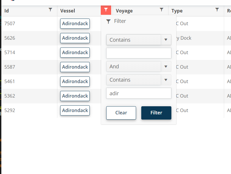
For the filter menu, when you enter a filter value, it would be nice if you could press enter to execute the filter instead of having to click "Filter."
I want to change the default Grid loading animation to a pulsing loader indicator.
.png)
Hello
The new adaptive toolbar I think doesn't follow the same style as other components, particularly scrollable tabs.
https://demos.telerik.com/blazor-ui/grid/adaptive
The UI scroll buttons shouldn't just disable, they just be hidden/removed from the UI altogether when they are not active (as it is pretty confusing to the user otherwise) - they should only appear when they need to appear. They also take up real-estate for no value.
Telerik already have the same concept in the UI for the scrollable-tabs seen here;
https://demos.telerik.com/blazor-ui/tabstrip/scrollable-tabs
So I see some inconsistency between the 2 UI's and think they should not appear as does on scrollable tabs.
I would like to add some custom actions into the popup window. I know I can implement a custom edit popup with an entirely custom content and actions. However, this requires a lot of custom work to just add one additional action in the popup. Please provide an easier option to add custom actions in the edit window.
The feature request is to be able to customize the GridCsvExportOptions and GridExcelExportOptions from the API methods -
- ExportToExcelAsync
- ExportToCsvAsync
- SaveAsExcelFileAsync
- SaveAsCsvFileAsync
It will be useful to be able to customize the columns and data to be exported.
===
Telerik edit:
A possible workaround is to click the built-in Grid export buttons with JavaScript. With this approach, you will be able to use the built-in export options and events. Here is a REPL example.
I want to filter a Grid by DateTimeOffset? field
===ADMIN EDIT===
There are two possible options:
1. Use a DTO in which you have a DateTime field converted as desired by your app from the DateTimeOffset. Filtering, sorting, editing, and grouping on DateTime values are supported out-of-the-box.
REPL example that demonstrates this approach.
2. Use the Grid Filter Template. As a filter editor, you can use the DateTimePicker component, which supports the DateTimeOffset type.
REPL example that demonstrates this approach.
Hello,
Please consider a Grid feature that changes the component layout on mobile devices or narrow screens. The idea is to switch the column layout to a card layout or anything similar to this example: https://css-tricks.com/responsive-data-tables/
It is possible to implement a similar behavior with the Telerik Blazor Grid and MediaQuery components, but it requires reusing the column titles in the CSS code: https://blazorrepl.telerik.com/GnYPmHFR176Jg5Yg02
===
Telerik Blazor team: Everyone who is interested in this feature, please vote for it to help us prioritize. Also, share your opinion about which Grid features you strictly need in the "mobile" layout and which ones you are ready to sacrifice. Some features don't make sense in a card / listview layout anyway, but still, the mobile-friendly Grid may require completely different HTML markup and UX, so some features may need to be completely revamped.
Please consider altering or providing configuration for how DateTime values are formatted in filter expressions generated by ToDataSourceRequest(). Currently, the format includes full precision (e.g., 2025-04-04T00:00:00.0000000), which causes issues when passed to Entity Framework Core with SQL Server, as SQL Server expects precision up to milliseconds (.fff), not ticks (.fffffff).
Why This Is a Problem
- When passing filter expressions from ToDataSourceRequest() directly into a LINQ-to-EF query, the resulting SQL query fails if the DateTime string has 0000000 (7 digits of precision).
- SQL Server’s datetime and datetime2 types don’t support nanosecond-level precision.
- EF Core attempts to translate it, but fails with SQL conversion errors
Please consider extending the GridColumn component to include fine-grained header presentation properties, such as:
- HeaderAlignment (e.g., Left, Center, Right)
- WrapHeaderText (bool)
- HeaderTooltip or HeaderAdornmentTemplate
These enhancements would dramatically improve clarity and usability in complex data grids.
Why This Is Important
In enterprise-grade applications — like ERP dashboards, financial reporting, or cutover schedules — grids are dense and loaded with meaning. Users rely heavily on headers to interpret the data beneath, especially when:
- Column headers are long or require abbreviations.
- Users need contextual guidance without clutter.
- Alignment improves visual scanning and aesthetics.
Please consider adding a TooltipTemplate parameter to the GridColumn component to allow developers to define custom tooltips for each cell using the same template logic available in CellTemplate.
Why This Matters
In enterprise applications — especially in ERP dashboards, cutover schedules, and KPI reports — data often needs contextual clarification. While tooltips are supported globally or via title attributes, there’s currently no clean, built-in way to customize tooltips per column using templating logic.