I am using Telerik Grid in our project and I have enabled the feature Reorderable="true". At GridColumnMenuSettings I am getting the following options:
Set column position :
- Move Next
- Move Previous
Those options are commonly showing for all columns but I want to disable "Move Next" option for the last column and "Move Previous" option for the first column as these options are not applicable to the corresponding columns.
I noticed a different behavior when filtering programmatically through the state and when you use the filter UI.
When filtering programmatically the filter is set after the data arrives. I am using a FiltterMenu and the filter icon is colored to indicate there is an applied filter only after the data is filtered. When filtering from the menu, I can the opposite behavior - the filter is set first and then the data is filtered. To me, this seems to be the correct behavior.
Reproduction: https://blazorrepl.telerik.com/wSavwTPd367WqA9r37.
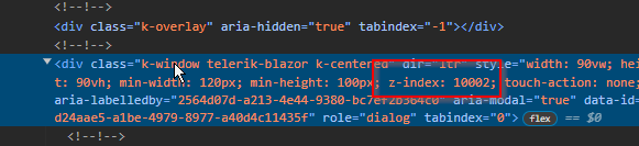
I have a TelerikGrid with Reordarable enabled inside of a TelerikWindow. Reordering of the column works fine only the drop clue is not showing. I think this is because the z-index is incorrect.
Missing drop clue:

z-index of drop clue is 10000:

z-index of window is 10002:
We want frozen columns exactly like this:
When a user deletes a record that decreases the number of pages on that Grid, and then they try to edit or add a record, they get stuck in the OnCancel event handler, which gets called over and over in an endless loop.
The behavior can be seen:
- After deleting a record in the Grid, which decreases the number of pages.
- The Grid is using a confirmation dialog from the DialogFactory for the Cancel action.
Steps To Reproduce
https://blazorrepl.telerik.com/GokIvFva42BLx7yl37
1. Delete item 11. The Grid will move you to page 1.
2. Try to edit or add a new item. OnCancel will fire in a loop.
3. If OnAdd and OnEdit are not defined, the loop will occur in OnUpdate and OnCancel.
On grids with a lot of data there is a delay between when the grid is assigned the data to when the grid shows the data. During this UI painting period, the NoDataTemplate is displayed for a second or two.
The grid should not show the NoDataTemplate unless the data source is loaded with an empty collection, not just while it is still trying to show the data.
Note: Having a generic message like in the documentation "No Data available / The data is still loading ..." is not satisfying our users. (Blazor Grid - No Data Template - Telerik UI for Blazor) These should really be two different states that can show different messages.
Thanks
When the user drags a third column to the Grid Group Panel, it ends up being second, instead of last. It looks like each new column is inserted at index 1, instead of appended last (when this is the user's intent).
@using Telerik.DataSource

<p>Group by a third column, so that it should come last in the Group Panel:</p>

<TelerikGrid @ref="@GridRef"
             Data="@GridData"
             Pageable="true"
             Sortable="true"
             Groupable="true"
             FilterMode="GridFilterMode.FilterRow"
             OnStateInit="@( (GridStateEventArgs<Employee> args) => OnGridStateInit(args) )"
             OnStateChanged="@( (GridStateEventArgs<Employee> args) => OnGridStateChanged(args) )">
    <GridColumns>
        <GridColumn Field="@nameof(Employee.Name)" />
        <GridColumn Field="@nameof(Employee.Team)" />
        <GridColumn Field="@nameof(Employee.Salary)" />
        <GridColumn Field="@nameof(Employee.OnVacation)" />
    </GridColumns>
</TelerikGrid>

@code {
    private TelerikGrid<Employee>? GridRef { get; set; }

    private List<Employee> GridData { get; set; } = new();

    private void OnGridStateInit(GridStateEventArgs<Employee> args)
    {
        args.GridState.GroupDescriptors = new List<GroupDescriptor>();

        args.GridState.GroupDescriptors.Add(new GroupDescriptor()
        {
            Member = nameof(Employee.Team),
            MemberType = typeof(string)
        });

        args.GridState.GroupDescriptors.Add(new GroupDescriptor()
        {
            Member = nameof(Employee.OnVacation),
            MemberType = typeof(bool)
        });
    }

    private async Task OnGridStateChanged(GridStateEventArgs<Employee> args)
    {
        if (args.PropertyName == "GroupDescriptors" && args.GridState.GroupDescriptors.Count > 2 && GridRef != null)
        {
            var secondGroupDescriptor = args.GridState.GroupDescriptors.ElementAt(1);

            args.GridState.GroupDescriptors.Remove(secondGroupDescriptor);
            args.GridState.GroupDescriptors.Add(secondGroupDescriptor);

            await GridRef.SetStateAsync(args.GridState);
        }
    }

    protected override void OnInitialized()
    {
        var rnd = new Random();

        for (int i = 1; i <= 20; i++)
        {
            GridData.Add(new Employee()
            {
                Id = i,
                Name = "Name " + i,
                Team = "Team " + (i % 4 + 1),
                Salary = (decimal)rnd.Next(1000, 3000),
                OnVacation = i % 3 == 0
            });
        }
    }

    public class Employee
    {
        public int Id { get; set; }
        public string Name { get; set; } = string.Empty;
        public string Team { get; set; } = string.Empty;
        public decimal Salary { get; set; }
        public bool OnVacation { get; set; }
    }
}
The Grid exits edit mode when expanding or collapsing rows in a hierarchy scenario. This only happens when OnStateChanged is set.
Test page that reproduces the behavior: https://blazorrepl.telerik.com/wIkJvdlo09hXCV8u03
Error: System.OverflowException: Value was either too large or too small for a Decimal.
Could there be an option to NOT close the filter dropdown when the clear button is pressed? Is there an AutoClose parameter or something else?
I just got a request for this, and their thought is they will have a filter set, then want to click clear, and then still pick new items to filter before leaving the dropdown.Also, watching it on a touch device made it especially painful.
The Grid will cancel the insertion of a new item when:
- the new item is not saved yet
- the new item is expanded and its DetailTemplate is visible
- the user changes the value of a column that has an editor template
===
In the meantime, a possible workaround is to hide the expand button for items, which are not added to the "permanent" Grid data yet. Here is how to do it with CSS:
.k-grid-add-row .k-hierarchy-cell .k-icon {
    display: none;
}
I have the following configuration:
Editor component in Grid EditorTemplate and the Grid editing mode is popup
Here is a REPL example https://blazorrepl.telerik.com/QeuUwsvb15sxbLuB04
The popup that opens when editing the Grid resizes when I type in the Editor
Steps to reproduce the issue:
1. Run the REPL example
2. Click the Edit button in the Grid
3. Resize the popup
4. Start to type something in the Editor
5. The popup resizes
The Grid shows row skeletons in virtual scrolling scenarios when:
- The Grid is scrolled half a row, but the Skip value in the Grid state is still zero.
- The user filters while the Grid PageSize is greater than the total item count.
Test page: https://blazorrepl.telerik.com/mSkBaXkC50cEXmMB42
A possible workaround is to:
- Scroll the Grid to the top with JavaScript. This will trigger a new data request automatically.
- Reset the Grid state if the Grid is not scrolled, which will again trigger a new data request.
Example: https://blazorrepl.telerik.com/cSYrvEYW19htMCD934
Another possible solution is to disable the virtual scrolling at runtime if the total item count is too small: https://blazorrepl.telerik.com/mSOhvYuW47DaMk6c00
The Grid automatically scrolls to top when adding a new item in inline or incell edit mode. However, when the Grid has locked (frozen) columns, this scrolling doesn't occur.
Here is a test page with a JavaScript workaround in the OnAdd event:
@using System.ComponentModel.DataAnnotations

@inject IJSRuntime js

<label><TelerikCheckBox @bind-Value="@EnableScrollWorkaround" /> Enable Workaround</label>

<TelerikGrid Data="@GridData"
             EditMode="@GridEditMode.Inline"
             OnAdd="@OnGridAdd"
             OnUpdate="@OnGridUpdate"
             OnCreate="@OnGridCreate"
             Width="700px"
             Height="400px"
             Class="grid-class">
    <GridToolBarTemplate>
        <GridCommandButton Command="Add">Add Item</GridCommandButton>
    </GridToolBarTemplate>
    <GridColumns>
        <GridColumn Field="@nameof(Product.Name)" Width="200px" Locked="true" />
        <GridColumn Field="@nameof(Product.Price)" Width="200px" />
        <GridColumn Field="@nameof(Product.Quantity)" Width="200px" />
        <GridCommandColumn Width="200px" Locked="true">
            <GridCommandButton Command="Edit">Edit</GridCommandButton>
            <GridCommandButton Command="Save" ShowInEdit="true">Save</GridCommandButton>
            <GridCommandButton Command="Cancel" ShowInEdit="true">Cancel</GridCommandButton>
        </GridCommandColumn>
    </GridColumns>
</TelerikGrid>

<script suppress-error="BL9992">

    function scrollGridToTop() {
        var gridContentArea = document.querySelector(".grid-class .k-grid-content");
        if (gridContentArea) {
            gridContentArea.scrollTop = 0;
        }
    }

</script>

@code {
    private bool EnableScrollWorkaround { get; set; } = true;

    private List<Product> GridData { get; set; } = new();

    private int LastId { get; set; }

    private async Task OnGridAdd(GridCommandEventArgs args)
    {
        if (EnableScrollWorkaround)
        {
            await js.InvokeVoidAsync("scrollGridToTop");
        }
    }

    private void OnGridUpdate(GridCommandEventArgs args)
    {
        var updatedItem = (Product)args.Item;
        var originalItemIndex = GridData.FindIndex(i => i.Id == updatedItem.Id);

        if (originalItemIndex != -1)
        {
            GridData[originalItemIndex] = updatedItem;
        }
    }

    private void OnGridCreate(GridCommandEventArgs args)
    {
        var createdItem = (Product)args.Item;

        createdItem.Id = ++LastId;

        GridData.Insert(0, createdItem);
    }

    protected override void OnInitialized()
    {
        for (int i = 1; i <= 30; i++)
        {
            GridData.Add(new Product()
            {
                Id = ++LastId,
                Name = $"Product {LastId}",
                Quantity = (short)Random.Shared.Next(0, 1000),
                StartDate = DateTime.Now.AddDays(-Random.Shared.Next(60, 1000)),
                IsActive = LastId % 4 > 0
            });
        }
    }

    public class Product
    {
        public int Id { get; set; }
        [Required]
        public string Name { get; set; } = string.Empty;
        public decimal Price { get; set; }
        public int Quantity { get; set; }
        public DateTime StartDate { get; set; }
        public bool IsActive { get; set; }
    }
}
As of UI for Blazor 6.0.2 OnRead event handler is triggered twice if Grid has defined the GridAggregates Parameter (if you try defining Grid without the GridAggregates Parameter, the OnRead event handler is caller once). In the first call the args.Request.Aggregates value is empty, while in the second one that field is populated correctly.
The behavior may be related to the fix of this issue but I'd prefer the Grid to fire OnRead only once if possible.
===
ADMIN EDIT
===
Currently, OnRead fires twice only on initial load. A possible optimization that you can implement on your side is to toggle a flag based on which you can process the data only once. You can do that in the second OnRead as this is when the AggregateResults field of the request gets populated.
Here is a basic example: https://blazorrepl.telerik.com/GokrRkYX536x1mSF35.
The Grid will throw a JavaScript error if the user wants to group and drops a column header near the edges of the grouping header or between existing group chips.
This is a regression in version 6.0.0.
REPL test page: https://blazorrepl.telerik.com/wouBdbvw36O4UaAR14
A possible workaround is to remove the empty space, which triggers the error, so that users cannot drop on it:
CSS
    .k-grid .k-grouping-header {
        padding: 0;
        border-bottom-width: 0;
        gap: 0;
    }

        .k-grid .k-grouping-header::before {
            margin: 0;
        }

    .k-grid .k-grouping-header .k-grouping-drop-container {
        margin: 0;
    }