Hi,
The ask is for a feature request to take the already wonderfully done globally applied filter features down to a per column basis without the overhead and burden of resorting to the custom FilterMenuTemplate approach.
The current way of doing business creates much overhead in code particularly when several columns are involved.
Something like:
<TelerikGrid Data="@MyData"
FilterMode="@GridFilterMode.PerColumn"
<GridColumns>
<GridColumn Field="MyField01" FilterMode="@GridFilterColumnMode.FilterRow" />
<GridColumn Field="MyField02" FilterMode="@GridFilterColumnMode.FilterMenu" />
<GridColumn Field="MyField03" Filterable="false"/>
etc..
</GridColumns>
</TelerikGrid>
Thanks!
Ron
Hello,
we recently updated Telerik.UI.for.Blazor from 9.0.0 to 12.3.0, afterwords we noticed that in several instances where we use the `TelerikGrid` component, keyboard interactions stopped working. Specifically the `@onkeydown` seems to no longer propagate to parent elements of the grid. As this was not mentioned in the Breaking changes for the version 10 or 12 releases we assume this to be a bug.
here a simplified example:
            <div style="padding: 0; width: @(ShowSidePanel ? "65%" : "99%")" tabindex="0" @onkeydown="@(OnKeyPress)">
                <TelerikGrid TItem="IncomingInvoiceGridItemViewModel"
                             @ref="GridRef"
                             Class="admin-grid"
                             Height="@OverviewHeight"
                             RowHeight="50"
                             Pageable="false"
                             PageSize="PageSize"
                             FilterMode="@GridFilterMode.FilterMenu"
                             Sortable="true"
                             Resizable="true"
                             Reorderable="true"
                             ShowColumnMenu="true"
                             ScrollMode="@GridScrollMode.Virtual"
                             SelectionMode="@GridSelectionMode.Single"
                             OnStateInit="@OnStateInit_SetStateAsync"
                             OnStateChanged="@OnStateChanged_SaveStateAsync"
                             SelectedItemsChanged="@OnSelectedItemsChanged_LoadPdf"
                             OnRead="@OnRead_UpdateFilteredItems">
                    <GridSettings>
                        <GridColumnMenuSettings Lockable="false" />
                    </GridSettings>
...
<!-- aggregates, columns and noDataTemplate omitted -->
...
                </TelerikGrid>
            </div>
Implementation / usages of the features did not change, only updates where changes required by the update Telerik.UI.for.Blazor from 9.0.0 to 12.3.0.
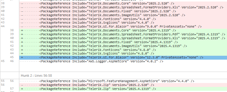
These were the dependencies updated alongside the update of Telerik.UI.for.Blazor from 9.0.0 to 12.3.0 :
Hello,
seems like the GridToolbar(even the GridToolbarTemplate) in grid is not rendering "GridToolBarOverflowMode.Section". The "Scroll" mode is ok.
Is there any additional setup, or did i missed some setup...?
REPL:
https://blazorrepl.telerik.com/wqYQvvEq40GkajEZ30
based on:
https://www.telerik.com/blazor-ui/documentation/components/grid/toolbar
some mention about "sections" but it seems for another purpose:
https://www.telerik.com/blazor-ui/documentation/knowledge-base/common-net8-sections
Thanks
Hy,
It is possible to have default color themes (Primary,Dark,Info,Error,...) for Telerik Blazor Grid component as well without having to change the color by css overriding?
.png)
Hello
The new adaptive toolbar I think doesn't follow the same style as other components, particularly scrollable tabs.
https://demos.telerik.com/blazor-ui/grid/adaptive
The UI scroll buttons shouldn't just disable, they just be hidden/removed from the UI altogether when they are not active (as it is pretty confusing to the user otherwise) - they should only appear when they need to appear. They also take up real-estate for no value.
Telerik already have the same concept in the UI for the scrollable-tabs seen here;
https://demos.telerik.com/blazor-ui/tabstrip/scrollable-tabs
So I see some inconsistency between the 2 UI's and think they should not appear as does on scrollable tabs.
Please consider adding new grid-level properties to control visual styling and editing behavior more intuitively:
- HeaderThemeColor
- ShowGridLines
- EditModeDisplay (e.g., None, ValueOnly, All, Auto)
These options would provide teams with greater flexibility to align grids with branding, accessibility, and user interaction standards.
Why This Is Valuable
Grids are the centerpiece of most enterprise applications — and users rely on visual consistency and responsive interaction. Today’s grids need to:
- Match branding and accessibility guidelines (dark/light, color accessibility).
- Visually separate data (e.g., grid lines on for financial reports, off for dashboards).
- Clearly communicate edit state (inline, batch, or value-only editing).
These settings would empower developers to deliver purpose-built grids without deep CSS overrides or workarounds.
Please consider adding support for an optional header row indicator that can display a conditional icon + themed tooltip, used to show non-field-level validation or status messages — especially during inline or in-cell editing, and ideally in batch edit scenarios.
Why This Is Needed
In enterprise applications — especially those with batch entry workflows, cutover planning, or financial approvals — validation needs often extend beyond just field-level errors. Common use cases include:
- Rule-level messages (e.g., “Only one Primary Owner allowed per group”).
- Cross-row or cross-field issues (e.g., overlapping dates, missing dependencies).
- Batch edit feedback (e.g., conflict indicators before submit).
Currently, there’s no clean way to show column-specific validation or guidance in a visual, inline way that:
- Doesn’t clutter the cell.
- Surfaces at the column level (just like a header).
- Feels native to the grid.
Please consider adding a TooltipTemplate parameter to the GridColumn component to allow developers to define custom tooltips for each cell using the same template logic available in CellTemplate.
Why This Matters
In enterprise applications — especially in ERP dashboards, cutover schedules, and KPI reports — data often needs contextual clarification. While tooltips are supported globally or via title attributes, there’s currently no clean, built-in way to customize tooltips per column using templating logic.
Upgraded to .NET 9 and Telerik UI For Blazor 8.0.0 and the grid header text is no longer centered for the columns that are set to do so.
I ran a backup copy of the same project that was using .NET 8. The columns centered okay. I then upgraded that same project to .NET 9 without making any code changes and the columns no longer centered.
Thanks,
Joe
In many cases the header text of columns gets truncated to an ellipses if the columns aren't wide enough. It would be nice if there was a global way to display a tooltip for each column header that is made up of the header text. I know that I can do this using the column header template, but that will require that I create a template for every column in all of my grids. I'm looking for a way to have it work globally. This could be with a general header template that has context about the header Title, or just a Boolean flag to display column header tooltips.
Thanks,
Mike
Cuando agrego GridAggregates el exportador de excel no me permite dejar limpia la fila de Totales (FooterTemplates) para unicamente dejar el Dato me coloca la siguiente estructura: "aggregate_sum: X" y al remover el aggregate_sum de los archivos de recursos me deja el texto ": X" por lo que la cadena sigue sin quedar limpia.
De igual manera en mi grid view tengo la columna de Totales y no la agrega al archivo que se exporta los totales como se ve en la imagen:

I am using a CheckBoxList filter menu and I am setting an initial filter through the OnStateInit. I noticed that when the Grid initializes and I check all the boxes, the Grid does not show any records. For reference, if no initial filter is applied and all CheckBoxes are selected, the Grid shows all the records.
Reproduction: https://blazorrepl.telerik.com/GSbbbJut14K03I2x14.
===
ADMIN EDIT
===
As a workaround for the time being, you may create a custom Filter Menu.
There seems to be no System.Type that will allow a GridColumn to be specified with the 'FieldType' attribute to receive a TelerikTimePicker
typeof(DateTime) --> TelerikDateTimePicker
typeof(?) --> TelerikTimePicker
<TelerikGrid Data="@gridDataExpando" Width="100%" Sortable="false" Pageable="false" Resizable="true" ShowColumnMenu="false"
             ScrollMode="@GridScrollMode.Scrollable"
             Height="100%"
             EditMode="@GridEditMode.Incell"
             OnUpdate="@UpdateHandlerExpando"
             OnEdit="@EditHandler">
   <GridColumns>
      @{
         var firstItem = gridDataExpando.FirstOrDefault();
         if (firstItem != null)
         {
            var dictionaryItem = firstItem as IDictionary<string, object>;
            foreach (var item in dictionaryItem)
            {
               if (!item.Key.Contains("Id"))
               {
                  <GridColumn Field="@(item.Key)" FieldType="@(this.GetDataType(item.Key))" Width="140px" DisplayFormat="{0:hh:mm:ss tt}">
                     <HeaderTemplate>
                        <span>@item.Key</span>
                    </HeaderTemplate>
                   </GridColumn>
               }
            }
         }
      }
   </GridColumns>
</TelerikGrid>
Hi,
I have spent a while looking for the feature to move the Footer Template to the first line of the Telerik grid. Is this currently possible with a parameter I'm unaware of? How possible would this be to do if not.
Kind Regards,
Elliot
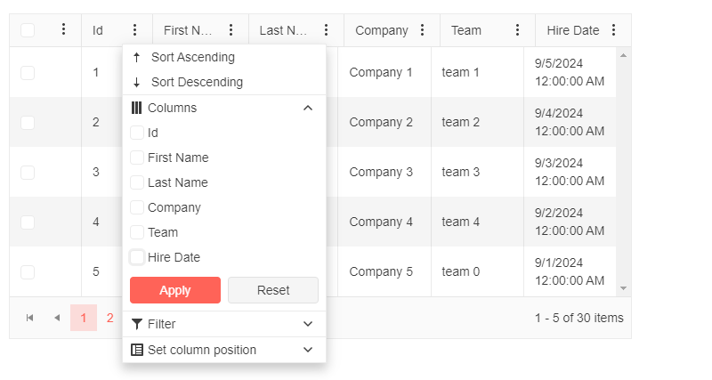
Problem Statement:
We have the following blazor grid:
We have enabled the GridColumnMenuSettings
Now when we open the column chooser it does not disable for the last option.
When we don't have the GridCheckboxColumn then it works as intended
The last column option is disabled
Expected Result : We don't want the check box column to be shown in the column chooser and the last option to be unchecked in the column chooser needs to be disabled.
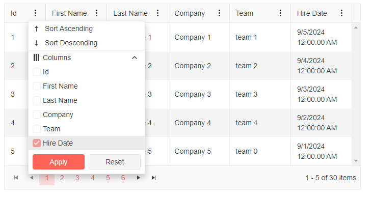
@* Use the Template to render the list of columns and add some custom styles *@
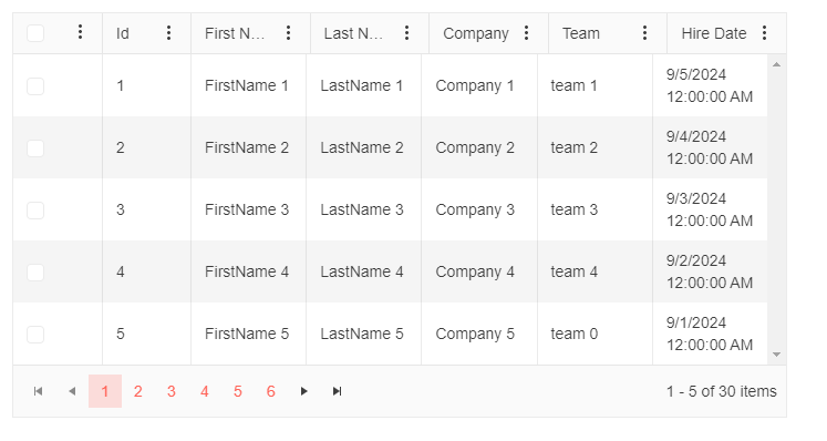
<TelerikGrid Data="@MyData"
Pageable="true"
PageSize="5"
Width="700px"
FilterMode="@GridFilterMode.FilterMenu"
Sortable="true"
ShowColumnMenu="true">
<GridSettings>
<GridColumnMenuSettings Sortable="true"
Lockable="false"
FilterMode="@ColumnMenuFilterMode.None" />
</GridSettings>
<GridColumns>
<GridCheckboxColumn Width="80px" HeaderClass="header-select-all" />
<GridColumn Field="@(nameof(SampleData.Id))" Width="80px" Title="Id" Id="id-column-id" />
<GridColumn Field="@(nameof(SampleData.FirstName))" Title="First Name" Id="firstname-column-id" />
<GridColumn Field="@(nameof(SampleData.LastName))" Title="Last Name" Id="lastname-column-id" />
<GridColumn Field="@(nameof(SampleData.CompanyName))" Title="Company" Id="companyname-column-id" />
<GridColumn Field="@(nameof(SampleData.Team))" Title="Team" Id="team-column-id" />
<GridColumn Field="@(nameof(SampleData.HireDate))" Title="Hire Date" Id="hiredate-column-id" />
</GridColumns>
</TelerikGrid>
@code {
public string TextboxValue { get; set; } = string.Empty;
public IEnumerable<SampleData> MyData = Enumerable.Range(1, 30).Select(x => new SampleData
{
Id = x,
FirstName = $"FirstName {x}",
LastName = $"LastName {x}",
CompanyName = $"Company {x}",
Team = "team " + x % 5,
HireDate = DateTime.Now.AddDays(-x).Date
});
public class SampleData
{
public int Id { get; set; }
public string FirstName { get; set; }
public string LastName { get; set; }
public string CompanyName { get; set; }
public string Team { get; set; }
public DateTime HireDate { get; set; }
}
}
Currently the GridSearchBox is able to search in all of the visible columns but when it comes to searching in multiple columns split by space it does not work. Or even two different strings in the same cell.
Example:
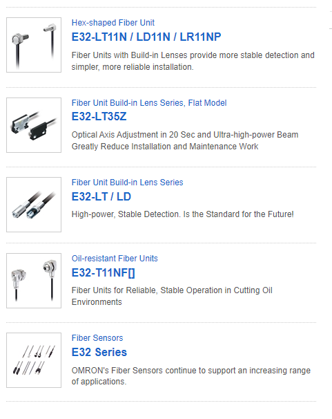
If from the above grid, I type in the search box, "LT" three products will be returned but if I type "LT LD" it should return two products but the results set comes with nothing.
I have implemented CustomSearchBox component as a solution in the interim to achieve this functionality. But it would be a worthwhile effort to have this functionality out of the box.
Thank you.
Sheraz
Hi,
it seems that grid.GetState() and FilterDescriptors, contains +1 "dummy" object.
- If it is by design, ok, BUT then, how to bind this filter descriptor to the ie TelerikFilter? = It displays that dummy object as it is, and confusing end users. Or how to "identify 100%" that is some kind of dummy value to be trashed?
How to reproduce:
1 run the repl demo
2 put "a" into the first colum(Name) filter
3 click button and observe the content of filter descriptors(serialized below the grid - RED is wrong, Green is expected as ok)
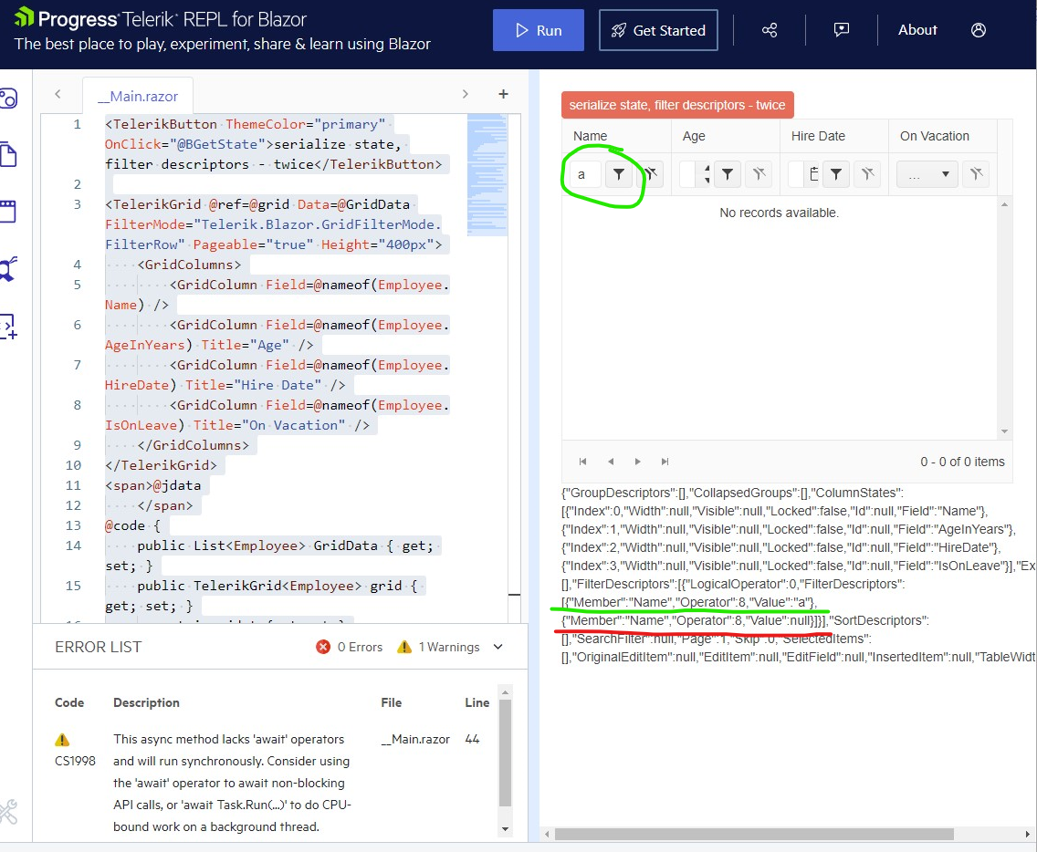
similar, but not the same(iam came from here):
Thanks for the tip, clarification, or removing that redundant values.
On grids with a lot of data there is a delay between when the grid is assigned the data to when the grid shows the data. During this UI painting period, the NoDataTemplate is displayed for a second or two.
The grid should not show the NoDataTemplate unless the data source is loaded with an empty collection, not just while it is still trying to show the data.
Note: Having a generic message like in the documentation "No Data available / The data is still loading ..." is not satisfying our users. (Blazor Grid - No Data Template - Telerik UI for Blazor) These should really be two different states that can show different messages.
Thanks
Greetings,
When using single selection mode, a row can be selected either by clicking the checkbox or by clicking on the rest of the row. There is no difference at all. Now, let's say I have a grid with multiple selection mode enabled, e.g.:
<TelerikGrid Data="listOfFoos" SelectionMode="GridSelectionMode.Multiple">
    <GridColumns>
        <GridCheckboxColumn SelectAll="true" SelectAllMode="GridSelectAllMode.All"  />
        <GridColumn Field="@nameof(Foo.Name)" Title="Name" />
    </GridColumns>
</TelerikGrid>
public class Foo {
public string Name { get; set; }
}
public List<Foo> listOfFoos = [ new Foo{Name="First"}, new Foo{Name="Second"}, new Foo{Name="Third"} ];
When we click an unselected row, the behavior varies depending on where we click exactly:
- if we click on the checkbox of the unselected row, the unselected row becomes selected. Previously selected rows are still selected. Everything is fine.
- if we click on the unselected row but not on the checkbox (e.g. on another column), the unselected row becomes selected but previously selected rows are unselected.
This notably makes multiple selection impossible if we click on the row but not on the checkbox and gives the impression we are using single selection mode. It is especially strange if we consider the existence of the CheckBoxOnlySelection parameter of <GridCheckboxColumn> whose name suggests we can select using the rest of the row by default.