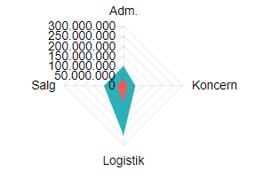
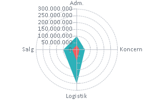
Expose colored ranges (Plot Bands) to allow highlighting certain areas in the chart plot area - similar to https://demos.telerik.com/kendo-ui/bar-charts/plotbands.
---
ADMIN EDIT
---
This feature will allow you to define certain color ranges in the plot area. If you are looking for ability to color the whole plot area in alternating way, you may check this feature request - Is it possible to change the plot area background color in an alternating way.
Is there any plan to add an Org Chart as a control?
For reference - Kendo jQuery Org Chart.
The Org Chart should display the reports to / is a manager of relation (1:0,m) between employees and/or managers graphically.
Is it possible to change plot area background color on charts so that every second line is a different color.
I have attached a image with the background color look.
---
ADMIN EDIT
The current request targets the ability to color the whole plot area in alternating way. If you need to only color a certain range of the plot area, you may take a look at the Plot bands feature request.
While the most common use case is to alter the background color based on the major plot area units, we'd like to gather your feedback on how you'd expect the feature to behave - allow color altering on major units, minor units or custom steps.
---
The code below does not produce a chart series with a line that is 50 width? What am i missing?
@page "/chartdemo"
Line series
<TelerikChart>
<ChartSeriesItems>
<ChartSeries Type="ChartSeriesType.Line" Name="Product 1" Data="@series1Data">
<ChartSeriesMarkers Size="10"></ChartSeriesMarkers>
</ChartSeries>
<ChartSeries Type="ChartSeriesType.Line" Size="10" Name="Product 2" Data="@series2Data">
<ChartSeriesLine Width="50"></ChartSeriesLine>
</ChartSeries>
</ChartSeriesItems>
<ChartCategoryAxes>
<ChartCategoryAxis Categories="@xAxisItems"></ChartCategoryAxis>
</ChartCategoryAxes>
<ChartTitle Text="Quarterly revenue per product"></ChartTitle>
<ChartLegend Position="ChartLegendPosition.Right">
</ChartLegend>
</TelerikChart>
@code {
public List<object> series1Data = new List<object>() { 10, 2, 5, 6 };
public List<object> series2Data = new List<object>() { 5, 8, 2, 7 };
public string[] xAxisItems = new string[] { "Q1", "Q2", "Q3", "Q4" };
}
The Chart Tooltip does not render correct values for the data points when the chart is bound to a model, has multiple series and Template is used. The DataItem does not seem to work as expected.
ADMIN EDIT:
If the Chart is bound with Independent Series Binding the FormattedValue will get the correct values.
If the Chart has no Template the correct values for the data points will be displayed
I have a line chart I am using to plot two related series of data. When these two series have the same values, or very similar values, the series that is second in the render order completely covers up the first line. This makes it look like the first line isn't being rendered, and makes it impossible to access the tooltips for the first series. I need a way to disambiguate overlapping data.
Thank you
jQuery.Deferred exception: Cannot read property 'bbox' of undefined TypeError: Cannot read property 'bbox' of undefined.


