Our Site supports multiple themes that we have built using the SASS Theme Builder. For all Telerik Components we have used so far the theme changes on them as expected when using the example found here (Change Theme at Runtime). The problem seems to be the chart component will not adhere to the newly applied theme after its initial load. Seems like this is because it is shown as an SVG with hardcoded attributes on the element. Is there a workaround for this (other than reloading the components entirely)?
Before & After Theme Change:
I would like to be able to control the rendering of the Lines on the X and Y axis for the Chart. For example, I would like to be able to hide them, change their color, etc. Currently, such an option is available for the stock chart with the following nested tags: StockChartCategoryAxisLine and StockChartValueAxisLine.
Hello support team,
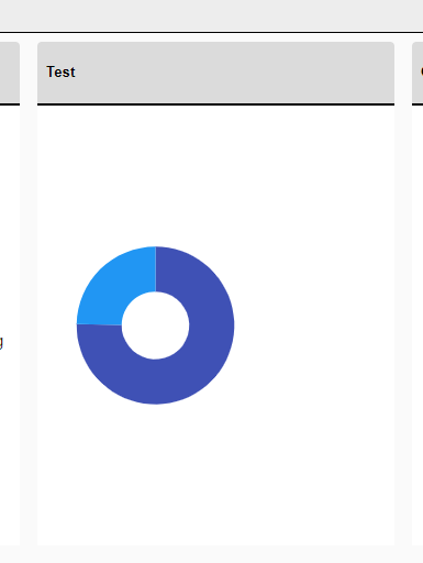
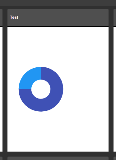
from the donut chart example under https://demos.telerik.com/blazor-ui/chart/donut-chart:
Is there a specific reason why all charts have a Template sub-property for the ChartSeriesTooltip construct but the Template field with the template syntax for the ChartSeriesLabels construct? I would favour a unified syntax for both of the properties, if this is possible somehow...
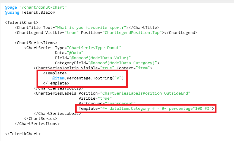
Is this planned for the future to be unified? Especially formatting like shown under https://docs.telerik.com/blazor-ui/knowledge-base/chart-format-percent is not as simple as I would have expected as nobody wants to touch JavaScript code literally :D (Also, localizing data seems quite difficult with that technique).
The best option in my opinion would be to remove those templates completely and just let the user decide what to show there while using a field called e.g. TooltipMappingName and LabelMappingName or something like that. This gives the chart the maximum of configuration possible.
Example:
<TelerikChart>
    <ChartTitle Text="What is you favourite sport?"></ChartTitle>
    <ChartLegend Visible="true" Position="ChartLegendPosition.Top"></ChartLegend>

    <ChartSeriesItems>
        <ChartSeries Type="ChartSeriesType.Donut"
                     Data="@Data"
                     Field="@nameof(ModelData.Value)"
                     CategoryField="@nameof(ModelData.Category)">
            <ChartSeriesTooltip Visible="true" Context="item" TooltipMappingName="@nameof(ModelData.Tooltip)"/>
            <ChartSeriesLabels Position="ChartSeriesLabelsPosition.OutsideEnd"
                               Visible="true"
                               Background="transparent"
                               LabelMappingName="@nameof(ModelData.Label)">
            </ChartSeriesLabels>
        </ChartSeries>
    </ChartSeriesItems>

</TelerikChart>

@code {
    public class ModelData
    {
        public string Category { get; set; }
        public int Value { get; set; }
  public string Tooltip { get; set; }
        public string Label { get; set; }
    }

    public List<ModelData> Data = new List<ModelData>()
    {
        new ModelData()
        {
            Category = "Football",
            Value = 35,
   Tooltip = "35%",
   Label = "Football: 35%"
        },
        new ModelData()
        {
            Category = "Basketball",
            Value = 25,
   Tooltip = "25%",
   Label = "Basketball: 25%"
        },
        new ModelData()
        {
            Category = "Volleyball",
            Value = 20,
   Tooltip = "20%",
   Label = "Volleyball: 20%"
        },
        new ModelData()
        {
            Category = "Rugby",
            Value = 10,
   Tooltip = "10%",
   Label = "Rugby: 10%"
        },
        new ModelData()
        {
            Category = "Tennis",
            Value = 10,
   Tooltip = "10%",
   Label = "Tennis: 10%"
        }
    };
}
Best regards,
Christian
The context DataItem is null for subsequent ChartSeries. It receives the correct object for the first ChartSeries, but for the rest is null.
<Admin Edit>
A workaround, for the time being, would be to remove the Template and let the Tooltip display the default value, which will be correct.
</Admin Edit>
Reproduction code:
<TelerikChart>
    <ChartTitle Text="Unrecoverable Errors Per Minute vs. Signal Level" />
    <ChartCategoryAxes>
        <ChartCategoryAxis Type="@ChartCategoryAxisType.Category" />
    </ChartCategoryAxes>
    <ChartValueAxes>
        <ChartValueAxis>
            <ChartValueAxisLabels Visible="true" />
        </ChartValueAxis>
    </ChartValueAxes>

    <ChartTooltip Visible="true">
        <Template>
            @{
                var data = context.DataItem as ModelData;
                <div class="card" style="font-size: 0.8rem; color: black">
                    <span>@($"{data.Value}")</span>
                    <span>@($"{data.Type}")</span>

                </div>
            }
        </Template>
    </ChartTooltip>

    <ChartSeriesItems>
        <ChartSeries Type="ChartSeriesType.Line"
                     Data="@ChartData1"
                     CategoryField="@nameof(ModelData.Type)"
                     Field="@nameof(ModelData.Value)">
        </ChartSeries>
        <ChartSeries Type="ChartSeriesType.Line"
                     Data="@ChartData2"
                     CategoryField="@nameof(ModelData.Type)"
                     Field="@nameof(ModelData.Value)">
        </ChartSeries>
        <ChartSeries Type="ChartSeriesType.Line"
                     Data="@ChartData3"
                     CategoryField="@nameof(ModelData.Type)"
                     Field="@nameof(ModelData.Value)">
        </ChartSeries>
    </ChartSeriesItems>

</TelerikChart>

@code {
    public class ModelData
    {
        public string Type { get; set; }
        public double Value { get; set; }
    }

    public List<ModelData> ChartData1 = new List<ModelData>() { new ModelData() { Type = "S1", Value = 1 } };
    public List<ModelData> ChartData2 = new List<ModelData>() { new ModelData() { Type = "S2", Value = 5 } };
    public List<ModelData> ChartData3 = new List<ModelData>() { new ModelData() { Type = "S3", Value = 9 } };
}
When I place a Chart in a small container, for example, a div, the labels are cut off and thus unreadable.
===
ADMIN EDIT
===
A possible workaround for the time being is changing the position of the labels so they are not cut off. For example: https://blazorrepl.telerik.com/mHkNkCEC16hMJnTg26.
I would like to control the font of the Value axis labels in a similar fashion to the way I can control the labels of the category axis:
    <ChartCategoryAxes>
        <ChartCategoryAxis Categories="@xAxisItems">
            <ChartCategoryAxisLabels Font="bold 12px 'Helvetica'"></ChartCategoryAxisLabels>
        </ChartCategoryAxis>
    </ChartCategoryAxes>
*** Thread created by admin on customer behalf ***
In need a chart that has a shaded area between a max and min set of curves, indicating the allowable area
Like this one: https://demos.telerik.com/kendo-ui/range-area-charts/index
The Chart Tooltip does not render correct values for the data points when the chart is bound to a model, has multiple series and Template is used. The DataItem does not seem to work as expected.
ADMIN EDIT:
If the Chart is bound with Independent Series Binding the FormattedValue will get the correct values.
If the Chart has no Template the correct values for the data points will be displayed
The code below does not produce a chart series with a line that is 50 width? What am i missing?
@page "/chartdemo"
Line series
<TelerikChart>
<ChartSeriesItems>
<ChartSeries Type="ChartSeriesType.Line" Name="Product 1" Data="@series1Data">
<ChartSeriesMarkers Size="10"></ChartSeriesMarkers>
</ChartSeries>
<ChartSeries Type="ChartSeriesType.Line" Size="10" Name="Product 2" Data="@series2Data">
<ChartSeriesLine Width="50"></ChartSeriesLine>
</ChartSeries>
</ChartSeriesItems>
<ChartCategoryAxes>
<ChartCategoryAxis Categories="@xAxisItems"></ChartCategoryAxis>
</ChartCategoryAxes>
<ChartTitle Text="Quarterly revenue per product"></ChartTitle>
<ChartLegend Position="ChartLegendPosition.Right">
</ChartLegend>
</TelerikChart>
@code {
public List<object> series1Data = new List<object>() { 10, 2, 5, 6 };
public List<object> series2Data = new List<object>() { 5, 8, 2, 7 };
public string[] xAxisItems = new string[] { "Q1", "Q2", "Q3", "Q4" };
}
It would be nice to make the label container less than the width of the element so that it stands out more.
I know that it can be set to different colors and transparent but adjusting the width would be a nice addition as well.
Hi!
I'm more than a little impressed with your Blazor efforts to-date, but there's one component lacking: a CandleStick chart.