Is it possible to use a different marker type other than the one provided by ChartSeriesMarkerType enum?
We would like to use a custom icon for some Scatter data but this doesn't seem to be supported out of the box. Please let us know if this is possible in the current framework, if not - can it be added as a feature?
Thanks,
Sean
See attached image. I want an option to change position on ticks, like in Kendo (see here).
I can't find an option in docs to move the axis position.
Currently, I get the desired result using SyncFusion Chart Component, attribute LabelPlacement allow selection between OnTicks and BetweenTicks option.
Hello,
Please allow us to distinguish which mouse button triggered the SeriesClick event.
Currently, scatter line plots do not support the stepped line style. This is something that would be hugely beneficial to us in our heavy utilization of scatter line plots with time series data.

The additional functionality of the stock chart (crosshairs, navigator) fits our needs very well, but our data is not currency formatted. As far as we have found, we have not seen a way to remove currency as a default format. I'm not sure if this is a bug, or intended functionality; but it's preventing us from rolling charts with that extended functionality.
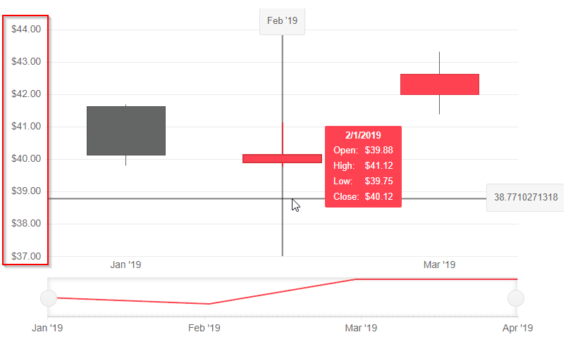
It would be fantastic to be able to visualize boolean data on a time based chart. We have a lot of time series data, and a good bit of it is boolean. It would be very beneficial to be able to plot that data along side our numeric data to provide context to both.
Example (blue/green bar at bottom of chart):
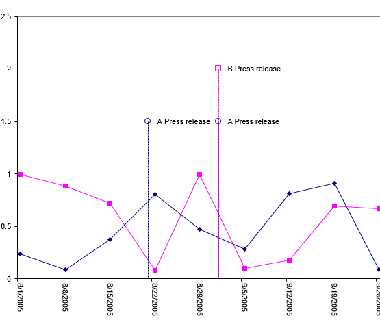
I would love to see the ability to put "pins" or "markers" for events on a time based chart. A lot of the work I'm doing with charts revolves around IoT, so we see a lot of value based data that needs to be contextualized with events.
Example:
Can the dev team comment on any known reasons why Charts (I think both SVG and Canvas) might not display when a blazor page is rendered from an automation tool like Chromium, Puppeteer, etc.? (e.g., https://developers.google.com/web/tools/puppeteer).
I have a standard blazor page that I can manually from a standard Chrome window, and it works fine and the Telerik chart displays.
But the same page, when launched either headless or with a GUI browser window, from a tool like Chromium or Puppeteer (with javascript enabled of course), it seems like the DOM is never dynamically updated to include the chart.
I am trying to customize the format of the ChartCategoryAxisLabels to render the abbreviated name of the day of the week using the following format:
<ChartCategoryAxisLabels Format="ddd dd/MM HH:mm"/>While it is a valid format, it seems that it doesn't work for the category labels.
---
ADMIN EDIT
---
For the time being, you can use the following to render the abbreviated name of the day of the week in the ChartCategoryAxisLabels:
<ChartCategoryAxisLabels Format="{0:EEE dd/MM HH:mm}"/>Expose colored ranges (Plot Bands) to allow highlighting certain areas in the chart plot area - similar to https://demos.telerik.com/kendo-ui/bar-charts/plotbands.
---
ADMIN EDIT
---
This feature will allow you to define certain color ranges in the plot area. If you are looking for ability to color the whole plot area in alternating way, you may check this feature request - Is it possible to change the plot area background color in an alternating way.
Is there any plan to add an Org Chart as a control?
For reference - Kendo jQuery Org Chart.
The Org Chart should display the reports to / is a manager of relation (1:0,m) between employees and/or managers graphically.
How do I stop a column chart generating over the hover-over effect?
The property exists in the Kendo Chart.