Unplanned
Last Updated: 04 Dec 2023 09:41 by Mark
Created by: Benjamin
Comments: 1
Category: Charts
Type: Feature Request
6
I would like to reverse the labels on the Value Axis
Unplanned
Last Updated: 03 Jan 2022 14:55 by ADMIN
Created by: Andrew
Comments: 1
Category: Charts
Type: Feature Request
1
The current version of the tooltip template context contains the information for the series color, but a particular data point might have a different color. Exposing such an option will allow better customization of the tooltip.
Unplanned
Last Updated: 22 Nov 2022 12:13 by ADMIN
Created by: Jesper
Comments: 4
Category: Charts
Type: Feature Request
12
I would like to customize the appearance of the Chart Legend
Unplanned
Last Updated: 06 Oct 2021 19:09 by ADMIN
Created by: Nikolas
Comments: 0
Category: Charts
Type: Feature Request
2

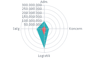
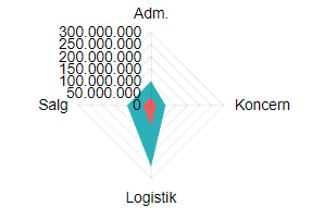
I would like a polar area chart.

Instead of

I want to have circular lines:

Unplanned
Last Updated: 07 Jan 2022 21:18 by Edward
Created by: Emil
Comments: 1
Category: Charts
Type: Feature Request
5
I would like to control the font of the value axis labels.
Unplanned
Last Updated: 25 Aug 2021 12:45 by ADMIN
I have 4 Radial Gauges and when I try to create a pdf with Kendo Drawing I am getting the following error: 

jQuery.Deferred exception: Cannot read property 'bbox' of undefined TypeError: Cannot read property 'bbox' of undefined.
Unplanned
Last Updated: 24 Aug 2021 14:59 by ADMIN
Created by: Kyle
Comments: 0
Category: Charts
Type: Feature Request
2
Expose Panes Functionality from the Chart Engine
Unplanned
Last Updated: 17 Oct 2023 15:35 by Mark
Created by: Lee
Comments: 1
Category: Charts
Type: Feature Request
16
Are there border settings in the Chart?
Unplanned
Last Updated: 10 Feb 2022 17:38 by ADMIN

Is it possible to change plot area background color on charts so that every second line is a different color.

I have attached a image with the background color look.

---

ADMIN EDIT

The current request targets the ability to color the whole plot area in alternating way. If you need to only color a certain range of the plot area, you may take a look at the Plot bands feature request.

While the most common use case is to alter the background color based on the major plot area units, we'd like to gather your feedback on how you'd expect the feature to behave - allow color altering on major units, minor units or custom steps.

---

Unplanned
Last Updated: 08 Jan 2024 14:36 by ADMIN
Created by: fabio
Comments: 2
Category: Charts
Type: Feature Request
6
I would like to be able to use the justified configuration in order to remove the empty spaces from my charts. 
Unplanned
Last Updated: 14 Dec 2020 11:01 by ADMIN
Created by: Chris
Comments: 0
Category: Charts
Type: Feature Request
9

Like in Kendo (here and here) so I can change the cursor for the chart to a pointer when the user hovers the series - I want that to indicate they can click on it (through the SeriesClick event).

---

ADMIN EDIT


workaround that you can consider which uses CSS to traverse the chart rendering:

<style>
    /* this will work in the chart below with its settings, axes, title and so on */
    .k-chart g[clip-path] g g g path {
        cursor: pointer;
    }

    /* a very generic selector that will capture just about everything in the plot area of the chart */
    /* Try this if you cannot make a more specific selector like the one above by inspecting the rendered content */
    /*.k-chart path {
        cursor: pointer;
    }*/
</style>

<TelerikChart>
    <ChartSeriesItems>
        <ChartSeries Type="ChartSeriesType.Column" Name="Product 1" Data="@series1Data">
        </ChartSeries>
        <ChartSeries Type="ChartSeriesType.Column" Name="Product 2" Data="@series2Data">
        </ChartSeries>
    </ChartSeriesItems>

    <ChartCategoryAxes>
        <ChartCategoryAxis Categories="@xAxisItems">
        </ChartCategoryAxis>
    </ChartCategoryAxes>

    <ChartTitle Text="Quarterly revenue per product"></ChartTitle>

    <ChartLegend Position="ChartLegendPosition.Right">
    </ChartLegend>
</TelerikChart>

@code {
    public List<object> series1Data = new List<object>() { 10, 2, 5, 6 };
    public List<object> series2Data = new List<object>() { 5, 8, 2, 7 };
    public string[] xAxisItems = new string[] { "Q1", "Q2", "Q3", "Q4" };
}

---

Unplanned
Last Updated: 23 Nov 2020 08:03 by ADMIN

I would like to be able to control the rendering of the Lines on the X and Y axis for the Chart. For example, I would like to be able to hide them, change their color, etc. Currently, such an option is available for the stock chart with the following nested tags: StockChartCategoryAxisLine and StockChartValueAxisLine.

Unplanned
Last Updated: 12 Oct 2020 13:15 by ADMIN
Created by: Ivan
Comments: 0
Category: Charts
Type: Feature Request
6
Like the Kendo one https://demos.telerik.com/kendo-ui/box-plot-charts/index because I need the outliers feature
Unplanned
Last Updated: 19 Oct 2023 19:24 by ADMIN
Created by: Rajesh
Comments: 2
Category: Charts
Type: Feature Request
15
I would like to be able to create small size charts and thus implementing Sparkline Charts like in the Kendo suite would work.
Unplanned
Last Updated: 20 Oct 2023 11:10 by Mark
Created by: Bryon
Comments: 2
Category: Charts
Type: Feature Request
9
I want to align my bar chart labels to the left of the chart.
Unplanned
Last Updated: 12 Sep 2023 15:17 by ADMIN
Created by: Bryon
Comments: 5
Category: Charts
Type: Feature Request
14

It would be nice to make the label container less than the width of the element so that it stands out more.

I know that it can be set to different colors and transparent but adjusting the width would be a nice addition as well.

Unplanned
Last Updated: 31 Jan 2024 12:11 by ADMIN
Created by: wu
Comments: 3
Category: Charts
Type: Feature Request
8
Unplanned
Last Updated: 24 Oct 2023 14:55 by ADMIN
Created by: Sylvain
Comments: 4
Category: Charts
Type: Feature Request
14

I would like to visually distinguish a certain element in a series from the others if its value matches a given criteria (for example, value exceeds a threshold). Ideally, I'd want to add a hash to my bars, because I want to keep all items with the same color (I don't want to use the ColorField).

Something similar is available in Kendo: https://demos.telerik.com/kendo-ui/bar-charts/visuals.

Unplanned
Last Updated: 11 Nov 2019 13:28 by ADMIN
Created by: Bill Wolff
Comments: 4
Category: Charts
Type: Feature Request
9
Trying to upgrade an Angular app that uses WijMo charts. It graphs server and web performance data. I can easily make a line or scatter chart but your Blazor component is not very flexible using DateTime on the x axis. I got it to work on a Line but not a ScatterLine. Also, when using the Line with AxisType = Date, I can't get the  BaseUnitStep working. Is there an enumerator for that? It tries to write the x label for every hour over 10 days. 
Unplanned
Last Updated: 27 Sep 2019 06:41 by ADMIN
Created by: Datafyer
Comments: 0
Category: Charts
Type: Feature Request
12

I have a page where I am displaying a chart and associated data in a grid below.

Being able to range select in the chart like in the asp.net core link below would offer a much better user experience.
That way the selected range could be specifically targeted in the grid data below the chart.

https://demos.telerik.com/aspnet-core/chart-api/selection