Hi
I have an TelerikMenu with a mix of internal and external links. The menu is using Data binding to a list of menu items. When using the mouse and clicking the external links it works as expected.
However when using the tab to set focus into the menu, then using the arrow keys to navigate to a menu item then hit Enter key, the link opens in the current tab, even if it set to target="_blank".
In this REPL the Enter key does nothing when at Telerik/Documentation and hitting Enter:
https://blazorrepl.telerik.com/mgYflMuM27MjqZrD54
In my case, the URL is opened in the current tab, instead of a new tab.
I'm using ItemTemplade to render the links and my template for external links looks like this:
if (item.IsExternal) { <ahref="@item.Url"class="@cssClass"target="_blank"rel="noopener noreferrer" @onclick="() => { if (isMobile) CloseMobileMenu(); }" @onclick:stopPropagation="!isMobile"> @item.Text <TelerikSvgIconIcon="@SvgIcon.HyperlinkOpen"Size="@ThemeConstants.SvgIcon.Size.Small"Class="@(isMobile ? "ms-2" : "ms-2")"/></a> }
The rendered HTML looks like this:
<li data-id="595df6d2-0580-42fd-999d-37f73afedcb6" tabindex="-1" class="k-item k-menu-item " role="menuitem" aria-live="polite"><span class="k-link k-menu-link "><div class="d-flex align-items-center justify-content-between w-100 px-2"><a href="https://theurl.com/an/l/45" class="k-menu-link-text" target="_blank" rel="noopener noreferrer">Go to external page<!--!-->
<!--!--><span class="telerik-blazor ms-2 k-icon-sm k-icon k-svg-icon k-svg-i-hyperlink-open" aria-hidden="true"><svg xmlns:xlink="http://www.w3.org/1999/xlink" xmlns="http://www.w3.org/2000/svg" viewBox="0 0 512 512"><!--!--><path d="M32 480h448V256h-32v192H64V64h192V32H32zM320 32l56.9 56.9.5.5L224 242.7l45.3 45.3 153.3-153.4L480 192V32z"></path></svg></span></a></div></span></li>I'd rather nog involve js-hacks to solve this issue. Is this a known bug or am i doing it wrong?
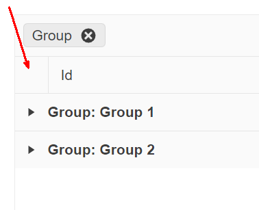
On a grid grouped by one or more fields, provide an option for end users to expand/collapse all rows at will. The following image is a suggestion of where this option (most likely a button) should appear:
1. Can you please add the ability to choose a chevron instead of a caret to signify there are menu items under it?
2. Can you please add the ability to collapse/expand the menu and just show the icon when collapsed.
For inspiration - https://www.fluentui-blazor.net/NavMenuTree
Thank you.
Do you have a planned date for Telerik UI for Blazor to fully support Visual Studio 2022 Professional?
Telerik UI for Blazor cannot be used with Visual Studio 2022 Professional in Debug mode and Hot Reload. There are couple issues, see below, that seems to be related, and that Telerik are not willing to fix. Those issues render Telerik UI for Blazor unusable when working with Visual Studio 2022 Professional with Hot Reload.
Predefined dialogs are not shown after hot reload updates are applied and Predefined dialogs throw when hot reload updates are applied
Blazor WASM breaks in VS2022 after Hot Reload in UI for Blazor | Telerik Forums
Hello guys,
I know you probably gonna redirect me to these topics:
https://feedback.telerik.com/blazor/1581128-ability-to-change-the-color-of-the-shape-on-click
But that is not a solution. The OnShapeClick-Event of the TelerikMap still triggers only if you click the shape, that was added last. Which means if I have 3 shapes in my TelerikMap, only a click on the third map will lead to the OnShapeClick event being triggered.
This is not a feature request, as you told Michael in his bug report und not at all related to the feature request of chaning a shape's color up on clicking it...but this is clearly a bug.
Please provide some short feedback on how / when this will be solved. Otherwise as a user of Blazor UI I have to manually write JavaScript Code, dismantle the DOM, trigger Interop-Methods etc. to achieve that behavior that should actually just work out of the box as documented.
Thanks and best regards!
Sebastian
namespace Telerik.Blazor.Components.Common;
TelerikGrid<T>
{
public virtual void Rebind()
{
ProcessDataAsync();
}
}
Rebind() doesnt use async/await, but ProcessDataAsync() does, which leads to race conditions.
Here's a demo:
https://codepen.io/MaxSebastian/pen/jOzMWxE
Please let me know if this is possible to make...
Best,
Darko
Since <TelerikGrid> is implemented as two separate <table>s, one for the headers and a second for the grid, it does not show repeated headers on subsequent pages when using the browser's Print feature.
Due to limitations of the <TelerikGrid> export functionality, I use the browser print function to export PDFs.
I need the table headers to duplicate on subsequent printed and exported pages.
I wonder if there is a way to duplicate the <thead> info in the second table and suppress its display but enable it for @media Print.
More details in ticket 1691848
1) Run the following REPL: https://blazorrepl.telerik.com/wJEJlqvC26v5pK9R49
2) There are 2 TelerikDateInput components binded to the same variable, with a DateInputFormatPlaceholder different than the default "dd/MM/yyyy"
3) In the first TelerikDateInput enter a valid date value
4) Note that the second TelerikDateInput assumes the same value, which is correct
5) Enter an invalid value in the first TelerikDateInput by clearing the day part or the month part or the year part
6) The second TelerikDateInput component assumes the default placeholder, instead of the one specified in DateInputFormatPlaceholder
7) Click on the second TelerikDateInput component: it now assumes correctly the placeholder specified in DateInputFormatPlaceholder
The following gif showcases the scenario: https://i.gyazo.com/a9e1f2d3b87cdac19e4e6b71bdeccb38.mp4
This also affects all the Telerik components that have a <*Component*FormatPlaceholder> tag.
Here is a REPL link which contains many components that have a <*Component*FormatPlaceholder> tag: https://blazorrepl.telerik.com/QJaTlglC29a2s8Ys43
I have come across a few instances where it would be awesome if the Data Collection on a MultiSelect, or even a DropDown could have a dynamic property to denote if the option in the collection is selectable. The use case is around items being disabled but remain intact on historical records. If I remove the item currently from the collection then the component no longer shows the item as selected because it isnt in the collection. If I leave the item in the collection, then it shows, but, can then be selected on future items, which I dont want. Would be awesome if I could pass a component parameter, similar to TextField, which is the bool property for if the option in the dropdown is selectable/disabled. This would then make it so that the item could be REMOVED, but not readded or selected on future records unless the value for the property was set back to true.
Please add a property (e.g., OpenOnFocus or AutoOpenOnEdit) to dropdown-based components (such as DropDownList, ComboBox, or inline grid editors) to automatically open the dropdown when the component gains focus or enters edit mode.
Why This Matters
In data-dense UIs — like inline grid editing, cutover task assignment, or status changes — users often need to:
- Quickly select from a known list, such as Status, Owner, or Type.
- Tab rapidly through form fields without needing extra clicks.
- Use keyboard-only navigation efficiently.
Currently, dropdowns often require an additional manual click to open — which slows down power users and disrupts workflows in editable grids.
Grids honor the [DisplayFormat(DataFormatString ... )] annotation for column content, but the FilterMenuType.CheckBoxList filter menu and the TelerikCheckBoxListFilter component don't. This is particularly noteworthy for formatting that truncates the contents such as DateTime which frequently tracks data smaller than user's care about, which can generate many visually identical checkboxes. To go along with the requested change, it would be nice if the filter matched off of the DisplayFormat string considering that is what the user sees and would therefore be referencing, since again, many DataFormatStrings can truncate data.
Because the TelerikCheckBoxListFilter component requires the field to match the data type of the grid's field, there isn't a way for the programmer to choose to show the filter menu with a checklist that matches the displayed values without building a fully custom FilterMenuTemplate with their own foreach loop and then figuring out a way to construct a CompositeFilterDescriptor filled with bracketing FilterDescriptors to account for the range of matching values. This is doubly troublesome since using the structure of CompositeFilterDescriptors needed to do that is not supported in the FilterMenuTemplate without also having to override the FilterMenuButtonsTemplate.
Generally speaking, it would make more sense to the users if the default options in the filter logically and visually matched with the default displayed values.
Reference material:
Grid column contents: https://www.telerik.com/blazor-ui/documentation/components/grid/columns/display-format
Checkbox List: https://www.telerik.com/blazor-ui/documentation/components/grid/filter/checkboxlist
Alternate FilterDescriptor shapes not supported: https://feedback.telerik.com/blazor/1681745-clear-button-in-grid-filtermenu-not-properly-clearing-custom-filter
Example Repl: https://blazorrepl.telerik.com/mJOSuxQw117zM1h321
can you provide a initial File click event handler attribute?
I want the user to be able to click on an initial file to download the file.
Hello,
i am trying to add a Clear Button inside the DropDownList-Component.
I tried to follow the instructions provided here: How do I add a Clear button to a DropDownList? in UI for Blazor | Telerik Forums respectiveley here: Telerik REPL for Blazor - The best place to play, experiment, share & learn using Blazor.
But unfortunateley, the button is never inside the component. It's always next to it or under the component.
In your example provided above, the button is inside the component.
I would love to have any solution for this one. A clear button is needed quite often.
I also have attached our custom component, where we use the Telerik DropDownList Component.
Thank you
We need a formal, Accordion component. This is missing like a sore thumb !
The Accordion should be the first component in the component list.
Using the panel bar is not the same as the functionality of Accordion. So, do not mark this request as a duplicate of a panel bar enhancement request.
This is a simple component and I request you to prioritize and release it urgently in the next release.
Thanks.
This seems to be a regression in this version. I cannot find an open issue on it. I think it's the same as this issue.
Here is a REPL link with the issue recreated. The bug happens the second time you open the dialog. You can see on the first close of the dialog that the parent window z-index is increased by 2. Then the second time you open the dialog the z-index is less than it's "parent" component.
Please link me to the current issue if there is an open duplicate.
Kind regards,
Linda