Example live daylight map: https://www.flightradar24.com/
I'd like to be have possibility to override <TelerikTimePicker /> buttons' actions or determine which button was clicked.
There's no built-in way to differentiate "Now" and "Set" button click on <TelerikTimePicker /> .
For example I'd like to be able to determine when "Now" button was clicked and modify the time accordingly (set different timezone offset for example).
Kind regards,
Ardi Aver
Hi,
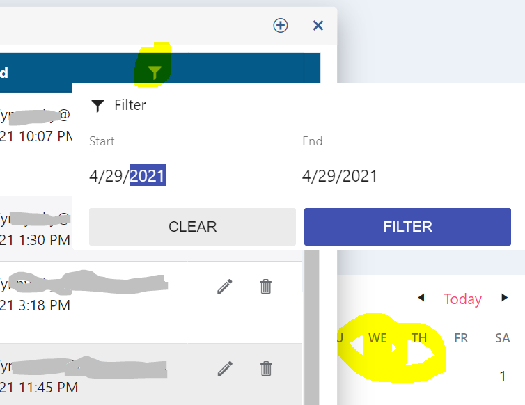
I reported this last week but it got declined ?? Perhaps a picture will help
The default grid displays the filter icon OVER the text and this makes the text unreadable. This is just the material format from your websites themebuilder
The icon should be closer to the column width adjuster - as you can see from the attachment there is more space between the columns than there is text
I would expect it to be "| Description Y |" and not "| Desc... Y |" which is what its doing. (really the space between the filter icon and the column adjusted is just wasted and there seems to be no way to fix it)
I've tried to move the k-i-filter using CSS and while giving it a left margin of 32px is working ok and making it look reasonable, it still has the circle highlighter when you click it in the wrong place and I can't figure out how to move that also.
I see a good solution for angular (PopupSettings.appendTo)
https://www.telerik.com/forums/datepicker-doesn%27t-open-in-ionic-modal#5117655
but blazor only has the PopupClass attribute to work with. Assigning that a class with a large z-index didn't help
It would be helpful if I had a rating control similar to Rating - MudBlazor.
Further it would be helpful if the selected/unselected items could be different visually for colors and icons.
Similar to how TelerikTextBox lets you set a label that moves above the control when filled, TelerikComboBox and TelerikMultiSelect also need this.
Currently you can set a label on TextBox but not some of the other editor controls.
Here is a screenshot comparing the textbox with the combo:
Here is the material UI demo for a combo with this feature:
https://material-ui.com/components/selects/
Hello Team;
I'd would to see an Image & gallery Blazor component that is is data bound with the following effects:
https://ambient-image.wemakesites.net/?ref=madewithvuejs.com
This will allow us to create attractive apps related to imaging and marketing apps.
Thanks!
I would like to suggest couple of helpful features on the OnRowRender event on the grid component. I know these can be done with a custom row template. But if a couple of additional properties would be tacked on to "GridRowRenderEventArgs args", it would be helpful.
- Columns and Cells collection
Would like to override the display of a databound item, but not the underlying data. - Selection
Based on props of the databound item, it would be helpful to disable the ability to select the row.
Hi,
I have seen Form - Auto-Generated sample in Blazor which is nice and handy, but what should I do, if I need to define a Dynamic event by code for a dropdown change for example ?
I might need to define and handle an event for each control that is dynamically generated. I hope someone can help.
Regards
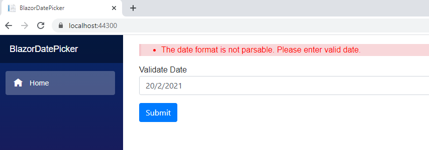
Step by step:
- Clear the date
- Set date using calendar
- Submit form
- Result: Prompt validation message: "The date format is not parsable. Please enter valid date."
- If you write the date manually, this validation message not show and can submit.
Note: The definition of de Datetime is not nulleable.
Screenshot:
Project: Attachment zip file.
I saw that DropDown TreeList is already in the to-do list, but I would like to even extend it by adding MultiSelect feature to it
So basically add MultiSelect but with TreeList inside
Regards
Andrzej
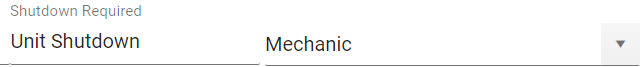
I would like to have the Label property to all input components, like ComboBox, NumericTextBox, all date inputs and pickers and so on. Right now only TextBox have it.
There a hack using HTML labels and CSS to get that but I think it is necessary to unify and not have to deal with two different concepts within the same form.
Input with Label property:
<TelerikTextBox Label="Container Name" @bind-Value="@ContainerSettings.ContainerName"></TelerikTextBox>
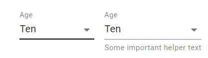
Hack to get same result in other inputs:
<label class="k-label" for="port">
Port <br>
<TelerikNumericTextBox Id="port" Arrows="false" @bind-Value="@ContainerSettings.Port"></TelerikNumericTextBox>
</label>
Wè would like to have the Fluent UI style available for Blazor. We are using the Telerik UI controls in a large project werd the UI has to be very similar to the one of Microsoft D365 Customer Service.
Regards, Henk
.jpg)
Subject says it all. We're porting a large WPF application to Blazor and need WPF Telerik controls with corresponding functionality. One of those controls is the breadcrumb control.
Would need to work in Blazor client or server topologies.