It would be great if touch support could be added to the Blazor carousel component, to make it possible to swipe left and right on mobile devices. Presumably it would also drag left and right with a mouse on laptop/desktop machines.
At the moment the component isn't really usable on a modern website as it does not behave as users expect on mobile devices such as phones and tablets.
Please create clean formatting button. It should work similar to the clean formatting button in the "Send Email" window in this demo https://demos.telerik.com/reporting/dashboard.
When you click the new button, if the text has any formatting (bold, italic, etc.), the formatting will be removed (the text will no longer be bold, italic, etc).
To be considered for implementation as a standalone component or feature of ListView, for example.
The purpose of such component is to provide option for users to reveal contextual actions when they do a swipe gesture on mobile devices. The swiping direction to consider is left and right (up and down are out of scope).
List of possible functionalities for consideration:
- Option to configure menu actions on left and right swipe gesture and define which menu actions will be shown on left and which on right swipe
- Option to use icons in menu items
- Additional customization options for menu items - color, images, custom content
- Configurable number of items for the menu, plus option to define more
- Confirmation of actions (needed for actions related to deleting/removing data)
Please feel free to provide any feedback and share your suggestions on desired functionalities.
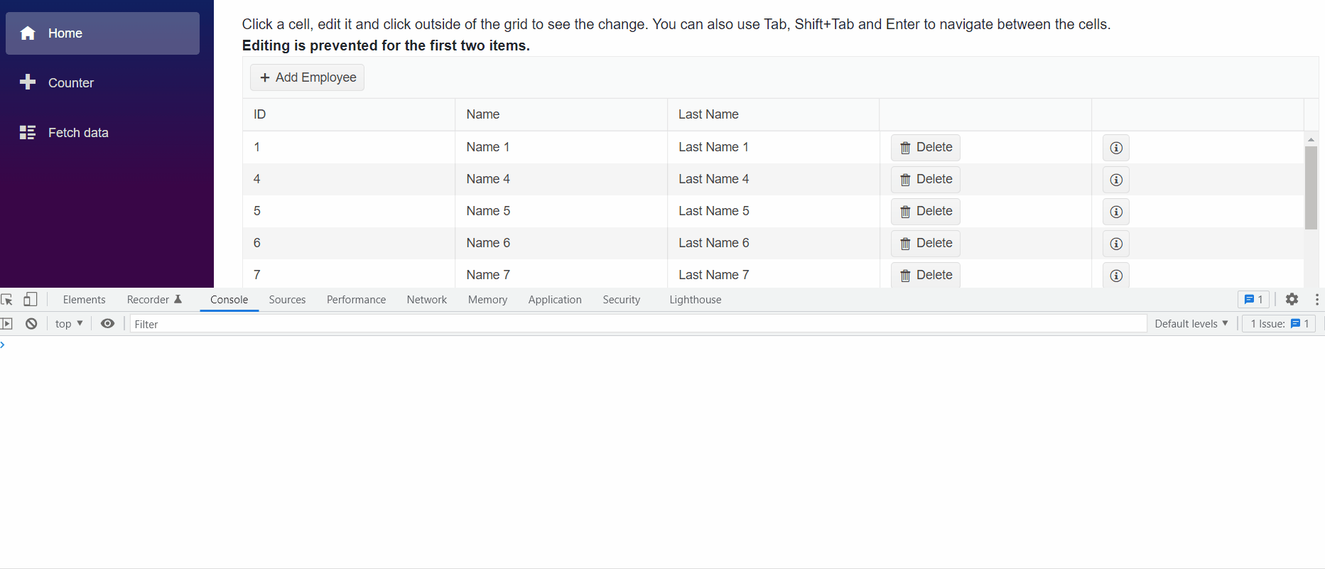
If you are in edit mode using InCell, clicking somewhere else inside or outside the Grid should fire OnUpdate if the item is valid. However, if you click on some customly added element in the Grid (e.g. button, icon, dropdown) this will not fire OnUpdate for a valid item.
In Incell edit, clicking anywhere besides the edited cell should fire OnUpdate for a valid input.
---
ADMIN EDIT
---
A possible workaround for the time being - in the OnClick handler of the custom element get the edited item from the Grid State. Update the item and programmatically close the edit mode.
For example: https://blazorrepl.telerik.com/ccuMGovv08NIX6u544.
The feature request is to be able to define different focused date for the calendar in the picker. The datepickers currently provide automatic focused date based on the selection:
- DateTime.Now if no selection is made
- Selected Date
Hi
Passwords are not yet supported. There is a DataAnotations Datatype for that. So technically this is possible and should not be a big deal. Almost all apps have a password entry somewhere.
Example:
class LoginModel
{
[Required]
[Display(Name = "User Name")]
public string UserName { get; set; }
[Required]
[DataType(DataType.Password)]
[Display(Name = "Password")]
public string Password { get; set; }
}
Annoying because then you have to do the form fields all manually because of the password.
Thanks for considering.
Best regards, Michael
Hi I was wondering if there is a way for us to have the functionality of CloseOnOverlayClick like on Dialogs for the Create/Edit Popup in the TelerikGrid?
I can't seem to find the option within the TelerikGrid -> GridSettings -> GridPopupEditSettings component
Thanks,
Daniel
Greetings,
I am curious if you intend on offering any means of control for the height of an appointment cell within the scheduler. For us it is in the Timeline view with Resources. I have downloaded the source code and implemented the functionality myself and am willing to share my changes. It ultimately performs three functions:
1. Creates a new parameter on the SchedulerTimeViewBase.cs so that it is end user facing.
2. Alters the code in the ContentTableBase.cs to assign the AllDayAppointmentOuterHeight property with this new parameter's value (plus 1).
3. Alters the AppointmentRendererBase.cs to assign the AllDayAppointmentHeight property with this new parameter's value.
Additional changes are necessary to the Models and Interfaces.
We have used the JS version of this for several years and need the additional real estate on the scheduler. This is the only means that I could figure to alter the height as the position of the cells and resource rows are computed on the back end. Any alterations using a CSS class during OnItemRender will produce cells that overlap each other and/or overflow to subsequent rows.
In
<FilterMenuTemplate Context="context">
<TelerikCheckBoxListFilter Data="@NameOptions"
Field="@(nameof(NameFilterOption.Name))"
@bind-FilterDescriptor="@context.FilterDescriptor">
</TelerikCheckBoxListFilter>
</FilterMenuTemplate>
I would like to have a DisplayField or TextField so that i can show the user something meaningful, while still filtering based on IDs behind the scenes?
More details on the concept for custom data: https://docs.telerik.com/blazor-ui/components/grid/filter/checkboxlist#custom-data
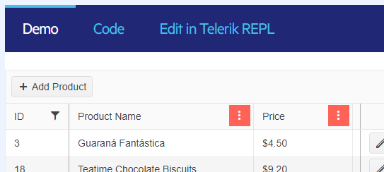
When a column is filtered, I'd like a better visual indicator of that fact.
The solid background to the menu button is not appealing, and it is applied whether a column is sorted or filtered.
The only full-featured Blazor DataGrid | Telerik UI for Blazor
I'd like a distinct indication of whether a column is filtered -- perhaps a filter icon next to the header text similar to how you might see an arrow when sorted.
---
I've attempted to create this myself using OnStateChangedHandler to iterate through the columns and call a Javascript function that finds the right column header and appends a filter icon. It kind of works sometimes, but I'm not sure I'll able to get it working consistently. Even so, it feel like a fragile hack that will probably break in a future update.
Ideally this would be an added feature, but in the meantime is there a way I can accomplish this myself?
QueryableExtensions.ToDataSourceResult throws IndexOutOfRangeException if a DataTable contains deleted rows.
using System.Data;
using Telerik.DataSource;
using Telerik.DataSource.Extensions;

var dt = GetData();

var res = dt.ToDataSourceResult(new DataSourceRequest());

DataTable GetData()
{
    DataTable table = new DataTable();

    // Make sure you specify the correct types
    // If you have any nulls in your (database) Column, you should use nullable type (int?, DateTime?,...)
    table.Columns.Add("ProductId", typeof(int));
    table.Columns.Add("ProductName", typeof(string));
    table.Columns.Add("UnitPrice", typeof(decimal));
    table.Columns.Add("UnitsInStock", typeof(short));

    // You should set default values to the columns that could be skipped in Create/Edit.
    // The alternative approach is to set the default values in the UpdateHandler and/or CreateHandler.

    // Having a default value in this case will prevent having DBNull values in your DataTable, because
    // DBNull is not parsable to any other primitive type and if you pass it to the grid, some of the operations could be broken
    table.Columns["ProductName"].DefaultValue = default(string);
    table.Columns["UnitPrice"].DefaultValue = default(decimal);
    table.Columns["UnitsInStock"].DefaultValue = default(short);

    for (int i = 1; i < 50; i++)
    {
        table.Rows.Add(i, $"Product{i}", i * 5.2, i * 2);
    }

    table.AcceptChanges();

    var lastRow = table.Rows[table.Rows.Count - 1];

    lastRow.Delete();

    return table;
}
I would like a Blazor PropertyGrid with
-- that could be bound to an instance of a custom Type that implemented INotifyPropertyChanged
-- with expandable/collapsible sections with the ability to prevent a user from expanding a collapsed section (e.g. the user lacks privileges to see that section's data)
-- would keep track of its UI state including collapsed sections (similar to the excellent implementation in Telerik's Blazor Grid)
-- that would allow the use of all Telerik Blazor editors as cell-value editors
I am interested in using this component primarily as a data-entry UX in a data-entry-intensive line-of-business application. Such a grid offers standard navigation on all data-entry screens in the application, eliminating tab-order, thereby greatly simplifying the end-user experience. The expanding/collapsing sections make it very economical in its use of screen real-estate. I have used such a component (from a competitor of Telerik) in a WinForms application with excellent results.
Have been pouring through all your release videos, (Great Job Sam, Ed Et Al...) to be better informed as to what project type to select for a new Enterprise Admin App. The FilterView control stood out as a means of potentially saving me more than a week of work, but I just can't see making a new forms app going forward. Blazor and Maui seem like the only logical choices going forward, please add if convenient...
Thanks.
Hi,
is it possible to add control of vertical timeline like this (https://antblazor.com/en-US/components/timeline) with extra features like:
- adding new items with button on top
- inline edit
- item selection
- item actions
I also attached image of what i build based on control from link above, I would like to implement something similar with Telerik.
Maybe you can recommend some other controls to replace it with?
Thank you :)