Hi. Still in the trial phase, and I was curious about this.
I'm trying to develop two apps, one in ASP.NET Core and the other in Blazor WASM.
I found the ASP.NET Core Bottom Navigation which is perfect for the ASP.NET Core project. Shown here.
However, I'd like to be able to show continuity as users transition to the Blazor project and I don't see a BottomNavigation component listed for Blazor.
Is this something that can be added to the Blazor UI tools, or is there an example someplace I can use to get started?
Thanks in advance.
Hi,
If Telerik can, at some point, develop a design tool like the Radzen Design Time, that would really be nice!
Thanks
In
<FilterMenuTemplate Context="context">
<TelerikCheckBoxListFilter Data="@NameOptions"
Field="@(nameof(NameFilterOption.Name))"
@bind-FilterDescriptor="@context.FilterDescriptor">
</TelerikCheckBoxListFilter>
</FilterMenuTemplate>
I would like to have a DisplayField or TextField so that i can show the user something meaningful, while still filtering based on IDs behind the scenes?
More details on the concept for custom data: https://docs.telerik.com/blazor-ui/components/grid/filter/checkboxlist#custom-data
All I ask is to give a way to have a proper working datepicker. Like your javascript datepickers. That doen't care only for right values but for the person that uses it. Telerik was an early adopter in the Blazor ecosystem, I don't know how they haven't yet fixed their datepickers.
You can do this with many ways. I don't know them all but I will propose some here.
- Create a second datepicker component that works properly.
- Put an attribute in the component to work with free-text
- Maybe if this attribute is on you can switch behind between 2 different components
- Find a other solution of your own.
In the end behind the scenes you shouldn't bind the datepicker input in the datetime property but to a sting one. DevExtress has done this right.
This will solve
- Proper user expirience when a user uses the keyboard to edit dates
- Copy-Paste issue
- Clear date parts issue
- all from 30/4/2022 to edit to 31/5/2022 with out having to clear the input
- Strange editing of years (I have an example in the end)
- Allow to have dots or what ever the users want between dates numbers. (e.x. 13.3.2022 )
I this is a trade-off and you will have senarios with wrong inputs and other things, but you already know them from the javascript world, and it's less importand than the aboves.
*Strange editing of years
Lets say that we have the year 1998 19and we want to put 2014.
the users See
-> 1/1/1998
-> 1/1/9982
-> 1/1/9820
-> 1/1/8201
-> 1/1/2014
That's not user friendly, and is very disturbing.
This public feature request:
- Explains how the TelerikRootComponent works.
- Outlines the problems of the current software design in static .NET 8 Blazor apps.
- Measures customer demand for a major change that may possibly resolve the current limitations.
How the TelerikRootComponent Works
Historically, the TelerikRootComponent was designed with the following purposes:
- To host and render all Telerik Blazor popups as RenderFragments. This means that all popups are rendered where the TelerikRootComponent is defined in the application's component hierarchy. In most cases, correct popup position requires the TelerikRootComponent to wrap all the content on the web page. Otherwise the correct position is not guaranteed and this is documented. In addition, the TelerikRootComponent instance is a CascadingValue, which allows it to collect all popup RenderFragments.
- The TelerikRootComponent exposes parameters for global application-wide Telerik settings, such as icon type or RTL support. This is another reason why it makes sense to have a single TelerikRootComponent that wraps all the page content.
Problems and Limitations in .NET 8 Blazor Static Apps
.NET 8 Blazor apps with "Per Component" interactivity location create a big challenge for the above state of affairs:
- Cascading values do not pass across render mode boundaries. .NET 8 includes a new feature for passing cascading values to interactive components (builder.Services.AddCascadingValues()), but this mechanism does not support passing of RenderFragments, because they are not JSON serializable. This brings the requirement that the TelerikRootComponent is part of an interactive component hierarchy.
- When the TelerikRootComponent is in a non-layout .razor file, it triggers more re-renders than normally. They are related to internal MediaQuery instances and all popups, which the root component manages.
So, developers who work with a globally static app with specific interactive components ("islands of interactivity") may need to:
- Place the TelerikRootComponent somewhere inside the component hierarchy, so it can't wrap all the page content. This will lead to wrong popup position.
- Use multiple TelerikRootComponents. This requires to define the same parameters for each TelerikRootComponent instance.
Next Steps
All developers who develop static .NET 8 Blazor apps with "Per Component" interactivity location:
- Please vote for this feature request, so that we can measure how many customers are affected by the described limitations.
- Post here and describe:
- Why do you need to use apps with "Per Component" interactivity.
- Your specific challenges with the current TelerikRootComponent setup.
I'd like at least a linear gauge
*** Thread created by admin on customer behalf ***
I would really be happy to see your WPF Diagram Control (https://www.telerik.com/products/wpf/diagrams.aspx) ported to Blazor.
Do you have any plans to do so?
I would like to add inline styles to different elements across the components, for example - the Grid Rows and Cells.
<AdminEdit>
The implementation of this might be by adding an args.InlineStyles (this is a sample name, it might not be the same when this is implemented) like the args.Class for the OnRow and OnCellRender events for the Grid.
</AdminEdit>
Telerik.DataSource.Extensions ToDataSourceResultAsync (https://docs.telerik.com/blazor-ui/api/Telerik.DataSource.Extensions.QueryableExtensions) should support Cancellation token as well as https://docs.telerik.com/aspnet-mvc/api/Kendo.Mvc.Extensions/QueryableExtensions.
It would be useful.
Greetings,
I am curious if you intend on offering any means of control for the height of an appointment cell within the scheduler. For us it is in the Timeline view with Resources. I have downloaded the source code and implemented the functionality myself and am willing to share my changes. It ultimately performs three functions:
1. Creates a new parameter on the SchedulerTimeViewBase.cs so that it is end user facing.
2. Alters the code in the ContentTableBase.cs to assign the AllDayAppointmentOuterHeight property with this new parameter's value (plus 1).
3. Alters the AppointmentRendererBase.cs to assign the AllDayAppointmentHeight property with this new parameter's value.
Additional changes are necessary to the Models and Interfaces.
We have used the JS version of this for several years and need the additional real estate on the scheduler. This is the only means that I could figure to alter the height as the position of the cells and resource rows are computed on the back end. Any alterations using a CSS class during OnItemRender will produce cells that overlap each other and/or overflow to subsequent rows.
The feature request is to be able to define different focused date for the calendar in the picker. The datepickers currently provide automatic focused date based on the selection:
- DateTime.Now if no selection is made
- Selected Date
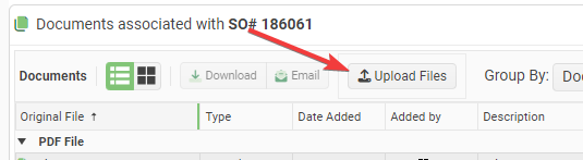
It is impossible to customize the Text and Icon for the Telerik Upload Blazor Component. It always sans "Select Files". This is not easy to see at a glance.
Requests:
- Add a Title attribute to the upload component that lets you change the text from the default "Select Files".
- Add the ability to set the Icon on the upload button.
Proposed Code:
<TelerikUpload Title="Upload Files" Icon="@SvgIcon.Upload" ... />I had to write some hacky JavaScript interop to accomplish this:
function setTelerikUploadButtonText(text) {
// Finds all the telerik blazor upload components on the page and changes the text of the upload button.
let replaced = 0;
const defaultText = "Upload";
// Find all the buttons with class "k-upload-button". There should be one for each upload component.
const buttons = document.getElementsByClassName("k-upload-button");
for (let i = 0; i < buttons.length; i++) {
// Find the span with class "k-button-text" and change its text.
const spans = buttons[i].getElementsByClassName("k-button-text");
if (spans.length > 0) {
// Add horizontal padding to the span.
spans[0].classList.add("px-2");
// Change the text.
spans[0].innerHTML = text ?? defaultText;
// Insert a font awesome icon.
spans[0].insertAdjacentHTML('afterbegin', '<i class="fas fa-upload"></i> ');
// Track how many buttons were updated.
replaced++;
}
}
console.info("setTelerikUploadButtonText: " + replaced + " buttons updated.");
return replaced;
}/// <summary>
/// Finds all the telerik blazor upload components on the page and changes the text of the upload button.
/// </summary>
/// <returns>The number of upload components button text that were found & replaced.</returns>
public static async Task SetTelerikUploadButtonText(this IJSRuntime jSRuntime,
string text = "Upload Files")
{
await jSRuntime.InvokeVoidAsync("setTelerikUploadButtonText", text);
}
Screenshot:
Is there any scope to add a Blazor Ranged Bar/Column Chart component as seen in other products:
- Telerik Web Forms Range Column Chart - RadHtmlChart - Telerik UI for ASP.NET AJAX
- Demo of core features in jQuery Range Bar Charts widget | Kendo UI for jQuery (telerik.com)?
We attempted to work around this by adding an invisible stacked series underneath our dataset. However, without the Ability to customize the highlighted/hovered series item (telerik.com), we are not able to effectively hide the invisible series from the user. We will have to fall back into the jQuery Kendo UI components once again. Alternatively, are there any other known work arounds to achieve this in Blazor?
Telerik UI for Blazor requires unsafe-inline styles in order to render style attributes from the .NET runtime.
Please add support for strict CSS CSP without the need for unsafe inline styles.
===
TELERIK EDIT:
Due to the complexity and required effort to add strict CSS CSP support:
- The feature request must gather enough votes.
- We may implement it gradually. That's why, everyone who is interested, please specify the exact components and features that you need to be compliant sooner.