.jpg)
Hi Telerik,
I have been using MudBlazor for my latest project (smaller one), but we are scaling up for another larger project now and are looking at the Telerik UI for Blazor.
Does Telerik UI for Blazor have an equivalent to the MudBlazor AppBar, an application wide top bar which is persistent through out the application life cycle?
Its able to contain other controls ie drawer icon, login/out button, spacers etc.
PS: See attached screen dump of the app bar.
Best regards
Ulrik
I would like to use scaffolding with Telerik UI for Blazor
**Admin Edit**
The plan is to be released in 3.3.0 release once extensions are thorougly tested.
**Admin Edit**
We’ve the use case of an editable combo-box and until now, we used to it with a textbox and a gridview to achieve this with your components.
Looking for feature parity with - https://www.telerik.com/kendo-react-ui/components/grid/data-operations/odata-server-operations/
ADMIN NOTE: The goal is to expose a method like args.Request.ToODataString() for the grid OnRead event, so you can pass this on to a service so it knows the grid state (page size, current page, filtering,..). The grid will still expect the total of items and the current page of data to be set in the local fields.
Our grids / drop downs / comboboxes pull 1000s of items, resulting in JSON of 20mb+ if we pull all of the elements to the client. The OData server operations have greatly reduced what we send over the wire, and have worked amazing well in our current React application. Would love to have the same capability for Blazor client side. We are treating Blazor as a client side replacement for React/Redux, we do not want to run Server Side Blazor.
I'd like to request a native Blazor Image Component that allows to provide different parameters to control the image.
This could also help to connect it to the upload component, for user to see the image while still in browser and make some changes, i.e resizing, cropping, Black/White, before sending it to server to be stored.
Thanks!
..Ben
Hi,
Firstly, love what you're doing with your Blazor components. I'd like to be able to add custom style to your components. For example
<TelerikTextBox Style="margin-left: 20px" />
Now of course we should be using a class for this and I know your components have a Class parameter, however what I'd like to do is something like this
<TelerikTextBox Style="@CssHelper.Margin.Top(20)" />
where the style is generated at runtime. I'm experimenting with such an approach to apply all styles, however I can't do so with a lot of your controls. Having said that, I've noticed that your animation container does have something along these lines with its ParentInlineStyle parameter.
        <TelerikAnimationContainer @ref="@AnimationContainer"
                                   Top="-72px" Left="calc(100% - 280px)" Width="300px"
                                   AnimationType="AnimationType.SlideDown"
                                   Class="k-popup"
                                   ParentInlineStyle="@Style">
So just wondering if this is something you're looking at doing?
thanks
Michael.
I'd like to use the adaptive rendering but I also need to keep AllowCustom feature.
===
ADMIN EDIT
===
This request applies to all components that support AllowCustom feature and adaptive rendering: for example, ComboBox, MultiColumnComboBox.
Telerik.Blazor.Components.TelerikSwitch`1[System.Boolean] requires a value for the 'ValueExpression' ValueExpression is provided automatically when using 'bind-Value'
This error occurs when the component is used with the EditForm component.
In
<FilterMenuTemplate Context="context">
<TelerikCheckBoxListFilter Data="@NameOptions"
Field="@(nameof(NameFilterOption.Name))"
@bind-FilterDescriptor="@context.FilterDescriptor">
</TelerikCheckBoxListFilter>
</FilterMenuTemplate>
I would like to have a DisplayField or TextField so that i can show the user something meaningful, while still filtering based on IDs behind the scenes?
More details on the concept for custom data: https://docs.telerik.com/blazor-ui/components/grid/filter/checkboxlist#custom-data
I would like to add inline styles to different elements across the components, for example - the Grid Rows and Cells.
<AdminEdit>
The implementation of this might be by adding an args.InlineStyles (this is a sample name, it might not be the same when this is implemented) like the args.Class for the OnRow and OnCellRender events for the Grid.
</AdminEdit>
I'd like at least a linear gauge
*** Thread created by admin on customer behalf ***
Is there any scope to add a Blazor Ranged Bar/Column Chart component as seen in other products:
- Telerik Web Forms Range Column Chart - RadHtmlChart - Telerik UI for ASP.NET AJAX
- Demo of core features in jQuery Range Bar Charts widget | Kendo UI for jQuery (telerik.com)?
We attempted to work around this by adding an invisible stacked series underneath our dataset. However, without the Ability to customize the highlighted/hovered series item (telerik.com), we are not able to effectively hide the invisible series from the user. We will have to fall back into the jQuery Kendo UI components once again. Alternatively, are there any other known work arounds to achieve this in Blazor?
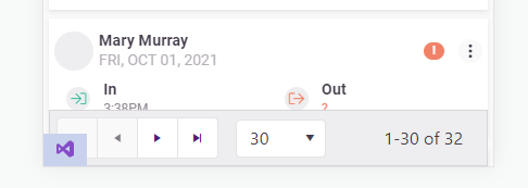
Allow "items per page" and "1 - X of Y items" on the pager configurable or even allow them to be hidden/removed.
On mobile devices the telerik pager takes up too much room and needs to be more responsive. I'm already aware of this feature request: https://feedback.telerik.com/blazor/1442883-responsive-layout-for-the-pager
But I would like to take it a step further and be capable of customizing/removing the text.
Add the following Parameters to the TelerikPager:
[Parameter] public bool ShowItemsPerPageText { get; set; } = true;
[Parameter] public bool ShowXofYItemsText{ get; set; } = true;
<TelerikPager ShowItemsPerPageText="false" />
<TelerikPager ShowXofYItemsText="false" />
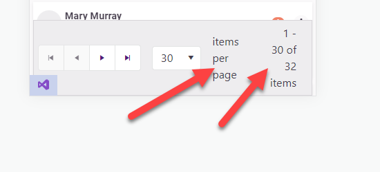
In my opinion this looks better
==============
ADMIN EDIT
==============
In the meantime, you can change the pager text through localization. It is important to keep the same number of placeholders, however, so that the string.Format() call it is used in will not throw.
This strings are behind the following keys:
- "items per page" - key: "Pager_ItemsPerPage"
- "1 - X of Y items" - key: "Pager_Display" . Default value is "{0} - {1} of {2} items".
Hi,
If Telerik can, at some point, develop a design tool like the Radzen Design Time, that would really be nice!
Thanks