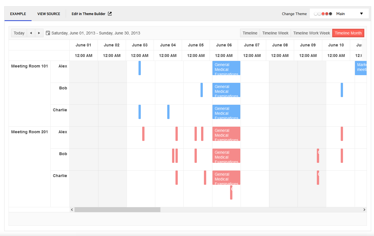
If I specify "SortMode.Mixed" for a Grid's "SortMode" (via the .Sortable fluent method), the sort mode in the JavaScript initializer is set to "multiple" instead. This can even be seen on the MVC Demo page here: https://demos.telerik.com/aspnet-mvc/grid/sorting (the "mixed" demo behaves just like "multiple").
In the Kendo MVC source code for 2022.1.301, the GridSortableSettings.Serialize method appears to use the following logic:
if (SortMode != GridSortMode.SingleColumn)
{
    json["mode"] = "multiple";
}Hi Team,
I would like to request the functionality to configure the FilterDescriptor's Member as a List rather than a field.
Thank you!
Hello,
During the completion of my ticket (1556993) it was suggested I request a feature and explain its purpose.
The a large grants accounting system I've built, management has requested the ability to control access to, and apply permission upon pages and features within the site.
For example, in the Federal Grants page with a grid using popup template editor, I need to limit display of the default create button, while displaying the rest of the toolbar.
Similarly, I to limit display of the edit and delete buttons individually.
I'm applying such constraints using custom roles with user membership in each roles.
Bug report
A regression introduced in R1 2022.
Reproduction of the problem
Reproducible with the RadioButton and RadioButtonFor helpers.
@Html.Kendo().RadioButton().Name("HealthA1").Label("Yes").Value(true).HtmlAttributes(new { id = "HealthA1_True" })
@Html.Kendo().RadioButton().Name("HealthA1").Label("No").Value(false).HtmlAttributes(new { id = "HealthA1_False" })
Current behavior
The rendering is broken: no label element is rendered, the Kendo classes are not applied to the input.
Expected/desired behavior
The RadioButton renders properly.
Environment
- Kendo UI version: 2022.1.301
- jQuery version: x.y
- Browser: [all]
When we are managing large volumes of data with several thousand datasource objects (grid rows) all of the rows need to be transported with each event.
This leads to errors with the json being too large to serialize.
We wish to restrict the data footprint and only return data for the page requested.
so if the grid has 100 pages and page size is 10 we only want to return the 10 rows required for the page, not 1000 rows.
This is not possible with the Kendo grid.
To work around this issue we have devised a strategy to return the the number of datasource objects Kendo grid expects up to the requested page count, but they are empty objects with no data, and then only have the last 10 rows populated with data.
It would be better for the grid control just to expect the number of results expected to the selected page and not have to add the dummy rows, so long as the total number of rows is provided so that the grid knows how many pages there are.
Our work around looks something like this in asp.net MVC
var users = cm.getUsers();
var result = new DataSourceResult();
var results = new List<user>();
int index = 0;
if (pageNum == 1)
results = users.Take(pageSize).ToList();
else
{
index = pageSize * (pageNum - 1);
results = users.Skip(index).Take(pageSize).ToList();
}
List<user> output = null;
[This is the bit that should be handled by the kendo grid, without the need for dummy rows to further reduce json size]
if (index == 0)
{
output = new List<user>(results);
}
else
{
output = new user[index].ToList();
output.AddRange(results);
}
result = output.ToDataSourceResult(request);
result.Total = users.Count();
return Json(result, JsonRequestBehavior.AllowGet);
With the latest 2022 release, the grid toolbar seems to be rendering buttons incorrectly. It is generating them with k-button and k-button-icontext classes only on them. I don't 100% know this is wrong, but i expected them to render with k-button-solid-base and k-rounded-md classes, and i'm pretty sure i saw docs saying the icontext is not used anymore.
Note: this is about the mvc wrapper.
I'm not sure if this is a bug but if you leave the size off of a column, it stretches to fill the remaining area. However I discovered that this does NOT happen if you lock one of your columns. If you do this, the column doesn't render at all.
Bug report
Regression introduced in R1 2022.
Reproduction of the problem
Reproducible in the demo: https://demos.telerik.com/aspnet-mvc/grid/search-panel
Current behavior
There is a difference in the rendering of the search panel.
MVC:
<span class="k-textbox k-grid-search k-display-flex">
    <input autocomplete="off" class="k-input" placeholder="Search..." title="Search..." type="text">
    <span class="k-input-icon">
       <span class="k-icon k-i-search"></span>
    </span>
</span>
Kendo UI for jQuery and Core:
<span class="k-searchbox k-input k-input-md k-rounded-md k-input-solid k-grid-search">
    <span class="k-input-icon k-icon k-i-search"></span>
    <input autocomplete="off" placeholder="Search..." title="Search..." class="k-input-inner">
</span>
As a result, in MVC the search panel's magnifying glass is displayed outside the input.
Additionally, the search panel's appearance in Kendo UI for jQuery and Core is different than the one in the previous versions. In R3 2021, the input is positioned on the left hand side of the Grid's toolbar and the magnifying glass appears at the right end of the input. In R2 2022, the input is positioned on the right side of the toolbar and the magnifying glass is displayed at the beginning of the input.
R3 2021 dojo
R1 2022 dojo
Expected/desired behavior
Positioning of the input within the toolbar and the magnifying glass icon within the input, to be as in R3 2021.
Environment
- Kendo UI version: 2022.1.119
- jQuery version: x.y
- Browser: [all]
Hello community,
We would like to have the option / ability to apply accent insensitive filtering/searching for every control gives the ability to control, like grids, treelists, dropdownlists e.t.c.
For example, when using grid column filtering, if we have a data entry like 'Μόδεστος' in a column, we could retrieve this data entry by giving the following terms:
'μοδεσ' should return data entry, now doesn't
'μοδεστος' should return data entry, now doesn't
'ΜΟΔΕΣ' should return data entry, now doesn't
This case I am giving, takes cares only for " ΄ " accent diacritic, but should apply for all diacritic, e.g 'προϊόντων', should return by searching for term like 'προιον'
I believe that that should be the default case, such as now ignoreCase does.
Thank you,
AGGELIKI
The columns widths do not match the header and are slightly off, and after enough columns it is half a column out.
Bug report
Not reproducible with Sass themes.
Reproduction of the problem
https://dojo.telerik.com/ejaVeZUD/7
Current behavior
Map custom markers are not positioned correctly when zooming out using 'Less' themes
Expected/desired behavior
Markers are positioned correctly when zooming out.
Environment
- Kendo UI version: 2021.3.1109
- jQuery version: x.y
- Browser: [all]
EditorViewData does not work for popup edit mode. But there are situations where we need to pass view data for a specific editor, like we can in InCell and InLine edit modes. Unfortunately there is currently no easy way to do this.
It has been suggested to use AdditionalViewData or create a custom popup editor, but AdditionalViewData values would be the same for each widget inside the popup editor, and creating a custom popup editor for each and every grid we use would be cumbersome. So I ask that you please seriously consider this feature request.
-Steven
Consider implementing logic that strips js comments from the Kendo templates.
If the following js function is added into the Grid's custom popup editor:
<script>
	//some comment
	(function () {
		alert(1)
	})();
</script>A possible workaround is to use the following comment syntax:
<script>
	/*some comment*/
	(function () {
		alert(1)
	})();
</script>
<script>
    //my amazing function|
function() {
  var x = 0;
  doSomething();
}
Your grid will "minify" this into a single line when including the popup code as an editor template. This will break everything because javascript will treat everything after the double-slashes as a comment, which means the entire popup is now gone.
This has been an ongoing issue for years and we expected that your code would someday be smart enough to strip comments when minifying the popup (which minifying is supposed to do anyway) or perhaps convert them so they open and close.
Note: I realize it's not really a "minify" since it keeps the same variables but it's about as well as i can describe what's going on.
The requested solution is simply to strip comments out when pulling in the custom popup editor, as they are pretty much useless when the entire popup is in a single line anyway.
Add Japanese to the supported cultures and provide the respective resources with localized messages:
https://docs.telerik.com/aspnet-mvc/globalization/localization#setting-the-current-language
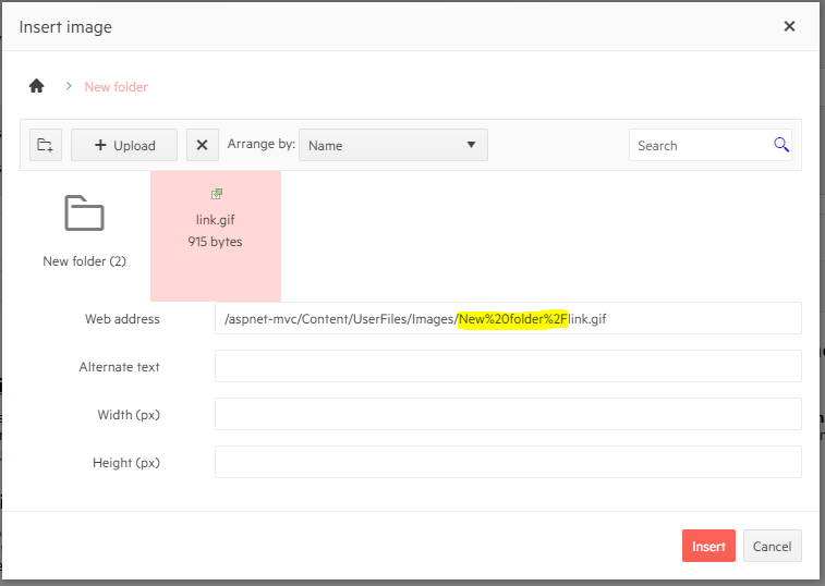
Editor => Imagebrowser path for subfolder is url-encoded
if a picture from a subfolder is selected, the generated image-url is encoded for the subpath
encoding may be usefull, but not for the path separator
Hi
can you please enable column resizing for multicolumnbombo box popup grid.
thanks
regards
Hassan
Hi Team,
I would like to integrate editors based on UIHint for specific fields within my Form/Wizard. If it is achievable, please update documentation/demos with an example.
Thank you!


