When you configure RadHtmlChart's YAxis with NarrowRange set to true, the setting is not serialized and as a result, not applied.
You can avoid it by setting the narrowRange on the client-side:

		<telerik:RadHtmlChart runat="server" ID="RadHtmlChart1" Width="250px" Height="300px">
			<ClientEvents OnLoad="chartLoad" />
			...
		</telerik:RadHtmlChart>
		<script>
			function chartLoad(){
				var chart = $telerik.$("#RadHtmlChart1").data("kendoChart");
				chart.options.valueAxis.narrowRange = true;
			}
		</script>
If you set in code behind CharTitle with simple Quote like
RadChart1.ChartTitle.Text = "Présences sur l'année sélectionnée";
you obtain a blank space chart (nothing display)

you have to set for running
RadChart1.ChartTitle.Text = "Présences sur l'année sélectionnée";
The contrast between the colors for the background and the text in the Tooltip of the Chart series is very low (dark background and black text). https://www.screencast.com/t/fhx6937j

The problem is most obvious in the Outlook, Simple, Web20 and Sunset skins.

Workaround would be  setting the Color property for the ToolTipAppearance to White
We want the Kendo chart widget (RadHtmlChart actually) to blend in with the webpage we use it in. In this page, we use font-weight 300. Since there is no way to specify the font-weight in the chart, we have had to use a hack to specify it:
function chartLoad(chart, args) {
chart.get_kendoWidget().setOptions({ title: { font: "20px sans-serif; font-weight: 300" }});}
This is not only a clumpsy hack, but it also make use of a custom skin impossible (for setting the font).
I have an htmlchart using a scatter series and a radgrid, on the grid row hover event I call the below javascript function to show the relevant tooltip for the plotted point matching the id of the grid row.
function showToolTip(eventArgs, chart, plotXvalue, plotYvalue) {var chart = $telerik.findControl(document, chart);
var widget = chart.get_kendoWidget();
widget.showTooltip(function (point) {
var gridID = eventArgs.getDataKeyValue("Id");
var key = "ID";
var mypoint = point.value.x == eventArgs.getDataKeyValue(plotXvalue) && point.value.y == eventArgs.getDataKeyValue(plotYvalue) && point.dataItem[key] == gridID;
if (!mypoint) {
widget.hideTooltip();
}
return mypoint;
})
};
This all works well, however I would like to also highlight the plotted point that the tooltip relates to, the same effect as the mouse over on the point within the chart.
Currently, the HighlightAppearance of the Series does not have a property that controls the InactiveOpacity:
As a temporary workaround, this can be set through the options in the OnKendoWidgetInitializing event:
<script>
    function OnKendoWidgetInitializing(sender, args) {
        var series = args.series[0]
        series.highlight = series.highlight || {};
        series.highlight.inactiveOpacity = 0.2
    }
</script>
<telerik:RadHtmlChart ID="RadHtmlChart5" runat="server" BorderColor="Fuchsia" BorderStyle="Solid" BorderWidth="1px">
    <ClientEvents OnKendoWidgetInitializing="OnKendoWidgetInitializing" />
    <PlotArea>

        <Series>
            <telerik:PieSeries StartAngle="90">
                <%-- This is how it should be configured after the feature request --%>
                <%--<HighlightAppearance InactiveOpacity="0.2" />--%>

                <SeriesItems>
                    <telerik:PieSeriesItem Name="Slice1" Y="60"></telerik:PieSeriesItem>
                    <telerik:PieSeriesItem Name="Slice2" Y="40"></telerik:PieSeriesItem>
                </SeriesItems>
            </telerik:PieSeries>
        </Series>
    </PlotArea>
</telerik:RadHtmlChart>
Test Environment:
OS: Windows_11Browser: Version 103.0.1264.71 (Official Build) (64-bit)
Voice access: Voice Access
Repro Steps:
1. Open URL: https://docs.telerik.com/devtools/aspnet-ajax/controls/chart/understanding-radchart-types/bar-charts page in Edge Browser.
2. Navigate the Graph under the Bar chart section.
3. Observe that Voice Access Numbers are not showing for bar graphs in reports.
Actual Results:
Voice Access Numbers are not showing for bar graphs.
Expected Results:
Voice Access Numbers should be showing for bar graphs.
Hi , help to change the RadChart To RadHtmlChart for line chart series , below is the existing code used RadChart . i need to update to RadHtmlChart
hartAnalysis_BLL objBLL = new ChartAnalysis_BLL();
DataTable dt = objBLL.GetMonthlySSMTotalQuantityImported(arrParameters);

// Create new chart
RadChart2.ChartTitle.TextBlock.Appearance.TextProperties.Font = new System.Drawing.Font(RadChart2.ChartTitle.TextBlock.Appearance.TextProperties.Font.FontFamily, 11, System.Drawing.FontStyle.Bold);
RadChart2.ChartTitle.TextBlock.Text = "Extended Monthly SSM Total Quantity Imported \n(" + ssm[0] + ")";
RadChart2.Width = AppConstants.CONST_CHART_WIDTH;
RadChart2.ChartTitle.Visible = true;
RadChart2.Chart.DefaultType = ChartSeriesType.Line;
RadChart2.PlotArea.Appearance.Dimensions.Margins.Left = Telerik.Charting.Styles.Unit.Percentage(10);
RadChart2.PlotArea.Appearance.Dimensions.Margins.Right = Telerik.Charting.Styles.Unit.Percentage(15);
RadChart2.PlotArea.Appearance.Dimensions.Margins.Bottom = Telerik.Charting.Styles.Unit.Percentage(30);

RadChart2.DataManager.ValuesXColumn = "Date";
RadChart2.DataManager.ValuesYColumns = new string[1] { "SSM Quantity" };
RadChart2.IntelligentLabelsEnabled = true;
RadChart2.DataSource = dt;
RadChart2.DataBind();
RadChart2.Skin = AppConstants.CONST_TELERIK_CHARTSKIN;

RadChart2.PlotArea.XAxis.Clear();
RadChart2.PlotArea.XAxis.IsZeroBased = false;
RadChart2.PlotArea.XAxis.AutoScale = false;
RadChart2.PlotArea.XAxis.Appearance.ValueFormat = ChartValueFormat.ShortDate;
RadChart2.PlotArea.XAxis.Appearance.CustomFormat = "MMM yy";
RadChart2.PlotArea.XAxis.AxisLabel.Visible = true;
RadChart2.PlotArea.XAxis.AxisLabel.TextBlock.Text = "Month \n(" + AppFunctions.GetDisclaimer() + ")";
RadChart2.PlotArea.XAxis.AxisLabel.TextBlock.Appearance.TextProperties.Color = System.Drawing.Color.Black;
RadChart2.PlotArea.XAxis.Appearance.LabelAppearance.RotationAngle = -45;

RadChart2.PlotArea.YAxis.AxisLabel.Visible = true;
RadChart2.PlotArea.YAxis.AxisLabel.TextBlock.Text = "Total Quantity of SSM Imported (" + dt.Rows[0]["UOM"] + ")";
RadChart2.PlotArea.YAxis.AxisLabel.TextBlock.Appearance.TextProperties.Color = System.Drawing.Color.Black;

RadChart2.Series.GetSeries(0).Appearance.PointMark.Dimensions.Width = 1;
RadChart2.Series.GetSeries(0).Appearance.PointMark.Dimensions.Height = 1;
RadChart2.Series.GetSeries(0).Appearance.PointMark.FillStyle.MainColor = System.Drawing.Color.Black;
RadChart2.Series.GetSeries(0).Appearance.PointMark.FillStyle.FillType = FillType.Solid;
RadChart2.Series.GetSeries(0).Appearance.PointMark.Visible = true;
RadChart2.Series.GetSeries(0).Appearance.LineSeriesAppearance.Color = System.Drawing.Color.Orange;
RadChart2.Series.GetSeries(0).Appearance.LineSeriesAppearance.Width = 3;

int intYear = dt_SelDateFrom.Year;
int intMonth = dt_SelDateFrom.Month;
DateTime start = new DateTime(intYear, intMonth, 1);
TimeSpan ts = dt_SelDateTo - dt_SelDateFrom;
int intMthDiff = Convert.ToInt32(Math.Ceiling((ts.TotalDays / 30)));

for (int i = 0; i < intMthDiff; i++)
{
    ChartAxisItem item = new ChartAxisItem();
    item.Value = (decimal)start.AddMonths(i).ToOADate();
    RadChart2.PlotArea.XAxis.AddItem(item);
}

DataTable dt_avg = objBLL.GetSSMTotalImportedLastYearAverage(arrParameters);

// Define chart series
ChartSeries avg_series = new ChartSeries();
avg_series.Appearance.LabelAppearance.Visible = false;
avg_series.Name = "Last Year Average";
avg_series.Type = ChartSeriesType.Line;
avg_series.Appearance.PointMark.Dimensions.Width = 1;
avg_series.Appearance.PointMark.Dimensions.Height = 1;
avg_series.Appearance.PointMark.FillStyle.MainColor = System.Drawing.Color.Black;
avg_series.Appearance.PointMark.FillStyle.FillType = FillType.Solid;
avg_series.Appearance.PointMark.Visible = true;
avg_series.Appearance.LineSeriesAppearance.Color = System.Drawing.Color.Red;

foreach (DataRow row in dt_avg.Rows)
{
    foreach (DataColumn col in dt_avg.Columns)
    {
        Decimal dec_data = Convert.ToDecimal(row[col]);
        Double dbl_data = Convert.ToInt32(dec_data);
        avg_series.AddItem(dbl_data);
    }
}

RadChart2.AddChartSeries(avg_series);

ArrayList arrParameterBaseline = new ArrayList();
arrParameterBaseline.Add(dt_SelBaselineFrom);
arrParameterBaseline.Add(dt_SelBaselineTo);
arrParameterBaseline.Add(dt_SelSSMSeqID);
SqlDataReader dr_baseline = objBLL.GetSSMTotalImportedBaseline(arrParameterBaseline);

ChartSeries baseline_series = new ChartSeries();
baseline_series.Appearance.LabelAppearance.Visible = false;
baseline_series.Name = "Baseline Average";
baseline_series.Type = ChartSeriesType.Line;
baseline_series.Appearance.PointMark.Dimensions.Width = 1;
baseline_series.Appearance.PointMark.Dimensions.Height = 1;
baseline_series.Appearance.PointMark.FillStyle.MainColor = System.Drawing.Color.Black;
baseline_series.Appearance.PointMark.FillStyle.FillType = FillType.Solid;
baseline_series.Appearance.PointMark.Visible = true;
baseline_series.Appearance.LineSeriesAppearance.Color = System.Drawing.Color.Chartreuse;

Double dbl_baseline = 0;

if (dr_baseline == null)
{
    dbl_baseline = 0;
}
else
{
    try
    {
        while (dr_baseline.Read())
        {
            if (dr_baseline["TotalImportedBaseline"] == DBNull.Value)
                dbl_baseline = 0;
            else
            {
                Decimal dec_baseline = dr_baseline.GetDecimal(dr_baseline.GetOrdinal("TotalImportedBaseline"));
                dbl_baseline = Convert.ToDouble(dec_baseline);
            }
        }
    }
    catch (Exception ex)
    {
        AppFunctions.SetMessageError(this.Page, AppConstants.CONST_ERROR_LOAD_CHART);
        AppFunctions.ErrorLog(ex);
    }
    finally
    {
        if (dr_baseline != null)
        {
            dr_baseline.Close();
            dr_baseline.Dispose();
        }
    }
}

for (int i = 0; i < intMthDiff; i++)
{
    baseline_series.AddItem(dbl_baseline);
}

RadChart2.AddChartSeries(baseline_series);

Panel1.Controls.Add(RadChart2);

}
catch (Exception ex)
{
    AppFunctions.SetMessageError(this.Page, AppConstants.CONST_ERROR_LOAD_CHART);
    AppFunctions.ErrorLog(ex);
}
I am struggling with setting the BackgroundImage on a series item in RadChart control. The problem i am having is, the background image works fine in my local environment, and on our Dev and QA server. Note the down arrow background images below.
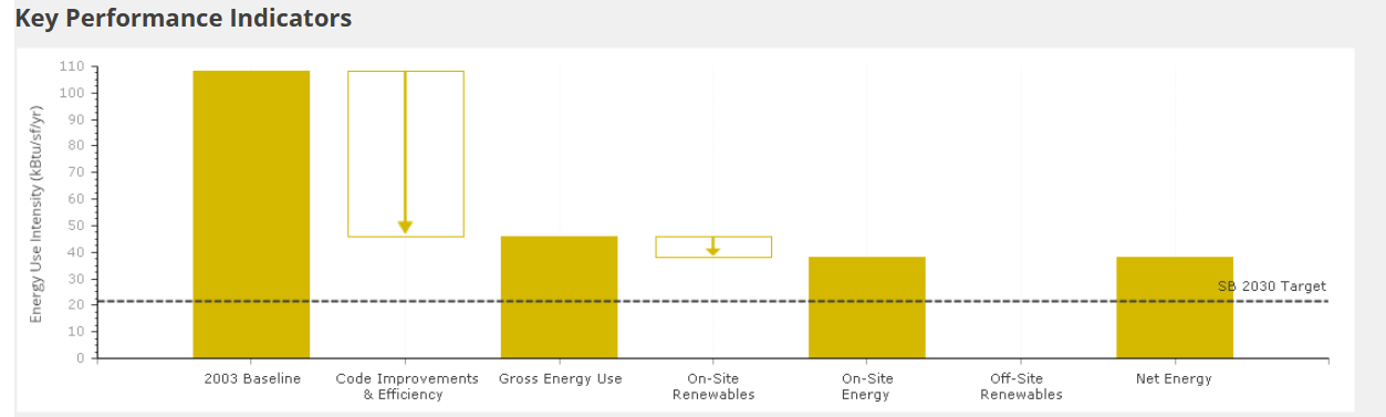
It does not, however work in our demo or production environments. It is running the same code in the a very similar environment. I ensured that the files are present on the server. It just doesn't seem to want to load them.
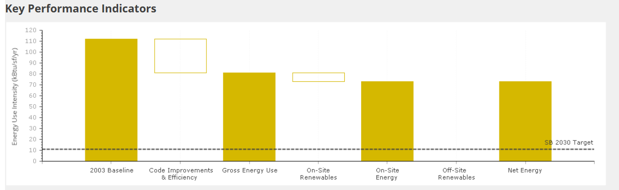
Hoping you can provide some insights.
Thanks
After upgrading to Telerik UI for ASP.NET AJAX 2026 Q1 (2026.1.211.462) the HtmlChart Sparkline cannot initialize.
The demo page loads, but the chart is empty and the component is not usable.
The browser console shows a JavaScript initialization failure originating from the Telerik scripts.
The first error thrown is:
Uncaught ReferenceError: kendo is not defined
at Telerik.Web.UI.WebResource.axd...
Immediately after that a second error appears:
Uncaught TypeError: kendo.jQuery(...).kendoSparkline is not a function
The second error is a cascade failure because the Kendo widgets are never registered due to the first error.