Currently, when the grid is set to:
<ClientSettings EnablePostBackOnRowClick="true">The post back will be fired even if the clicked row is already selected, which sometimes is not good.
To solve this we need to write a javascript event on rowclick to cancel the event if the row is already selected, but it will be nice to have this as a built in setting like
<ClientSettings EnablePostBackOnRowClick="true" PostBackOnRowClickOnSelectedRow="false">Thanks,
ilan.
Pasting plain text content from notepad or other text editor into the RadEditor control (design view) results in container HTML tags adding to the content and inline styles that make the text unreadable.
Content pasted:
Lorem ipsum dolor sit amet, consectetur adipiscing elit, sed do eiusmod tempor incididunt ut labore et dolore magna aliqua. Ut placerat orci nulla pellentesque dignissim enim sit. Diam quam nulla porttitor massa id neque. Ipsum suspendisse ultrices gravida dictum fusce ut. Sed odio morbi quis commodo odio aenean. Sed faucibus turpis in eu mi bibendum neque egestas congue. Sed pulvinar proin gravida hendrerit. Cras semper auctor neque vitae tempus. Nisi porta lorem mollis aliquam ut porttitor leo a diam. Quis vel eros donec ac odio tempor. Tellus in metus vulputate eu scelerisque felis imperdiet proin. Et ligula ullamcorper malesuada proin libero nunc consequat interdum. Neque viverra justo nec ultrices.
Result in RadEditor:
<div class="telerik_paste_container" style="border-width: 0px; position: absolute; overflow: hidden; margin: 0px; padding: 0px;">Lorem ipsum dolor sit amet, consectetur adipiscing elit, sed do eiusmod tempor incididunt ut labore et dolore magna aliqua. Ut placerat orci nulla pellentesque dignissim enim sit. Diam quam nulla porttitor massa id neque. Ipsum suspendisse ultrices gravida dictum fusce ut. Sed odio morbi quis commodo odio aenean. Sed faucibus turpis in eu mi bibendum neque egestas congue. Sed pulvinar proin gravida hendrerit. Cras semper auctor neque vitae tempus. Nisi porta lorem mollis aliquam ut porttitor leo a diam. Quis vel eros donec ac odio tempor. Tellus in metus vulputate eu scelerisque felis imperdiet proin. Et ligula ullamcorper malesuada proin libero nunc consequat interdum. Neque viverra justo nec ultrices.</div>
See accompanying screenshots.
The issue can be replicated with AutoCompleteBox demo: https://demos.telerik.com/aspnet-ajax/autocompletebox/examples/default/defaultcs.aspx
Set the SingleLineEntries property to "Enabled", and add a new Entry to the AutoCompleteBox. At this point, the page will scroll up and as a result hiding the AutoCompleteBox.
While changing the value from RadCombox, meaning firing the SelectedIndexChanged, I am getting the below error.
Exception information:
Exception type: NullReferenceException
Exception message: Object reference not set to an instance of an object.
at MDM.WebApplication.MyPendingActions.rgrid_ItemDataBound(Object sender, GridItemEventArgs e)
at Telerik.Web.UI.RadGrid.OnItemDataBound(GridItemEventArgs e)
at Telerik.Web.UI.GridCommandItem.SetupItem(Boolean dataBind, Object dataItem, GridColumn[] columns, ControlCollection rows)
at Telerik.Web.UI.GridTableView.CreateTopCommandItem(Boolean useDataSource, GridColumn[] copiedColumnSet, GridTHead thead)
at Telerik.Web.UI.GridTableView.CreateControlHierarchy(Boolean useDataSource)
at Telerik.Web.UI.GridTableView.CreateChildControls(IEnumerable dataSource, Boolean useDataSource)
at System.Web.UI.WebControls.CompositeDataBoundControl.PerformDataBinding(IEnumerable data)
at System.Web.UI.WebControls.DataBoundControl.OnDataSourceViewSelectCallback(IEnumerable data)
at Telerik.Web.UI.GridTableView.PerformSelect()
at Telerik.Web.UI.GridTableView.DataBind()
at Telerik.Web.UI.RadGrid.AutoDataBind(GridRebindReason rebindReason)
at Telerik.Web.UI.RadGrid.OnLoad(EventArgs e)
at System.Web.UI.Control.LoadRecursive()
at System.Web.UI.Control.LoadRecursive()
at System.Web.UI.Control.LoadRecursive()
at System.Web.UI.Control.LoadRecursive()
at System.Web.UI.Control.LoadRecursive()
at System.Web.UI.Page.ProcessRequestMain(Boolean includeStagesBeforeAsyncPoint, Boolean includeStagesAfterAsyncPoint).
When trying on localhost SelectedIndexChanged of RadCombobox is getting fired and rgrid_NeedDataSource of RadGrid is not fired but when deployed on IIS, the scenario is opposite, SelectedIndexChanged is not fired but rgrid_NeedDataSource is getting fired.
Please help.
Also another thing, I wanted to understand how to use licenses.licx file in our project for telerik dll version 2013.1.314.45?
The RadSignature has the option to reset the contents of the signature but it would be great to make an event like a OnReset or OnClear so I can set the status of other objects on my page.
I just installed the latest release (Telerik_UI_for_ASP.NET_AJAX_2023_1_314) and the program gives me an error.
This is the error :
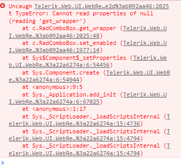
Hello,
Can you please add the control ID to this error so the affected control can be easily identified? Right now, if you have a page with multiple combo boxes, it is extremely time consuming to locate the one with the issue.
Thank you,
DJ
--
Selection out of range
Parameter name: value
Description: An unhandled exception occurred during
the execution of the current web request. Please review the stack trace
for more information about the error and where it originated in the
code.
Exception Details: System.ArgumentOutOfRangeException: Selection out of range
Parameter name: value
Source Error:
An unhandled exception was generated during the execution of the current
 web request. Information regarding the origin and location of the
exception can be identified using the exception stack trace below.
|
Stack Trace:
|
RadImageGallery is a great control and supports many image formats out of the box (JPEG, PNG, BMP, etc.)
However, it does not provide native support for HEIF. HEIF is now the default format for most Apple devices (anything after iOS 11 update).
It would be great if RadImageGallery were updated to provide support for this format so that developers don't have to force image conversions of photos taken by Apple devices.
Hi,
currently the only way to set the translation for the "All" option that is created through the enabled "EnableAllOptionInPagerComboBox" property is to set the translation in the "RadGrid1_ItemDataBound" method, which is described here: Localization on RadGrid: Paging Option All
It's a workaround for a missing localisation. By setting the translation in the RadGrid1_ItemDataBound method the if-statement is being checked for every row processed, which is not good for performance.
Could you please make it possible to set the translation with a property and have the default value set in the resource file of the grid?
Thank you.
Hello,
I'm facing JavaScript issues after enabling "Telerik.ScriptManager.EnableHandlerEncryption" on Web.config,
I've just followed Encrypt Telerik WebResource Querystring in order to hide the Telerik version.
After this the RadMenu breaks when i do a PostBack action (by pressing a button), the console outputs the same error when hovering a RadMenuItem and the submenus has stop being displayed.
The console error:
Uncaught TypeError: Cannot read properties of null (reading 'apply')
  at Type.callBaseMethod (Telerik.Web.UI.WebRe...=:6:7353)
  at c.RadMenuItem._createChildControls (Telerik.Web.UI.WebRe...=:5300:49)
  at c.RadMenuItem._ensureChildControls (Telerik.Web.UI.WebRe...=:2770:72)
  at c.RadMenuItem._getChildren (Telerik.Web.UI.WebRe...=:2768:32)
  at c.RadMenuItem.get_items (Telerik.Web.UI.WebRe...=:3552:36)
  at c.RadMenuItem._onItemMouseOver (Telerik.Web.UI.WebRe...=:4159:8)
  at Telerik.Web.UI.EventMap._onDomEvent (Telerik.Web.UI.WebRe...=:3289:6)
  at HTMLDivElement.<anonymous> (Telerik.Web.UI.WebRe...=:6:307)
  at HTMLDivElement.b (Telerik.Web.UI.WebRe...=:623:53)
I've tested this error with version 2020.2.617.45 and 2022.3.913 but the same problem.
Looking in the forum i've found this post with a related issue also a reply has a reference to a private feedback and this last one seems to be the same or almost the same problem, so i've tried to follow the workaround on "global.asax" file and "Page_Load" on the master page without luck.
The steps i've follow:
- Enabling "Telerik.ScriptManager.EnableHandlerEncryption".
- Site seems working correctly.
- I press a RadButton inside a RadAjaxPane.
- Response from server is OK.
- Then i hover the cursor on RadMenuItems on RadMenu.
- Console starts to show the related error explaining above.
- RadMenu stops to present the submenus completely.
I'd like to have another way to workaround this in order to make RadMenu work properly again and keep Telerik version hidden.
Regards
Scenario: need dynamically change header test on dropdown change, while retaining HeaderContext filter type icon
After conversation with support created this request
Description:
'Selected' state is not defined for 'Pagination controls' in entire page.
Environment (OS, Application, Versions):
OS: Windows_11
Version: 21H2
OS Build: 22000.856
Browser: Microsoft Edge Version 105.0.1343.33 (Official build) (64-bit)
URL: https://demos.telerik.com/aspnet-ajax/grid/examples/overview/defaultcs.aspx
Screen Reader: NVDA(2022.2)
Repro Steps:
1. Open URL:https://demos.telerik.com/aspnet-ajax/grid/examples/overview/defaultcs.aspx page in Edge Browser.
2. Navigate to pagination controls present below "Book A Car' table under 'Overview'.
3. Open NVDA.
4. Navigate to 'Selected button' on pagination controls.
5. Observe an issue that 'Selected' state is not defined for 'Pagination controls'.
Actual Result:
'Selected' state is not defined for 'Pagination controls' in entire page.
Expected Result:
State 'Selected' should be defined on pagination controls. In this case, the expected role is {button or has a pop-up}. All components need a proper role attribute, ideally with semantics. In rare cases a role attribute should be added to give full context and information to assistive technology. Learn more by reading about when to use an aria role and the html/aria role mappings.
Test Environment:
OS: Windows_11
- Open URL: https://demos.telerik.com/aspnet-ajax/grid/examples/overview/defaultcs.aspx page in Edge Browser.
- TAB to the grid container.
- Observe the issue that the grid container is receiving focus.
Actual Behavior:
Focus moves on non-interactive controls.
Expected Behavior:
Focus shouldn't go to the non-interactive element in table content.
It would be great if telerik can provide remove blank data rows on column which helps when dealing with huge data.
I am able to achieve the logic with below code.
var grid = $find('<%= RadGrid_MeaInfo.ClientID %>');
// MasterTable
var masterTable =
grid.get_masterTableView();
// Items/Rows
var dataItems = masterTable.get_dataItems();
for (var i = 0; i <
dataItems.length; i++) {
var item =
masterTable.getCellByColumnUniqueName(dataItems[i], "TriggerMan")
debugger;
if (item.innerHTML ==
"" || item.innerHTML == undefined) {
masterTable.hideItem(i);
}
}
Test Environment:
OS: Windows_11URL: https://demos.telerik.com/aspnet-ajax/grid/examples/overview/defaultcs.aspx
Screen Reader: NVDA (2021.3)
Repro Steps:
- Open URL: https://demos.telerik.com/aspnet-ajax/grid/examples/overview/defaultcs.aspx page in Edge Browser.
- Open NVDA
- Tab to the 'BOOK NOW' controls in the grid.
- Press Enter
- Observe the issue that 'BOOK NOW' is announced as a link, but it opens a popup instead of behaving as a link. It should have a role of button.
Actual Behavior:
Incorrect role as 'link' is defined for button control "Book Now."
Expected Behavior:
In this case, the expected role is {button}. For the "Book Now" button the correct role should be defined.
All components need a proper role attribute, ideally with semantics. In rare cases a role attribute should be added to give full context and information to assistive technology.
I would like to request the RadRadioButtonList's get_oldSelectedIndex method used in the OnSelectedIndexChanged event should return -1 instead of undefined when no item is selected.
Thank you!
Test Environment:
OS: Windows_11URL: https://demos.telerik.com/aspnet-ajax/calendar/overview/defaultcs.aspx
Tool: Accessibility Insight for web.
Repro Steps:
1. Open URL: https://demos.telerik.com/aspnet-ajax/calendar/overview/defaultcs.aspx page in Edge Browser.
2. Navigate to calendar under overview Section by using tab key.
3. Run Accessibility Insight tool.
4. Verify the bug.
Actual Behavior:
Ensures the contrast foreground and background colors doesn't meet WCAG 2AA contrast ratio thresholds.
Expected Behavior:
Ensures the contrast between foreground and background colors meets WCAG 2 AA contrast ratio thresholds.
Test Environment:
OS: Windows_11URL: https://demos.telerik.com/aspnet-ajax/grid/examples/overview/defaultcs.aspx
Screen Reader: NVDA (2021.3)
Repro Steps:
1. Open URL https://demos.telerik.com/aspnet-ajax/grid/examples/overview/defaultcs.aspx page in edge browser and turn on NVDA.
2. Navigate to table by using Tab key.
3. Observe that screen reader is announcing clickable when focus lands on table.
Actual Results:
Screen reader is announcing clickable when focus lands on table.
Expected Results:
The screen reader should only read relevant information once for each item.