Hi Team,
Dennis Callahan from Telerik submitting this on behalf of Don -
If your team could create a theme for UI for WPF that mimicked the look of a UWP application and responded to the Windows 10 Light and Dark setting that would be excellent. I have not found such a theme in any of the products I have looked at so if Telerik could do it I think it might be the first.
WORKAROUND:
Extract the template of the toolbox control and set the duration of the DoubleAnimations inside the "showAnimation" and "hideAnimation" storyboards to zero.
I'm trying to draw a polygon on my RadMap using the MapPolygonView control. I can only see the polygon after I finished drawing it, but while I'm drawing - I can't see the lines.
Please add the capability for the RadMap to visualize the animation of shape's lines as it is being drawn.
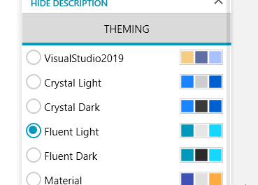
The check mark of the RadioButton is misaligned when DPI settings are set to a higher than the default value, e.g. 125%.
The problem can easily be reproduced using the Telerik UI for WPF Demo application:
An advanced search textbox control for WPF. A good example can be found at: http://davidowens.wordpress.com/2009/02/18/wpf-search-text-box/
It would be really great if the autocomplete box could handle the page up/down key to skip multiple entries at once. As we have like 200 entries in the list it would be a great advancement for the users using the keyboard.
Already tried your example from the forum but it is not functional.
All the best!
When creating a NetCore project with NoXaml binaries via Telerik VSExtenstions for WPF and the installation of UI for WPF suite is not on C drive the following error occurs: "Error occurred while restoring NuGet packages: The local source 'C:\Program Files (x86)\Progress\Telerik UI for WPF R2 2020\ToolboxNugetPackages\' doesn't exist."
As we now have support for Webcams with RadWebcam-Control how about supporting Twain? But not the old version, instead the platform independent newer Twain-Direct. There is already C# Source Code under MIT-License available: https://github.com/twain/twain-direct. I think this could be used in Xamarin and WinForms, even ASP.NET also...
The standard fonts listed at http://docs.telerik.com/devtools/wpf/controls/radpdfprocessing/concepts/fonts#standard-fonts cannot be embedded in a document. Using one of them prevents the document from complying with PDF/A standard.
This item is migrated to the Telerik Document Processing portal:
http://feedback.telerik.com/Project/184/Feedback/Details/190042
Please use the new item for commenting, voting and subscribing instead of this one.
It would be awesome if the user would be able to create folders for visual organization in tree views, tree list views and list views. These folders should not be actual items in the tree, but rather be a visual simplification for complex lists and trees.
Folder specific features:
- Add, move, rename and delete folders
- Add or move items to the folders (for example via drag&drop)
- Move and delete folders with their content
- Verification, if certain types are allowed in a folder
- Sort the content of the folder
View specific features
- Switch between “folder view” and “folderless view”
- Save and load structures, similar to the LayoutControl
- Verification, if a folder is allowed to be moved to or created in certain areas
- Possibility to manipulate the structure from the code
With this feature the user would find it easier to organize sometimes complex trees and lists into manageable folder structures, as the layout would be created by the user himself. The folders also make collective operations on items in them easier to handle, as the user can move or delete the folder with its content and does not need to select long lists of items for every operation. This would increase the usability of the trees and lists.
Hello,
We want to integrate a web browser in a flyout pane in WPF to display html 5 pages. Moreover, we want to display some html contents in tooltips too.
The provided WebBrowser by WPF framework does not work well.
Consequently, the idea is to have a "htmlplaceholder" (as you provide in silverlight) which supports HTML 5 and could be based on chromium engine.
Thanks & regards,
When a RadGridView column is bound to a sub-property e.g. "Player.FirstName", one can cancel the edit operation while the value of the cell's editor is invalid and the original value is not restored.
http://www.telerik.com/community/forums/silverlight/general-discussions/feature-request-callout-control.aspx
Exception when editing the template and showing the tooltip of the ValidationErrorElement
Workaround:
Replace the validation element:
<Grid x:Name="ValidationErrorElement" Visibility="Collapsed"><Grid.ToolTip>
<ToolTip x:Name="PART_ToolTip" Placement="Right" DataContext="{Binding RelativeSource={RelativeSource TemplatedParent}}">
<ToolTip.Template>
<ControlTemplate TargetType="{x:Type ToolTip}">
<Grid x:Name="RootVisual" HorizontalAlignment="Right" Margin="5,0" Opacity="0" RenderTransformOrigin="0,0">
<Grid.RenderTransform>
<TranslateTransform X="-25" x:Name="xform"/>
</Grid.RenderTransform>
<VisualStateManager.VisualStateGroups>
<VisualStateGroup x:Name="OpenStates">
<VisualStateGroup.Transitions>
<VisualTransition From="{x:Null}" GeneratedDuration="0" GeneratedEasingFunction="{x:Null}" Storyboard="{x:Null}" To="{x:Null}"/>
<VisualTransition From="{x:Null}" GeneratedDuration="0:0:0.2" GeneratedEasingFunction="{x:Null}" To="Open">
<Storyboard>
<DoubleAnimation Duration="0:0:0.2" To="0" Storyboard.TargetProperty="X" Storyboard.TargetName="xform">
<DoubleAnimation.EasingFunction>
<BackEase Amplitude="0.3" EasingMode="EaseOut"/>
</DoubleAnimation.EasingFunction>
</DoubleAnimation>
<DoubleAnimation Duration="0:0:0.2" To="1" Storyboard.TargetProperty="Opacity" Storyboard.TargetName="RootVisual"/>
</Storyboard>
</VisualTransition>
</VisualStateGroup.Transitions>
<VisualState x:Name="Closed">
<Storyboard>
<DoubleAnimation Duration="0" To="0" Storyboard.TargetProperty="Opacity" Storyboard.TargetName="RootVisual"/>
</Storyboard>
</VisualState>
<VisualState x:Name="Open">
<Storyboard>
<DoubleAnimation Duration="0" To="0" Storyboard.TargetProperty="X" Storyboard.TargetName="xform"/>
<DoubleAnimation Duration="0" To="1" Storyboard.TargetProperty="Opacity" Storyboard.TargetName="RootVisual"/>
</Storyboard>
</VisualState>
</VisualStateGroup>
</VisualStateManager.VisualStateGroups>
<Grid>
<Path Data="M4,0L0,4 4,8z" Fill="#FFDC000C" HorizontalAlignment="Left" Height="10" Stretch="None" VerticalAlignment="Top" Width="6"/>
<Border Background="#FFDC000C" Margin="4,0,0,0" Padding="1">
<TextBlock Foreground="White" MaxWidth="250" Margin="8,4" TextWrapping="Wrap" Text="{Binding ValidationErrors[0].ErrorContent}"/>
</Border>
</Grid>
<ContentControl/>
</Grid>
</ControlTemplate>
</ToolTip.Template>
</ToolTip>
</Grid.ToolTip>
<Border Background="Transparent" HorizontalAlignment="Right" Height="9" VerticalAlignment="Top" Width="9"/>
<Border BorderBrush="#FFDC000C" BorderThickness="1" CornerRadius="1"/>
<Path Data="M0,2L5,2 5,7z" Fill="#FFDC000C" HorizontalAlignment="Right" Height="7" VerticalAlignment="Top" Width="7"/>
</Grid>

