Add logic that searches deeper in the Content's hierarchy to try finding the first element with an automation peer.
The fly view is not properly displayed when the second item is clicked and the sub-items are expanded (see attached video).
Attached is a project with a workaround as well.
TypeNameParserException is printed in the Output pane of Visual Studio, when RadNavigationView is initialized. The exception message is:
MS.Internal.Xaml.Parser.GenericTypeNameParser.TypeNameParserException: 'Prefix 'helpers' does not map to a namespace.'
This happens because of a known issue in the Visual Studio designer, which is discussed here.
This issue can be safely ignored. It won't cause issues in the control at runtime.
The parent RadNavigationViewItem doesn't appear selected in case you select one of its sub items, then select another item from the root level and select the first item again.
This reproduces only in the Fluent theme.
You can work this around by extracting the ControlTemplate of RadNavigationViewItem and removing the ExitAction of the following MultiDataTrigger.
<MultiDataTrigger>
	<MultiDataTrigger.Conditions>
		<Condition Binding="{Binding RelativeSource={RelativeSource Self}, Path=IsExpanded}" Value="False"/>
		<Condition Binding="{Binding RelativeSource={RelativeSource Self}, Path=HasSelectedSubItem}" Value="True"/>
	</MultiDataTrigger.Conditions>
	<MultiDataTrigger.EnterActions>
		<BeginStoryboard>
			<Storyboard>
				<DoubleAnimationUsingKeyFrames Storyboard.TargetProperty="RenderTransform.ScaleY" Storyboard.TargetName="SelectedVisual">
					<EasingDoubleKeyFrame KeyTime="0" Value="0"/>
					<EasingDoubleKeyFrame KeyTime="0:0:0.15" Value="1">
						<EasingDoubleKeyFrame.EasingFunction>
							<SineEase EasingMode="EaseIn"/>
						</EasingDoubleKeyFrame.EasingFunction>
					</EasingDoubleKeyFrame>
				</DoubleAnimationUsingKeyFrames>
			</Storyboard>
		</BeginStoryboard>
	</MultiDataTrigger.EnterActions>
	<MultiDataTrigger.ExitActions>
		<BeginStoryboard>
			<Storyboard>
				<DoubleAnimationUsingKeyFrames Storyboard.TargetProperty="RenderTransform.ScaleY" Storyboard.TargetName="SelectedVisual">
					<EasingDoubleKeyFrame KeyTime="0" Value="1"/>
					<EasingDoubleKeyFrame KeyTime="0:0:0.1" Value="0">
						<EasingDoubleKeyFrame.EasingFunction>
							<SineEase EasingMode="EaseIn"/>
						</EasingDoubleKeyFrame.EasingFunction>
					</EasingDoubleKeyFrame>
				</DoubleAnimationUsingKeyFrames>
			</Storyboard>
		</BeginStoryboard>
	</MultiDataTrigger.ExitActions>
	<Setter TargetName="SelectedVisual" Property="Opacity" Value="1"/>
	<Setter TargetName="BackgroundVisual" Property="Background" Value="{Binding RelativeSource={RelativeSource TemplatedParent}, Path=(mat:MaterialAssist.PressedBrush), Mode=OneWay}"/>
</MultiDataTrigger>
Then you can apply the modified template, using the ItemContainerStyle of RadNavigationView.
<telerik:RadNavigationView.ItemContainerStyle>
	<Style TargetType="telerik:RadNavigationViewItem">
		<Setter Property="Template" Value="{StaticResource CustomNavigationViewItemControlTemplate}" />
	</Style>
</telerik:RadNavigationView.ItemContainerStyle>
Data binding the IsExpanded property of RadNavigationViewItem doesn't work on load of the control.
To work this around, you can override the IsExpandedProperty's metadata as shown in the attached project. Note that the project was created with the Xaml version of the Telerik dlls.
This reproduces in the Office2013 theme.
To work this around, extract the ControlTemplate of RadNavigationViewItem and change the Foreground values in the following trigger from MainBrush to AccentBrush or another brush of your choice.
<MultiDataTrigger>
	<MultiDataTrigger.Conditions>
		<Condition Binding="{Binding RelativeSource={RelativeSource Self}, Path=IsExpanded}" Value="False"/>
		<Condition Binding="{Binding RelativeSource={RelativeSource Self}, Path=HasSelectedSubItem}" Value="True"/>
	</MultiDataTrigger.Conditions>
	<Setter TargetName="IconContent" Property="TextElement.Foreground" Value="{telerik:Office2013Resource ResourceKey=AccentBrush}"/>
	<Setter TargetName="Content" Property="TextElement.Foreground" Value="{telerik:Office2013Resource ResourceKey=AccentBrush}"/>
	<Setter TargetName="ExpandedIcon" Property="TextElement.Foreground" Value="{telerik:Office2013Resource ResourceKey=AccentBrush}"/>
	<Setter TargetName="CollapsedIcon" Property="TextElement.Foreground" Value="{telerik:Office2013Resource ResourceKey=AccentBrush}"/>
	<Setter Property="BorderBrush" Value="{StaticResource NavigationView_NavItemBorderBrush_Selected}"/>
	<Setter TargetName="SelectedVisual" Property="helpers:ThemeHelper.CheckedBrush" Value="{telerik:Office2013Resource ResourceKey=AccentBrush}"/>
	<Setter TargetName="SelectedVisual" Property="Opacity" Value="1"/>
</MultiDataTrigger>If you set the RadNavigationView's IsPaneOpen property in XAML and start the application, the items are is not opened (the pane is collapsed). You can notice that IsPaneOpen property is set back to false, when the control gets loaded.
To work this around, subscribe to the Loaded event of the RadNavigationView instance and in the event handler, set the IsPaneOpen property.
private void RadNavigationView_Loaded(object sender, RoutedEventArgs e)
{
	this.radNavigationView.IsPaneOpen = true;
}
Add a feature that allows you to open a sub menu when you click on a RadNavigationViewItem.
Similar to the hamburger menu in the Windows' Mail application.
Hello,
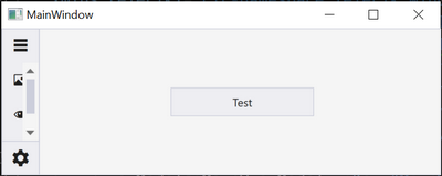
Currently when resizing the application, we get a scrollbar like this (which is not the best user experience):
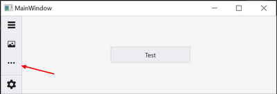
We would like to have a "more" icon to show hidden items in a submenu.
Best regards,
Hello,
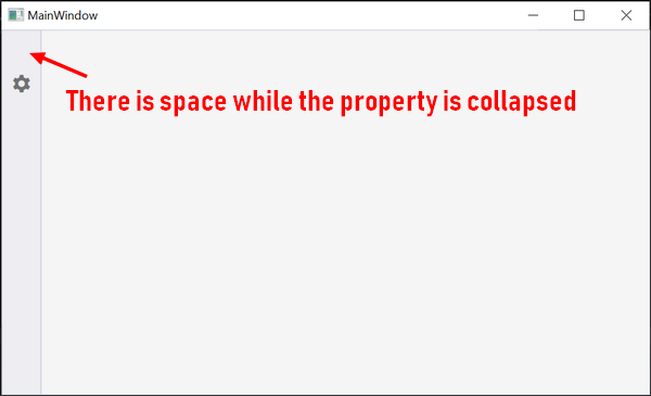
I would like to hide the pane toggle button. Consequently I set the PaneToggleButtonVisibility to "Collapsed" but I get the same render as I set "Hidden".
That would be nice if this space no longer exists when we set the property to collapsed.
The code sample I used:<telerik:RadNavigationView x:Name="navigationView" PaneToggleButtonVisibility="Collapsed">
<telerik:RadNavigationView.Items>
<telerik:RadNavigationViewItem Content="Foo">
<telerik:RadNavigationViewItem.Icon>
<telerik:RadGlyph Glyph="" FontSize="20" />
</telerik:RadNavigationViewItem.Icon>
</telerik:RadNavigationViewItem>
</telerik:RadNavigationView.Items>
</telerik:RadNavigationView>Thanks,
Hello,
Currently when we start the application, no item is selected. Once we select one it appears as selected and we show a related pane. This is the nominal behavior of the component.
But we want to deselect it when we are clicking again on it (like in Visual Studio Code). So ideally we want a NavigationItemBehavior property with a value "Normal" and a value "Toggle".
Regards,
<telerik:RadNavigationViewItem Content="Test" Foreground="Blue"/>
Possible workaround:
<telerik:RadNavigationViewItem>
<TextBlock Text="Test" Foreground="Blue"/>
<telerik:RadNavigationViewItem>


