Scrolling with the mouse wheel scrolls directly to the bottom of the messages instead of scrolling smoothly between the items.
To work this around, create a custom class that derives from RadChat and override its OnPointerWheelChanged method.
public class CustomChat : RadChat
{
    private ScrollViewer scrollViewer;

    internal ScrollViewer ScrollViewer
    {
        get
        {
            if (this.scrollViewer == null)
            {
                this.scrollViewer = this.ChildrenOfType<ScrollViewer>().Where(sc => sc.Name == "PART_ScrollViewer").FirstOrDefault();
            }

            return this.scrollViewer;
        }
    }

    protected override void OnPointerWheelChanged(PointerRoutedEventArgs e)
    {
        if (this.ScrollViewer != null)
        {
            int delta = e.GetCurrentPoint(this).Properties.MouseWheelDelta;
            double wheelDetents = delta / 120.0;
            double scrollableRange = ScrollViewer.ExtentHeight - ScrollViewer.ViewportHeight;
            double step = 0.01 * scrollableRange;
            double offsetDelta = wheelDetents * step;
            double newOffset = ScrollViewer.VerticalOffset - offsetDelta;
            newOffset = Math.Max(0, Math.Min(ScrollViewer.ExtentHeight, newOffset));

            ScrollViewer.ScrollToVerticalOffset(newOffset);
        }
    }
}
Since Q2 2025, user defined Dark/Light/HighContrastResourcesPaths do not work - the custom resources are anot applied to the controls.
/// <summary>
/// Resource loader that provides the resource dictionaries with the brushes for the Telerik controls.
/// See https://docs.telerik.com/devtools/universal-windows-platform/common/teleriknamedbrushes.
/// </summary>
public sealed class TelerikResourceLoader : CustomXamlResourceLoader
{
/// <inheritdoc/>
protected override object GetResource(string resourceId, string objectType, string propertyName, string propertyType)
{
object result;
if (resourceId == "DarkResourcesPath")
{
result = new Uri("ms-appx:///{ProjectName}/Assets/Themes/Dark_Telerik.xaml");
}
else if (
resourceId == "LightResourcesPath" ||
resourceId == "HighContrastResourcesPath")
{
result = new Uri("ms-appx:///{ProjectName}/Assets/Themes/Light_Telerik.xaml");
}
else
{
result = null;
}
return result;
}
}
<ResourceDictionary.ThemeDictionaries>
<ResourceDictionary x:Key="Light">
<SolidColorBrush x:Key="TelerikGrid_BackgroundPointerOver" Color="Red" Opacity="0.25"/>
</ResourceDictionary>
<ResourceDictionary x:Key="Dark">
<SolidColorBrush x:Key="TelerikGrid_BackgroundPointerOver" Color="Green" Opacity="0.25"/>
</ResourceDictionary>
</ResourceDictionary.ThemeDictionaries>
Edit - indeed the Light/Dark/ResourcePaths are deleted from the generic files of telerk controls due to the following regression in WinUI App SDK 1.7.25:
https://github.com/microsoft/microsoft-ui-xaml/issues/10506
This should allow you to enable filtering also in the DataGridTemplateColumn.
Then all other columns being hidden before maximization are still invisible.
Workaround: Set width of the DataGrid.
This is the same feature as the "FilterRow" FilteringMode setting of RadGridView for WPF.
The scrolling in RadChat feels incosistent and not smooth when having messages with different heights.
To work around this you can modify the ControlTemplate of ChatMessageList in order to set the Background property of the ScrollViewer element to a value different than null. For example, Transparent.
 <Application.Resources>
     <ResourceDictionary>
         <ResourceDictionary.MergedDictionaries>
             <XamlControlsResources xmlns="using:Microsoft.UI.Xaml.Controls" />
			 <ResourceDictionary Source="ms-appx:///Telerik.WinUI.Controls/Themes/Generic.xaml"/>
			 <!-- Other merged dictionaries here -->
         </ResourceDictionary.MergedDictionaries>
			<!-- Other app resources here -->

		<Style  TargetType="chat:ChatMessageList" BasedOn="{StaticResource ChatMessageListStyle}">
			<Setter Property="Template">
				<Setter.Value>
					<ControlTemplate TargetType="chat:ChatMessageList">
						<Border Background="{TemplateBinding Background}" BorderBrush="{TemplateBinding BorderBrush}" BorderThickness="{TemplateBinding BorderThickness}">
							<!--The background of the Scrollviewer is set here-->
							<ScrollViewer x:Name="PART_ScrollViewer"
										  VerticalScrollBarVisibility="Auto" HorizontalScrollBarVisibility="Disabled"
										  BorderThickness="0"
										  Background="Transparent">
								<ItemsPresenter Margin="{TemplateBinding Padding}" />
							</ScrollViewer>
						</Border>
					</ControlTemplate>
				</Setter.Value>
			</Setter>
		</Style>
	</ResourceDictionary>
 </Application.Resources>
The list with the RadChat messages disappears when the ImageSource of ImageCardMessage is assigned after the control is loaded.
To work this around, you can pre-set the ImageSource of the image cards using a placeholder image.
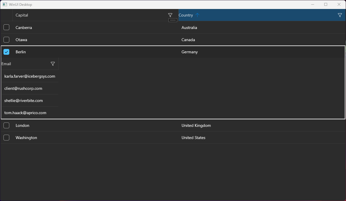
Hello, I tried to implement the sample application from your docs. (https://docs.telerik.com/devtools/winui/controls/raddatagrid/row-details)
But it seems to be not working, the detail area is not displayed completely. Only one column.
I have a similar behavior on another application.
Details:
- .NET 7
- Windows 11 Pro Version 23H2 (22631.3155)
- Telerik WinUI 2.9.0
The default behavior of the WinUI native Popup is to render within the bounds of its owner element. This means if the DataGrid reaches the end of the window and there is not enough space for the filtering control to draw, it will get clipped.
To avoid the clipping and allow the Popup to get displayed outside of the window, the ShouldConstrainToRootBounds property of the Popup should be set to false.
Add an API in the RadDataGrid control to allow setting the ShouldConstrainToRootBounds option of the Popup.
In the meantime, you can disable the Popup constrain via an implicit Style in App.xaml:
<Application.Resources>
    <ResourceDictionary>
        <ResourceDictionary.MergedDictionaries>
            <XamlControlsResources xmlns="using:Microsoft.UI.Xaml.Controls" />
            <ResourceDictionary Source="ms-appx:///Telerik.WinUI.Controls/Themes/Generic.xaml"/>
            <!-- Other merged dictionaries here -->
        </ResourceDictionary.MergedDictionaries>
        <Style TargetType="Popup">
            <Setter Property="ShouldConstrainToRootBounds" Value="False" />
        </Style>
        <!-- Other app resources here -->
    </ResourceDictionary>
</Application.Resources>

