Hi Guys,
Have just upgraded to the Kendo UI v2024.3.806 along with kendo-theme-classic v8.2.1 and have noticed you can no longer set the $kendo-disabled-opacity & $kendo-disabled-filter variables to override their values because they are now being hard set in the following section within the 'all.scss' file.
// Backward compatibility
// #region @import "./color-system/_swatch-legacy.scss"; -> scss/core/color-system/_swatch-legacy.scss
@if ($kendo-enable-color-system) {
...
$kendo-disabled-opacity: .6;
$kendo-disabled-filter: grayscale(.1);
...
}
This is a regression from
@progress/kendo-theme-classic:8.0.1
where neither of these variables were being hard set.
Also can you confirm what version of the SASS themes are compatible with the latest Kendo UI because the latest version on NPM is now v9.0.0 which was released 3 days prior to Kendo UI v2024.3.806.
NOTE: kendo-theme-classic: 9.0.0 also has these two variables hard set.
Regards
Alan
If I place the DateRangePicker inside a TelerikForm, the start and end input fields are stacked vertically.
If I were to place the control just inside a div, they are arranged horizontally.
How can I get the control to arrange itself horizontally when inside a form?
---
ADMIN EDIT
Here is a reproducible that begins with a short CSS workaround (remove the style to see the issue):
<style>
    .k-form .k-daterangepicker-wrap .k-floating-label-container {
        display: inline-block;
        width: auto;
    }
</style>


<div class="demo-section k-form k-form-vertical">
    <div class="k-form-field">
        <label for="outbound-date" class="k-label k-form-label">Travel Date</label>
        <div class="k-form-field-wrap">
            <TelerikDateRangePicker @bind-StartValue="@StartValue"
                                    @bind-EndValue="@EndValue"
                                    StartId="outbound-date">
            </TelerikDateRangePicker>
        </div>
    </div>
    <div class="k-form-field">
        <p>The selected travel date is: <strong>@StartValue.Value.ToLongDateString()</strong> and <strong>@EndValue.Value.ToLongDateString()</strong></p>
    </div>
</div>

<div class="demo-section">
    <h4><label for="outbound-date">Book your flight tickets</label></h4>

    <TelerikDateRangePicker @bind-StartValue="@StartValue"
                            @bind-EndValue="@EndValue"
                            StartId="outbound-date">
    </TelerikDateRangePicker>

    <div class="mt-lg">
        <h6 class="kd-demo-heading mt-sm">Selected Dates</h6>
        <div><strong>Departure: </strong> @StartValue?.ToString("dd MMM yyyy")</div>
        <div><strong>Return: </strong> @EndValue?.ToString("dd MMM yyyy")</div>
    </div>
</div>

@code {
    public DateTime? StartValue { get; set; } = new DateTime(2020, 4, 3);
    public DateTime? EndValue { get; set; } = new DateTime(2020, 4, 10);
}
---
Kendo SASS themes allow the definition of a variety of colors for grid rows that are applied in different situations:
- $grid-alt-bg defines the color of alternate rows
- $grid-selected-bg defines the color of selected rows
- $grid-selected-alt-bg defines the color of selected alternate rows
However, at least in @progress/kendo-theme-classic (v. 5.4.1), $grid-selected-alt-bg is only applied for locked columns. You can check that by doing a string-search for "$grid-selected-alt-bg" in dist/all.scss. I have not checked if the same happens when using other themes.
When setting the Toolbar's "size" property to "none", the Kendo-UI SASS themes apply a default spacing of 0 between all items. This can be adapted by altering the $kendo-toolbar-spacing variable. However, adding a value bigger than 0 leads to additional space before the first toolbar item.
This DOJO reproduces the behavior (since SASS-variables cannot be adapted in the DOJO-editor, I have mimicked the effect by setting appropriate styles to the container).
Note that this only happens if the toolbar's size is set to "none".
Kendo Theme Version: 7.0.2
The Kendo-UI "Classic" SASS theme supports the $kendo-calendar-cell-border variable. However, its value is never applied. This also means that variables like $kendo-calendar-cell-selected-border etc. do not have any effect, because they only set the border-color, but not the border itself.
Kendo Theme Version 7.0.2
The Kendo-UI SASS themes support setting the amount of spacing between items using the $kendo-pager-item-spacing variable. However, no spacing is added between the next/previous buttons and the "number" section.
Also, spacing does not work properly if the "select" element is disabled and therefore not displayed.
Kendo Theme Version: 7.0.2
See here:
https://github.com/twbs/bootstrap/blob/main/scss/_variables.scss#LL804C1-L804C24
$input-btn-border-width is now a custom variable.
(see bootstrap 5.2 version: https://github.com/twbs/bootstrap/blob/v5.2.3/scss/_variables.scss#L738 where $input-btn-border-width was a simple scss variable)
The main problem is that on file:
@progress\kendo-theme-bootstrap\scss\input\_variables.scss you are using:
$kendo-input-border-width: $input-border-width !default;
$kendo-input-border-height: ( $kendo-input-border-width * 2 ) !default;
so scss compilation gives me an error:
SassError: Undefined operation "var(--bs-border-width) * 2".
   ╷
10 │ $kendo-input-border-height: ( $kendo-input-border-width * 2 ) !default;
My temporary fix is to define, before importing _variables file:
$kendo-input-border-width: 1px !default;
Basically, the main problem is that package @progress/kendo-theme-bootstrap 6.4.0 with bootstrap 5.3 doesn't work anymore.
Thanks.
Diego
Using the latest Classic Kendo theme, when showing a grid with a pager, the button indicating the currently selected page has a background that's a function of the button's text color (opacity .2). This results in a background color that lacks sufficient contrast with the text color which is not compliant with WCAG contrast rules for display text.
https://webaim.org/resources/contrastchecker/?fcolor=F35800&bcolor=F1D2C0
#F35800 is the default primary button color in the default theme and F1D2C0 is the color that results from the interaction between a background with opacity .2 laid over the default background grey #F0F0F0. I've attached a screenshot of the PowerToys color picker showing the computed color of the button.
The button background color needs to pass all of the WCAG checks in the above link in our application and really should by default in my opinion.
Hello,
I'm adding sass-loader to my webpack build so that I can keep up to date with the latest theme builds more easily. We simply use the default theme.
Webpack is giving me the following warning, however ...
WARNING in ./node_modules/@progress/kendo-theme-default/dist/all.scss (./node_modules/css-loader/dist/cjs.js??ruleSet[1].rules[0].use[1]!./node_modules/postcss-loader/dist/cjs.js!./node_modules/sass-loader/dist/cjs.js!./node_modules/@progress/kendo-theme-default/dist/all.scss)
Module Warning (from ./node_modules/sass-loader/dist/cjs.js):
Deprecation Using / for division outside of calc() is deprecated and will be removed in Dart Sass 2.0.0.

Recommendation: math.div($a, $b) or calc($a / $b)

More info and automated migrator: https://sass-lang.com/d/slash-div

node_modules\@progress\kendo-theme-default\dist\all.scss 1039:15  k-math-div()
node_modules\@progress\kendo-theme-default\dist\all.scss 4138:21  root stylesheet

 @ ./node_modules/@progress/kendo-theme-default/dist/all.scss 8:6-188 22:17-24 26:7-21 52:25-39 53:36-47 53:50-64 57:6-67:7 58:54-65 58:68-82 64:42-53 64:56-70 66:21-28 77:0-158 77:0-158 78:22-29 78:33-47 78:50-64 55:4-68:5

1 warning has detailed information that is not shown.
Use 'stats.errorDetails: true' resp. '--stats-error-details' to show it.
Hi Kendo Team,
after we updated to version 2022.2.301 we decided to modify our theme by compiling the Metro theme from the source files and adjusting some of the variables provided.
When working on the multiselect styles however we noticed that changing the variable '@chip-solid-hover-text' in the 'type-metro.less' file did not lead to any change. The attached screenshot shows that the chip still keeps its black text color on hover even though the variable was set to white.
We inspected the _theme.less file in the folder Default/chip and noticed that the variable is not used by the theme (see screenshot). Looking at the code this also seems to be the case for the 'selected' styles.
We can add additional styles to fix that on our end but since there is a variable for both cases I am sure this is just an oversight and wasn't planned.
Thanks,
Markus
To reproduce, enable High Contrast mode in the OS and then go to any Splitter demo.
Bug report
Reproduction of the problem
Dojo example.
Current behavior
The mobile material theme does not apply specific styles to a button that has the "km-primary" class. Compare to the Nova mobile theme, which does have specific rules that use ".km-primary" selector.
Expected/desired behavior
CSS rules that use the ".km-primary" selector should be added to the theme.
Environment
- Kendo UI version: 2019.2.619
- jQuery version: x.y
- Browser: [all]
The problem is easily reproduced using the widget demo page https://demos.telerik.com/kendo-ui/dropdowntree/index
Simply switch to the High Contrast theme; the k-widget element is lacking the border-radius style hence looks different to the other widgets.
It looks like the k-dropdowntree class is missing from the following style rule:
.k-autocomplete, .k-block, .k-calendar-container, .k-colorpicker, .k-combobox, .k-datepicker, .k-datetimepicker, .k-drag-clue, .k-dropdown, .k-dropdown-wrap, .k-editor-inline, .k-grid .k-filter-options, .k-grouping-header .k-group-indicator, .k-inline-block, .k-list-container, .k-multiselect, .k-notification, .k-numeric-wrap, .k-numerictextbox, .k-picker-wrap, .k-slider-selection, .k-slider-track, .k-split-button, .k-textbox, .k-tile, .k-timepicker, .k-tooltip, .k-touch-scrollbar, .k-treeview .k-in, .k-upload, .k-window, .k-window-action, .k-window-titleless .k-window-content {
    border-radius: 13px
}
Bug report
Reproduction of the problem
- Go to the Themebuilder page
- Select BlueOpal theme
- Modify the "Error" color.
- Download the custom theme
Current behavior
The generated kendo.custom.css file contains the following rule:
undefined undefined undefined undefined undefined undefined undefined undefined undefined undefined undefined undefined undefined undefined undefined undefined undefined undefined undefined undefined undefined undefined undefined undefined undefined undefined undefined .k-text-error {
  color: #7030a0;
}
Expected/desired behavior
The rule should have correct selector, or if it is redundant it should not be included in the file.
Environment
- Kendo UI version: 2020.2.617
- jQuery version: x.y
- Browser: [all]
Bug report
On screens with smaller sizes not all tools in the Spreadsheet Toolbar are visible. The tools overlap the overflow button and thus cannot be selected.
Reproduction of the problem
- Run the following demo and reduce the window width
Current behavior
On wider screens all tools are visible:

On narrower screens only some tools are visible and the overflow button is overlapped:

or completely hidden:
Expected/desired behavior
The overflow button should be visible so all Spreadsheet tools are accessible.
Environment
- Kendo UI version: 2020.3.118
- Browser: [all]
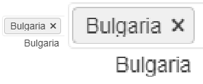
In some cases the text for the selected items does not display properly. Some letters, for example g, get their bottom cut off. This behaviour can be observed on for.ex. the Telerik page https://docs.telerik.com/blazor-ui/components/multiselect/overview The picture below was taken on the latest Edge browser, 1080p screen, 100% zoom level. Funnily enough, changing the zoom level either way makes the text fit in the selected items.
How can I increase the space for the text in the selected items so it's less likely to be cut off?
Line 56: box-flex: 1;
kendoui.for.jquery.2020.3.1021.commercial-source\src\styles\mobile\common\buttongroup.less
Line 31: margin-collapse: separate;
kendoui.for.jquery.2020.3.1021.commercial-source\src\styles\mobile\common\scroller.less
Line 103: margin-collapse: separate;
kendoui.for.jquery.2020.3.1021.commercial-source\src\styles\web\common\mixins.less
Line 54:
.flex-align(@alignment) {
flex-align: @alignment;
}
Ellipsis missing on month view
---
ADMIN EDIT
The Ellipsis icon is invisible in Material and Default, partially hidden in Bootstrap. The Show More button is invisible in Material. You can see the issues in the following demo: https://demos.telerik.com/blazor-ui/scheduler/month-view
Here is a workaround to make the Ellipsis icon visible which indicates a button in Material too:
<style>
    button.k-more-events > .k-icon.k-i-more-horizontal {
        top: initial;
        bottom: 0;
        transform: translate(-50%);
    }
</style>
I made a repl to show the issue: https://blazorrepl.telerik.com/GcaGvdaw31AartTh17
The 3 differently sized text area's render with almost the same size. Inspecting the elements, the textarea is wrapped in a span which is given a k-input-[sm/md/lg] class, and the text area is given minorly different padding for each. This works fine for TextBox, but not what you would expect from textarea.
I would expect textarea to render 1 line for sm, 2 lines for md, and 4 lines for lg, or something similar. The padding is a fairly useless difference here for a text area.
Describe the bug
Starting from v2022.1.119 the scrollbar of the View Html tool of the Editor is missing.
To reproduce
- Run this Dojo or the All Tools Demo
- Click on the "View Html" Tool
Expected behavior
The textarea of the View Html's popup should be scrollable
Screenshots

Affected package (please remove the unneeded items)
- all themes
Affected suites (please remove the unneeded items)
- Kendo UI for jQuery
Affected browsers (please remove the unneeded items)
- All
Build system information (please remove the unneeded items)
- Not Applicable
Additional context
Bug also observed with Less Kendo jQuery Themes