It would be awesome to have "style hooks" for all components - this can be implemented through css variables/properties and would allow for things like dynamic theming including support for dark mode etc.
Because css variables/properties can be read and written through javascript this would open up several new ways for dynamic layouts.
CSS variable/properties are supported on all current browsers except IE 11, and it is possible to implement them with a gracefull fallback.
sometimes seems too small the icons in a grid,and i would be nice to have bigger incons with 24X24 ,or 32X32 pixels,because it's very difficult to find something to fit with the themes used in kendo ui.
In the new SASS Default v2 theme, you took away too much contrast compared to the original default theme. Why? Don't you know that many people find it hard to read things where the text color is too close in value to the color of the background color?? Please stop with the very low contrast.
Currently, using npm install --save @progress/kendo-theme-material will get the standard Material Design theme for use across the React Components, but why is Material Black not available this way? (npm install --save @progress/kendo-theme-materialBlack)
Kendo UI jQuery does already have Metro themes. Pls add this for new Kendo UI, too!
Kendo provides a means to build your theme with SCSS variables in the build process. It would be great if it were possible to have these variables scoped to specific contexts, eg <div class="panel-dark"> receives the panel-dark themes, whereas if it is a child of "panel-light" then it receives the panel-light themes. Some of these kinds of features may be on the way with upcoming Custom Element features eg :part, :theme, but could potentially be possible today by having a style transclusion component, something like <kendo-theme-adjuster [styleCallback]="scssVariableSetter()"><my-content></my-content></kendo-theme-adjuster>. We need to support a variety of component themes simultaneously (not just switch back and forth) within a single app, and would like to not need to manually override all the kendo styles in these situations.
Hello ladies and gentlemen.
In Bootstrap 4 (and Material) SASS theme the opacity setting for placeholder is missed.
Example: https://demos.telerik.com/kendo-ui/multiselect/index
My fix for Bootstrap 4 (I not known the opacity setting for Material placeholders):
.k-multiselect-wrap {
  > .k-readonly {
    opacity: 0.7;
  }
}Eduard Töws
Bug report
When using Spreadsheet with SASS theme and entering an array formula with Ctrl+Shift+Enter the {} braces surrounding array formula in the formula bar are not displayed.
Reproduction of the problem
Enter the following formula in any cell within the dojos below cell and press Ctrl+Shift+Enter : =Product(C3:C11)
dojo of a Spreadsheet demo with LESS theme
dojo of a Spreadsheet demo with SASS theme
Current behavior
Spreadsheet with LESS based theme displays the array formula correctly in the formula bar: {=Product(C3:C11)}
Spreadsheet with SASS based theme displays the array formula incorrectly in the formula bar: =Product(C3:C11)
Expected/desired behavior
Spreadsheet with SASS based theme should display array formulas with {} braces: {=Product(C3:C11)}
Environment
Kendo UI version: 2019.3.1023
Hello,
I prepared a demo https://dojo.telerik.com/EYeYUSUw/6
Also applies to the latest default sass theme but probably to many more.
As you can see, the master grid its 'content row' hover effect is being applied to even the header of the detail grid and there is no way to resolve that unwanted effect apart from adding more styling tedious rules.
The resolution is so simple:
.k-grid tbody tr:hover, .k-grid tbody tr.k-state-hover {
    background-color: #e6e6ea;
}
Should be
.k-grid tbody > tr:hover, .k-grid tbody > tr.k-state-hover {
    background-color: #e6e6ea;
}
I did not search for the source files/lines what might need to change - easy to find in your current version.
There could be many more of these simple improvements which would save many hours on ours side!
Regards,
Jan
Ellipsis missing on month view
---
ADMIN EDIT
The Ellipsis icon is invisible in Material and Default, partially hidden in Bootstrap. The Show More button is invisible in Material. You can see the issues in the following demo: https://demos.telerik.com/blazor-ui/scheduler/month-view
Here is a workaround to make the Ellipsis icon visible which indicates a button in Material too:
<style>
    button.k-more-events > .k-icon.k-i-more-horizontal {
        top: initial;
        bottom: 0;
        transform: translate(-50%);
    }
</style>
When you put a TelerikEditor in a Telerik Form the Format dropdown gets stretched, which forces it onto its own line which doesn't look as good.
Adding the form-control class from bootstrap to a textarea causes worng appearance especially when I have autosize set to true.
---
ADMIN EDIT
Here is a workaround:
<style>
    span.k-textarea.form-control {
        border: 0;
        box-shadow: none;
        width: 100%;
        height: auto;
    }

        span.k-textarea.form-control textarea {
            border: 1px solid rgb(206, 212, 218) !important;
            border-radius: 0.25rem !important;

        }
</style>

<TelerikTextArea @bind-Value="@theValue" Class="form-control" AutoSize="true" />

@*<textarea class="form-control" @bind="theValue"></textarea>*@

@code{
    string theValue { get; set; } = "one\ntwo\nthree\nfour";
}
---
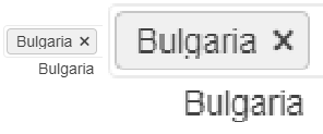
In some cases the text for the selected items does not display properly. Some letters, for example g, get their bottom cut off. This behaviour can be observed on for.ex. the Telerik page https://docs.telerik.com/blazor-ui/components/multiselect/overview The picture below was taken on the latest Edge browser, 1080p screen, 100% zoom level. Funnily enough, changing the zoom level either way makes the text fit in the selected items.
How can I increase the space for the text in the selected items so it's less likely to be cut off?
a popup opens a little bit wider than screen what cause skills
https://dojo.telerik.com/AzOHeDIx/3
could you please advise how to proceed?
Thx Alex
See demo:
- https://demos.telerik.com/kendo-ui/scheduler/index
- Change your theme to Fiori
- Notice the selected view is blue but the text is bunched up and also blue.
I'm not sure about other themes but this is the one we use. Submitting so you can provide a fix in next version but can you provide a CSS fix for this that we can add to our page in the meantime?
See attached screenshot.
Thanks!
1 - when use bootstrap v4 theme, ddl does not handle long names gracefully, please find in attachment example in bootstrap v4 & silver themes, also here are the dojo exaples
v4: https://dojo.telerik.com/
silver: https://dojo.telerik.
2 - for grid and separate controls validation message has diff view
https://dojo.
should be the same
Bug report
Reproduction of the problem
Dojo example.
Current behavior
The mobile material theme does not apply specific styles to a button that has the "km-primary" class. Compare to the Nova mobile theme, which does have specific rules that use ".km-primary" selector.
Expected/desired behavior
CSS rules that use the ".km-primary" selector should be added to the theme.
Environment
- Kendo UI version: 2019.2.619
- jQuery version: x.y
- Browser: [all]
The problem is easily reproduced using the widget demo page https://demos.telerik.com/kendo-ui/dropdowntree/index
Simply switch to the High Contrast theme; the k-widget element is lacking the border-radius style hence looks different to the other widgets.
It looks like the k-dropdowntree class is missing from the following style rule:
.k-autocomplete, .k-block, .k-calendar-container, .k-colorpicker, .k-combobox, .k-datepicker, .k-datetimepicker, .k-drag-clue, .k-dropdown, .k-dropdown-wrap, .k-editor-inline, .k-grid .k-filter-options, .k-grouping-header .k-group-indicator, .k-inline-block, .k-list-container, .k-multiselect, .k-notification, .k-numeric-wrap, .k-numerictextbox, .k-picker-wrap, .k-slider-selection, .k-slider-track, .k-split-button, .k-textbox, .k-tile, .k-timepicker, .k-tooltip, .k-touch-scrollbar, .k-treeview .k-in, .k-upload, .k-window, .k-window-action, .k-window-titleless .k-window-content {
    border-radius: 13px
}