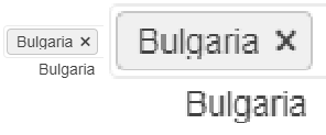
In some cases the text for the selected items does not display properly. Some letters, for example g, get their bottom cut off. This behaviour can be observed on for.ex. the Telerik page https://docs.telerik.com/blazor-ui/components/multiselect/overview The picture below was taken on the latest Edge browser, 1080p screen, 100% zoom level. Funnily enough, changing the zoom level either way makes the text fit in the selected items.
How can I increase the space for the text in the selected items so it's less likely to be cut off?
Ellipsis missing on month view
---
ADMIN EDIT
The Ellipsis icon is invisible in Material and Default, partially hidden in Bootstrap. The Show More button is invisible in Material. You can see the issues in the following demo: https://demos.telerik.com/blazor-ui/scheduler/month-view
Here is a workaround to make the Ellipsis icon visible which indicates a button in Material too:
<style>
    button.k-more-events > .k-icon.k-i-more-horizontal {
        top: initial;
        bottom: 0;
        transform: translate(-50%);
    }
</style>
Bug report
On screens with smaller sizes not all tools in the Spreadsheet Toolbar are visible. The tools overlap the overflow button and thus cannot be selected.
Reproduction of the problem
- Run the following demo and reduce the window width
Current behavior
On wider screens all tools are visible:

On narrower screens only some tools are visible and the overflow button is overlapped:

or completely hidden:
Expected/desired behavior
The overflow button should be visible so all Spreadsheet tools are accessible.
Environment
- Kendo UI version: 2020.3.118
- Browser: [all]
I need my application to be fully WCAG compliant.
I have multiple form fields that are not to be modified by the user, but must be readable by them.
Take the combobox for example: https://dojo.telerik.com/@GaloisGirl/exAZIROW
- The disabled variant is not focusable, nor does it have sufficient contrast between text and background. This is correct by WCAG rules, but not suitable to my use case.
- The readonly variant is almost perfect, but the arrow has visual cues that suggest it's interactive (color, hover background, cursor) when it's not.
The same problems occurs for DatePicker (see https://docs.telerik.com/kendo-ui/api/javascript/ui/datepicker/methods/readonly ) and other widgets.
Please keep in mind the subtle differences in meaning between readonly and disabled and do not just apply disabled styles to readonly widgets.
Hello,
I prepared a demo https://dojo.telerik.com/EYeYUSUw/6
Also applies to the latest default sass theme but probably to many more.
As you can see, the master grid its 'content row' hover effect is being applied to even the header of the detail grid and there is no way to resolve that unwanted effect apart from adding more styling tedious rules.
The resolution is so simple:
.k-grid tbody tr:hover, .k-grid tbody tr.k-state-hover {
    background-color: #e6e6ea;
}
Should be
.k-grid tbody > tr:hover, .k-grid tbody > tr.k-state-hover {
    background-color: #e6e6ea;
}
I did not search for the source files/lines what might need to change - easy to find in your current version.
There could be many more of these simple improvements which would save many hours on ours side!
Regards,
Jan
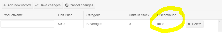
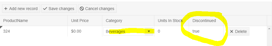
Hi,
When using a sass themes , like default-v2 and programmatically execute a set on datasource the dirty-field seems to not have enough time to mark the cell that is changed.
dojo: https://dojo.telerik.com/@utveckling@promosoft.nu/OjebanAX
Original State:
State after cell change:
Currently there are 3 application themes: Default, Material, and Bootstrap.
These are nice and helpful however having 3 is quite a bit limiting.
I totally understand that a lot of people will and maybe should create a theme based on their own styles and preferences.
However I honestly think most people probably use a default theme and make small corrections to it in order to suit their needs.
-------
Admin edit: We will be keeping here a list of the suggestions, add your comment which one you would like to see implemented - if it's not on this list, we will add it:
- Dark (black) theme - you can find a basic sample attached below that uses #363636 for background and #d5d5d5 for text colors (two of the main colors for the Black Material theme we have in Kendo), you can further tweak things in the Theme Builder app
- Fluent UI - based on the Fluent UI by Microsoft
- Kendo Themes such as BlueOpal, Silver and Office 365 - you can generate them from the predefined color swatches on the left hand side of the Theme Builder app
- Theme that uses CSS, not SASS variables so that it can be customized at runtime - at the moment, you can generate the needed themes and switch them at runtime as shown here.
------
In WPF there are 20 or so styles.
Why only 3 in Blazor when the web is just as easy to style as WPF?
Hi there,
as we are building apps for SharePoint and Office we are in need of a theme that looks like Office 365. Kendo UI for jQuery has that but there's a big shift towards building those apps with Typescript and React. Unfortunately the Kendo UI React package doesn't provide an Office 365 theme so everything we build doesn't integrate well to the look and feel of SharePoint and Office.
It would be great if you were able to migrate that theme over from jQuery to the React components.
Thanks and kind regards
Christian
Bug report
Reproducible with the Default and Bootstrap SASS themes.
Reproduction of the problem
Reproducible in the demos.
- Resize the browser window making it more narrow (screencast)
Current behavior
Icons are misaligned.
Expected/desired behavior
Icons are properly aligned.
Environment
- Kendo UI version: 2019.3.917
- jQuery version: x.y
- Browser: [all]
A suggestion to handle the issue is to use a font loading strategy that renders an invisible fallback font face, or a font face observer.
See demo:
- https://demos.telerik.com/kendo-ui/scheduler/index
- Change your theme to Fiori
- Notice the selected view is blue but the text is bunched up and also blue.
I'm not sure about other themes but this is the one we use. Submitting so you can provide a fix in next version but can you provide a CSS fix for this that we can add to our page in the meantime?
See attached screenshot.
Thanks!
Hello ladies and gentlemen.
In Bootstrap 4 (and Material) SASS theme the opacity setting for placeholder is missed.
Example: https://demos.telerik.com/kendo-ui/multiselect/index
My fix for Bootstrap 4 (I not known the opacity setting for Material placeholders):
.k-multiselect-wrap {
  > .k-readonly {
    opacity: 0.7;
  }
}Eduard Töws
a popup opens a little bit wider than screen what cause skills
https://dojo.telerik.com/AzOHeDIx/3
could you please advise how to proceed?
Thx Alex
A new Kendo UI theme which is in compliance with and extends Zurb Foundation styles -> http://foundation.zurb.com/sites/docs/kitchen-sink.html
Especially with dark themes such as Metro Black, the traditional browser scrollbar does not really fit. I know scrollbar customization is not available in all browsers, but no fallback support is required (as the css is simply ignored by these browsers), and I believe it would greatly benefit users of the browsers that are supported.