
Hello,
The MultiSelect and ComboBox Icons seem to have issues. First, in the MultiSelect, I'm not able to customize the icon within the IconButton. In the similar ComboBox, I can customize the icon, but the change is not reflected in the live view.
I would expect that all the clear "X" icons within the dropdown components would inherit from the base TextBox "Clear Icon" but they don't.
Regards,
Brian
When the ThemeBuilder project has custom variables or variables exported from Figma in the output _tokens.scss file all variables are with the ‘tb’ or ‘figma’ prefix.
It will be good if these prefixes can be configuration options for the project and users can choose what prefix (or no prefix) should use.
Consider providing partial exports for the SCSS when working with the Kendo Fluent theme. Partly exports are available for all other flavors except for the Fluent theme.
+1 from t.1652071
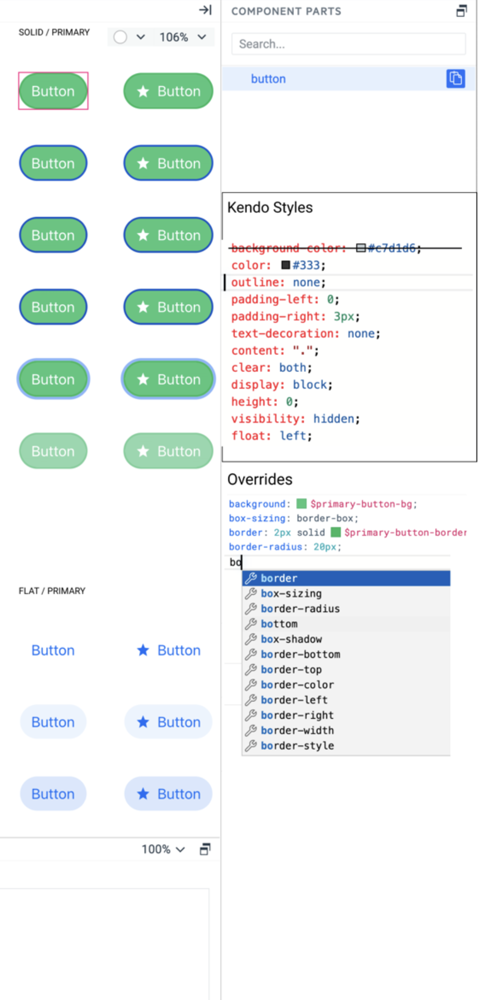
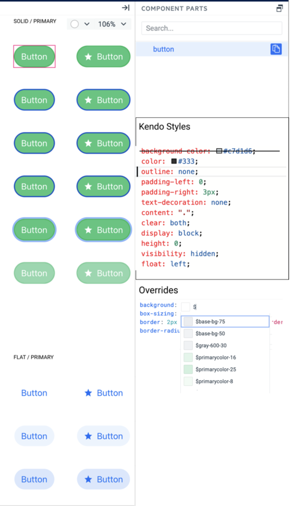
In my example the neumorphism-default
box-shadow: 3px 3px 5px 0px rgba(52, 178, 50, .33), -3px -3px 5px 0px rgba(255, 255, 255, .6);On the ButtonGroup I got overflow on the other buttons and I want to clip the buton for remove the shadow on adjacents buttons.
In my example:
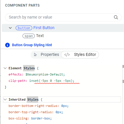
This clip-path can help to apply shadow on the buttons group
to pass from this :
to this


Hi,
Would it be possible to expose either a "before" or "after" selector on Treeview Root/Child items?
This would allow an additonal hook for styling, and it a feature of items in the Drawer, Panelbar etc.
Many thanks,
Ian
Currently, the ThemeBuilder application supports only major Kendo releases (like R1, R2, and R3) and the version of the theme that is interconnected with these release versions.
Consider the option to provide functionality to choose between newer versions of the Kendo themes that are released with service packs and patches. This way, the user will have the ability to test versions that contain theme fixes before the next major release.
For example, R2 2023 officially supports Kendo theme 6.4.0, and before R3 2023 is released the Kendo theme is already at version 6.7.0
Consider the option to support absolute paths for background-image in the Style Editor.
This will enable users to visualize the background-image changes directly in ThemeBuildeer (currently the only option is to export the theme and load the changes in the end application).
Alternatively, consider the option to provide a space for loading images with relative paths (fir fast preview in ThemeBuilder).
Hello,
We have been creating custom variables for a color palette that our design system uses. However, we are unable to set any of the global properties (ie. text color) to one of the custom variables we have created. The list of variable options is limited to the "Theme Colors." We can set the color manually by setting the hex color it would be great if we could use our custom variables, especially if the list of global variables grows in the future.
Thank you for consideration of this feature!
Add a new smart code editor as a variant of the Property Grid with all visual properties. Do not replace the property grid with this editor. They can live next to each other in different tabs. The smart code editor should support all features of the property grid but with advanced functionalities.
1. Show all kendo styles attached to the selected layer in a text format
2. Marks which style is overridden by user styles
3. Users can add any CSS property, not just the one listed by the Proprty grid editors.
4. Intellisense for CSS properties, something like:
5. Intellisense for using sass/css variables – the editor can recognize the property name and list only corresponding tokens for example – background – shows color tokens, box-shadow – shows effect tokens. Something like:
As the subject suggests, I think the ability to support multiple swatches in a single project would be a fantastic addition to Themebuilder!
This change would allow a user to select a theme that'll encompass an app's light mode, and once finished, select a separate theme to repeat the process for dark.
As it currently stands, separate Themebuilder projects need to be created in order to separate light and dark themes.
Thank you in advance for your consideration!
Consider the option to expose predefined classes of HTML elements from the Kendo themes. This would allow atomic customization and mapping to other imported variables (like ones imported from Figma designs).
For example:
An option to style the H1 header from the Kendo theme, which has the .k-h1 class.
Q: Can one css file be produced for just the components selected in ThemeBuilder?
Ideally, we would like to have the option to produce only partial themes for specific components. This will allow to minimize the size of the output CSS/SASS files, which will allow us to lower the size of the end application.
Alternative ways to achieve similar results through manual application builds: https://docs.telerik.com/themebuilder/partial-theme-build
Currently, in ThemeBuilder, each uploaded font must have a unique font family name.
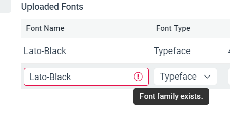
However, in some cases, we would like to add multiple font variants (files) via the same font family name (e.g., all named "Lato") and let the user control them through typography variables (from where users should be able to control the specific weight, type, etc.).
I have a grid with a column that contains clickable text in <a> tags and want it to be obvious to the user that this is clickable, by having the text display in blue.
However, there is a CSS class being applied that is preventing the styling from showing:
.k-grid a {
color: inherit;
text-decoration: none;
}
Is it possible for me to modify the styling of these links within ThemeBuilder and not have to add a custom global style override? I have not found any way of changing this.
Thanks
Allow customisation of frozen and locked columns & cells in Grid for more comprehensive component styling.
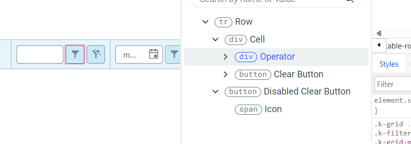
Currently, you can style only the Operator and the Clear buttons components inside the FilterRow Cell template. It would be great to have the ability to style the rest of the components (e.g. Inputs, NumericTextBox, etc.)