Allow customisation of frozen and locked columns & cells in Grid for more comprehensive component styling.
Currently, in ThemeBuilder, the generated stypes for the Kendo/Telerik Grid component are for size "medium" (or "md").
However, in Kendo UI for JQuery and other Kendo/Telerik suites, the Grid size property supports other values like "small" and "large".
https://docs.telerik.com/kendo-ui/controls/grid/appearance/sizing
https://docs.telerik.com/kendo-ui/api/javascript/ui/grid/configuration/size
Consider providing ThemeBuilder templates to allow the generation of styles for other Grid sizes
ThemeBuilder only allows limited control over a specific set of exposed variables. Although these variables are constantly analyzed and updated, some, such as $base-gradient, cannot be modified through ThemeBuilder and require manual adjustments.
Example of variable that is not currently exposed: $base-gradient
The feature request is to explore the possibility of exposing more variables or providing a UI for selecting Kendo variables, bearing in mind that some Kendo themes may have over 2,000 variables.
So far the following variables were requested explicitly:
1623384: $base-gradient
1630912:
$kendo-grid-header-padding-y
$kendo-grid-padding-x
$kendo-grid-padding-y
$kendo-input-border
$kendo-input-hover-border
Consider providing public API endpoints for different ThemeBuilder functionalities, such as export options. This will allow users to provide automated distribution of the theme.
Requested through t.1644512
Now, to reset a component to default, you need to click on each layer and look for where it was changed. It would be great to have a button to roll back all settings, for example, like in the screenshot.
Otherwise, it turns out that you spend a lot of time setting up the component, and then return the same amount of time back.
Thanks!
Problem: To delete a custom variable in ThemeBuilder, it must be detached from all its use places. However, these places are not immediately clear, and there is no global search option to find them.
Goal: Provide a UI option to find/list all places where a variable is used within a ThemeBuilder project.
Consider exposing a template for the ContextMenu component in ThemeBuilder.
https://docs.telerik.com/kendo-ui/controls/menu/contextmenu/overview
https://docs.telerik.com/blazor-ui/components/contextmenu/overview
Requested through t.1658717
Currently, there are no means to style the clear button of the DropDownTree component.
Consider exposing a template for the clear button (similar to the "(span) Input" component part).
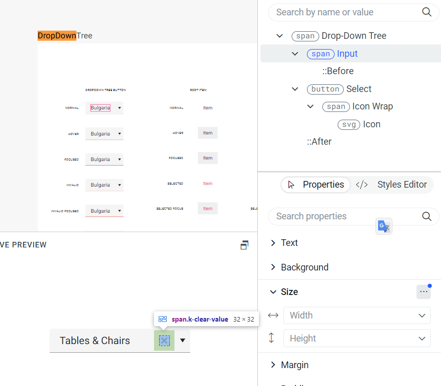
requested through t.1660254
Consider providing a way for users to define color palettes. Such a feature is currently unavailable in ThemeBuilder.
Requested through t.1665887.
Consider providing a styling template for the Kendo/Telerik Grid with sticky columns
For example:
https://demos.telerik.com/aspnet-mvc/grid/sticky-columns
Note:
Currently, in Kendo UI for React a similar concept is the locked columns https://www.telerik.com/kendo-react-ui/components/grid/columns/locked/
Currently, there is no way to style the different states (e.g. hover) of the Grid's Column Menu items through ThemeBuilder.
Consider exposing templates for those states.
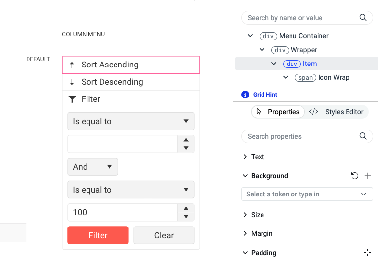
Requested through t.1661051.
Support in ThemeBuilder for using variable fonts (a font where a single file contains all weight variations).
https://fonts.google.com/knowledge/glossary/variable_fonts
Example for variable font: https://fonts.google.com/specimen/Inter
Requested through t.1627093
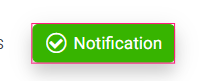
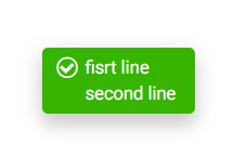
Consider providing an option to customize the text content for various components (like "Button", "Notification", etc.) so that users can test various scenarios like having longer strings, multiline strings, and similar scenarios.
For example, a user should be able to easily change the template text so that he can test sub-element alignment
Current template
Desired template with customized text
As of now, customization is only possible through the browser developer's tooling.
Consider the possibility of creating a gallery-like platform to showcase various ThemeBuilder demo projects.
The goal is to demonstrate the potential of creating different themes in ThemeBuilder and customizing various Kendo/Telerik components. The gallery should showcase different supported themes alongside multiple demo projects from the supported frameworks, such as JQuery, Angular, Vue, Blazor, and MVC, with Material, Bootstrap, Fluent, and Default themes.
Consider the options for providing a ThemeBuilder template for Kendo Spreadsheet
https://demos.telerik.com/kendo-ui/spreadsheet/index
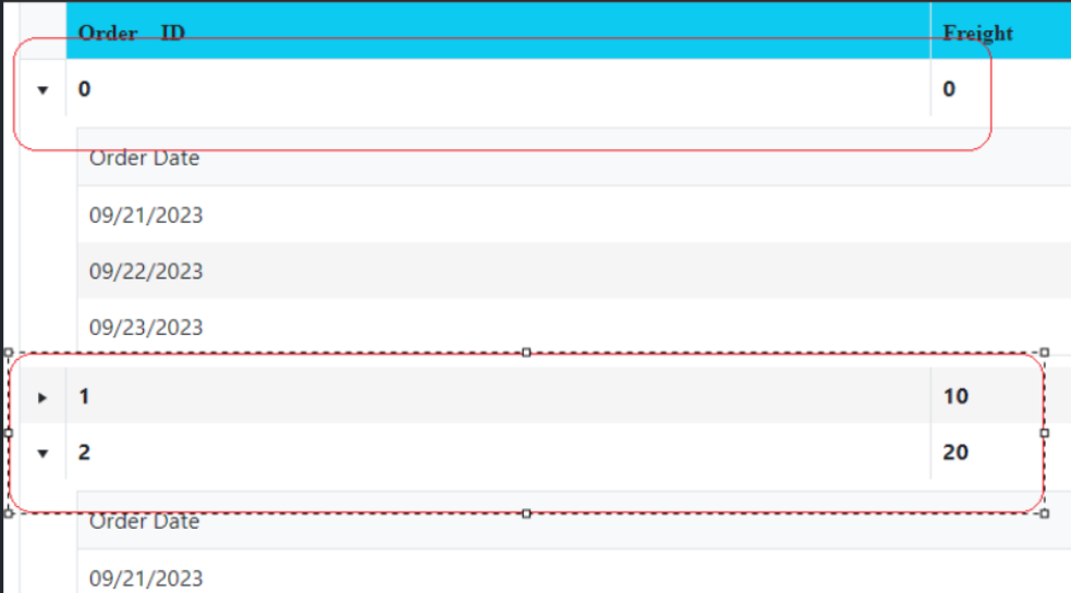
Consider the option to support the Telerik/Kendo hierarchical grids or grid grouping through separate component templates.
For example,
https://demos.telerik.com/aspnet-mvc/grid/hierarchy
https://www.telerik.com/kendo-angular-ui/components/grid/grouping/basics/
The hierarchical grids are visualized with a master row similar to the Grouping Row template. However, it is currently impossible to directly style the hierarchical master row.
Example for grid groups
https://stackblitz.com/run/?file=src%2Fapp%2Fapp.component.ts
In ThemeBuilder Q1 2024 there are Grid templates for styling alternate rows and selected rows. However, there is no template for styling selected alternate row.
Consider providing templates for each rendering option.
In my example the neumorphism-default
box-shadow: 3px 3px 5px 0px rgba(52, 178, 50, .33), -3px -3px 5px 0px rgba(255, 255, 255, .6);On the ButtonGroup I got overflow on the other buttons and I want to clip the buton for remove the shadow on adjacents buttons.
In my example:
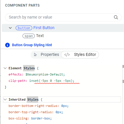
This clip-path can help to apply shadow on the buttons group
to pass from this :
to this


There is a template in the Constructive Elements canvas of components, such as Grid, MultiSelect, etc., for Filter List Item. Currently, ThemeBuilder does not have an exposed component part for modifying its search icon. It becomes problematic when we use font icons, especially a different font file for the icons, which requires changing the character code.
Consider exposing a component part to modify this icon.