There is android platform specific attached property ImeOption for entry control.
<Entry x:Name="Default" FontSize="22" Placeholder="Default" Keyboard="Numeric" android:Entry.ImeOptions="Next" />
Please provide an option to use this property for Telerik MAUI RadEntry.
Runtime exception with latest Microsoft .NET iOS sdk 8.0.100 17.0.8490
Exception:
 TelerikTestForSimulator[24646:547905] *** NSForwarding: warning: object 0x60000289d5c0 of class 'Telerik_Maui_InputElement_RadTextField' does not implement methodSignatureForSelector: -- trouble ahead
 TelerikTestForSimulator[24646:547905] *** NSForwarding: warning: object 0x60000289d5c0 of class 'Telerik_Maui_InputElement_RadTextField' does not implement doesNotRecognizeSelector: -- abort
Keyboard remains open on iOS when taping outside of Entry control.
There is a workaround for the MAUI Entry control by setting the HideSoftInputOnTap property on the Pagel, but this property does not work on RadEntry. The keyboard remains open.
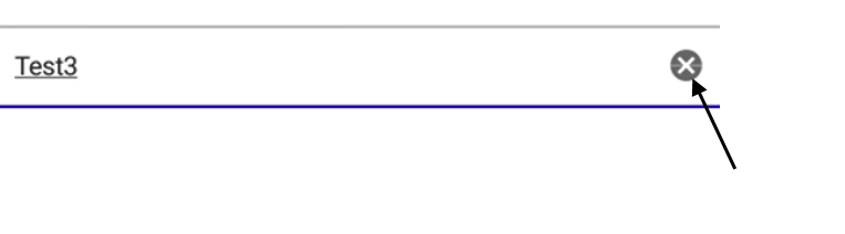
A line going through the clear button of the RadEntry control. The behavior is reproduced on Android 9.0
Hi Team,
I need to be able to set the color of the selection highlight.
- On WinUI/UWP you can do this using the TextBox.SelectionHighlightColor
- On iOS and MacCatalyst, it is done using the UITextField.TintColor.
- On Android, it is ColorAccent
Can you please add a new top-level property on the .NET MAUI RadEntry control that allows us to set this?
Thank you,
Craig
When you've set IsPassword=True and have an initial value for Text, that value is ignored (only the watermark is shown).
Reproducible on .NET MAUI peview14 using UI for MAUI 0.6.0 with the following code
<telerik:RadEntry Placeholder="Password" Text="1234" IsPassword="True"/>
The Placeholder position is not in sync with the Entry's Text, it is always top-left aligned.
Here's a quick screenshot of what happens when the RadEntry is larger than the default.
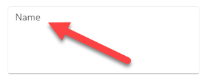
This has the side effect of not being aligned with the Text.
Suggested Solution
There are several ways I can think of to approach this, but I think the easiest way would be to just bind the top level control's VerticalTextAlignment property value on the internal Label being used for the Placeholder
<telerik:RadEntry Placeholder="Name"
                              WidthRequest="280"
                              HeightRequest="100"
                              VerticalTextAlignment="End"/>
The same is valid for the RadEntry control which is used internally in the AutoComplete
On Android: RadEntry and .NET Maui Entry behavior are identical. When unfocused, the focused background is still applied.
On WinUI: RadEntry and .NET Maui behavior when are unfocused, the focused background is still applied. When RadEntry is in the "Focused" and "PointerOver" visual states, the control behavior is with the default state. When .NET Maui Entry is in the "Focused" and "PointerOver" visual states, the control behavior is with the "PoinetOver" visual state.
On iOS and MacCatalys: When RadEntry is unfocused, the focused background is still applied.
On Windows when IsReadOnly state changes to true, the control state does not change, you can still edit the text.
Example:
<VerticalStackLayout >
            <Switch IsToggled="{Binding IsReadOnly,Source={x:Reference EntryShareName}}"/>
            <telerik:RadEntry x:Name="EntryShareName"
                                FontSize="14"
                                Placeholder="Enter text here"
                                PlaceholderColor="#99000000"
                                AutomationId="radEntry">
            </telerik:RadEntry>
        </VerticalStackLayout>
Hi Team,
I would like to be able to use standard .NET data annotations on my bound property with the RadEntry's validation features.
For example, the following MaxLength attribute:
[MaxLength(12)]
public string CustomerId
{
    get => customerId;
    set => SetProperty(ref customerId, value);
}
Thank you,
Mads