In the jQuery version of the Grid, the columnMenu can be configured to show/hide the different column menu options.
Here is an example of how the sortable prop can be configured in a way the sorting options will be hidden in the column menu.
Please provide the same configurations options for the column menu in the Native Grid
Describe the bug
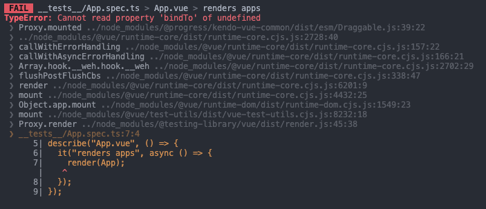
When the Grid's resizable property is set to true, the following test fails:
import { describe, it, expect } from "vitest";
import App from "../App.vue";
import { render } from "@testing-library/vue";

describe("App.vue", () => {
  it("renders apps", async () => {
    render(App);
  });
});
- The issue is not replicable if in Draggable.js file the:
import KendoDraggable from '@progress/kendo-draggable';
is changed with:
import { Draggable as KendoDraggable } from '@progress/kendo-draggable';
With this error:
To Reproduce
- Open this project
- Run 'npm install'
- Run 'npm run test:unit'
Expected behavior
The test should pass as it used to pass in version 3.5.0, for example.
The current implementation of the Native Vue Grid doesn't provide an option to control the visibility of the column menu in each component column.
Providing a property that can control the visibility of the different column menus will be very useful in scenarios when we want to create a customized column menu that contains a component with a popup. With the current implementation of the component, if we for example add a DatePicker to the column menu, the opening of the DatePicker's calendar triggers the closing of the column menu. Having a prop that controls the visibility of the column menu we can easily handle the described scenario.
Add groupHeaderColumnTemplate, as in Kendo jQuery Grid and Kendo Vue Wrapper Grid, that can be applied as it is done in this demo https://demos.telerik.com/kendo-ui/grid/aggregates.
Providing an Excel-like behavior inside the Native Grid will be a very nice feature for the component. The described behavior includes:
- Cells and rows selection like in Excel
- Editing like in Excel
- Keyboard navigation like in Excel
Describe the bug
The @progress/kendo-vue-buttons is missing as peer to @progress/kendo-vue-grid package
It would be beneficial if the Kendo UI for Vue ColumnMenu had an option to display the visible columns as it is in Kendo UI for Jquery, instead of creating a custom columnMenu:
Describe the bug
The selectionChange & headerselectionchange events of the Native Grid component are unexpectedly triggered when filtering data in the component.
-
The issue is not replicable on Chrome and Safari.
-
A possible workaround for the bug is demonstrated in this StackBlitz example
To Reproduce
- Open this StackBlitz project in Firefox
- Enter random text in the filter input of some of the fields
- See the following two errors in the console:

and

Expected behavior
No JS errors should appear when filtering the Grid component, no matter the browser that is used.
Add a numeric indicator for the sorted columns shown when multiple columns are sorted to indicate which order the columns are being sorted in.
This feature is already available in the angular Grid:
https://www.telerik.com/kendo-angular-ui/components/grid/sorting/multi-sort
Introduce filter buttons highlight to visualize which column has a filter applied.
The feature is available in KendoReact:
https://www.telerik.com/kendo-react-ui/components/grid/filtering/advanced-filtering#filtering-data-grid-through-column-menu-filter

Description:
We would like to request the addition of multi-cell selection functionality to the Kendo Grid for Vue, similar to what is available in the Kendo Grid jQuery version.
Current Situation: The Kendo Grid for Vue currently supports:
Row selection via the selectedField prop with checkboxes
Single row highlighting
Cell navigation via the navigatable prop
However, it lacks the ability to select multiple individual cells or cell ranges, which is a feature available in the jQuery version of Kendo Grid.
Requested Feature: Add multi-cell selection capabilities to the Kendo Grid for Vue, including:
Selection Modes:
- Single cell selection
- Multiple cell selection (Ctrl+Click)
- Range selection (click and drag, or Shift+Click)
- Column selection
- Row selection (already exists)
API/Props:
selectable prop with values like:
-"cell" - single cell selection
- "multiple, cell" - multiple cell selection
- "cell, row" - combined cell and row selection
selectedCells prop to track selected cell coordinates
onCellSelectionChange event handler
Functionality:
- Visual feedback for selected cells (highlight/styling)
- Keyboard navigation support (arrow keys, Shift+arrows for range selection)
Use Cases:
- Data analysis and comparison across multiple cells
- Batch operations on selected cells
When using a grid with a selectable column and keyboard navigation enabled, it's not possible to select the last visible row. Instead of selecting the row, the grid just scrolls the item to the center of the grid.
I've attached a gif of the behavior and a sample project based on the grid demos.
We are currently upgrading the vue-gid-wrapper to the better native-vue-grid. Unfortunately some features, like the minScreenWidth, don't seem to be included yet.
I assume the features from the wrapper will all be included in the new native grid, but to be sure I'm requesting the feature (minScreenWidth).
columns: [
        {
          field: 'variableName',
          title: 'fieldTitle',
          width: '125px',
          minScreenWidth: 1000
        },
        ...
]Hi Team,
I'm using the export excel feature in the grid. When I'm trying to download data less record( < 3k) it's working fine, but this becomes problematic when I'm trying to download huge data (more than 10k) my browser hangs and after some time browser crash. Do let me know any solution regarding this issue.
I'm submitting a bug report
Current behavior
In a Native Grid that has a multicolumn header which is locked, when the Grid is scrolled horizontally, the upper(shared) part of the multicolumn header is moving based on the scrolling direction.
Expected behavior
When the multicolumn header is locked it should not move along with the horizontal scrolling inside the Grid
Minimal reproduction of the problem with instructions
- Open this example
- Scroll the Grid horizontally
I'm submitting a...
- Bug report
Current behavior
The "type" GridColumn prop is not available in the Typescript definitions available in the GridColumnProps.d.ts file.
Expected behavior
The type prop should be available also in the Typescript context as it is available in this Knowledge base article
I'm submitting a...
- Bug report
Current behavior
When a named slot template is used in the Grid, the PDF export functionality will not export the cells that have an applied template.
In the linked below example, after exporting the Grid to PDF, the header cell of the "UnitPrice" column is empty.
If you remove the headerCell: 'headerTemplate' configuration and export the Grid to PDF, everything is exported correctly.
Expected behavior
All Grid cells should be exported to PDF no matter if they have a template applied to their definition.
Minimal reproduction of the problem with instructions
- Open this project.
- Click on the "Export vie PDF component" button
- Check the exported file
I'm submitting a...
- Bug report
Current behavior
If a column has a value of 0 and there is no editor defined for this column, when editing Grids' data, the input in which 0 should be displayed is actually empty.


Expected behavior
When editing the Native Grid, the data displayed when a row is not in edit mode should be the same as when the same row is in edit mode.
Minimal reproduction of the problem with instructions
- Open this StackBlitz example
- Edit a row whose UnitPrice value is 0
- See the empty input for the UnitPrice field, when the selected row is in the "edit" mode
There is an issue with white space that appears when you scroll a Grid with Groupable and Virtualization configurations switched on.
Reproduction:
- Go to this article.
- Scroll the Grid till the end of the scroller
- See the white space.
Jumping issue:
When you scroll the linked above example there is a strange "jumping" of the rows.