Hi. I would like to share my experience and thought of Kendo for Vue.
I still like and am using Kendo for Vue but here is my feedback :)
I reviewed the Kendo Vue version and made a purchase.
However, as a result of evaluating, there are some areas that are a bit disappointing.
It seemed that there were most of the templates that could be used in jQuery.
Checking with the Vue version, most of the examples and event handling are not written, and there are much information that I have to go and check with jQuery version.
If it is enough description and information about Direct code that can use examples and event handling in Vue version
in detail on the site, it would be much easier to use.
Thank you.
The Kendo UI for Vue Scheduler Wrapper doesn't support year view which is available in the jQuery suite.
To reproduce the issue follow the below steps:
- Open this StackBlitz example
- From the DropDownList in the upper right corner select "Year"
- Check the console. The following error appears in it:

Expected behavior
The "Year" view should be available in the Kendo UI for Vue Scheduler Wrapper
Hi,
Please consider adding a better, native, way to handle the case as described in my post here.
hhttps://stackblitz.com/edit/kgeavu?file=src/main.vue
the console.log is observed even when selecting other tabs.
The Native NumericTextBox doesn't have the 'k-state-focused' class applied to it, once the component is focused.
For comparison, the Angular and React versions of the same component get this class applied.
React: https://www.telerik.com/kendo-react-ui/components/inputs/numerictextbox/
Angular: https://www.telerik.com/kendo-angular-ui/components/inputs/numerictextbox/
Currently in Vue we don't provide the ability to share with the customers the source code before the compilation but just the already compiled code.
We need to provide the ability to fork the repository and build components from the Vue repository similarly to the way it is done in Angular and React.
Bug report:
https://stackblitz.com/edit/bbuqh1?file=src/main.vue
Steps:
Focus the input, type some text and blur -
Current:
an warning is observed in the console and the types string is passed to the change event.
Expected:
an warning is observed in the console and the types string SHOULD NOT BE passed to the change event.
It would be nice if we can see a native version of the component.
In a scenario when a mouse is connected to an iPad, using the mouse, we cannot switch the states of the Switch component.
If the screen is touched, the Switch is correctly switching position.
Here is a video demonstrating the issue:
kendoswitch-rpreplay-final1635815724-mp4.zip
Describe the bug
When defining a custom editor Template for the Scheduler(wrapper) component we define the value passed to the editable-template property as follows:
editorTemplate(data: any): any {
  return {
    template: EditEventTemplateComponent,
    templateArgs: Object.assign({}, data, {
      parentComponent: schedulerRef.value,
    }),
  };
}
With the above definition, in the EditEventTemplateComponent, the templateArgs cannot be accessed inside the setup function, when the Composition API is used. In the mean time, the templateArgs are accessible in the template of the EditEventTemplateComponent.
To Reproduce
- Open this project: sample-scheduler-composition-api.zip
and install its NPM packaged(npm install) - Start the project(npm run serve)
- Double click on one of the events available inside the Scheduler.
- Check the console of your browser
-->
Expected behavior
The templateArgs should be accessible inside the setup function when using Composition API.
- Possible workaround: Use the classic Options API instead. When we use the Options API, the templateArgs are accessible inside the mounted hook.
When using the Drawer component in Kendo UI for Vue, it expands from the wrong side the first time is it toggled if expanded: false and overlay:true
This can be reproduced on the Display Modes example by clicking Edit in StackBlitz, changing the initial value of expanded from true to false (line 92), and toggling the drawer in overlay mode.
After it has been toggled once, it then expands in the correct direction.
It does work correctly if I use "rtl" direction instead of "ltr".
https://stackblitz.com/edit/gv4uwk?file=src/main.vue
Focus the initial input then press tab
the stepper is focused yet it does not change visually so we know it
expected:
There is a visual initial representation of the focused component
Describe the bug
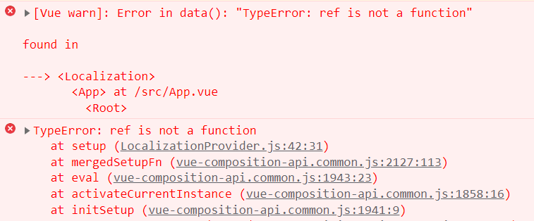
When the Localization and Intl Providers are used in Vue 2 with Composition API, there is an error in the browser's console that appears initially, before any user interaction. The error is "[Vue warn]: Error in data(): "TypeError: ref is not a function"". After this error appears, no matter what values are passed to both the Localization and Intl components, the are not functioning.
To Reproduce
- Open this CodeSandbox example
- Open the browser's console and see the error.
Expected behavior
The Localization and Intl Providers should work correctly in both options and composition API contexts
https://stackblitz.com/edit/nqnhfx-scivtg?file=src%2Fmain.vue

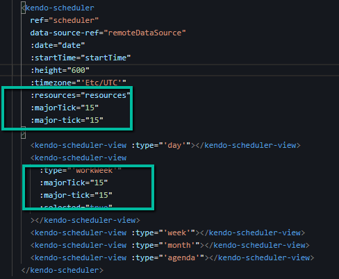
Trying both variations as your documentation is inconsistent on the naming. But neither way gets the views to show times at 15 minute increments.
Describe the bug
When binding the Scheduler Wrapper component to a remote datasource, there are two requests sent to the remote service.
To Reproduce
- Open this StackBlitz example and run it.
- Open the Network tab of your browser and see the requests
Expected behavior
Only one request should be sent to the remote service
We have a window hidden with v show and a DatePicker in it.
When we open the DatePicker and try to hide the Window the popup of the DatePicker stays opened
example and steps in ticket - 1562574
workaround - delay the hiding of the Window with 200 ms to ahve a default hiding of the popup executed:
const toggleDialog = (e) => {
e.preventDefault();
setTimeout(() => {
if (visible.value) {
showPopup.value = false;
}
visible.value = !visible.value;
}, 200);
};
Describe the bug
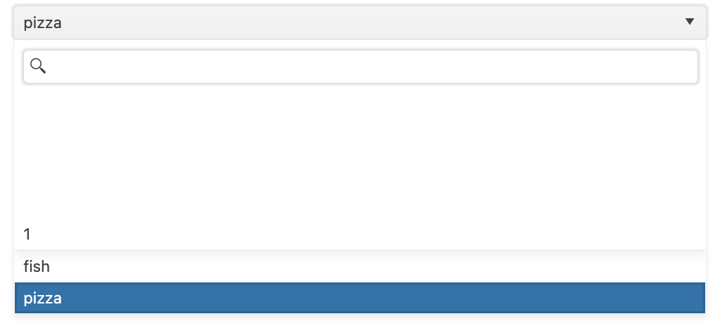
When working with the Wrapper DropDownList, if the component uses the v-model directive, there are some white spaces appearing in the popup of the component.
If the component doesn't use the v-model, the described behavior is not replicable.
To Reproduce
- Open this StackBlitz example.
- Select "Fish"
- Select "Pizza"
- Repeat steps 2 and 3 multiple times
- See the white space in the popup
Expected behavior
No white space should appear in the popup of the DropDownList component.
When entering a number with decimals in a Native NumericTextBox with a format it rounds up the number if you enter more decimals than the format allows. In this Stackblitz project you can see this behavior.
In the Wrapper NumericTextBox it is possible to add a round property with the value false which prevents the rounding of decimal numbers. Instead of rounding it truncates the number. By my knowledge and what I can find in the Vue documentation this property isn't available in the Native NumericTextBox.
Proposed solution
Add round property with related logic to the native component.
Steps to reproduce
- Copy and paste the value 12.345
- See that the value in the input becomes 12.35
- See that :round="false" does nothing.


