Environment Details:
OS: Windows11 version 21H2 (OS build 22000.856)
Edge Browser version: 104.0.1293.47
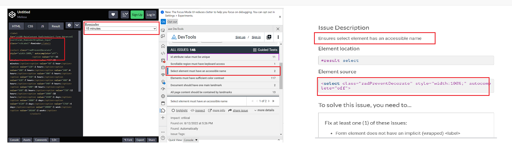
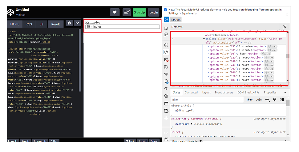
Repro steps:
1. Open Code Pen: https://codepen.io/m1mrt/pen/VwXjEzJ page in Edge Browser.2. Run Axe dev tools3. Observe an issue that select element has an accessible name.
Actual Result:Select element does not have an accessible name.
Expected Result:
All components need an accessible name, ideally using semantic elements and attributes. In rare cases, aria-label or aria-labelled by may be needed to alter the name.
Screenshot attachment:
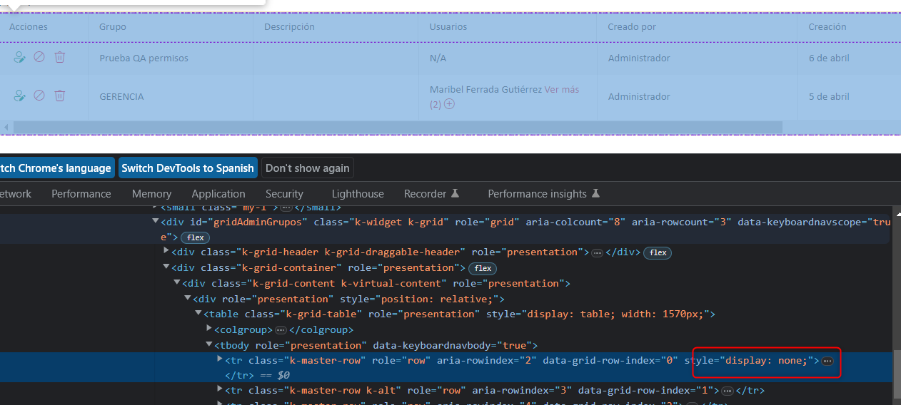
We have problems with the grid because for no reason a 'display:none' appears, specifically in this creation action
We can't understand when the error might occur, we think it's a coincidence of class names.
Can you guide us through this error?
It is my first time raising a support contact so I don't know what background they can mostly support.Greetings and thank you very much
Actual Result:
While navigating in table, Narrator is not announcing as 'enter table' and it is also not announcing rows and column information. while navigating in table, With arrow keys or table navigation keys or tab key, Narrator is announcing as 'end of line/blank'.
With caps-arrow keys, Narrator is giving row and column information.
Expected
While navigating in table, Narrator should announce as enter table and it should also give row and column information. And while navigating with arrow keys or table navigation keys or tab key, Narrator should not announce as 'end of line/blank' instead it should give row or column information
I have attached files, in which there is an app bar content there is a dropdown in the dropdown there are four elements, in that I need four drawer container on the left side as I attached by clicking the single dropdown, how can I attach 4 drawer container in a single project
Thank you
- This issue is observed with all three screen readers.
- Same issue is observed in chrome browser as well.
- Turn on Screen Readers:
- Narrator: Win + Shift + Enter
- NVDA: Ctrl + Alt + N
- JAWS: Ctrl + Alt + J
- Verbosity:
- Narrator: Default
- JAWS: Beginner, Highest
- NVDA: Default
- Open the URL: Agora Home Page (PPE) in latest edge browser.
- Press tab key to move to the 'Save as' control present in the page and activate it using enter key.
- Save as dialog gets displayed.
- Press tab key to move to the 'workspace to be saved as in' edit field and activate it using 'Alt + down arrow key'.
- Enter any invalid data in the search edit field.
- Now Verify whether screen reader is announcing the search result information on giving invalid data in the search edit field in windows or not.
- This issue is observed with all three screen readers.
- Same issue is observed in chrome browser as well.
- Name is not properly defined for once control. Screen reader is narrating the name twice for the once control as "Once check box not checked report frequency: once"
Path: Home > Header > Reports > Schedule a report button > Schedule a Report pop-up.
Refer Attachment: Name is not properly defined for once control.png
- Turn on Screen Readers:
- Narrator: Win + Shift + Enter
- NVDA: Ctrl + Alt + N
- JAWS: Ctrl + Alt + J
- Verbosity:
- Narrator: Default
- JAWS: Beginner, Highest
- NVDA: Default
- Open the URL: Agora Home Page (PPE) in latest edge browser.
- Press tab key to move to the 'Alerts' control present in the page and activate it using enter key.
- 'Alert Definitions' page gets displayed.
- Press tab key to move to the 'Functions? Filter' control and activate it using 'Enter key'.
- Navigate through the radio buttons in the displayed popup using arrow keys and verify whether screen reader is announcing incorrect name for the radio buttons present in the filter dropdown in windows or not.
- Same issue repro on heading 'Workspaces & Dashboards' [appears on Home --> Header--> Hamburger menu--> Popup] (Refer Attachment: Note_1_Same issue repro on heading 'Workspaces & Dashboards'..mp4).
- Heading hierarchy is not sequential in the Home page.
- Turn on Accessibility insights for web extension.
- Navigate to the headings toggle control and turn it on.
- Open the URL: Agora Home Page (PPE) in latest edge browser.
- 'Agora home page (PPE)' will be displayed.
- Navigate to 'Hamburger' menu control using tab key and activate it using enter key.
- 'Workspace and dashboards' popup will be displayed.
- Navigate to 'Add dashboard' control in the list displayed using tab key and activate it using enter key.
- 'Create Dashboard' dialog gets displayed.
- Observe and verify whether visually appearing heading text 'Create Dashboard' in the dialog is not programmatically defined as heading or not.
- Same issue is observed for the below two dialogs.
- Visually appearing heading 'Import Workspace' is not defined as heading programmatically. [Path: Home page-->activate 'Hamburger' menu-->Import workspace--> Popup] (Refer Attachment: Note_1_Visually appearing heading 'Create Workspace' is not defined as heading.png.)
- Visually appearing heading 'Create Workspace' is not defined as heading programmatically. [Path: Home page-->activate 'Hamburger' menu-->Add new workspace--> Popup] (Refer Attachment: Note_2_Visually appearing heading 'Import Workspace' is not defined as heading.mp4).
- Turn on Accessibility insights for web extension.
- Navigate to the headings toggle control and turn it on.
- Open the URL: Agora Home Page (PPE) in latest edge browser.
- 'Agora home page (PPE)' will be displayed.
- Navigate to 'Add a widget' control using tab key and activate it using enter key.
- Navigate to 'Mark down' control in the list displayed using tab key and activate it using enter key.
- 'Create text widget' dialog gets displayed.
- Observe and verify whether visually appearing heading text 'Create Text Widget' is programmatically defined as heading or not.
Environment (OS, Application, Versions)
- OS: Windows 11 Enterprise 22H2 (OS build: 22621.1992)
- Browser: Chrome Version 115.0.5790.102 (Official Build) (64-bit)
- URL: Column Menu - Kendo React (telerik.com)
- Matrix: Chrome+ JAWS.
Repro Steps
- Open URL: Column Menu - Kendo React (telerik.com)
- Navigate to context menu controls available on column headers of Basic usage table.
- Verify if context menu is accessible using keyboard.
Actual Results
The 'context menu' controls available on the column headers under the basic usage table are not accessible using the keyboard.
Expected Results
The 'context menu' controls available on the column headers under the basic usage table should be accessible using the keyboard.
On this page: https://www.telerik.com/kendo-react-ui/getting-started/
On this section: "Add a KendoReact Data Grid"
When I launch the app as usual:
```sh
yarn start
```
Then the browser page includes this error:
```
Compiled with problems:
ERROR in ./.yarn/__virtual__/@progress-kendo-react-data-tools-virtual-df92d36fcf/0/cache/@progress-kendo-react-data-tools-npm-5.2.0-8d098f65a0-5d68752aaa.zip/node_modules/@progress/kendo-react-data-tools/dist/es/columnmenu/ColumnMenuFilterForm.js 19:0-55
Module not found: Error: @progress/kendo-react-data-tools tried to access @progress/kendo-react-buttons (a peer dependency) but it isn't provided by your application; this makes the require call ambiguous and unsound.
Required package: @progress/kendo-react-buttons
Required by: @progress/kendo-react-data-tools@virtual:79c9c696d5f1e6f4dd730946c0d2912611551a498926b146bcbdd9d142588c5f4c2333469b63e7a9a2bdd1f0f1313d0d70b72cc8dbcafcc20e21e6b9790f6068#npm:5.2.0 (via /Users/joel/git/joelparkerhenderson/demo/demo-react-kendo/.yarn/__virtual__/@progress-kendo-react-data-tools-virtual-df92d36fcf/0/cache/@progress-kendo-react-data-tools-npm-5.2.0-8d098f65a0-5d68752aaa.zip/node_modules/@progress/kendo-react-data-tools/dist/es/columnmenu/)
Ancestor breaking the chain: demo-react-kendo@workspace:.
…
```
The solution that works for me...
Add the package:
```sh
yarn add @progress/kendo-react-popup
````
Edit `src/App.js` and add this line:
```js
import '@progress/kendo-react-popup';
```
As per the subject. This can be observed in the following StackBlitz which is forked from the Telerik documentation on resizing with three small changes:
- Remove style={{ height: '400px' }} from the Grid component in app.tsx
- Remove height: 100%; from my-app style in index.html
- Remove height: 100%; from html, body style in index.html
https://stackblitz.com/edit/react-vajzshwv?file=app%2Fapp.tsx,index.html
Logged as a bug because there is nothing in the documentation stating that a height for the Grid or Grid container must be set in order for this to work. If this is a documentation issue rather than a code issue, please advise the recommended approach for using the Grid resizable property.
@progress/kendo-react-inputs@9.0.0
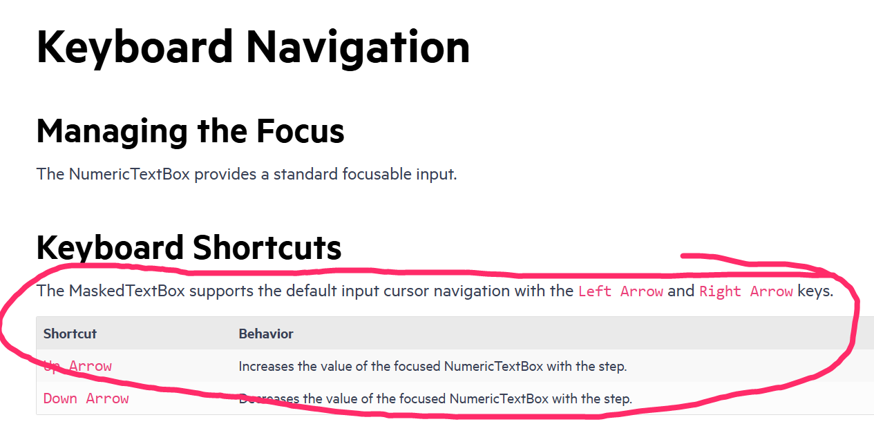
going back to this ticket, we'd like to use CTRL+up/down for our own purposes... as such, you can now disregard that feature request in lieu of fixing this bug =)
since this is undocumented behavior (documentation screenshot below) i believe we have a legitimate bug claim.
also, other controls like DateTimePicker reliably ignore the CTRL+up/down while implementing bare up/down as documented.
Hi Team,
We are using data-grid along with excel export for showing lakhs of data (sometimes over 20 lakhs) in our app and over 80 columns. We found a the TIME TAKEN is over 2.5 mins for over 10 lakhs (rows*cols) data. We have tried the KendoOmxml with kendo saveAs function from file-saver as well.
I have tried with server-side export instead of client-side aslo and still it's the same behavior. In my observation I am suspecting the below line.
component.toDataUrl().then((dataURL) => {Here component is the reference of ExportExcel component. After getting dataURL I am calling save api to download the file. But toDataUrl() function is taking the whole time. Is there any way we can get this base64 dataURL faster?
You can refer to the codeSandbox Link. We have 80 columns(including duplicates), while importing productsSmall.json file which contains 77 rows, export excel is working well and good. But when you change the import to productsLarge.json file which contains 10,000 rows (if cannot be seen, please copy paste the dummy data from attached file with even more usual amount of data we use in our app), the screen is stuck or takes too much time to get process complete and sometimes it throws error(maybe because of codesandbox incapability).
Stackblitz link (if codesandbox hangs more) https://stackblitz.com/edit/react-q5wlpg-4bs2zc?file=app%2Fmain.tsx
We have a large number of customers requesting this feature to be fast. Please let us know with an optimized solution.
Regards,
Manjula
Drag-and-Drop editing is a very usefull and required functionality in a lot of enterprise apps (Move/resize tasks along the timeline, adjust completion percentage, dependencies editing).
We noticed these features are (maybe partially) available in the Kendo Gantt components for (at least) jQuery and Angular.
Are there plans to introduce similar functionality in the KendoReact Gantt component? If so, could you share a timeline for implementation? Or maybe you can suggest some workarounds?
We’d greatly appreciate your insights on this point, as it's critical to our evaluation process.
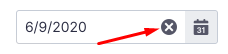
The DatePicker and DateInput React components miss the customizable button to clear the date value.
Would be nice to have ability to customize the icon, size, margins and a selectable option to clear the date value to null or a default value (as set to the component) or bind a custom event handler.
Hi Team,
I am writing to inquire about modifying the default behaviour of the Kendo UI Menu component. The sub-menu items are displayed when hovering over the parent menu item. However, I require the sub-menu items to be visible only when the parent menu item is clicked.
Desired Behavior:
Sub-menu items should remain hidden by default.
Clicking on the parent menu item should expand the sub-menu and display the child items.
Clicking on another parent menu item should collapse the previously expanded sub-menu and expand the new one.
Implementation Challenges:
I have explored the Kendo UI documentation and API, but I am unable to find a direct configuration option to achieve this desired behaviour.
Could you please provide guidance on how to modify the Kendo UI Menu component to display sub-menu items only on click of the parent menu item?
Please let me know if you require any further information or if there are any examples available that demonstrate this functionality.
Reference URL - https://stackblitz.com/edit/react-zugkrezk?file=app%2Fapp.jsx,app%2Fapp.css
Reference Ticket - https://www.telerik.com/account/support-center/view-ticket/1679073
Thank you for your time and assistance.
Mahesh
When I press on a day from the past the DatePicker automatically scrolls to the next/previous year. Please check the attached video.
Is there any workaround for this issue ?