Request:
- provide a boolean property "virtualScrolling" on component GridColumnMenuCheckboxFilter which allows rendering a large list of filter options without delay
Discussion:
- https://www.telerik.com/forums/gridcolumnmenucheckboxfilter-virtual-scrolling
Use case:
- there are a lot of options to filter already in memory
- the filter dropdown has to open quickly (it opens slowly now, because there are so many options)
- after opening, the user sees a huge list (i.e. a long scrollbar)
- so he starts making the list of options smaller using the search input
Here's a screenshot with 100 options.
Alternatives:
From a developer point of view I think a scrollable filter is the most convenient way to handle the problem.
An alternative would be to provide a handler whenever the user selects a combobox in the GridColumnMenuCheckboxFilter. Then we could cut the number of options after a threshold and an option / combobox labelled "show more". When this is clicked, the filter options are re-rendered, the lists gets longer - and the user will get annoyed and will making the list of options smaller using the search input.
An other alternative would be to have a possiblity to force the user right away to use the search box. Instead of showing the list of checkboxes a text would be shown: "1258 options. Please refine your search input." But this would be a more invasive option.
Provide built-in scrolling of the Chart.
It should work similar to the pannable but allows scrolling with the mouse wheel instead of zooming.
The required end result is similar to this:
https://stackblitz.com/edit/react-rgpxmk-nrntv1?file=app/main.jsx
https://demos.telerik.com/kendo-ui/numerictextbox/events
We would like this as we need to distinguish between a change due to a user typing and a change due to a spin.
To hack around this we will probably need to create a DOM event on click on the spin buttons or something
Add render function/prop for the ColorPicker popup.
This will allow rendering custom elements inside the ColorPicker Popup.
Add virtualization to the TreeView component to handle large trees.
Each node should be possible to have open at all time.
Each node should have the possibility to be selectable with a checkbox.
Allow sorting per column by a field other than the displayed field on the column. This goes for group sorting as well, when grouped by a certain field, the groups can only be sorted by that field, when we actually need those groups sorted in an arbitrary order we have defined in another field on the data.
https://github.com/telerik/kendo-react/issues/633
The Angular ButtonGroup has a 'selection' property that is not present in the React ButtonGroup.
This functionality would be nice to have in React.
The following code snippet is the temporary fix that has been provided to me by support to mimic Angulars functionality in React.
import React from 'react';
import ReactDOM from 'react-dom';

import { Button, ButtonGroup } from '@progress/kendo-react-buttons';

class ButtonGroupContainer extends React.Component {
  state = {
    selected: null
  }
  groupButtonClick = (e) => {
    this.setState({
      selected: e.target.id
    })
  }

  isSelected = (index) => {
    return index === parseInt(this.state.selected) ? true : false
  };

  render() {
    return (
      <div className="row">
        <div className="col-xs-12 col-sm-6 example-col">
          <ButtonGroup>
            <Button togglable={true} id={1} selected={this.isSelected(1)} onClick={this.groupButtonClick}>
              Bold
                     </Button>
            <Button togglable={true} id={2} selected={this.isSelected(2)} onClick={this.groupButtonClick}>
              Italic
                     </Button>
            <Button togglable={true} id={3} selected={this.isSelected(3)} onClick={this.groupButtonClick}>
              Underline
                     </Button>
          </ButtonGroup >
        </div>
      </div>
    )
  }
}
ReactDOM.render(
  <ButtonGroupContainer />,
  document.querySelector('my-app')
);
I'm looking at implementing a Chart with multiple ChartPane, each with their own legend displaying only the series displayed in the respective pane.
Here is an example of the layout with separate charts: https://stackblitz.com/edit/react-xtyhbu-muedhd?file=app%2Fmain.js
After speaking with support, they suggested I created a feature request here.
Problem:
The DateTimePicker does not work in IE11 due to it's failure to fully support the shorthand syntax for flex (https://github.com/philipwalton/flexbugs#flexbug-4). In order for it to work in IE11 flex-basis needs a unit defined and therefore does not support calc() in this scenario.
Potential Fix:
If you break out flex-grow, flex-shrink and flex-basis then calc() can be used for flex-basis.
Currently, this is possible with CSS animation only:
https://github.com/telerik/kendo-react/issues/326
Hello support team,
Can you please provide an example in kendo react to upload > crop > save cropped image. My use case is that user should be able to choose, crop and save their profile photo.
Thank you.
Hi There,
This is the kendo ui for jQuery scheduler we use in our older version of product. Note that the resources are across the top, and dates down the side.
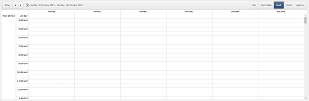
We have switched to react and we want similar view. This is the closest we can get.
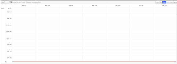
The resources are on left hand side so we cannot see all the resources.
Kendo-ui for jQuery has an additional boolean property ‘date’ (https://docs.telerik.com/kendo-ui/api/javascript/ui/scheduler/configuration/group) which groups the view by date down the left hand side, and resources across the top. There is no alternate property available in kendo-react-ui which will result in same appearance as it does in kendo-ui.
We are using kendo scheduler version 4.0.0.
Is there any way to achieve this? Do we have to implement a custom view? If so how?
- Papiya
The DatePicker component has a `toggleButton` prop which we use for customisation, but this prop is missing from DateTimePicker and TimePicker, this makes an inconsistent API and is frustrating for us because we cannot easily apply the same customisation to them.
Please can you add `toggleButton` prop to DateTimePicker and TimePicker.
Hi
We use the directory upload feature in our MVC app using Kendo. We are now redeveloping the app using React but this feature is missing.
Is this feature on the roadmap for a future update (soon)?
Kind regards
Rakesh
We can add one of the following options:
1) Add style props to the ComboBox popupSettings. This will allow the developer to set a custom min-width.
2) Provide an option that will set the minWidth to the same as the ComboBox width.
We try to cover the following case:
The Popup will auto grow based on the longest item, but its widht should not be shorted than the ComboBox.
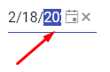
The width of the Kendo React DatePicker can become small due to the container width.
In such case, consider the following use case
Users select the date part (year) and start incrementing it by the "up" key. The year date part is selected, but is partially visible,
and the users do not see the date part that they are currently modifying, while they can fully see the other date parts that are not currently in focus.
The DateInput needs a horizontal scrolling to ensure that a focused date part is fully visible to the users in case if the width of the component is narrow.
Please check the case here
https://stackblitz.com/edit/react-8dqy6j-gvgwtk?file=app%2Fmain.jsx