I would like to know if there are any Kendo React components to suit Bottom navigation functionality as per Material Design
Thanks in advance,
Multi-selecting rows using the mouse selection doesn't work for React Kendo Grid.
With the kendo grid wrapper for React we were able to multi-select rows using the mouse selection in the grid bounds.
This support ticket is a feature request for a React version of the DropDownTree component: https://demos.telerik.com/kendo-ui/dropdowntree/index
For now I've hacked together something using a span styled like the collapsed DropDownTree, a React Popup and a React TreeView. It would be great if this control could be adapted for React and added to the dropdowns package. Unless there is an easy way to accomplish this using the React Dropdown and the React Treeview?
This is similar to the DateInput functionality to move between the different sections with the arrow keys.
This functionality should be optional, not always on.
It's annoying because:
1) Every time I go to a new page or refresh my browser it comes up bright yellow
2) It blocks the search bar which I use a lot
3) The seminar is over which just annoys me more
I'm OK if you want to tell me once like a privacy notice, but don't tell me every time my web page refreshes and overwrite part of the page.
Currently, they are only expandable downwards.
Hi,
I was just running through the new features of KendoReact 2021 R2 and am very keen to start implementing.
One of my colleagues pointed out that there is an ellipses after each checkbox when using checkboxes under Grid Selection, see https://www.telerik.com/kendo-react-ui/components/grid/selection/#toc-customizing-the-selection). It sees this is the casein MS Edge and Chrome. I use Firefox, so didnt notice it.
Thanks for the new features, keep it up.
Regards,
Grant
Hi Team,
We are using Kendo react scheduler in one of our project. We need a custom marker in a scheduler control similar to current date time marker in a Timeline view. I have attached the image for reference.
Please let us know if there is any property available or any other ways to achieve this functionality. Also, how can we place it properly in a scheduler slot based on specific date and time like May 12, 2020 13:40.
Regards,
Abhinav
Similar to how it is done in Kendo UI for jQuery:
https://docs.telerik.com/kendo-ui/controls/scheduling/gantt/how-to/colorizing-tasks
Can the Kendo UI Multiselect possibly select the "active" item when tab is pressed? It currently does this for the enter key.
We are building a Typescript Create React App application, and we would really like to be able to allow our users to type a partial entry and then allow tab to complete the selection and move on to the next input.
I tried to make it have this behavior but it became a fairly large mess and seems like it could be facilitated in the source code with less mess.
Even possibly just exposing access to more events would make it easier, like an onKeyDown, but that would still require some additional code to figure out what the current active item is.
Currently using these below, not sure what "Version" below in this form those belong to so I just guessed:
"@progress/kendo-react-inputs":"^3.9.0"
"@progress/kendo-react-dropdowns":"^3.9.0"
WHAT:
Add custom cell rendering option for MultiColumnComboBoxColumn. Just like the 'cell' in GridColumnProps.
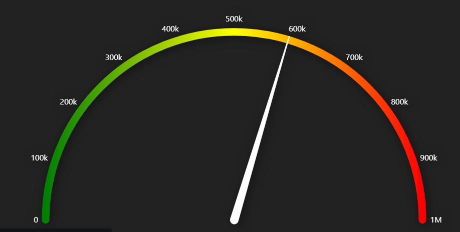
I am trying to create a radial gauge with gradient fill but I don't see any help regarding this. Please see the below image of what actually I am looking for.
I am using ExcelExport...
import { ExcelExport, ExcelExportColumn } from "@progress/kendo-react-excel-export";
one of the columns being exported is an Enum value. Is it possible to export the data and have the excel column be a dropdown picklist? I've attached a file of an example
Thanks
Is it possible to have a multirange support in the RangeSlider like the following (https://zillow.github.io/react-slider/):
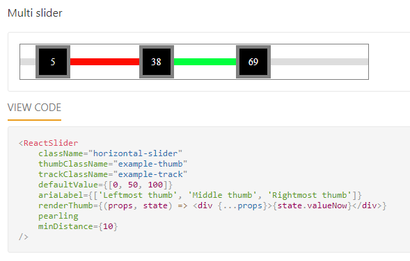
It could be helpful to get multi range values using only one component. Easier for the developer to manage the data and for the user to select it.
Hi,
How to select the tree-list column like excel column selection ?
How can be copy selected column data with the another column ?
please provide the reference link or example.
--