When using the <Window> component, there is an issue trying to maximize, when a parent element has positioning (ie: position: absolute, position: relative). The calculation for defining the width uses window.innerWidth (similar for height). However, for placement, it uses top and left = 0.
You can see a sample of this on StackBlitz:
https://stackblitz.com/edit/react-59kqss
This is a straight copy of https://www.telerik.com/kendo-react-ui/components/dialogs/window/controlled-mode/, but added the additional styles to the parent <div>.
Version is 3.14.
Thanks.
With the ArcGauge component, when you set the rangeLineCap to something other than 'butt' (ie: round or square), the indicator does not line up with the tick lines. This leads to misleading values. Please look at this StackBlitz:
https://stackblitz.com/edit/react-itztql
This will show the comparison between round and butt rangeLineCaps.
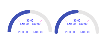
From the screenshot as well, the ArcGauge on the right looks like the value is greater than 0, resulting in the user being mislead on the result.
Hi,
I have Scheduler vertical timeline with an user group and more users I add the wider is every slot. Example 2 users https://stackblitz.com/edit/react-dttghr?file=app%2Fmain.jsx . Example 4 users https://stackblitz.com/edit/react-dttghr-a3nor3 the slot is double in width in comparation with 2 users. Can I control this somehow?
Hello,
After taking a look at your example in the documentation here (which doesn't seem to be working) https://www.telerik.com/kendo-react-ui/components/charts/chart/elements/selection/#using-selection-as-navigator
I fixed the onSelectEnd function and got it working. However, the selection chart is reloading the data every time onSelectEnd changes this.state.min and this.state.max.
Here is the example:
https://stackblitz.com/edit/react-nub1sc?file=app/main.jsx
As you can see, this makes for a clunky UI.
If this isn't a bug, do you have suggestions on how to fix this?
Thanks,
Orla
- Configure a Kendo React Grid with paging on a react-bootstrap tab that is hidden on initial load
- Navigate to the tab - the Grid is rendered with truncated paging controls and no item count
- Resize the screen in any way - the full paging controls and item count are restored
Is there a workaround for this issue?
I would like to use my custom component as the chat input. Is it possible to add new prop to chat component? Similar to DatePicker's "dateInput" prop.
The navigation sidebar smooth scroll animation doesn't work for the Calendar component.
Here is a codesandbox that showcases the issue: https://codesandbox.io/s/hopeful-river-sk4oc?fontsize=14&hidenavigation=1&theme=dark
Thanks in advance for fixing this :-)
Hi there!
I've written this component for a custom message input box for the Chat in Conversational UI for React:
import { ChatMessageBoxProps } from '@progress/kendo-react-conversational-ui'
import { FC } from 'react'

const CustomChatMessageBox: FC<ChatMessageBoxProps> = (props) => {
  return (
		<>
			<input
				type="text"
				name="message"
				className="h-full w-full text-base md:text-sm focus:outline-none"
			/>
			{props.sendButton}
		</>
  )
}

export default CustomChatMessageBox
I'm supplying this component to the `messageBox` prop of the Chat component. However, sending the message doesn't work; neither by pressing enter or pressing the send button. If I replace the input with props.messageInput, it works.
Any help in fixing this will be greatly appreciated!
Thank in advance :-)
When changing the popup setting "appendTo" to a different element that has a wider width then the input of the dropdown multiselect is not working properly.
The dropdown is attached to that element but the styling is not changing to that parent and is just taking the width of it initial parent.
Example can be found here:
https://stackblitz.com/edit/react-wwhosr-awnrdm?file=app/main.jsx
When using the standalone popup control this is working as it should and adjusting it's width based on the parent it's appended to.
if (_this.element && document.activeElement === _this.element) {
                _this.element.setSelectionRange(selection.start, selection.end);
            }
@progress/kendo-react-dateinputs": "^4.3.0"
DatePicker and DateInput React components malfunction when rendered inside iFrame.
For example, key navigation between date parts is not working for the DateInput/DatePicker rendered inside iFrame.
When user clicks on the month part of the date, the month part does not get selected.
Same for day or year part.
The reason is a code similar to this in DateInput.js:
if (_this.element && document.activeElement === _this.element) {
                _this.element.setSelectionRange(selection.start, selection.end);
            }
if (document.activeElement !== _this.element) This code references the top level "document".
If the React component is rendered inside iFrame, we need to use the contentDocument of the iFrame to have this code working as expected.
Could replace "document" with "_this.element.ownerDocument" to make it work inside iFrame as well as in the top level window.
Now "document.activeElement" always returns the reference to the iFrame element rather than the expected date input element inside iFrame.
We are implementing the application level zooming.
When user changes the zoom level from "100%" to , say, "200%",
all the components on the web page rerender proportionally bigger.
And we need to zoom the DatePicker react component as well.
We tried to use unofficial "zoom" CSS style property
https://developer.mozilla.org/en-US/docs/Web/CSS/zoom
and "scale" CSS function, but that does not give a good solution.
https://developer.mozilla.org/en-US/docs/Web/CSS/transform-function/scale()
If that takes time, please advise an approach how we can achieve zooming of the DatePicker/DateInput react component.
So far only interested in zooming of the DateInput and calendar toggle button (not popup Calendar itself).
The SCSS files from the kendo-theme-material contain !important rule, that makes it difficult to override the styles in the consuming application.
We have a requirement to customize the DatePicker Kendo React component so that it has a border around all 4 sizes, as by default the theme has the border only on the bottom.
We have applied a new custom style to k-picker-wrap and added the
border-top-color: $datetime-border !important;
style
But due to the !import rule in the file
@progress\kendo-theme-material\scss\datetime\_layout.scss, line 15
the custom style that we applied in the consuming application does not get applied.
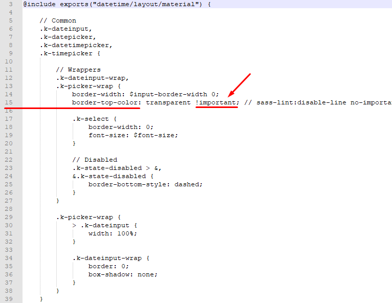
Please find screenshots with the details of the problem.
The screenshots indicate that the custom style for the border-top-color did not get overriden, and the box is missing the top border.
Kindly advise approach that we can use to customize the CSS styles that has !important CSS rule, so that we can override the styles defined in the material theme.
Hi There,
This is the kendo ui for jQuery scheduler we use in our older version of product. Note that the resources are across the top, and dates down the side.
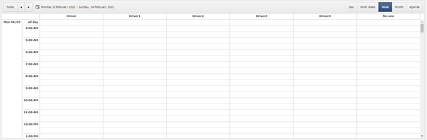
We have switched to react and we want similar view. This is the closest we can get.
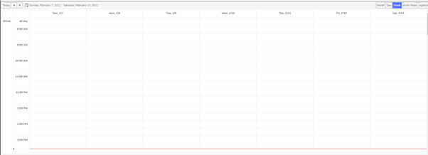
The resources are on left hand side so we cannot see all the resources.
Kendo-ui for jQuery has an additional boolean property ‘date’ (https://docs.telerik.com/kendo-ui/api/javascript/ui/scheduler/configuration/group) which groups the view by date down the left hand side, and resources across the top. There is no alternate property available in kendo-react-ui which will result in same appearance as it does in kendo-ui.
We are using kendo scheduler version 4.0.0.
Is there any way to achieve this? Do we have to implement a custom view? If so how?
- Papiya
The DatePicker component has a `toggleButton` prop which we use for customisation, but this prop is missing from DateTimePicker and TimePicker, this makes an inconsistent API and is frustrating for us because we cannot easily apply the same customisation to them.
Please can you add `toggleButton` prop to DateTimePicker and TimePicker.
The width of the Kendo React DatePicker can become small due to the container width.
In such case, consider the following use case
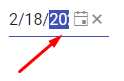
Users select the date part (year) and start incrementing it by the "up" key. The year date part is selected, but is partially visible,
and the users do not see the date part that they are currently modifying, while they can fully see the other date parts that are not currently in focus.
The DateInput needs a horizontal scrolling to ensure that a focused date part is fully visible to the users in case if the width of the component is narrow.
Please check the case here
https://stackblitz.com/edit/react-8dqy6j-gvgwtk?file=app%2Fmain.jsx
The className prop on the ChipList component is ignored in version 3.18.0. A simple addition of class strings does not appear in the compiled product, e.g.
  return (
    <ChipList
      className='flex-layout --wrap --end'
      data={chipData}
      onDataChange={onDataChange}
      chip={props => (
        <Chip removable removeIcon='k-i-close' {...props} />
      )}
    />
  )
I've looked through the transpiled source in node_modules, and it seems the className property passed to the React.createElement() function totally ignores the prop class names.
Hi,
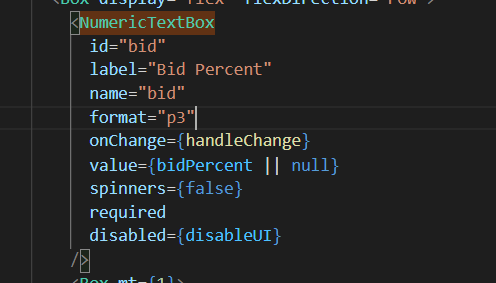
I'm using the NumericTextBox to receive a value stored in a state, it has a percent "p3" format so it display numbers like this "0,000 %". When the state change, the value displayed in the NumericTextBox loses its format. If I click in the field and press space or any other key, the format comes back. The expected result was the NumericTextBox always keeping the format, what can be done in this situation?
NumericTextBox code
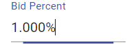
This is the textbox when I change the value direct in the field, it works fine
The state is shared between 2 NumericTextBox. if I change the value in the other textbox, it loses the format in this textbox
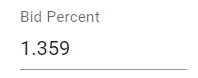
If I go in this textbox and just hit space, the format comes back
What can be done to keep the textbox format?
Thank you