Hi
I am currently using kendoReact TreeList and using custom filtering for text. I want to limit allow filtering to happen only after user enters 3 or more characters. For this I want to show a placeholder saying "Enter more than 3 characters to filter....". Can I add a placeholder to the filter header ?
Thanks and Regards
Gaurav Thakur
I am using ExcelExport...
import { ExcelExport, ExcelExportColumn } from "@progress/kendo-react-excel-export";
one of the columns being exported is an Enum value. Is it possible to export the data and have the excel column be a dropdown picklist? I've attached a file of an example
Thanks
Hi,
How to select the tree-list column like excel column selection ?
How can be copy selected column data with the another column ?
please provide the reference link or example.
--
Hi,
How to set the default operator of a second date filter which is different from first,
I have attached the screenshot for two different operator i need in case of date filter.
Hello,
i am new to React and Kendo React UI.
I am reading the documentation for Gantt, and if i understand it correctly i can customize header column (headerCell?), but I dont know how. Is there any examle ?
I wound like to customize the column with dates.
Thank you, Matjaz Reberc
This is helpful as in some case the panel bar items represent a path and if an inner element is selected/expanded this means that the full path (all parent items) have to be expanded as well.
The KendoReact Upload Component is designed to send files from file systems to dedicated server handlers, however we would like to use it to send files as byte arrays in form submission. A workaround has been provided here: https://www.telerik.com/forums/kendoreact-upload however we would like to see if there is any community interest in this becoming a standard feature.
Thanks
Add an option to show a callout (arrow) element for the Chart tooltip.
Similar to the Tooltip component option:
https://www.telerik.com/kendo-react-ui/components/tooltip/api/TooltipProps/#toc-showcallout
1) Use this StackBlitz application: https://react-scwx3i.stackblitz.io - This is based on Telerik's own DatePicker React example.
2) Highlight the AM/PM section.
3) Try to change the AM/PM section via typing. It doesn't change. Note that other fields in the date/time picker are responsive to keyboard input.
Expectation is that the AM/PM section should respect at least "A" and "P" inputs.
https://www.telerik.com/kendo-react-ui/components/charts/api/GridLines/
Similar to how other elements provide the option to render a custom visual.
Hi
I noticed in the PDF Export component limitations (https://www.telerik.com/kendo-react-ui/components/drawing/limitations-browser-support/) that it does not support iFrames. This is a major issue for us as we have data containing full HTML markup and <style> tags, which we want to embed in a PDF. We need to use an iFrame otherwise the styles will bleed into the rest of the document. Is there any plans to support iFrames in the future?
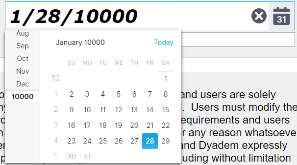
Defined a date rang. But it allows to enter a date larger than a max date of the range. Both via calendar and manually.
const minDate = new Date(1, 1, 1);
const maxDate = new Date(9999, 12, 31);

          return (

              <DatePicker value = {this.state.value}

                  min={minDate}
                  max={maxDate}

              />
The KendoReact MaskedTextBox value cannot be cleared once a value is set. See this forum post for examples and a proposed workaround: https://www.telerik.com/forums/maskedtextbox-cannot-be-cleared
I would like for a user to be able to clear the MaskedTextBox value without having to code it as a special case in the onChange event handler. I believe this should be done by default as per the Kendo jQuery MaskedTextBox, but it could also be optional via a prop or clear button.
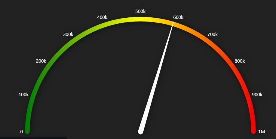
I am trying to create a radial gauge with gradient fill but I don't see any help regarding this. Please see the below image of what actually I am looking for.
Hi Team,
We are using Kendo react scheduler in one of our project. We need a custom marker in a scheduler control similar to current date time marker in a Timeline view. I have attached the image for reference.
Please let us know if there is any property available or any other ways to achieve this functionality. Also, how can we place it properly in a scheduler slot based on specific date and time like May 12, 2020 13:40.
Regards,
Abhinav