If we have items with the same text value and we navigate through them with the arrow keys and then select one with enter, the ComboBox will return the first item with that text instead of the currently selected one.
Hello,
I would like to request for the filter component to be supported in the KendoReact suite as it is in the ASP.NET Core UI suite.
One aspect is the hierarchical structure which can support complex filter scenarios but also the support to persist state of a set of filters.
Thank you
Hello,
I have a request to add a ListView control to a React Pure control package.
Thanks.
I'd really like a KeepIt prop on https://www.telerik.com/kendo-react-ui/components/conversationalui/api/Action/ so that the action stays even when someone is typing or there is another message below it.
The use case would be a link to a Order # for example that they could go back to and click.
https://www.telerik.com/kendo-react-ui/components/conversationalui/suggested-actions/
Example of how this works with react-native-gifted-chat:
https://github.com/FaridSafi/react-native-gifted-chat#message-object
Hello,
I have a request that for some tables the user needs arrows to be able to scroll left and right horizontally through the grid content. Is there a functionality like this provided out of the box by Kendo Grid, can you please point me to the docs or provide an example? I have provided an image to reflect this.
Thank you,
Andrei
I would like to know if there are any Kendo React components to suit Bottom navigation functionality as per Material Design
Thanks in advance,
In the KendoReact Scheduler component, there is a bug when you try and change the date for an event.
Steps to reproduce:
- use an editable scheduler component in your website
- click on an event in the scheduler to open the modal
- in the modal click on the date selector (calendar) icon next to Start or End.
- The date selector is behind the modal
Looks like you need to change the z-index of the date selector if it is a child of a modal.
Thanks! I attached screen shots.
Existing implementation of Scheduler component has a very limited customization support. To cover some real use-cases we need:
- Conditionally hide Scheduler Header and Footer. This is possible with CSS, but still makes sense to have props for that.
- Customize tooltip content when hovering on the event. Currently tooltip is a one line text, but adding support of a larger popups on hover would allow to show additional info associated with that event. Please consider adding a prop to pass custom component for tooltip/popup rendering (similar to how Custom cells work in Kendo Grid)
- Customize event component. Is there a way to have multiline text in the event component? Currently it is way to limited to show custom content e.g. adding custom icons is impossible.
- All events in the same group have a same color when displaying. Please consider adding individual color support for each event. This would help to support error states for events.
- Custom onDelete/onDoubleClick handlers. We would like to have custom implementation of Delete confirmation and Edit form.
Please advise on how to overcome those limitations as a short term solution and consider adding more Scheduler customization abilities to your Roadmap.
Example of highly configurable Scheduler/Timeline component: https://js.devexpress.com/Demos/WidgetsGallery/Demo/Scheduler/Timelines/React/Light/
Hi Team,
I am looking for PickList / duallist component but I am not getting it on kendo UI
Through this list we can move items from one list to another and vice versa.
Using buttons ,left,right,rightAll,LeftAll,Up,Down etc like "react-dual-list" component
In addition to that i want drag and drop feature to be enabled between the list
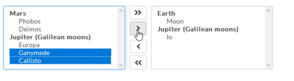
Can someone please help me to fine such component on Kendo UI
When using the auto for tooltip position, I would like the option to prioritize the order.
[right, left, bottom, top] for example would mean that it would check if that area is available to display a tooltip, and if not, it'll move on to the next one in the list.
Is this an option? How will I go about creating this functionality if not?
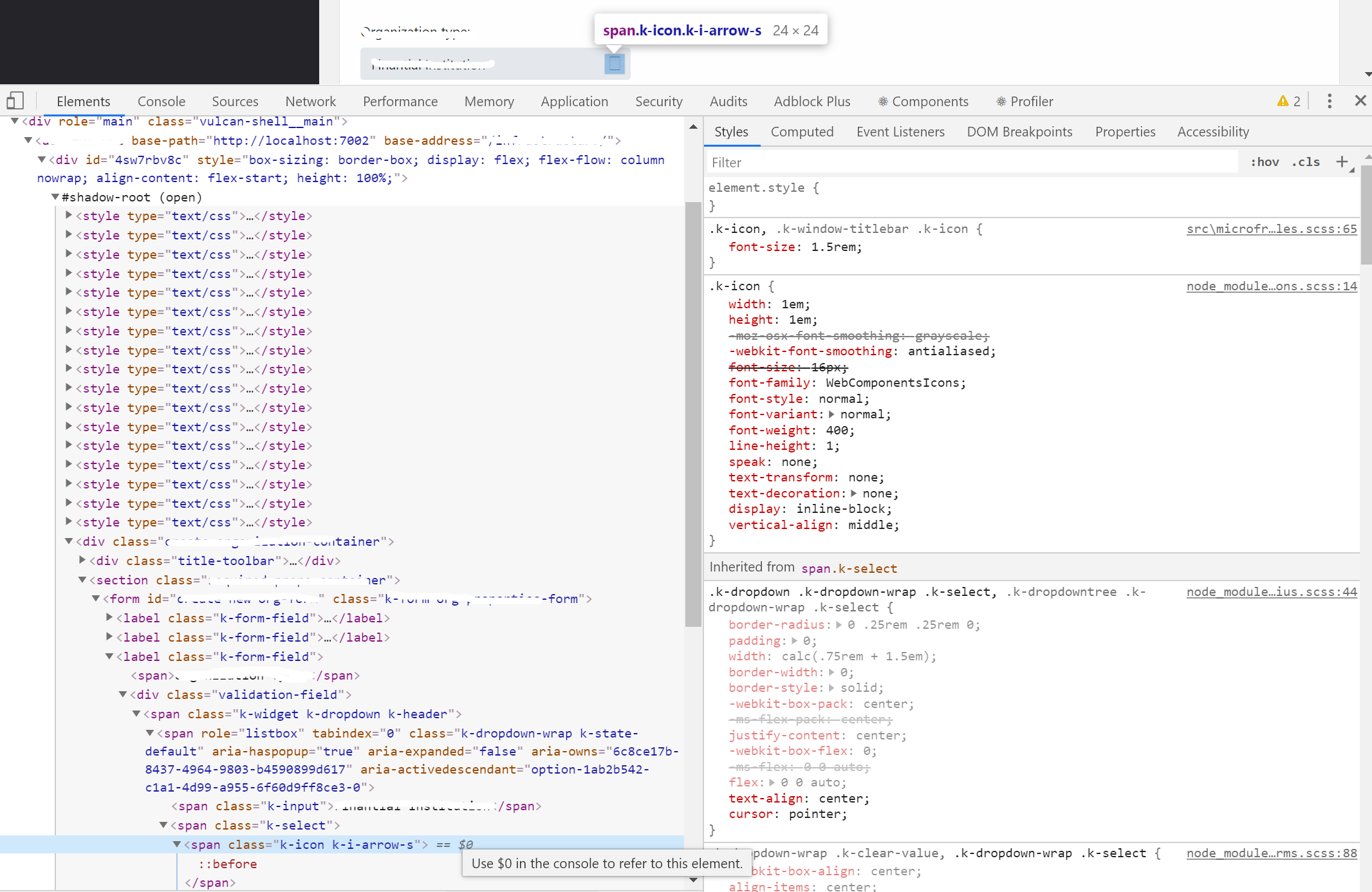
Steps:
1. Create web component with shadow-root.
2. Attach all.css styles behide shadow root.
3. Add compoent with icon from WebComponentIcon font.
Result:
Icon are not displayed properly.
Is it possible to add a target line to the ArcGauge? I have attached a picture of what I would like to accomplish using the ArcGauge component.
The achieve the same result as the one shown here:
https://support.office.com/en-us/article/show-or-hide-gridlines-on-a-worksheet-3ef5aacb-4539-4ad5-9945-5ed53772dc4d
Thanks in advance
Allow sorting per column by a field other than the displayed field on the column. This goes for group sorting as well, when grouped by a certain field, the groups can only be sorted by that field, when we actually need those groups sorted in an arbitrary order we have defined in another field on the data.
https://github.com/telerik/kendo-react/issues/633
I'm looking at implementing a Chart with multiple ChartPane, each with their own legend displaying only the series displayed in the respective pane.
Here is an example of the layout with separate charts: https://stackblitz.com/edit/react-xtyhbu-muedhd?file=app%2Fmain.js
After speaking with support, they suggested I created a feature request here.