The Data Grid does not work properly with large datasets. In the example below with one million records, it is impossible to scroll to the bottom of the grid.
Firefox: Rows fail to render after scrolling past approximately 200,000 rows.Chrome: Rows do render, but the skip parameter never exceeds 745,645 even when the scrollbar is at the bottom, preventing access to the remaining ~254,000 records.
This contradicts the documentation's claim that the grid "scales from hundreds to millions of records while maintaining a responsive user experience."
https://stackblitz.com/edit/react-aaxnyzxm?file=app%2Fapp.tsx
- Same issue repro on heading 'Workspaces & Dashboards' [appears on Home --> Header--> Hamburger menu--> Popup] (Refer Attachment: Note_1_Same issue repro on heading 'Workspaces & Dashboards'..mp4).
- Heading hierarchy is not sequential in the Home page.
- Turn on Accessibility insights for web extension.
- Navigate to the headings toggle control and turn it on.
- Open the URL: Agora Home Page (PPE) in latest edge browser.
- 'Agora home page (PPE)' will be displayed.
- Navigate to 'Hamburger' menu control using tab key and activate it using enter key.
- 'Workspace and dashboards' popup will be displayed.
- Navigate to 'Add dashboard' control in the list displayed using tab key and activate it using enter key.
- 'Create Dashboard' dialog gets displayed.
- Observe and verify whether visually appearing heading text 'Create Dashboard' in the dialog is not programmatically defined as heading or not.
- This issue is observed with all three screen readers.
- Same issue is observed in chrome browser as well.
- Name is not properly defined for once control. Screen reader is narrating the name twice for the once control as "Once check box not checked report frequency: once"
Path: Home > Header > Reports > Schedule a report button > Schedule a Report pop-up.
Refer Attachment: Name is not properly defined for once control.png
- Turn on Screen Readers:
- Narrator: Win + Shift + Enter
- NVDA: Ctrl + Alt + N
- JAWS: Ctrl + Alt + J
- Verbosity:
- Narrator: Default
- JAWS: Beginner, Highest
- NVDA: Default
- Open the URL: Agora Home Page (PPE) in latest edge browser.
- Press tab key to move to the 'Alerts' control present in the page and activate it using enter key.
- 'Alert Definitions' page gets displayed.
- Press tab key to move to the 'Functions? Filter' control and activate it using 'Enter key'.
- Navigate through the radio buttons in the displayed popup using arrow keys and verify whether screen reader is announcing incorrect name for the radio buttons present in the filter dropdown in windows or not.
- This issue is observed with all three screen readers.
- Same issue is observed in chrome browser as well.
- Turn on Screen Readers:
- Narrator: Win + Shift + Enter
- NVDA: Ctrl + Alt + N
- JAWS: Ctrl + Alt + J
- Verbosity:
- Narrator: Default
- JAWS: Beginner, Highest
- NVDA: Default
- Open the URL: Agora Home Page (PPE) in latest edge browser.
- Press tab key to move to the 'Save as' control present in the page and activate it using enter key.
- Save as dialog gets displayed.
- Press tab key to move to the 'workspace to be saved as in' edit field and activate it using 'Alt + down arrow key'.
- Enter any invalid data in the search edit field.
- Now Verify whether screen reader is announcing the search result information on giving invalid data in the search edit field in windows or not.
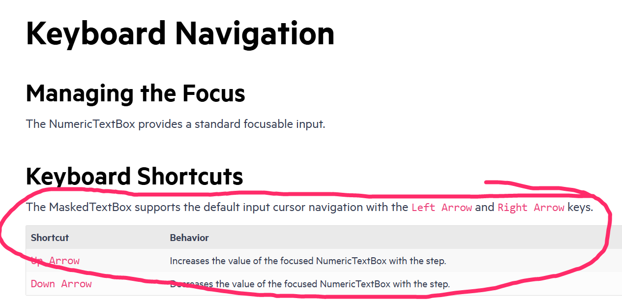
@progress/kendo-react-inputs@9.0.0
going back to this ticket, we'd like to use CTRL+up/down for our own purposes... as such, you can now disregard that feature request in lieu of fixing this bug =)
since this is undocumented behavior (documentation screenshot below) i believe we have a legitimate bug claim.
also, other controls like DateTimePicker reliably ignore the CTRL+up/down while implementing bare up/down as documented.
Test Environment:
- Open URL: https://www.telerik.com/kendo-react-ui/components/charts/chart/elements/axes/#toc-displaying-time-series
- Kendo React home page will appear.
- Navigate to the "Displaying Time Series" bar graph using tab key.
- Navigate using arrow keys through the chart controls.
- Verify whether the Screen reader is announcing the complete data points information of the "Displaying time Series" bar graph or not.
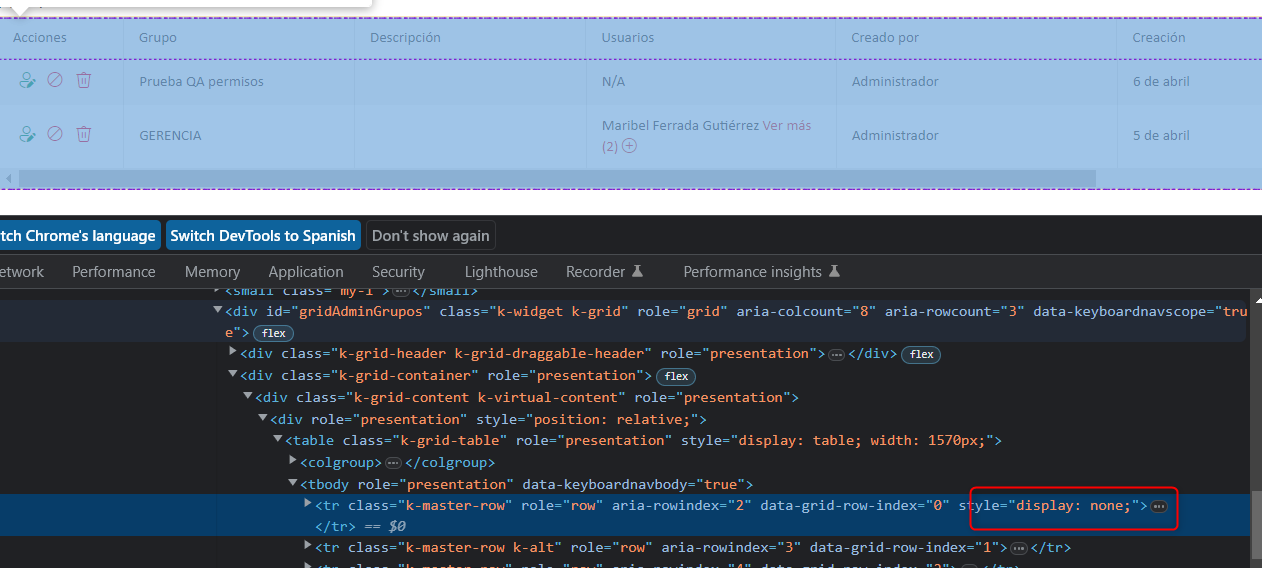
We have problems with the grid because for no reason a 'display:none' appears, specifically in this creation action
We can't understand when the error might occur, we think it's a coincidence of class names.
Can you guide us through this error?
It is my first time raising a support contact so I don't know what background they can mostly support.Greetings and thank you very much
We would like to use Kendo React to build a micro frontend UI but we did not found any relevant information that this is currently supported.
The main issue we are facing is how it isolate Kendo theme styling between different micro frontends.
Let's say we have 2 micro frontends A and B:
- A is using Kendo v6.
- B is using Kendo v7 (or some other future/past version).
Both of them will include their global Kendo styles which will collide.
After some investigation, we came up with 2 possible approaches:
- Isolating micro frontends using shadow DOM. This is the most common technique but unfortunately not supported by Kendo React yet.
- Prepend custom class to all Kendo CSS selectors (for example ".microfronend-a .k-button" instead of just ".k-button").
We have experimented with the second approach and it seems like a way to go. It also required to append all popups to root DOM node of a micro frontend which can be done easily using PopupPropsContext.
But adding a class to all Kendo CSS selector is technically not a trivial task. It would be nice if Kendo supported this out of the box, for example by providing some SCSS configuration variable.
Currently, there is a following signature of function "rowRender" passed to React Grid:
rowRender?: (row: React.ReactElement<HTMLTableRowElement>, props: GridRowProps) => React.ReactNode;
I managed to access something which I assume represents this index somehow by using "row._owner.index" although I'm not completely sure if that is always identical to the index of the row being rendered.
It would be very helpful if an index of a rendered row could be accessed as follows:
rowRender?: (row: React.ReactElement<HTMLTableRowElement>, props: GridRowProps, index: number) => React.ReactNode;
Hi Team,
If you take a look at my demo, I have 2 scheduler events, and I've created a custom SchedulerItem that renders the background of one of them to be blue.
When dragging the items around, the dragItem mains the same color with a bit of opacity, cool.
When resizing, the orange (?) one works great, this is the default color theme. However when I resize the blue one, while resizing, the resizeItem is an opaque blue, but the SchedulerItem underneath reverts back to the original default color scheme thereby mixing the colors.
Please advise.
Thanks,
Grant
Test Environment:
OS: Windows_11Browser: Version 103.0.1264.71 (Official Build) (64-bit)
Prerequisite steps:
1. Go to system settings.
2. Navigate to 'Accessibility' and activate it.
3. Navigate to 'Contrast theme' and activate it.
4. Select 'Desert/Aquatic' High Contrast theme in the combo box.
Repro Steps:
1. Open given URL https://canvasjs.com/docs/charts/chart-options/axisx/viewport-minimum/ in Edge.
2. Graph page will be open.
3. Turn on High contrast theme.
4. Verify that Graphs are not adapting high contrast Aquatic and Desert modes or not.
Actual Behavior:
Graphs are not adapting high contrast Aquatic and Desert modes. They remain same as in normal mode.
Expected Behavior:
Graphs should adapt high contrast Aquatic and Desert modes as defined. All elements should adapt to respective modes properly.
Environment Details:
OS: Windows11 version 21H2 (OS build 22000.856)
Edge Browser version: 104.0.1293.47
Repro steps:
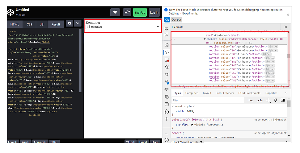
1. Open Code Pen: https://codepen.io/m1mrt/pen/VwXjEzJ page in Edge Browser.2. Run Axe dev tools3. Observe an issue that select element has an accessible name.
Actual Result:Select element does not have an accessible name.
Expected Result:
All components need an accessible name, ideally using semantic elements and attributes. In rare cases, aria-label or aria-labelled by may be needed to alter the name.
Screenshot attachment:
Test Environment:
OS: Windows_11Screen Reader: NVDA (2021.3)
Repro Steps:
1. Open URL: SMB Scheduler (agentcalendardevone.azurewebsites.net) page in Edge Browser.
7. Observe an issue that Incorrect role 'link' is defined on button controls.
Actual Behavior:
Incorrect role 'link' is defined on button controls present on 'Calendar' popup.
Expected Behavior:
In this case, the expected role is {button}. All components need a proper role attribute, ideally with semantics. In rare cases a role attribute should be added to give full context and information to assistive technology. Learn more by reading about when to use an aria role and the html/aria role mappings.
Any chance you could provide simple sample code (stackblitz ideally) demonstrating how to combine multiple PDFExport's into a single PDF file?
The need to combine comes from wanting page numbering to start at 1 within each individual pdf render.
Totally open to using the lower level exportPDF from the drawing library... perhaps there's a straightforward path to combining the individual DataURI's? also open to using additional 3rd party npmjs libraries.
Not only would I like control over the group order (like from this thread https://feedback.telerik.com/kendo-react-ui/1523636-need-to-be-able-to-have-more-control-over-the-order-of-groups-in-the-kendo-grid-sort-on-the-text-is-insufficient), it would be awesome if we could sort groups themselves.
I understand that the current set up sorts children within groups but not the groups themselves. However, sorting within and between groups is a bit more intuitive to the user when they see visually-grouped information and try to sort on it => most of our users expect the groups to get sorted as well.
Although I can write my own sorting functionality, it can get out of hand quickly with ascending/descending, numeric vs alphabetic columns, and multi-sort vs single sort, but KendoReact already has the capability to sort in these three ways with its non-grouped grid functionality.
To Whom It May Concern,
I am requesting the Kendo team to implement a new feature of programmatically setting a Grid's page for the Kendo React Grid.
This can be accomplished by having a listener for the Grid's state. For example, when the Grid's skip props is changed, the Grid's page will also change to the number of elements skipped.
Please consider implementing this feature.
Thank you.
Sincerely,
Andrew J. Yang
Keysight Technologies
Hi there,
I can see there is a column chooser component for the Angular Data Grid e.g. https://www.telerik.com/kendo-angular-ui/components/grid/columns/menu/#toc-column-chooser-item but there is not an equivalent for the React Data Grid (unless you code it yourself).
The DevExpress React Grid does have this feature https://devexpress.github.io/devextreme-reactive/react/grid/docs/guides/column-visibility/ so we were wondering if such a thing is planned React Data Grid?
Thanks very much,
James
There is an inconsistency with the DateRange picker in the way element focus is set when closing the date selection popup by mouse vs keyboard. When using the mouse to close the date range selection popup, element focus becomes lost/reset.
You can simulate this from the example page https://www.telerik.com/kendo-react-ui/components/dateinputs/daterangepicker/
Steps to simulate good behavior (this works correctly):
* click the 'from' input text element (causes the popup to open and the text input to have focus)
* press 'escape' to close the popup (the popup is closed, and the 'from' input element retains focus)
* press 'tab' (focus moves to the 'to' text input element)
Steps to simulate behavior that could be improved:
* click or tab into the 'from' input element (causes the popup to open and the text input to have focus)
* click (with the mouse) outside the popup to close it (the popup is closed, and focus appears to be lost.)
* press 'tab' (focus moves to the 'from' input element again because we are back at the beginning of the tab order list)
This input can lead you into a tab order loop if you mix pressing 'tab' to advance focus, and using the mouse to click to close the date selection popup.
Feature request: when clicking to close the popup, element focus should be retained in the 'from' or 'to' text input; whichever had focus before the popup close, the same as pressing 'escape' to close the popup.
Hello,
Our team is using MobX-State-Tree (MST) and KendoReact TreeList control with virtual scrolling enabled. According to documentation MST model stores data as an observable array (https://mobx-state-tree.js.org/API/#array and https://mobx.js.org/api.html#observablearray).
The MST model’s field ‘tree’ is not a regular array, but a LegacyObservableArray.
From UI standpoint:
initially all tree nodes are collapsed
user clicks on i.e. 3rd tree node
selection is not displayed on any tree node (3rd node expected to be selected)
user expands 1st tree node - selection is set on the 3rd tree node
The following warning appears in the browser console.
Warning: Failed prop type: Invalid prop `data` of type `object` supplied to `TreeList`, expected `array`.
in TreeList (created by wrappedComponent)
in wrappedComponent (created by wrappedComponent)
in div (created by wrappedComponent)
in div (created by wrappedComponent)
in wrappedComponent
Model is defined as:
const TreeViewModel = types
.model('TreeViewModel', {
selectedItemUUID: types.maybe(types.string),
tree: types.optional(types.array(TreeNodeModel), []),
isLoaded: types.maybe(types.optional(types.boolean, false)),
treeTypes: types.optional(types.array(TreeNodeTypeModel), []),
})
.views((self) => ({
get treeCollection(): any {
return self.tree;
},
}))
Component is defined as:
return (<>
{!viewModel.isLoaded && loadingPanel}
<div className='treeListContainer' ref={stageCanvasRef}>
{treeListContainerHeight && <TreeList
style={{ maxHeight: `${treeListContainerHeight}px`, overflow: 'auto', }}
data={viewModel.treeCollection}
expandField={expandField}
subItemsField={subItemsField}
columns={columns}
selectedField={selectedField}
rowHeight={40}
scrollable="virtual"
/>}
</div>
</>);
The following workaround allows converting an observable array to a regular array.
.views((self) => ({
get treeCollection(): any {
return JSON.parse(JSON.stringify(self.tree)); // or self.tree.slice()
},
}))
This solution affects performance due to array copy.
Besides this TreeList uses an array copy. User’s selection and expanding don’t trigger related changes in the initial observable array in the model.
Related event handlers (i.e. onSelectionChange, onExpandChange) should be extended to make appropriate changes in the MST model.
Can you please extend KendoReact controls to support observable arrays?
Is there a better solution?


