The Angular ButtonGroup has a 'selection' property that is not present in the React ButtonGroup.
This functionality would be nice to have in React.
The following code snippet is the temporary fix that has been provided to me by support to mimic Angulars functionality in React.
import React from 'react';
import ReactDOM from 'react-dom';

import { Button, ButtonGroup } from '@progress/kendo-react-buttons';

class ButtonGroupContainer extends React.Component {
  state = {
    selected: null
  }
  groupButtonClick = (e) => {
    this.setState({
      selected: e.target.id
    })
  }

  isSelected = (index) => {
    return index === parseInt(this.state.selected) ? true : false
  };

  render() {
    return (
      <div className="row">
        <div className="col-xs-12 col-sm-6 example-col">
          <ButtonGroup>
            <Button togglable={true} id={1} selected={this.isSelected(1)} onClick={this.groupButtonClick}>
              Bold
                     </Button>
            <Button togglable={true} id={2} selected={this.isSelected(2)} onClick={this.groupButtonClick}>
              Italic
                     </Button>
            <Button togglable={true} id={3} selected={this.isSelected(3)} onClick={this.groupButtonClick}>
              Underline
                     </Button>
          </ButtonGroup >
        </div>
      </div>
    )
  }
}
ReactDOM.render(
  <ButtonGroupContainer />,
  document.querySelector('my-app')
);
Add render function/prop for the ColorPicker popup.
This will allow rendering custom elements inside the ColorPicker Popup.
I am looking for added support for multi drag and drop and the ability to select multiple days as this is available in the jquery version:
https://demos.telerik.com/kendo-ui/scheduler/event-selection
https://demos.telerik.com/kendo-ui/numerictextbox/events
We would like this as we need to distinguish between a change due to a user typing and a change due to a spin.
To hack around this we will probably need to create a DOM event on click on the spin buttons or something
Provide built-in scrolling of the Chart.
It should work similar to the pannable but allows scrolling with the mouse wheel instead of zooming.
The required end result is similar to this:
https://stackblitz.com/edit/react-rgpxmk-nrntv1?file=app/main.jsx
With the ArcGauge component, when you set the rangeLineCap to something other than 'butt' (ie: round or square), the indicator does not line up with the tick lines. This leads to misleading values. Please look at this StackBlitz:
https://stackblitz.com/edit/react-itztql
This will show the comparison between round and butt rangeLineCaps.
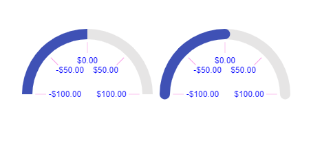
From the screenshot as well, the ArcGauge on the right looks like the value is greater than 0, resulting in the user being mislead on the result.
When using the <Window> component, there is an issue trying to maximize, when a parent element has positioning (ie: position: absolute, position: relative). The calculation for defining the width uses window.innerWidth (similar for height). However, for placement, it uses top and left = 0.
You can see a sample of this on StackBlitz:
https://stackblitz.com/edit/react-59kqss
This is a straight copy of https://www.telerik.com/kendo-react-ui/components/dialogs/window/controlled-mode/, but added the additional styles to the parent <div>.
Version is 3.14.
Thanks.
We need to customize our exported excel to contain some additional information to the top rows of the excel sheet.
On using 'filterable' option as true in ExcelExport React component, it's getting applied on the first row but we want those filters to come on header values present on the 2nd/nth row in case we have some additional information on the top rows.
<ExcelExport
                    data={data}
                    fileName="Products.xlsx"
                    ref={(exporter) => { this._exporter = exporter; }}
                    filterable={true}
                >
Please refer the attached snapshots for actual and expected results needed from customization.
I would like to request a mode for the Kendo React Date and Time Inputs that would allow the use of a mask like that of the MaskedTextBox - allowing the user to type freely without having to make use the arrow keys for each individual date/time part.
I am trying to lock first column in Grid, when I used the instructions in Kendo React documentation I tried the same but as you see in screenshots it's not working.
https://demos.telerik.com/kendo-ui/timeline/index
Add parseFormats option to the KendoReact DateInputs (DateInput, DatePicker, DateTimePicker etc).
The option is expected to work as the parseFormats one available in Kendo UI:
https://docs.telerik.com/kendo-ui/api/javascript/ui/datepicker/configuration/parseformats
Request:
- provide a boolean property "virtualScrolling" on component GridColumnMenuCheckboxFilter which allows rendering a large list of filter options without delay
Discussion:
- https://www.telerik.com/forums/gridcolumnmenucheckboxfilter-virtual-scrolling
Use case:
- there are a lot of options to filter already in memory
- the filter dropdown has to open quickly (it opens slowly now, because there are so many options)
- after opening, the user sees a huge list (i.e. a long scrollbar)
- so he starts making the list of options smaller using the search input
Here's a screenshot with 100 options.
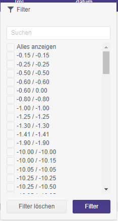
Alternatives:
From a developer point of view I think a scrollable filter is the most convenient way to handle the problem.
An alternative would be to provide a handler whenever the user selects a combobox in the GridColumnMenuCheckboxFilter. Then we could cut the number of options after a threshold and an option / combobox labelled "show more". When this is clicked, the filter options are re-rendered, the lists gets longer - and the user will get annoyed and will making the list of options smaller using the search input.
An other alternative would be to have a possiblity to force the user right away to use the search box. Instead of showing the list of checkboxes a text would be shown: "1258 options. Please refine your search input." But this would be a more invasive option.
Create a custom view with only specific dates shown in the Scheduler.
For example, the Sheculder will only show the dates 02/02/2020, 02/10/2020 and 02/20/2020.
Thanks in advance
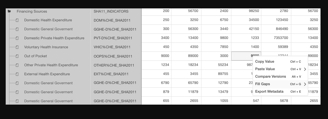
Hello,
I have a query regarding multiple cell paste and transpose paste
1. Multiple cell pastes:
Mouse selection of multiple cells after selecting, the contents present in the cells should get copied and while pasting it should get paste in multiple cells.
e.g i) column no 3 and 4 having value 200 and 56700 after selection of this value gets copied while pasting into column no 3 and 4,250 and 3250 replace by copied value
ii) column no 3 and 4 having value 200 and 56700 and next row value i,e 250and 3250 after selection of this value gets copied while pasting into column no 5, so the values 2400,98250,6750,34500 replace by copied values
2.Transpose Paste:
Mouse selection of two or more cells, then the contents present in that cells should get copied then after clicking on transpose paste the copied cell content get pasted vertically in multiple cells.
e.g column no 3 and 4 having value 200 and 56700 after selection of this value gets copied while pasting into column no 3,250 and 300 replace by copied value
all cells should be editable
Hello,
Please allow the Form component to submit even if it's not marked as modified internally. I am trying to use the Form within a Stepper workflow, and the Form can have default values based on what they submitted in the previous Step. If they return to the Step with the Form on it, though, and those initial values are not changed while displaying the Form, then the Form internally is not marked as modified, therefor the submit event never fires.
It'd be nice if we could have a boolean to tell the Form if we care to block submission based on modified or not.
Thank you