Hi Team,
I would like to request a way to make it easier to change the state of the tiles(Adding and Removing) using outside components such as the Kendo UI CheckBoxGroup.
Thanks!
Our clients are requesting that the search in the multiselect look like the search in the dropdownlist. They want it to be in the list that opens rather than in the value box and want a consistent operation and look. This should be an option that can be set when initializing the multi-select. I attempted this using the forum post below but it is quite buggy and requires a lot of modifications.
https://www.telerik.com/forums/make-filter-in-multiselect-look-like-filter-in-dropdownlist
I have an imageEditor component on my page, and am resizing the images to calculated width & height. I am using the ResizeImageEditorCommand command:
imageEditor.executeCommand({ command: "ResizeImageEditorCommand", options: { width: Math.round(newWidth), height: Math.round(newHeight), aspectRatio: true } });After resizing, some of the images seem 'flaky'. The is not reproducible with every image but can be observed with PNG and JPG as well. I have provided sample images in ticket ID: 1647561.
I would like the images in the ImageEditor to have the same quality after resizing.
The Kendo Spreadsheet is bound to a Kendo datasource, the datasource defines a schema, but when the JSON comes back the spreadsheet just ignores the schema properties and dumps the entire thing into the sheet.
It would be nice to not have to code up some additional workaround after already having defined the schema I want.
(No control over the JSON structure from the server)
Expose the ability to alter default icon content. Similar to how it can done in the Kendo UI for Angular suite - https://www.telerik.com/kendo-angular-ui/components/icons/icon-settings/#toc-svg-icons
Hi Team,
I would like to request that the Kendo UI Grid includes an event for when an export is completed. This way, I can control and alert the user when a document has been successfully exported.
Thank you!
In Excel, there is an option for Sparkline to set a marker for the highest point, lowest point, first point, last point, and negative point.
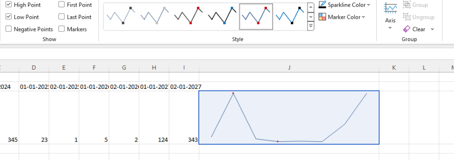
I know that it is possible to customize the appearance of the markers using the markers.visual. However, I would like to have the option as a built-in configuration to ensure better performance.
- Currently, when the legend has a lot of items or the labels are too long, it will create multiple lines and takes spaces. We would like to keep the legend in one line as fixed and add a scrollbar within the legend.
- This will make the chart more clean and the legend wont overtake the space of the chart and it will remain the same size no matter how many items it contains.
I would like be able to have a vertical scrollbar on a kendo grid without enabling horizontal scrolling.
Currently when the scrollable feature is set to true, scrolling is enabled for both horizontal and vertical.
I would like to see something like:
scrollable:{ vertical : true, horizontal: false }
Can that be done?
Thank you!
Currently, there is no way to reuse a single method of a model and execute different logic based on additional data related to the specific element.
Before the CSP improvements in R1 2023, an unsupported workaround was configuring the method along with the arguments that were evaluated and accessible from the method itself.
Example of the unsupported approach:
    <div id="test">
      <p  data-bind="text: spanLabel('test')" ></p>
      <p  data-bind="text: spanLabel('another test')"></p>
    </div>

    <script>
      var viewModel = kendo.observable({
        spanLabel: function(args){
          return "spanLabel executed, args: "+ args
        },
      });

      kendo.bind($("#test"), viewModel);
    </script>
Improvement suggestion
Allow the model methods to have access to the reference element. That would enable the internal method logic to get additional data based on the element and achieve the same functionality as the unsupported workaround approach.
Example of the desired functionality:
    <div id="test">
      <p data-bind="text: spanLabel" data-span-label="test"></p>
      <p data-bind="text: spanLabel" data-span-label="another test"></p>
    </div>

    <script>
      var viewModel = kendo.observable({
        spanLabel: function(args) {
          let element = args.referenceElement;
          let spanLabelArgs = element.attr("data-span-label")
          return "spanLabel executed, args: " + spanLabelArgs
        },
      });

      kendo.bind($("#test"), viewModel);
    </script>
Kendo UI ImageEditor, jQuery version. Add Draw simple shapes and text over image like you have in the WPF image editor component.
I saw a slightly similar request but not exactly what I would like.
Thanks, Kurt Miller
I have a requirement to show parent rows below the child rows, such that
when a parent row is expanded the children show up above the parent. Currently from
the options, it seems that parent row can only be expanded to show
children below the parent. This is not supported by the grid or treelist, and Kendo support has requested this be logged as a feature.