I am currently using the ANDI accessibility tool and have encountered an accessibility issue with the tooltip icons across my application.
The tool reports an "Aria-Hidden Alert" stating: "Element is focusable but has or is contained by [aria-hidden = true]." The tool also reports as "Keyboard Access Alerts" which states" "Focusable element is not in keyboard tab order; should it be tabbable"?
The HTML for these elements shows aria-hidden = true and focusable = false. I believe the focusable attribute should be set to true.
I have attempted to resolve this using JavaScript to directly removing aria-hidden = true and changing focusable to true. However, there is no built-in configuration in Kendo UI for ASP.NET MVC to customize these accessibility attributes for tooltip icons therefore it didn't work.
Can you make the icons customizable?
I am including a screenshot of the code.
We use the KendoUI for jQuery framework in the enterprise SaaS application we create. Giving our clients access to their data and being able to provide a mechanism where a client could build out some of their own functionality on our Saas platform (ie accessing the Data, webservices etc) is highly desirable.
Our front end is based on a MicroUI approach, so if the client can vibecode building a new microUI, the UI experience with the other microUI we provide would be seamless. Examples might be: Create a Scheduler view showing all the European Holidays in 2026, or create a grid view populated with all the customers who have not transacted in 2025 and show their linkedin link/profile.
We can easily wrap any vide coded application into our application now using the microUI approach, but what we dont get is the same look and feel, themes and components being used. It is this we are looking to solve.
I created a forum post and it was suggested that I create a feature request for improved Kendo Grid keyboard accessibility when the grid contains locked columns and/or clickable elements such as buttons, links, and input boxes. I noted the following issues that I feel should be supported without having to write a bunch of workarounds or create a poor user experience for regular (mouse and keyboard) users.
This is an urgent concern because many of our clients are requiring our site to meet accessibility standards and with the heavy use of Kendo grids in their current state, it does not seem to.
I have a grid with 2 locked columns with a button in the first column and a hyperlink in the second column, the other columns just have text. I set navigatable to true. None of my fields are editable.
Here is a dojo: https://dojo.telerik.com/KUcMekCh
When the user tabs to the grid, they first get the search bar in my custom grid toolbar. Next they tab to the button (which happens to be a bootstrap dropdown menu but I don't think that is relevant). Here is where the issues start:
- They then hit tab again and sometimes are taken to the hyberlink while other times they are taken to the next row, skipping column 2's hyperlink.
- The grid does not always enter Kendo's navigation mode. When it doesn't, there is no way for the user to interact with the column header which has the sort and tooltip buttons in it.
- When they get to the bottom of the grid, the locked side will scroll vertically but the unlocked side remains in place, causing the rows to be misaligned.
- When an input cell is in the unlocked portion of the table, the user has to tab through the entire list before getting back to editing the input for a row. This isn't logical.
- I worry that if there were editable cells, which some of my grids have, the user won't be able to tab to the next editable cell and instead will be forced to navigate through every cell. I don't want to make it more difficult for a normal user in order to accommodate a keyboard only user so there needs to be a way for both to work well.
- Often the focus ends up on the unlocked table which attempts to put a blue outline around that, however, the outline isn't fully visible since that is inside of a scrollable div.
- You can click into a cell with navigatable set to true and then use the navigation but that doesn't work for a keyboard only user.
- When navigatable is not turned on, the user cannot scroll vertically if they tab to the table.
Dear Team,
Currently, Telerik Smart Grid AI features rely on external AI services (e.g., OpenAI cloud). While this works well, customers who cannot use online services face challenges when trying to integrate local models (such as Ollama).
Since the Smart Grid already exposes its schema to the AI service, it would be highly beneficial if Telerik could provide at least one default AI service (hosted and managed by Telerik) that:
Works seamlessly with dynamic/auto-generated columns
Supports basic grid operations such as sorting, filtering, paging, highlighting, and grouping
Ensures compatibility with the Telerik.AI.SmartComponents.Extensions package
Rationale:
Many enterprise customers have restrictions on using cloud-based AI services and prefer local or vendor-hosted solutions.
A default AI service from Telerik would simplify integration, reduce configuration overhead, and guarantee compatibility with Kendo Grid features.
This would also ensure consistent behavior across environments without requiring customers to experiment with different local models.
Impact: This feature would significantly improve adoption of AI-powered grid functionality for customers with strict data policies, while ensuring a smooth developer experience.
Reference: For more details on the issue and context, kindly refer to the support ticket: Telerik Support Ticket #1707506 (https://www.telerik.com/account/support-center/view-ticket/1707506)
Thanks & Regards,
Hiren Lad
Hi Team,
While I understand there are release notes and breaking changes, I would like to request you consider adding some version information to the documentation. This would help identify when certain features were introduced.
Thank you!
Enhancement
Currently the dialog action buttons can not hold only icons, the API does not provide means to have a button with only an icon or an icon and text. Considering the aforementioned we should extend the API to allow adding of icons inside the action buttons.
Please make the speech to text button/suffix of a kendo textarea available via mvvm. Also speech to text button to come standard as a tool in the kendo editor.
When I add a minimum or maximum value to the date picker, the control allows out-of-range dates to be entered until the dateInput option is set to true. At that point, any out-of-range date will be set to either "min" or "max." The change event will not be called for that change.
This would be perfect:
- The default behavior is to set the minimum or maximum value when the date input value is out of range. It would be nice if this behavior didn't depend on the dateInput option.T
- Trigger a change event when the control itself sets the minimum or maximum value.
- Add an option to change the behavior to generate an error on the control when an out-of-range value is entered.
Note: In some situations, the default behavior of setting it to "min" or "max" can also be useful... but with a change event trigger however!
We have noticed a serious performance issue in the TreeList control which I have confirmed in the latest version in this Dojo: https://dojo.telerik.com/aNuKanAG. This Dojo is a based on the TreeList in-cell editing demo from your website.
- Open the Dojo link I provided and Run it.
- Open your browser DevTools console so you can see console.log messages.
- Navigate to a leaf node of the tree if it isn't already open by default; ex: Daryl -> Guy -> Buffy -> Hyacinth
- Click in and out of an editable cell; ex: Ext
- Observe the DevTools console where you will see that the 'rendered XXX' text has been written for EVERY CELL in the entire tree.
- Expand/collapse the closest parent group
- Again, observe that EVERY CELL has been re-rendered
I was trying to figure out if there was any good reason for this. In the Dojo above all data are nested under a single parent. So, I created another Dojo but this time there are two separate parent groups: https://dojo.telerik.com/OcEmAgIz. This Dojo is based on the Binding to local data demo from your website.
- Open the Dojo link and Run it.
- Clear the DevTools console so you can see a clean display of results for the next action.
- Expand and collapse a child group of Daryl Sweeney.
- Observe the console log results: you will see that Dan Sweeney was also re-rendered.
The problem here is that these re-renders are very expensive. Imagine if the call to console.log was instead something else that might need a bit of computation time to complete.
The simple act of expanding and collapsing a group from an unrelated part of the tree, or simply opening and closing an editable cell should not result in the entire tree being re-rendered. This is a serious performance issue, and seems completely unnecessary.
What I have demonstrated in the Dojos I created is that Kendo is re-rendering the ENTIRE structure. The goal of this feature would be to rerender only the specific cells of the treelist that have been impacted by an edit.
Currently, the Kendo UI RangeSlider provides a single-colored track (.k-slider-track) with a separate style applied only to the selected range. However, in many modern design requirements, there is a need to split the track into multiple colored sections (e.g., 3 or more segments with different colors) to visually represent thresholds, ranges, or categories.
Example Use Cases:
Displaying low, medium, and high ranges with green, yellow, and red colors.
Visualizing different risk or performance levels directly on the slider track.
Providing a better UI experience by mapping ranges to business values.
Requested Feature:
Add native support to configure multiple color segments within the RangeSlider track (either via configuration options or styling hooks). Ideally, developers should be able to specify:
Number of segments.
Color for each segment.
Segment boundaries (percentage or value-based).
Workarounds Tried:
Custom CSS overlays and pseudo-elements can partially simulate the effect, but they are not reliable or fully aligned with the slider’s rendering behavior.
Impact:
This feature would enhance usability and visualization, making the RangeSlider more flexible for dashboards, financial apps, performance monitoring, and other business-critical UI scenarios.
Reference:
Please find an attached image illustrating the requested multicolored track (example with 3 segments: green, yellow, and red).
We would like the ability to execute custom actions once a control has been fully initialized and rendered.
Use Case
On our login page, we use the Form control. After the Form control is created, we need to reposition our SSO buttons so that they appear beneath the default buttons rendered by the form. Without a reliable event, it is difficult to determine when the control is ready for safe modification.
Proposed Solution
Introduce a Created event (or similar) that is triggered once the control is fully rendered. This event would provide a hook for developers to perform additional UI adjustments or integrate custom functionality.
Reference
Syncfusion ASP.NET Core controls provide this functionality through a Created event.
Slider seems to only output numbers, I want to use it for date ranges, ala mint.com.
Hi Team,
I would like to request the source code from the AI Service from the Kendo UI Grid demos be available to download.
Thank you!
When a pager control uses responsive mode, but renders initially as hidden, the control fails to render properly.
The control should render to the appropriate responsive mode regardless of whether the control is visible or not when it is initially rendered.
For example; similar to http://www.highcharts.com/stock/demo/arearange

Having area 'scatter' support, such as 'scatterArea', and 'scatterAreaRange', like the existing 'scatterLine', is also desirable.
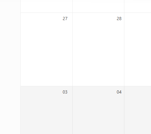
Views - Month - numberOfWeeks (set to 6 weeks), do not need to see previous or next month week. Only show days of the selected month.
This is OK:
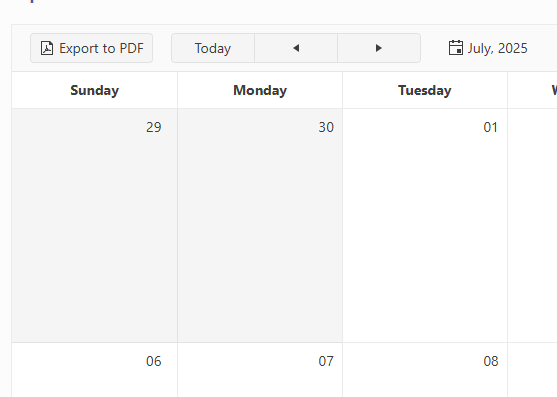
This is not, unnecessary week of Aug 03. The extra week adds to a busy calendar clutter.
When the workbook is exported to Excel, it is currently not possible to display the progress for example, in percentage of exported data.
You are returning a "jquery promise", you can call the ".notify" function while the process is running and tell us that you are at step X of Y, when running these settimeout.https://dojo.telerik.com/mHMUMjpg/6
So, we can display a nice progressbar, instead of just a "loading animation" that doesn't tell if the process is really running. In some cases, it can take between 30 and 60 seconds, so the user think that the app is doing nothing!