

Other vendors offer visual representations and better access to what controls are available and how to quickly use them in different scenarios. I cannot find any visual such as http://www.oracle.com/webfolder/technetwork/jet/jetCookbook.html?component=home&demo=all which nicely highlights what each control looks like from an index perspective.
Furthermore, the code in a cookbook should be copy and paste and not have dependencies on hidden helper classes.

ToolBar items only have two states (besides visible and enabled):
- displayed in the toolbar
- displayed in the overflow dropdown (kind of responsive because not very practical on mobile devices where you are left with two visible buttons at the most, and a possibly large overflow dropdown)

On mobile devices, we would buttons buttons that shrink to icon only (no text) before being sent to overflow dropdown. This would improve greatly the responsiveness.

Several of your controls (Scheduler, Grid) make use of the Validator control for validation on the edit forms.  Once the validator is loaded there is no way to change the options.

It is important if the validator is going to be embedded within other controls that we be able to enable/disable validateOnBlur and get/set the errorTemplate.

Without the ability to change the validator options, support recommends use of private methods.

An alternate choice would be to require those controls that are embedding the validation to provide these options as part of their configuration.

Thanks
Kendo UI pivotgrid should have a way to customize the filters. Specifically have a date picker for date fields and a date range. But something so we can override what the default is.
Support Issue: https://www.telerik.com/account/support-center/view-ticket/1561941
I hope you provide proper exposed options for extending the column menu items.
Thanks
Hi Team,
I'd like to request a tool which can parse an Excel File to JSON easily.
Thank you!
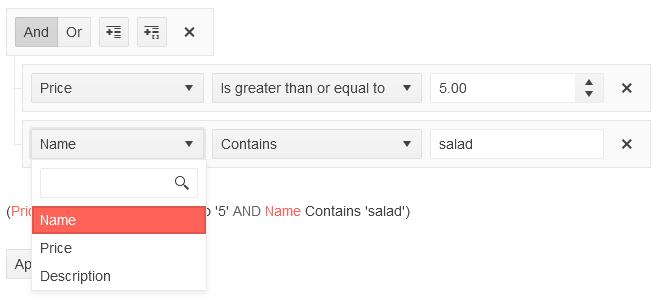
For the Kendo Filter widget, being able to filter the list of fields in the dropdown list would be useful for longer lists and an event to see when the user added or removed a filter condition to manually set any other options for these lists. I have modified your sample filter in the browser console to add the filter to the dropdown in the screenshot here.
If the drawTabularData function could support grouping, that would be great. Right now, when I group a Grid by a column and then use drawTabularData to export the Grid data to a PDF, the table in the PDF is blank -- it has the right number of columns, but the rows are empty. I'd really appreciate it if this worked, so that users could have the full ability to export a PDF of the data exactly as it looks in the Grid.
Similar to the Funnel chart, some chart libs also offer a Pyramid Chart. We are also interested in the Pyramid.
This dashboard layout quite exciting.
please refer this url
easy to do our own Analytic dashboard

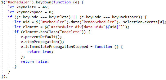
The scheduler is either editable or not. And deletion events are either allowed or not. This isn't a black and white thing. Consider employees at a store. They can see each other's events for scheduling but they are only allowed to modify their own events. So I want editing and deleting enabled but conditionally.
In my case I hook into the databound event and I add a class "nodelete" on events that cannot be deleted. Then I have CSS that hides the "X" button on hover and I block the edit window from appearing.
However, the keyboard still prompts for a deletion. I think there should be some function for whether an event is editable. That, or an event should fire before the deletion prompt so I can stop it from occurring.
Here's a hacky work around. I don't like accessing properties starting with underbar as they are considered private and subject to change but I don't see a better way.
I would love it if I could add a header to the PDF when using drawTabularData. I'd like to add some header information (e.g. some text above the table) describing what the PDF contains. Ideally this would repeat on each page of the PDF.

For context, I'm using drawTabularData to export data from a Grid component to PDF in a way that supports horizontal page splitting (column splitting).
Hi Support,
I have some issues with the copySelectionToClipboard Method for the Grid widget.
In the first one, the copy function of the table seems to have a problem with locked columns. In the dojo of the first problem the table headers are displayed shifted.
Secondly, grouped table headers are not copied. To see in the second dojo.
Lastly, it should be mentioned that the definition for the copy method is not included in the kendo-ui npm packet.
Problem 1:
https://dojo.telerik.com/OBOQemUm
Copy result in Excel:

Problem 2:
https://dojo.telerik.com/OBOQemUm/2
Copy result in Excel:

Best regards,
Jonas
On this page Demo of core features in jQuery Circular Gauge widget | Kendo UI for jQuery (telerik.com) there is a link to the client side API documentation (big blue button "API Reference") but the link returns a 404 error.
This is the page it links to https://docs.telerik.com/kendo-ui/api/dataviz/circulargauge.
Hi,
This is only i minor issue, since the actual method seems to be working fine. I just thought i would bring to you attention that the demo page for the JQery method getOptions is havinf issues.
https://docs.telerik.com/kendo-ui/api/javascript/ui/grid/methods/getoptions
Steps to reproduce:
- Navigate to the link
- click on the preview tab of the example
Below are some of the more noteworthy errors and warnings:
- jquery.js?020081004:3 GET https://docs.telerik.com/kendo-api/announcements/kendo-ui 404
- VM359 kendo.all.min.js:9 License activation failed for @progress/kendo-ui v2023.2.606
No license found.
See https://docs.telerik.com/kendo-ui/intro/installation/using-license-code for more information.
Hi Team,
the SignalR demos are spread out across multiple products and it is hard to get a single cohesive demo that I'm looking for.
- After fresh installation Telerik UI for ASP.NET Core PURCHASED 2024.1.319 (MAT 19, 2004) Start: Demos - Telerik UI for ASP.NET Core 2024 Q1 -> Grid -> SignalR Binding -> hundreds of JS errors -> not working.
see pic. p101.PNG - https://github.com/telerik/ui-for-aspnet-core-examples Telerik.Examples.Mvc
I replace telerik local trial nuget packages with purchased and I add kendo-ui-license.js
I can compile and run the app, but when I change data in one browser -> no changes in other browsers, i.e no SignalR - https://github.com/telerik/ui-for-aspnet-mvc-examples signalR-bound-grid not compilable
- https://github.com/telerik/kendo-ui-demos-service/tree/master/signalr-hubs
This is probably a joke? edited 6 years ago, no Kendo UI, and this can't even start to run - https://www.telerik.com/support/code-library/binding-to-signalr
download SignalRLocalHub.zip -> compile -> run -> everything (delete, edit, add) works excellently. but this is .Net Framework 4.5! and ancient package references and in addition uses Entity Data Model (EDM).
Request
Please create an example that works like 5) without problems and hundreds of JS errors, but with APS.NET Core (current net8) + SignalR (current @microsoft/signalr 8.0.0) + Kendo UI for jQuery Grid - Entity Data Model (EDM) ?
Feature Request/Enhancement to allow series.tooltip configuration for bubble charts in chart initialization.
Since my company is a public entity we are required by law to follow ADA accessibility on our web apps. We are currently using ASP.NET Core MVC and Kendo UI for jQuery. To meet the ADA requirements I have been going through our Kendo Charts and configuring the tooltips to meet the ADA color blindness contrast ratio standard of 3:1.
It came to my attention that I cannot configure the bubble chart's series.tooltip the same way that I can a donut or pie chart. Since I am required to use a certain color of red in my chart and the default tooltip.color is black the contrast for small text does not meet the WCAG AA standard for text under 17 pt.
My feature request/enhancement is to allow charts to all have the same initialization process for things such as series.tooltip to allow easy config to meet ADA standards.
Hi Team,
I would like to share some feedback about the documentation, but I want to make sure it goes to the correct team. Is this the best place to share it?
Thank you,
Michael
**** CREATED BY PROGRESS TECHNICAL SUPPORT ****